Yeah, I mean, literally the only way they could be more plain was if there were no numbers or logos. They still look pretty good, but you could do a lot better.
Log in or register to post comments about the Virginia Tech Hokies
It's not even our best soccer kit, but to side with the OP, the orange on maroon with no white has a special place in my heart. I miss the orange shoulder/tv numbers on the home maroon jerseys for football
.
Log in or register to post comments about the Virginia Tech Hokies
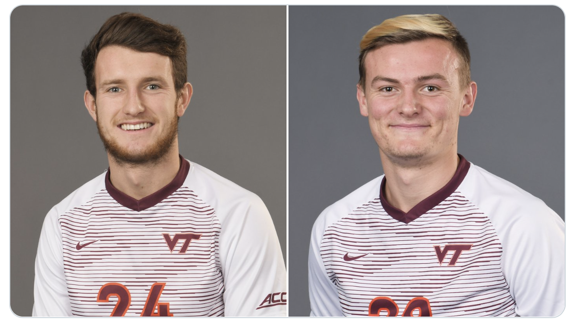
Here's the ALL MAROON kits...
And tough to see...but there's thin grey lines in there...
These are from 2019...the subliminal stripes are ok...
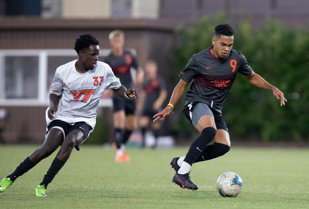
These are from 2020 with the stripes now cris-crossed...
Better look at the front...
Ive never cared for the sash look on a non-National team kit...but that's me.
Kinda like these whites, but NEVER liked any of out blacks. (Especially with a maroon stripe on the black.
(That black just looks dark dark dark grey...and not in a Hokie Stone way.)
Too much...
Log in or register to post comments about the Virginia Tech Hokies
Needs some kind of white give structure to the number and logo, as orange on maroon tends to blend together from a distance.
That said, I'm just not a fan of the VT logo on a soccer uni. Needs something that is a bit more crest-ish to fit with the sport, so either create a VT centric crest (which I know we won't do) or go with the Hokiebird head or the Fighting Gobbler throwback. I also really hate uniforms with a giant VT logo front and center. From those soccer jerseys to the basketball ones, there is just something that is off about it, and that goes for pretty much every school, and not just VT (UNC does it as well, and it looks equally garbage on them, too).
Log in or register to post comments about the Virginia Tech Hokies
I was mainly pointing out that VT does have a crest. Also, the Pylons emblem was used on the football helmets in one of the Hokie Stone iterations so there is precedent there for the soccer team.
you want the curvy VT to make its way onto our uniforms
I'd support making Fuente (and only Fuente) wear the curvy VT until football is ranked in the Top Ten at the end of the season again.
Log in or register to post comments about the Virginia Tech Hokies
That said, I am pretty sure the athletic rebrand a couple years ago made it a point that the academic and athletic branding are now completely different, and as such, you won't see those kind of crossovers anymore.
Plus, sadly, the pylons aren't even a school logo anymore. That was scrapped in lieu of the curves. 🤮
Log in or register to post comments about the Virginia Tech Hokies
The Pylon precedent was 8 seasons ago, and that logo has since been retired as a symbol of VT....
Personally I'm not a fan of alternate logos for various teams on Campus. The VT serves for ALL sports, and I'm fine with that. If soccer did a crest, then softball would have something different, and lacrosse would be different. Now, it's all the same VT that has been "normalized" across all sports. (In regards to spacing and size.)
Log in or register to post comments about the Virginia Tech Hokies
Now that we're on the topic of the logo, I'm about to say something that might be a little controversial on here.
I like the vintage stacked VT more than the current. I love the symmetry of it, and its a better logo to use in vertical spaces, like a jersey, than the current, which is more horizontal. It fills out spaces better. There's also a lot of white space in the current logo that almost has it lose its shape from a distance. I also hate how its impossible to outline the logo without there being a mismatch in height between the V and T in either the inner or outer colors.
Log in or register to post comments about the Virginia Tech Hokies
Jander and casually sliding of some form of "recruiticorn" into an unrelated discussion.... up there with dcwilson and "i get that" for iconic TKP duos
Log in or register to post comments about the Virginia Tech Hokies
We are all in search of the mythical recruiticorns that will lead us to the promise land. And my comment was directed at making fuente wear that abomination of a logo...
Log in or register to post comments about the Virginia Tech Hokies
You easily can. I just built it using a configurator on Nike's website.
And that's what's sad about our jerseys. In 10 minutes I can make something I like better using a stock Nike jersey.
Log in or register to post comments about the Virginia Tech Hokies
both numbers need an outline. I prefer the double outline that we had with MV7, but could also go for the single outline we had with Tyrod. The lack of an outline has always looked cheap to me.
But yeah, main numbers white, shoulders orange. Simple, basic, Hokie. Hell, I'd even say we could still go with the hokiestone pattern in the numbers if we are keeping it this simple.
Log in or register to post comments about the Virginia Tech Hokies
Can someone more up on design/fashion explain to me the desire to have the shoulder and chest numbers a different color? It just always looks off whenever I see it (even in the throwbacks/older jerseys).
I agree some sort of outline is needed around the numbers to help them but stop with the schizophrenic colors for the numbers themselves. It's like no one in the uniform design room could win the argument for their preferred color so we went with both.
Log in or register to post comments about the Virginia Tech Hokies
I like it because, as far as I know, we're the only school that went with the mismatched colors. So when I see it, I know its Tech, without needing to see any stripes or logos (or even colors, to be honest).
I like a combination of unique and simple. Those Vick era jerseys managed to accomplish it.
Log in or register to post comments about the Virginia Tech Hokies

:format(webp)/cdn.vox-cdn.com/uploads/chorus_image/image/69181294/Strickler_K_19MS_nd_SP_1702R.0.jpg)

Comments
Honestly a tad too plain for me. I'd prefer a little white accent somewhere.
Yeah, I mean, literally the only way they could be more plain was if there were no numbers or logos. They still look pretty good, but you could do a lot better.
It's not even our best soccer kit, but to side with the OP, the orange on maroon with no white has a special place in my heart. I miss the orange shoulder/tv numbers on the home maroon jerseys for football
.
Yep these are sick
Here's the ALL MAROON kits...


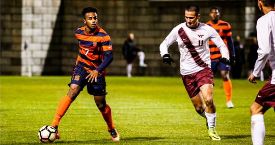


And tough to see...but there's thin grey lines in there...
These are from 2019...the subliminal stripes are ok...
These are from 2020 with the stripes now cris-crossed...
Better look at the front...
Ive never cared for the sash look on a non-National team kit...but that's me.
Kinda like these whites, but NEVER liked any of out blacks. (Especially with a maroon stripe on the black.
(That black just looks dark dark dark grey...and not in a Hokie Stone way.)
Too much...
Yeah the whites look the best of these
I always found the whites (with maroon sash) funny, because it's essentially the same as The Marching Virginian's uniform.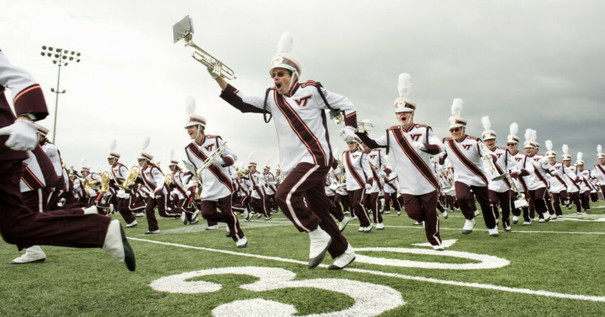
Needs some kind of white give structure to the number and logo, as orange on maroon tends to blend together from a distance.
That said, I'm just not a fan of the VT logo on a soccer uni. Needs something that is a bit more crest-ish to fit with the sport, so either create a VT centric crest (which I know we won't do) or go with the Hokiebird head or the Fighting Gobbler throwback. I also really hate uniforms with a giant VT logo front and center. From those soccer jerseys to the basketball ones, there is just something that is off about it, and that goes for pretty much every school, and not just VT (UNC does it as well, and it looks equally garbage on them, too).
We do have a Coat of Arms and crest
Unfortunately, athletic and academic branding is separate, unless you want the curvy VT to make its way onto our uniforms.
I was mainly pointing out that VT does have a crest. Also, the Pylons emblem was used on the football helmets in one of the Hokie Stone iterations so there is precedent there for the soccer team.
I'd support making Fuente (and only Fuente) wear the curvy VT until football is ranked in the Top Ten at the end of the season again.
I know, I was making a joke.
That said, I am pretty sure the athletic rebrand a couple years ago made it a point that the academic and athletic branding are now completely different, and as such, you won't see those kind of crossovers anymore.
Plus, sadly, the pylons aren't even a school logo anymore. That was scrapped in lieu of the curves. 🤮
The Pylon precedent was 8 seasons ago, and that logo has since been retired as a symbol of VT....
Personally I'm not a fan of alternate logos for various teams on Campus. The VT serves for ALL sports, and I'm fine with that. If soccer did a crest, then softball would have something different, and lacrosse would be different. Now, it's all the same VT that has been "normalized" across all sports. (In regards to spacing and size.)
Now that we're on the topic of the logo, I'm about to say something that might be a little controversial on here.
I like the vintage stacked VT more than the current. I love the symmetry of it, and its a better logo to use in vertical spaces, like a jersey, than the current, which is more horizontal. It fills out spaces better. There's also a lot of white space in the current logo that almost has it lose its shape from a distance. I also hate how its impossible to outline the logo without there being a mismatch in height between the V and T in either the inner or outer colors.
This. Give me more of the old "TV" block block letter logo as well as the old gobbler logo.
Do not disagree!
FWIW we painted our cornhold boards with the stacked VT logo because it fit a lot better and looked a lot better and was a lot easier to do
Fuente has enough trouble recruiticorning...
Jander and casually sliding of some form of "recruiticorn" into an unrelated discussion.... up there with dcwilson and "i get that" for iconic TKP duos
We are all in search of the mythical recruiticorns that will lead us to the promise land. And my comment was directed at making fuente wear that abomination of a logo...
The mountain nation of Switzerland does not need a crest:
I think these look sick, I'd wear that
Can we put Virginia Tech University on them?
Only if we change our nickname to the hookies.
I'm just going to keep posting this until VT finally just gives in and bends to my will.
I would purchase this very quickly...
You easily can. I just built it using a configurator on Nike's website.
And that's what's sad about our jerseys. In 10 minutes I can make something I like better using a stock Nike jersey.
Can you make the 25 on the front of the jersey orange as well?
lose the white cuff, add VT to neckline, and use our font for numbers and this might be perfect.
both numbers need an outline. I prefer the double outline that we had with MV7, but could also go for the single outline we had with Tyrod. The lack of an outline has always looked cheap to me.
But yeah, main numbers white, shoulders orange. Simple, basic, Hokie. Hell, I'd even say we could still go with the hokiestone pattern in the numbers if we are keeping it this simple.
Can someone more up on design/fashion explain to me the desire to have the shoulder and chest numbers a different color? It just always looks off whenever I see it (even in the throwbacks/older jerseys).
I agree some sort of outline is needed around the numbers to help them but stop with the schizophrenic colors for the numbers themselves. It's like no one in the uniform design room could win the argument for their preferred color so we went with both.
I like it because, as far as I know, we're the only school that went with the mismatched colors. So when I see it, I know its Tech, without needing to see any stripes or logos (or even colors, to be honest).
I like a combination of unique and simple. Those Vick era jerseys managed to accomplish it.
My favorite jersey, of course that season we went very far in the tournament, and Patrick Nyarko had a long steady MLS career: