
𝙉𝙚𝙬 𝙢𝙖𝙧𝙤𝙤𝙣 𝙩𝙝𝙧𝙚𝙖𝙙𝙨, #HokieNation 👀#Hokies 🦃⚾️ pic.twitter.com/td7OZJiNQa— Virginia Tech Baseball (@HokiesBaseball) January 12, 2023
To compare, this is the look from last year:
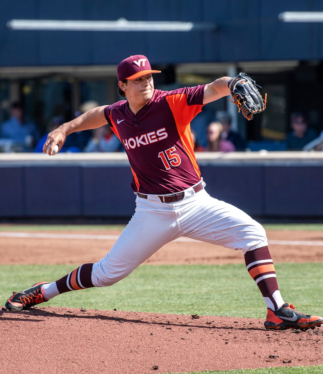
My personal early verdict? Big upgrade. Never liked the pullover jerseys, and disliked the orange under arm blob even more. Now if only they would actually sell these to fans, that would be great
Forums:
DISCLAIMER: Forum topics may not have been written or edited by The Key Play staff.

Comments
Agreed, much better look and well deserved for the team.
It doesn't suck!
After so many recent uni changes both pro and college that have looked just awful, changed so little it didn't change at all, or both (looking at you, Minnesota Twins), I'm glad to see a uni change that looks nice.
Way better than the NIL swag in the other thread fo sho'
Softball with a fresh new look, as well:
I like these much more than the men's (also good). The pinstripes work well with maroon top and script lettering
See, I like the script a lot better, but I think if you're going pinstripe pants, you've got to go pinstripe jerseys. Solid pants with solid jerseys. Pinstripe with pinstripe.
I'm normally not a pinstripe guy but these look good. If we didn't have the script on the jersey and instead went with what the baseball team has then stripes wouldn't look nearly as good.
I will say this. While I do like pinstripes, I absolutely hate the baseball pinstripe uniform
The VT is comically small and looks like an afterthought. I really don't like the numbers placement that is basically at the belt line on the front, and really don't like that its a pullover instead of a button up.
That one jersey in particular needs an overhaul. Badly
In case you haven't noticed our apparel deal is a fucking joke. Full stop. Dollars, designs, retail availability- everything.,
I think sleeveless jerseys are a pretty fine line to walk, too. Very few of them look good, and I don't think pinstripes work with them.
On the other hand...

with the proper S&T this take on the sleeveless approach could be intimidating. Although I'm certain the NCAA would stick their nose in it and declare that its threatening to the other team.
Imagine wearing these on a cold late spring Blacksburg day just to play mind games with the opposing team who you know would be in full long sleeves and neck warmers.
They sold last years Maroon ones in the university bookstore, which bodes well for this spring.
With you on the pullover thing though. Broke my wrist shortly before the ACC tourneys, and it was a bitch and a half trying to get that jersey on and off over a bulky cast.
These are the 2004 ACC football jerseys vs the tyrod Taylor football jerseys, way better this year!
Who's dad shot this video
Does anyone else feel like with all the jersey refreshes this year we're probably staying with Nike once the contract is up? Maybe Whit is just trying to milk them for all we can before switching.
I think this is Nike having an "oh shit" moment and realizing they need to step it up in order to keep the contract. I hope Whit takes them to the cleaners.
Nike would dump VT in a NY second. Whit really helped matters when he publicly said "our nike relationship is beyond dollars"- in other words we need Nike a lot more than they need us. LOL. They would dump VT and wouldn't think twice. The problem with that of course is if we were to go to Adidas or UA lets say- do you trust VT to negotiate a louisville type adidas deal? which would be a huge financial gain? or will we get stuck with an inferior brand AND a shitty money deal? hmmmm
Definitely an upgrade, we no longer look like a cartoon.
I'm still upset that Whit decided that baseball needed to streamline branding with the rest of the school. The unis were the best when we were rolling out Hokie takes on MLB uniforms and using all sorts of logos on the hats.
I like these and the new softball uniform