
Let's get right to it...
This might be the most underrated and overlooked uniform that VT has ever worn. Give me maroon and orange versions of this, maybe with more traditional block numbers for our inevitable Pry restyle and I'll be happy.

Forums:
DISCLAIMER: Forum topics may not have been written or edited by The Key Play staff.
Comments
I loved those white pro-combats. They were my favorite uniform that we wore while I was a student (I was at that UVA game in the UVA student section with a bunch of blokes I went to high school with and winning that game was extra special) with the '06 or '07 Maroon unis with the orange piping being a very close second
Agree with this 100%. I would not be mad if we used those piping jerseys again.
Now for my controversial opinions.
These unis were/are 🔥:

These are probably my favorite helmets other than the maroon with orange flake:
i actually really like the asymmetrical arm color, but not with white pants.
Also, I love those helmets with a white jersey.
concur. both of these were sex
Loved these helmets.
I bought this jersey when I got to Blacksburg in 2005 and to my wife's chagrin still wear it on a lot of football saturdays. The last time it was 'washed' was when the rain soaked through my sick all maroon VT starter jacket in the North Endzone during the fuck matt ryan game.
These are a very close second to the Mike Vick jerseys from a few years earlier on the list of best VT looks.
My daughter, who is 10 and in the 4th grade, had a little project to do the other day. They had to stand in front of the class, tell everyone what their favorite color is and why. I had no idea until she came to me the night before and said, "daddy, can you listen to this for me?" "Of course sweetheart..."
And she commenced: "My favorite color is Chicago Maroon because that is the color of my favorite college... Well Iike purple too because my brother is a Duke. But I love Chicago Maroon."
Brought tears to my eyes...
Additionally, and to the point of this thread, IMO you can't beat the late 90's AME unis. Classic, clean and worn by the best football teams to step foot in Lane Stadium.
You're raising right
Late 90's AME!!!
It doesn't get better than this
Point of order: this but with matte helmets would be sexy
Those are the bees knees. The jerseys could be a little more form fitting to make them harder to grab on to though.
This is the way.
Dont like: weird pixel gradient numbers and arm band stripes.
Love: clean white, basketball net epaulettes (pauldrons?)
Grew on me big time: asymmetric helmet stripes
That strip has not grown on me, but I hate strip on helmets soooo probably never will
I don't mind the stripe on the white helmets, but the maroon lids should be solid maroon 100% of the time. Do a matte or orange flake to mix it up every so often, but no damn stripes.
Replace the gradient with solid colors for the stripes and numbers and that's a killer permanent uniform. The pant stripes should probably be straight lines without that flare at the knee, but that's me.
This is the way
I am not impressed.
I thought these were awesome.
Potentially unpopular opinion: while these and the 2010 black Pro Combat's were awesome in a vacuum and I loved them, they both look very 2009/2010 to me now. I still think we just need a refreshed version of the Vick-era or 04-07 era Unis and keep it simple but clean looking. And not opposed to orange alternates of those either. Similar to how FSU just rebooted their classic uniform look for this upcoming year, I think that looks great.
Asymmetrical helmet stripes are an abomination.
Agreed. LOLUVA wears asymmetrical helmet stripes.
That stitching on the shoulder pads is awesome. I could do with a different number font though.
Pretty sure the number font is now illegal
I could do without the number gradient and spider web shoulder pad pizzazz. Personally, I do not like white uniforms at all. It screams weakness to me.
Pump the below '99 Maroon and White into my veins all day along. O, and add maroon pants and a three man backfield, double tight, with Suggs or Jones running head on into someone and I will excrete in my pants.
My biggest complaint about this uniform set was that the numbers were the wrong font
The 5 is supposed to have a point to it:
Compare to what we wore:
That's just asking too much. Do you know how difficult it would have been to get Nike to change the font for up to 10 whole jerseys? There's no way a company of that size could manage something like that.
I don't understand why the numbers are white. Numbers should be orange with white trim, not vice versa.
EDIT: My shitty paintshop tweaks

White on the numbers for a color jersey seem to pop better on TV/make numbers easier to read. I read that's why FSU changed their rebrand in 2014 from gold numbers on the garnet to white. Their latest throwback refresh they just announced looks great and the direction we should go in.
Numbers on a colored jersey must be distinct and in a contrasting color. Remember that Oregon got in trouble for their grey on white unis, and light green on dark green unis a few years ago. That's why we almost always end up with white on maroon.
As long as boyzee is allowed to have a blue field and wear blue jerseys, I refuse to acknowledge that the NCAA or any other governing entity has any authority in this regard.
You make a good point
Similar to dressing a team in pink; it looks soft. What looks nastier 1) a team in all black or 2) a team in all white? Why is the Ruby All Blacks brand so bad ass?
For me, darker colors all day as long as they are simple -- aka -- don't get washed out with Oregon futurama. Hey, if you prefer the cleanliness and purity of white dress on the football field, by all means.
On a thread about hot takes this is approaching the temperature of the sun or at least mercury. White jerseys are unavoidable for ~6 games a year, might as well have a nice looking white kit.
That being said I stand by my previous comments in other uni threads that we need to ditch the white effect game. Let Penn State have that garbage and do a Black/Gray uniform for military appreciation with a lot of references to the Corp.
Wins. Wins looks the nastiest!!!
I am a big fan of storm trooper or ice uniforms.
Sorry, nerdy Starwars is a horrible analogy to football.
Star Wars is the perfect analogy to football.
You got a bitch ass pompous empire, let's call them Notre Dame, on the other side of the field, and you have a choice of being a rebel and fighting back, or being a little bitch, and getting your shit rocked for 4 qtrs.
Shit, had an old wrestling coach use war analogies, got a guy hurt in the process
Re: white jerseys bad: agreed if the team is playing at home. It bugs me in the NFL, too. The road team should wear white, end of story.
No idea if the white effect is still a thing, but if it is, let's do away with it.
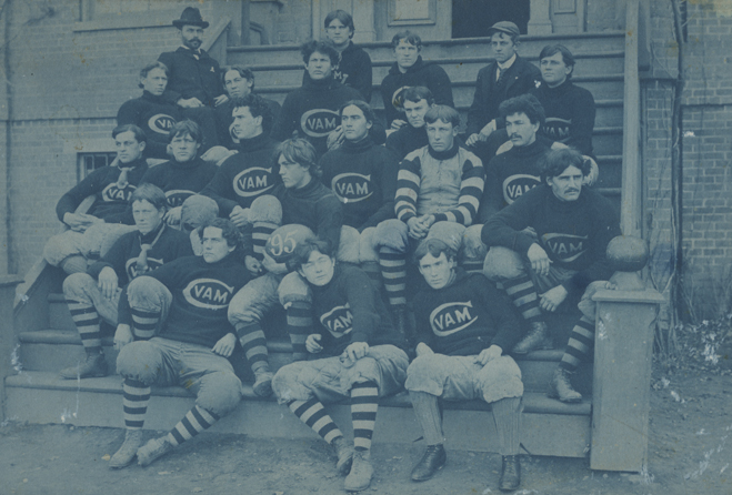
Yes please and we can sport the Black and Gray 1895 throwbacks.
Nike deal expiring soon... new unis coming? 👀 👀
Heard we were potentially looking at a short-term renewal. Perhaps give us time to explore other options/some leverage rather than signing long-term lowball deals. I do hope we see some changes in unis for this upcoming season.
Not going to lie, best pair of sweatpants I own.
Maybe it's just the lighting, but the helmet white doesn't match the jersey white and for that reason I've gotta pass lol. I'm also not a fan of the spider-web stuff on the shoulder pads and the gradient stuff on the numbers and shoulder stripes.
I'm going unpopular opinion time, the numbers both font and color are the best part of this uniform
My hottest uni take is that the maroon helmets without stripes are boring. They're boring in person they're boring on TV. Some schools can go with a single color helmet we can't. Give me the 80s-early 90s stripes and white facemask all day.
/cdn.vox-cdn.com/uploads/chorus_asset/file/18959774/354741.jpg.jpg)
Those uniforms were good all over.
Move the shoulder number to the top of the shoulders (only because jerseys don't have sleeves anymore) and put it on the dang field
This. This jersey and helmet combo make my pants smaller.
Looks too much like the redskins
Which is why I would put the stripes together without the maroon gap in between the white and orange. But I still like it even if it looks like the skins (and I hate the skins)
With white facemasks and orange stripe thicker than white stripes
Any image with sad Miami is a good image
No love for what is clearly what is the best VT helmet of all time?! We should make these the primary logo, truly iconic.
That's a damn good lookin helmet!
Best ever. That why I have one in my office. Matte maroon w a killer logo. Yum.
Need more matte helmets
I'm a big matt supporter
Hell Nah
Please dump the awful unis that we have been wearing the last few years. It is the worst thing we've worn. The stripes on the shoulders are dumb and it looks freakin' goofy as hell with the collar on the back.
Go back to the Mike Vick era unis or take that design and make them a little bit more modern. I was looking for some pics of a design that someone put on the web years ago, and this is the only image I could find.
All I really want is them to change the maroon color from whatever the current abomination is back to the late 90s early 00s. Have a Hokie Stone alternate and incorporate something with the Corps into that uni. 1 orange accented jersey for Orange Out, only to be worn then (with the metallic helmets we wore against anOSU in '15). No more helmet stripes with the VT, preferable a matte maroon. Also an alternate helmet that's the old Fighting Gobbler seen below. I would love that.
I don't care which shade of chicago maroon we use, just pick one and stick with it.
That's fair. I just hate the current Chicago maroon. But yeah pick one and roll with it.
Is this actually a logo that VT ever used or is it a fan created concept?
It's the same logo Homefield uses. And I believe they only license past ('classic' or 'historical') logos.
It's not. It's a recent artists creation.
I could have sworn that I saw that fighting gobbler or another used officially by Tech, but I can find no evidence of it. So then Homefield and fan created art.
Either way I think it's dope.
This?

Ah yes that's the one!
Looks like an angry n*tsack but I'll count it
Lmao. Yeah...let's please not unearth this one for any helmet logos.
As soon as I saw that with such resolution and clarity, I was like, dang, that looks like a wrinkly nut sack. It's almost like they thought putting the cute little cock eyed hat would make it okay.
Let's not use that one very much.