
May 23rd Update:
A #Hokies football uniforms update: It's still going to be a while. "Mid-summer" is the best estimate, I've been told. The issue is VT is at the mercy of Nike's production schedule. They don't currently have the new unis, so the release is not going to be imminent.— Andy Bitter (@AndyBitterVT) May 23, 2024
May 15th Update: Due to statements from Whit and Pry during the ACC Media Days, this is now confirmed to be happening in May.
Neither Babcock nor Pry gave a full rundown of what the new unis will look like, but they did confirm it'll have a more classic feel that goes away from the collarbone-striped look Tech adopted in a re-brand ahead of the 2018 season.
Pry said he went to some of the Hokies coaches and staffers who played during Tech's heyday — like defensive line coach J.C. Price and safeties coach Pierson Prioleau — to get their input, presenting them with a lineup of options and getting from them a thumbs up or thumbs down. They narrowed down the choices and repeated the process before coming to a final design that Pry said pulls from the Michael Vick days.
"It's a more traditional look and people I believe will appreciate it," said Babcock, who thinks they'll be revealed in "a week or so."
Also made mention that there will be more variety with the logos on the helmets going forward, so I would probably expect the stacked VT and possibly the Fighting Gobbler to return. I've also been seeing a script Hokies helmet making the rounds lately, and that could be an interesting possibility as well.
------------------
Original Post:
So I just noticed that Clark Ruhland (@Hokie20) is doing a countdown on Twitter...
pic.twitter.com/rkQqBjEQHg— Clark Ruhland (@Hokie20) April 27, 2024
pic.twitter.com/ruH96Tb1RZ— Clark Ruhland (@Hokie20) April 28, 2024
pic.twitter.com/AELviHFJ1X— Clark Ruhland (@Hokie20) April 29, 2024
pic.twitter.com/MZ5joXgYj5— Clark Ruhland (@Hokie20) April 30, 2024
Anyway, a comment on today's post seems to hint toward a coming announcement...
I think you're on to something— Clark Ruhland (@Hokie20) April 30, 2024
Truth is, if anyone would know it would be him given how involved he's been with branding over the years. Should this hold true, be on the lookout for an announcement on May 17th or 18th

Comments
are we getting a new patch on the uniform that says "SEC" instead of "ACC"?
honestly, I'd be on board with the gray uniforms from the chick-fil-a kickoff (I wanna say 2011?) and the foghorn leghorn helmets if it means we get into the SEC
All the stripes...
Some stripes. Not stripes like this...

Triple stripes3
YOU CAN'T TRIPLE STRIPE A DOUBLE STRIPE! YOU CAN'T TRIPLE STRIPE A DOUBLE STRIPE! YOU CAN'T TRIPLE STRIPE A DOUBLE STRIPE!
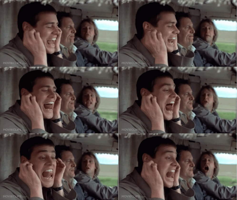
So basically this...
OH MY EYES! MY EYES!
It's his wedding countdown.
Yeah this seems to track
It's both, he's wearing the new jerseys for his big day.
/s
You joke, but I could see that happening
oooooh that would make sense
That's strange, I haven't seen the invites go out on TKP yet.
If it is new uniforms (which I'm not sure) the recent nike trend for the NFL has been "modern classics" which would point me to the '99 era uniforms which I would be onboard with
Rumblings on the other boards seem to suggest that's the direction we are going. Slightly updated versions of the Vick era unis. Which would be outstanding. I think Pry has said he really likes that traditional look as well.
I liked the throwbacks we did in 2021 against Cuse but the numbers font wasn't right for the look. They really stand out as bad. Change that font and lets go!
I'd be fine if they just used the current number font we used or just went to something traditional/standard. But absolutely have to have orange outline of white numbers on the front and back, and orange numbers with white outline on the sleeves. That's just so unique and makes that particular era jersey pop IMO.
Which Vick?
::ducks::
either, I liked both era uniforms WAAAAY better than anything from the last decade
Agreed, I loved the different colored sleeve look.
The colored pits uniforms were awful.
Agreed. I liked the ones with the random colored shoulder and they wore the nike shirts under that had two different colored sleeves.
Remember... KISS... "Keep it simple, stupid!"
We're actually going to Fanatics jerseys which will dissolve during rain games
You joke but MLBPA just said it was a Nike problem and exonerated Fanatics. Apparently the league is getting involved in the next offseason to ensure Nike fixes the myriad issues.
Yep the MLBPA outright said that Fanatics is just making everything to the exact specs that Nike is mandating, for what they've been hired to do, they're doing an excellent job. Even said that they're having routine discussions with players to make sure everything meets their needs, which is something Nike doesn't do.
They outright said that Nike is trying to innovate where it isn't needed. Which has been a recurring theme for them in the past.
Knowing the counsel for the MLBPA that is probably working on this, everyone will be wrong by the time it's over with.
Oh is Angel Hernandez also on the MLBPA? It would certainly explain a lot.
Swing and a miss....
Ball 2
Nah, the lawyer on the case. He's something.
You say this as if it is not accurate.
Tony Clark knows what he's doing
Uniforms that change color in the sunlight to an enormous full body stripe with Hokie Tracks. Diabolical.
Uniform thread. We're already in peak offseason.
to be fair, WVU just unveiled theirs, which is a bit of a throwback to their Pat White days, so tis the season
Heavily tempted to downvote based on featured team, but I am exercising restraint
Just wait until they release our new kit is this exact template just in our (sort of) colors.
Speaklng of, you have to give them credit for their "Coal Rush" unis, this hype video is sick:
Why do they have App States logo on the front of their helmet? /s
But damn cool video and good for leaning into their history.
I hate to bust everybody's bubble but he's getting married on the 18th. So unless the team is doing a uniform unveiling and it happens to be the same day he's getting married, then this is a big nothing burger unless you're Clark or Izzy or their family and friends. Congrats to them.
So, the uniform reveal is really just this in O&M?

This, but orange instead of the black trim

Solid.
Orange bowtie or maroon?
Gotta be maroon, right?
Hokie Stone pattern would get my vote
I just hope we get Chicago Maroon back
C'mon All Maroon Everything.
Yeah, I know it's not going to happen. Maybe some stripes.
We could do maroon stripes on AME...
BREAKING: New uniform has been leaked
Edit: I posted this on twitter also, and seeing that the number of replies of people who think this might be real is higher than 0 is astounding to me
Are the players going to be constantly leaning or something? Not a fan.
I think it's a joke (or at least I hope it is)
They anticipate so much scoring that they needed to be slanted in order to read properly since we'll be running downhill all the time.
And sideways, apparently.
I would rather them play in just their pads before wearing those abominations.
ok first those are horrible
With that said, I could be down for a maroon on maroon sublimation on the shoulders that adds more detail to the uniform up close, but is largely hidden from afar, be it a turkey feather or Hokiestone pattern. Do that to the 1999 template and it could be a nice blend of old and new?
Either that or do the 1999 template with the Hokiestone numbers we currently use. Either the old block numbers or new rounded, just make sure they have the double outline and color swapped on the shoulders.
Looks kind of hokey
Underrated comment
Beautiful
two things:
1. People of twitter are not the sharpest, let's be honest. I'm not at all surprised that people on twitter believe this. I also wouldn't be surprised if there's a healthy mix of people of twitter who love it and hate it.
2. Weirdly, this wouldn't be the worst uniform we've seen in the last decade...so...kinda believable in that sense, I guess.
I'd be skeptical of this uniform, but to be fair, let's just admit that most of us have seen the Hokies adopt some uniforms we really, really, REALLY didn't like.
I'll withhold believing any uniform design until it's announced by official sources.
Idk what got into people designing jerseys in the late 2000s into 20-teens.
I was shocked on the first response that said "I dig it"
I actually like it...
What they meant was, "I'd dig a hole and bury them in in."
#2 would belong to this atrocity, right?

The worst part about these is that they are Wyoming re-treads. they did it first.
No, that's not the worst part.
It is a bad part though.
The worst part is that for some reason we adopted it.
Twitter is a cult.
These look like the ProBowl was asked for input.
I dig this. I like that it's actually maroon and orange, not maroon and white.
With our Nike deal, I would bet on an existing "template" from another team in orange and maroon. I doubt it will be a unique design, just my opinion
exactly. Until Nike proves otherwise, I expect them to do the bare minimum and put forth zero creativity or effort for VT. IF/WHEN our uniforms change, if it's still Nike, it's not going to be anything special. My hope is that we go away from Nike altogether and get a better apparel deal with another company that is willing to put some creative effort into a fresh and unique design for us
The problem - there really aren't any other viable options and companies are paying out big deals like they use to
Fanatics
And I know its a shit company, but they are just getting into the marketplace, they start the NHL deal last year and you know they would love to get in the college athletics game at a large school. They have money to burn and you know they want to show that the whole MLB thing wasn't on them.
Not the direction I would've gone personally but it will be unique to VT and well received
So not AME?
I am going to assume this means its not the 99 throwbacks.
Any idea when they'll be looking to unveil them? I'm curious on the direction they're going, because we've really kind of run the gamut on what we've worn since the MV7 years. From the piping explosion of 2004 to the radical sides/sleeves of 2009 to the Beamer throwback of 2012 to now the funky shoulders of now, we've been all over the place.
I'm glad I was in school (jersey byying age) for good jerseys cause they've been terrible for a long time.
I haven't bought a jersey since Kevin Jones.
Adibi here, so only one ACC jersey.
I have my Lee Suggs Jersey
Jones, Suggs, & Harmony, baby!
This is criminally underlegged.
I took that to mean the opposite - the 99 throwbacks are certainly very unique to VT with the different colored sleeve numbers, and they will be very well received by the majority of the fan base. I think some would prefer we go a more revamped modern/flashy look. But the theme in uniforms lately seems to be shifting back to more traditional, and I think that's VT's best look personally.
The '99 jerseys were awesome cause they were very VT. It was like "Oh this thing I have 100 in my closet cause they hide blood well, your blood not mine" but the initial ACC jerseys were "I'm gonna beat you and look good doing it." Unfortunately we got into some dark times after that.
Yeah, I would be happy with either of these.


Or go way back to these numbers.
I only like the middle one, the rest are terrible to me
middle is definitely my favorite of the three. I don't hate the top one. I preferred the '04 look with the piping to the orange armpit look but they're both okay. I can't wait to be rid of the shoulder stripes. I think if you put anything out there that just doesn't have shoulder stripes it'll be an upgrade, IMO
Free
Meekthe piping!Honestly, given when Pry was here as a GA (1995-1997) I could see us going with a '95ish throwback this year with an actual arm stripe, moving the numbers to the tops of the shoulders, just outlined like in 1999
This would be awesome. I loved those.
I 🧡 the top numbers.
Yeah and it would be VERY VT to have top numbers different colors than the chest. My only gripe is that you really have a hard time reading the orange numbers on maroon, so you have to have the white outline, which they realized with the 99 jerseys (which I think debuted in 97?)
I could also see them doing something like this with our current number fonts
Think the basic design of the '99 jerseys started in 1996 with the orange numbers with white outline on the sleeves, white numbers with orange outline on the chest. And that basic template lasted through 2003. That's kind of what I suspect we are going to do, something very similar to that 96-03 template with our current number font. And I would love to see an orange jersey with the same design in the set, with maroon numbers on the sleeves in white outline. I don't think we ever officially did that jersey style in orange but I saw a few floating online and they look sweet (just make the chest number white with maroon outline).
IIRC- we never wore those in a game? The first orange in forever was the GT game with the Ryan Williams Tyrod template (under arms colored)? That game in Lane against a transitioning/bad GT team that we barely squeaked by should have warned us about Paul Johnson being a pain in the neck for years to come.
Correct - I don't believe we never used that orange 96-03 style jersey. But I think we need to have maroon, white, and orange versions with the new set, if this is actually the direction we are going.
I am guessing that we will in fact see all 3 colors in the new designs- whatever they are.
Yeah they never saw the light of day. In fact, I'm not even sure they ever sold an orange version of the 2004 piped jerseys to the fans.
If I remember correctly, Beamer was very superstitious about orange after a bad loss in the 90s.
That would have been a 19 point home loss to that team from Charlottesville in 1994.
Different unis. The DeShazo era (similar to Drunk) series.
Was the first time we wore orange jerseys with orange pants (had worn the jerseys 1-2 times earlier but with white or maroon pants). Beamer swore he burned them after the game and vowed to never wear OO again.
Nike does have a very recent templates for this one.
https://www.espn.com/college-football/story/_/id/38285361/new-college-football-uniforms-ohio-state-buckeyes-fiu-panthers-florida-gators
I dont hate the top one as a jersey, but it really sucked as a fan jersey, they didn't look the same and it bothers me to my core. I don't want to see another one of those fan jerseys for the rest of my life. The university should buy all of them back and burn them.
I thought they looked cool in 2008, but they just look 2008 to me now. Very much didn't age well IMO. Same with the black Boise pro combats in 2010. Just didn't age well to me.
I don't think it can be overstated on just how much the fanbase hated those jerseys when they debuted. I mean it took a while for everyone to warm up to the piping jerseys, and then they hit us with that.
Which is a shame, because VT should absolutely be wearing jerseys with the 'Blacksburg' number font that Nike provides.
Strongly agree
ANY of these
Appreciate your insight on this.
Man, don't do that. LAHokie is the last of the good sources we have around here. Just be happy knowing that he has some connections to the program somehow and shut your pie hole.
I'm a cake over pie guy.
Pie?
Dude, c'mon. I know you're frustrated with the school, but don't be a dick to people like LA for simply relaying what they know.
Well he didn't relay what he knew and was intentionally vague. But I get it. My apologies to the board.
Cake hole is British and last time I checked this is America!
The British are over there eating spotted dick. What do they know?
I got your spotted di...wait, no. nevermind.
And inches are, in fact, better than centimeters
The older I get the more value I see in the metric system and how silly the imperial system is. But I also don't have enough experience using the metric system to visually estimate lengths in centimeters and meters, so I just stick with inches and feet.
Obligatory:
I remember cracking up at this and my kid just didn't understand why it was so funny to me.
Nate Bargatze cracks me up - funny dude
Whenever I shoot grade, I do feet and fractions of inches. It irritates our civil engineers to no end if they have to use my info. But, when I'm shooting, it's for my purposes. They should have gone and shot it if they wanted tenths of feet.
Edit: if one of our civil engineers are reading this... all the love.
Oof.....I understand, but...
Reminds me of a story of a PM for a major home builder. We would do our site plans with tenths of feet for the el certs, surveyors, permitting office, etc. We would stake it out, but also put a mark on the pilings at the next lowest whole foot so they could measure up from there. He could not for the life of him do a conversion, or even figure out how to carry a small chart, so he would have 2 tape measures, one in tenths and one in inches. And pull both, side by side, to make the conversion right there. Occasionally you'd find "notes" on the pilings for the conversion. We called him boxtape.
The best is when you have grade rods in both tenths and inches, and you're in hurry and don't verify that the single inch rod in the organization is not on your jobsite. Halfway through shooting a set of points you try to right down 8 feet and 11.2 tenths wait............
I have a tape measure with both on it.
I guess I am going to play the old man card. I remember working in Civil Engineering in VA when VA switched to metric. The bids for VDOT were so screwed up that Virginia was the first state to switch to metric and the first state to switch back. Metric tons is far enough from a ton that all kinds of stone and asphalt quantities got screwed up.
It is pretty crazy that all of the other British countries changed over to the metric system about 50 years ago. And the U.S. said, nah, no thanks.
With modern facile computation, it's just easier to convert than to adjust. So, probably never happening now.
Just watched a YouTube video the other day from the channel History Matters on this exact subject. Their animated Ten Minute History videos and other short topics are hilariously entertaining and informative.
just subscribed to the channel. I'll try them out.
It pretty much happened, for all practical purposes post WWII when everyone else in the world had to retool and rebuild everything.
For many applications, inches works better.
The for instance my machinist/fabricator buddy gave me was in working with cutting.
starting at dividing something by 4, 1/2", 1/8, 1/32", 1/128", etc. Just multiply by 4.
25mm, 6.25mm, 1.5625mm, 0.390625mm, etc.
And if you need to divide by ten...
I am sure you could come up with plenty of examples for either case but, that was not my point. No one ever makes any good points for keeping and/or using ft/in. We already are well aware of the easy of math for div by 10 for metric.
But to answer your question.
.5", .05", .005", etc. Same as metric.
Well, there is some valid rationale.
If your installed infrastructure, tools, equipment and supplies are standardized in ft/in, then the cost of switching over could be really high.
It's no coincidence that U.S. train tracks turn out to be roughly the same width as Roman chariots, at 4ft, 8 1/2 inches.
Change is hard.
Change is easy, it's getting everyone to change together at the same time is hard.
Change may be easy but it is more difficult and expensive than retooling, retraining and changing intuitive understanding.
For many industries where it is advantageous to use metric, such as anything that is laboratory based, those changes have been made.
For other industries where it is not as advantageous or it is an industry significantly taxed or heavily regulated by the government, that is a huge ship to try and turn.
Update:
what, exactly, is the update here?
so there's 10 days left until his wedding? So what?
I'm still choosing to believe he's wearing the new kit to his wedding, plus I like the countdown photos.
🤷 Idk man, it's the off-season.
I'm not tryin' to be a dick. Off season, indeed. I'm just bustin' yer chops. I would love nothing more than to find out we're getting really cool new uniforms in 10 days. I doubt that happens.
I didn't read it like that. It was a valid question based on the rest of the comments on this post.
To be fair, we ARE getting new uniforms. Just don't know how cool they will be and not sure when the timeline on reveal will be.
exactly. there's a big AND there. I would love to find out we're getting cool uniforms AND that we'll find out soon. I doubt that we get both. I'm doubtful, even, that we'll get either. As long as Nike is in charge I'm not holding my breath on how cool they will be. I'm preparing to be underwhelmed. I'm less sure about when we might find out but middle of May seems like an odd time to announce new unis. ¯\_(ツ)_/¯
-my opinion only- and it's already been shunned on here- but its my opinion- I have not seen the designs and I have no inside access to them. Nike is far removed from the "pro combat " era of uniform design- outside of Oregon. Even their Ohio State alternates are - meh, no earth shattering changes. Their multi-million dollar Michigan makeover consisted of adding blue pants and changing the color hue a bit. Their hoops uni updates are mostly throwback designs now. I am guessing (opinion) that this VT uniform update will be 1. Someone elses template and 2. a bit underwhelming. We literally have the lowest paying deal in the P5. My only hope is that it doesn't say "virginia tech" down the pants ala Boise or Ok State. That debacle has NEVER worked or looked cool.
have a leg for making it abundantly clear (to me) that these are, in fact, opinions. :p
lol
Thanks for the leg. I have to do that now because I have said crazy shit like Justin Fuente is not a big time coach on here, and eligibility rules have laxed recently. So I clarify more now.
* in your opinion
so just circling back on this ;-)
do we count the announcement that there will be new uniforms, even though we haven't seen them and don't know whether or not they are cool?
either way, we didn't get both. We've found out we're getting new uniforms. Yay. TBD on whether or not they are actually cool.
Uniforms by Schrödinger? Either they're good or not good, but they are still in the box?
Yeah
And with all due respect to the likes of Jonathan Kabongo, Cam Johnson and Kendyl Brooks, its not like there's another notable #10 to use for VT given the number was retired after the Marshall crash.
He touts his status as "super fan" every chance he can get. Even though he is not even a mediocre donor. He is connected to the program though- through Beamer and on. He has an "in" with the equipment guys.
...he's literally helped design most of our branding decisions the last 20 years, designed the Cassell court, is consulted about our helmet designs and choices, personally designed the Beamer tribute jersey and helmet for his last home game and at one point designed all the stadium cups that were sold in Lane and Cassell as well as put together most of our social media branding...
But yeah, "super fan"....
The beamer one I'll give you. The rest. No comment. He is not in on Nike meetings with Whit and Pry doesn't ask him what uniform or helmet to wear.
He has collaborated on the designs of at least the helmets and making sure some of those small details meet the needs of the coaches at the time.
As for his relationship with the Equipment guys, he was part of their crew when he was a student. That's why he is involved, because he was good when he was here, and they've maintained that relationship since.
Also, he worked with the Wood Brothers to design this, both the car and the crew uniforms:
The guy is legit, well beyond being just a fan.
Fair enough- doesn't contradict my comment though.
The new unis are throwbacks...just throwing it back way further than we all had hoped /s
If we do this...got to have the 3/4 sleeves. Chefs kiss.
Pics, or it didn't happen.
I wish the VAMC logo wasn't so cavalier-ish.
Don't care, still want more VAMC, VPI, and kickin chicken gear on the market. I like our throwback stuff.
Maybe we need to limit it to the timeframe of our current official colors.
Our current official colors only date back like a decade, and the maroon is just objectively wrong.
But to your actual point, I wouldn't mind doing the black and gray prison uniforms one year for a military appreciation game. Or maybe 1905 Hunter Carpenter throwbacks against UVA.
The official colors aren't still Chicago Maroon and Burnt Orange?
While I'm OK with the black and white as a special edition, I do like some color.
He means the purple maroon and highlighter orange we currently use.
Good point.
Excuse you. It's magenta.
If you google up virginia tech colors no two sites agree. There are lots better looking maroons than Pantone: PMS 208
The day is finally here!
Is this one of those weddings where guests can take the table centerpieces with them?
Looks like I wasn't so full of shit after all
reading between the lines, it's going to be the MV7 era uni's- with perhaps hokie stone collars or something small in terms of change. Also will likely see the "TV" on a helmet design... I doubt the turkey tracks are coming back.
Good.
Modernized version of those unis. Details are in the same vein as what we have now in terms of font and the like but the template is similar to the recent throwbacks
I like
Just as long as we make the sleeve numbers orange it'll be great.
Would also much prefer the double outline on the numbers to mimic the logo.
Looks like someone made a mockup of it last year
FTFY
Seriously, it drives me nuts when the uniforms are maroon and white. Our colors are Orange and Maroon, not White and Maroon. We're not TAMU.
And that's the thing, it is such a simple little thing to make the sleeve numbers color swapped from the main, but I'm not sure any other school does that, and I don't think any NFL teams do. It's very much unique to VT without even considering the unique colors
It better be the classic VT maroon helmets, hopefully without the middle stripe
"A" (and A1)?
http://www.nationalchamps.net/Helmet_Project/
I still would love to see N without the stripes.
Edit: ...on our team's heads as they run out of the tunnel to Enter Sandman
Son of a bitch! New uniforms and Clark is getting married on the same day.
Everybody wins!
https://youtu.be/C6BYzLIqKB8?si=dtD6lqmkSCeYjMyn
(Joking!)
we will see them soon
The real question now, regardless of what the new unis look like - did they coordinate properly with EA to get this in the NCAA Football release, will it have to be a day 1 patch, or did we miss the boat entirely?
Even if we missed for the initial launch, everything I've seen has said they will have patches/updates for new uniforms. Hopefully not for an extra fee.
Hoping not expecting!
If it's possible, Tech should be pining for the jersey release to be an EA collab.
Show us the Lane Stadium entrance that wasn't in the trailer than as they run out have Kyron leading the way and you see the video game version for a split second then it cuts to the real thing.
Come on Whit
Whatsup?
via GIPHY
When are we seeing these new uniforms? I gotta know!

Word over on a non-paywall thread at 247 was that Whit severely misspoke and the uniforms aren't actually going to be ready/revealed until later this summer. Lol. Sounded like the "in a week or so" timeline was not very accurate. For what it's worth.
Trying to think if keep JF around an extra year or fumbling the timing announcement on a jersey release is a bigger hit to his resume.
Jersey release
As a avid video game player that's looking forward to the new NCAA football game that's coming out, I'd love for the new jerseys to be in the game, but I'm not getting my hopes up......
As stated above, knowing EA the new jerseys will be in the game as a day 1 DLC...
Not all of them though - just the jersey in one DLC, the helmet in another, and pants in a third. Then repeat with the same for the away uniform. And if we have alternates, that's another DLC
If you want the correct color maroon and orange another DLC, other wise they're both more red than they should be.
Update: TBD
stupid Nike
This just gives our marketing team time to come up with a sick Uni Reveal video we can blow our load over about a month or so before the first game.
Warning: dcwilson40 will in fact make a very sarcastic, much down voted post on here if these are not original designs on the heels of what I think (my opinion only) is a disingenuous /misleading tweet here. We are led to believe Nike is actually designing this sick new thing that isn't ready yet. If so- awesome and I will come on here and praise it. If it's an existing template in Orange and Maroon... you've been warned.
Ya know, I've been thinking about this - whether our current uniforms are actually any good is a matter of opinion, but I don't think I've seen anyone else with our current template of shoulder stripes.
I guess you could say they are unique to VT
Correct- the current design is the result of Whit's big once in 5 years meeting with Nike. They ARE original designs that came out of that meeting.
And IMO, in isolation, they aren't even bad jerseys, they just were not a far enough departure from the previous models and they are tied to some of the worst teams VT has had in 30+ years.
I never minded these jerseys- they were fine- Loved the hokie stone inside the numbers, etc. No problem. My issue with uniforms was the change helmet nonsense every game a few years back. Or wear the white helmets playing Miami or NC State- that had... drumroll white helmets too. Or wear orange jerseys vs. UVA or Cuse. That bullshit is what I hated. None of the combos were coordinated. It just looked like whatever clean jerseys and pants we had, we put on and hey lets wear THIS helmet this week. And there were annoying things like being late copying the Navy helmet design, "sort of" doing a chrome orange one but not, etc, etc, etc. the jerseys never bothered me.
We wear white too much and I would agree the combos never made much sense to me. Whit has stated the reason for going back to one helmet logo was for brand identity. Part of our brand is Chicago Maroon and Bburg Burnt Orange, let's fucking wear it.
You and I are old enough to remember when most teams- VT included- followed the Bama/Penn State/Texas model- dark jerseys at home, white on the road. Period. Penn State wears blue jerseys for their white out games for pete sake. oh, and I did forget to mention that yes, VT has worn orange jerseys for the maroon out, etc, etc, etc.
I think they're just bland honestly. It was like we just got married to the notion of having to have some sort of shoulder stripes and tried to get away from it while not at the same time. Too much white also IMO. They would have been fine without the unnecessary shoulder stripes.
The white out tshirt we had made with those jerseys with the white helmet and tapered stripe that says "Let's Go" just looked like the white power ranger to me. Every time I saw it wanted to say Go Go Power Rangers.
I don't know, I personally think they are pretty bad. Don't get me wrong, from the front and at the LOS they look alright, but from the back, they are a bit of a mess and shows that Nike pulled a half-assed design on us and never considered how to polish it. They had the collar stripe separate from the collar and go to essentially the bottom of the nameplate which was stupid because it forced us to go with a nameplate that stretched from arm to arm on the backs, otherwise you'd see how unfinished it was, as you can see with #38 here....
And by doing this, when the nameplate was attached, it caused unnecessary business around the collar that showed they were half assed stripes rather than just a wide V-neck, which for all intents and purposes, it appeared to be from the front...
Correct - the name plate thing was always sloppy. I'm told Nike ships football and hoops jerseys irrespective of the names- that is up to the school. Its why you saw hoops programs go with 7 pt. font when nike came out with the SOD template that interwove murals on the back of the jerseys.
Fair, the back of those jerseys are more of a mess than I realized.
I would have liked our current kit if we had more wins in them.
Seems like Whit could have said this.
Why'd he say in a week or so?
"Under promise, over deliver" is a much better strategy.
My guess would be he got bad info from a lower level staffer.
I really hope that isn't the case. We dont need something this simple to get screwed-up and incorrectly messaged up to leadership at any spot in the university.
Counter point...even IF they were to be out now, why drop them now. Do it in August when the team is in camp and much more energy and buzz around the season. Much better to do it then anyway.
And there's bad info all of the time. It is Nike they are dealing with after all.
With pay for play now, recruits care a lot less about uniforms. They care about money. The time to make a recruiting impact with a slick, professional reveal are behind us. Just release a couple pics on twitter and be done with it. Focus on panhandling efforts instead
I would argue that a slick release would hype up your panhandling efforts
Pay per reveal?
I'm gleaning that VT will have a an advance copy of each of the uniforms but the production or final run will be ready this summer.
I'd we get this "template" Ill be OK
https://pbs.twimg.com/media/GOrMOmFWsAMsXQb?format=jpg&name=large
Why? its basically the DeShazo/Will Furrer uni's we had in the early 90's
https://www.google.com/imgres?q=maurice%20deshazo&imgurl=https%3A%2F%2Fimgix.ranker.com%2Fuser_node_img%2F50075%2F1001495271%2Foriginal%2Fmaurice-deshazo-photo-u1%3Fauto%3Dformat%26q%3D60%26fit%3Dcrop%26fm%3Dpjpg%26dpr%3D2%26crop%3Dfaces%26h%3D125%26w%3D125&imgrefurl=https%3A%2F%2Fwww.ranker.com%2Flist%2Fbest-virginia-tech-hokies-quarterbacks%2Franker-college-football&docid=aasKkO-oysBHUM&tbnid=DYumbDfev0EieM&vet=12ahUKEwiot9H23bCGAxXKL0QIHUQoBVIQM3oECHEQAA..i&w=250&h=250&hcb=2&ved=2ahUKEwiot9H23bCGAxXKL0QIHUQoBVIQM3oECHEQAA
Those jerseys are fine, the yellow is just hard to look at.
If we do go with this template, I hope we can get orange numbers on the top of the pads.
This is what I was referring to with my GIF selection
I said this a while back, when people were getting antsy. It's not going to be anything wild. Where we have freedom to work is with our helmets. That doesn't come from Nike.
meh
I wouldn't hate it. It's clean. It's simple. Importantly, no stripes. If we get these jerseys, a white counterpart, and solid maroon and solid white pants to mix and match I'll be happy.
nope. still has shoulder stripes. get rid of the f*ing shoulder stripes, please and thank you
While I agree that we are all tired of stripes in general, I would call these sleeve stripes, and I like them a lot better than shoulder stripes.
I would take the collarbone stripes or the lsu style stripe over that. No stripes at all would be preferred
Isn't this UVA's template too? Hard pass.
The social media folks are just teasing us now.
The maroon cage is so much better than the white.
Depends on the uniform. If it's an 80s/early 90s throwback uni, then white mask all the way. If it's a late 90s and on uniform, AME!
I could not disagree more
7 and 4. Are we revealing the unis on July 4th??!?
And we actually scrapped the Vick era jerseys for Arians era jerseys.

I've rarely seen an emoji do more heavy lifting than that
Wallpaper Wednesday picking some specific kits again this week.
Am i going to be the only one disappointed if we just reboot the 99 unis? I mean, we can't come up with something new?
No, I actually wanted something new, but based on comments from staff and what Nike is doing across the board a 90s era refresh is what I think we should expect. I'll be a lot happier with a well done reboot than Nike throwing something against the wall like they apparently did with the last refresh.
I realize this is probably a minority opinion (by a long shot), but I have always liked these uniforms:

And I even really liked the orange version.
These were my favorite growing up. Though the 1999-2003 unis are still fantastic.
I don't hate em. Would prefer less white on the uniform.
I like these because they were unique to VT and not someone elses template
I like those, but these are my favorite ones.
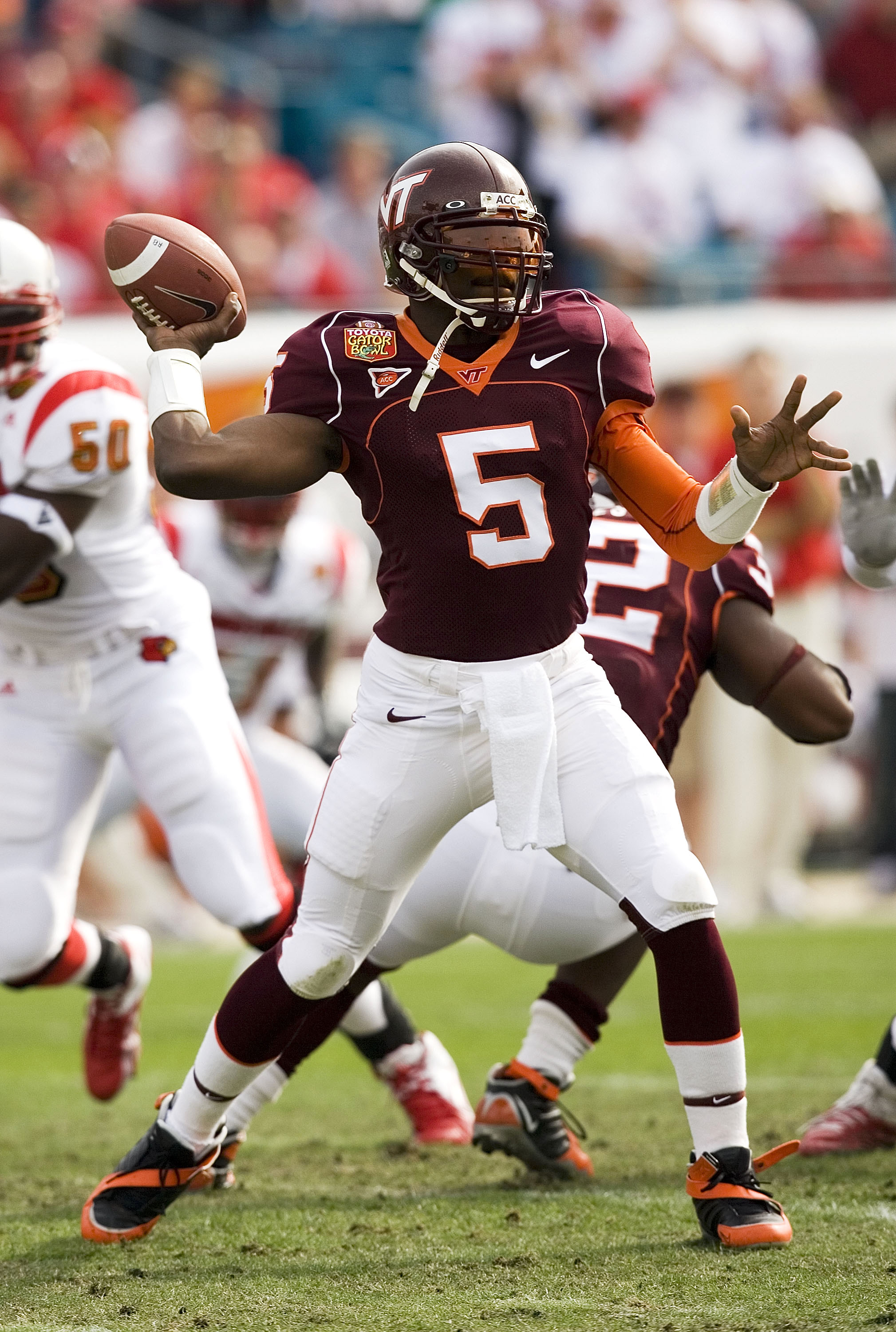
Maybe Nike/VT will surprise us and find a way to blend these and the 99s together, but I'm not holding my breath.
Screw it, let's bring piping back.
Yep, I really liked those too.
I still have my Jeff King 90 jersey in this style.
I despise the orange pits. The piping jerseys were so much better, despite being recycled Clemson jerseys.
We're in this together
Unless something has changed recently, they're going to be similar to the '99 Vick era uni but with a different number font.
sooo what happened to a july 4 drop?
Someone realized what a terrible idea that would be and changed the date?
probably smart but I need to see these unis!
At this point I hope they don't reveal the unis at all until the walk out of the locker room for Enter Sandman at the home opener
ok thatd be badass
Has there been any word on what unis will be in the NCAA Football 25 game? It comes out in just over a week so I would expect some VT footage to start floating around soon.
That being said I'm not sure how early EA would have needed pics of the new jersey in order to get them into the game.
So what are we going to wear for the Vandy game?
In the spirit of going with throwbacks, we play Vandy in these. Then we say we'll wear new jerseys for the home opener, but no pictures not even any hints. The players don't even get to see the new unis. They warm up in practice jerseys, then they go back to the locker room and change into the new threads. They walk out of the locker room onto the practice field and we see the new uniforms for the first time.
That's how you sell the sizzle!!!
Ah the ol georgia tech practice jerseys and the ol tyrod/glennon split...
We are undefeated in that uniform.
So with the video game coming out next week, you'd think we would have to have some kind of announcement this week, else it's pretty clear they either won't be in the game or will be patched in later
I've been thinking the same thing. But then I started thinking - what if we use the video game to make the announcement? Probably won't happen, but it'd be kind of cool. Pretty sure it's never been done before, I don't remember uniform reveals really being a thing 11 years ago.
At this stage, we might see them finally for Game 1. I know things take time and Nike is probably to blame here as much as anyone...but geez Whit, "next week or so" back in May? Did he just panic and say the first random thing that came to mind? Lol
We're probably well behind on reveal timing, because (a) we're not very high on the priority list at Nike, and (b) Nike is having to remake some of the crappy MLB uniforms. Those things were awful.
Knowing EA sports the game is probably loaded with the old unis and they'll release a DLC for the new jerseys same day that Tech announces them.
And that DLC will only be $19.99
And the worst part is I will 100% purchase this after having a few too many adult bevys
Yep, win a big game, fire up the Xbox, and say fuck it I want the new jerseys.
if they know our traditions they will slap a $25.25 price on the DLC
Answer coming soon....?
https://www.instagram.com/p/C9NTds9xnXL/?igsh=b3Vnbmw4bmplaGtq
So basically the old 1999 template with the double outline with current number font. Give me the orange sleeve numbers and I'm sold.
The off color sleeve numbers were always unique to us. Very much want us going back to it. Don't even need a logo.
The double outline is sooo nice.
The shade of maroon appears to be correct too to my view. No more purple maroon!
Well looks like we have some clarity now. Likely a uniform drop on Friday.
Edit - wasn't planning on drinking today but here we go!
So, it's looking like we are getting something really close to the 99s. I've seen a few different sources say they will have small tweaks. Outside of the font apparently changing, what other tweaks do y'all think we will get? I hope we keep the TECH on the pants.
Wrong answers only.
I'm really hoping we have an orange alternate in the Vick-era template to complete the set. There are some versions of it floating around online - don't know if those were ever official but we never ordered/wore them back in the day. The orange jersey with white chest/back numbers and maroon outline with maroon sleeve/white outline would be awesome.
I'm a little disappointed morganhole did the coal cracking unis or whatever they are calling them. I'm still hoping one day we do black and gray with some corp motifs.
If I had to guess...
Orange collars on neck and/or sleeve and a small VT logo on the bottom of the neck collar.
Also I would assume the hokiestone pattern will be in the numbers again
I was thinking the hokiestone pattern would be in the numbers too, but the number patches they put up on the teaser post from yesterday appear to just be plain white with orange outline. Could just be reading too far into it, but I feel like that detail would have been included.
Definitely think we will have a small VT logo at the bottom of the collar. Could go either way on the orange collars or not. If they do orange collars I hope they are very thin instead of the ridiculous wide collars from the last couple jersey iterations.
Yeah I only say the orange collar to match the current basketball uniforms, which it should be noted also have the double outline numbers with current font we are talking about
Personally, I hope it's a maroon collar on neck and sleeves, small VT at the V neck, white number with orange outline on front and back, with color-swapping on the sleeves. And then, just to spice it up, go with the mid-90s stripes on the pants.
If we were going to do any collar treatment, maybe do that stripe as the elastic bands on the sleeves.
Oh, and for shits and giggles, introduce merit stickers this year. Hokietracks as regular, but also a lunch pail decal for any player who has held onto it during the year. And something to commemorate those who got the 25 jersey as well.
I'd totally be up for Hokietracks merit stickers. Think that would look cool. Have also been some strong hints that we might see an alternate 'Hokies' script helmet decal as well.
Beamer logo if you get the 25
If you house a kick or punt return, you get a decal of this on the back of your helmet for the rest of the season.
So to better visually represent what I would want to go with it if I had my way....
Basically those, with the current number font, and maybe slightly smaller stripes on the pants. And then maybe throw in orange variants for the jersey, pants and helmet. The away white helmets could be a great candidate for the script Hokies that we've seen floating around from time to time.
Update: Well this is interesting....
From what I've heard, I do not expect stripes on the jersey, so its likely either the helmet or pants.... Could be completely off base, though
I'd be good with these.
Make the maroon helmet have the gobbler logo, and these would be fire.
I know the ship has sailed on this, but I wish they'd use that number font instead of the newer style. A more timeless look IMO.
If you really zoom in on the teaser photo, it doesn't look like a digitally generated image. It looks like a photo of a jersey that they sewed numbers onto. You can see the mesh holes.
I am wondering if the numbers in the image are the smaller numbers that would normally be sewn on the shoulder, and they're just sewn onto the belly of a blank jersey to make the "7.12.24" image. That'd mean no orange sleeve numbers.
Guess we'll find out soon.
I want the tapered/fade-out helmet stripes from the 2011(?) white Nike Combats on the maroon helmets.
i'd like to see stripes on the pants, but Nike hasn't been doing that lately. Their new NFL pants are all plain/no stripes.
Boise just used CFB25 to reveal their new unis.
why the hell are they allowed to use a hammer on the football field and we can't even have one in the dugout???
Now they're just trolling us
Soo basically the exact same jersey as every other team...
Lol...DC may have been right after all!
I honestly think the highly custom/pro combat stuff bubble has burst. Sure if Michigan or UNC wanted a total refresh Nike would oblige and of course Oregon gets new custom uniforms every season if not more often, but I think there are like 3 templates out there that Nike just slaps different colors on now. Their Commanders, Cardinals, and Bronco's refreshes are 100% underwhelming/plain as well. I think the uniform bubble is done.
Yeah but that's what we want. We've been unique before (very unique between 2004 and 2010), and the fanbase bitched and moaned heavily enough that the athletic department settled on the throwback jersey for the majority of the 2010s. When the 2004 set debuted when I was in college, people loathed the piping, thinking it made us look like a high school or arena league team. When we went with the next jerseys that full blocked color on the sides, our fanbase hated them. When we took part in the Pro Combat campaign, our donors ridiculed it, calling the looks embarrassing and told the Athletic Department that we should focus less on having special jerseys and more on winning. And when we debuted the current set, it wasn't met with open arms, it was pretty much rejected from the start. Interestingly, the 2 sets of jerseys that were most widely accepted during this time were the throwback from 2010 that were so popular we wore them in the Orange Bowl, and the throwback from a couple years ago that is apparently the basis of our next set.
Our fans want a traditional look. We don't want frills, we don't want to look unique, we want a classic style. Yes, that happens to align with what most football teams do, it just is what it is.
Ok but Pry and Whit stated we engaged former players, evaluated multiple options, and then settled on something that took inspiration from previous jerseys. If we went through all that just to end up with Baylor jerseys in orange and maroon I'm gonna be real butthurt. We can have a more traditional look without being a re-skinned version of every other Nike team with new jerseys this season.
Why don't you wait to see what we actually unveil before melting down?
That seems unreasonable, it's peak offseason.
I loved the piping, I hated the change because the '99 unis were solid. I absolutely hated the throw backs and the orange arm pits.
If nike is going plain, I'm good with that but I want something different, something special, the orange numbers on the side were that, hokie stone numbers on front and back would be too. Something to make sure we don't look like A&M or anyone else. UGA has red uniforms like lots of teams, they always look like UGA. I want THAT.
So...we're going back to a deal with Russell Athletic?
That's better than having Aeropostale:
The stripes are referring to them bringing back the 2016 OSU striped jersey they wore as an alternate
So based off of Boise St, Purdue (below) and other Nike schools it's just one template for everyone. My expectations are nothing higher than a maroon/orange this.
Definitely think the VT Twitter post yesterday was just trolling. I think we will be very pleased tomorrow.
Yes, the VT twitter stuff is all smoke screen
I think it's a misdirect. If there are stripes I do think it'll be on the helmet, not jersey
Tbh I'd be good with helmet or pants stripes. Would much rather have the double-outlined numbers on the sleeve than stripes. Guess we'll find out tomorrow!
Jokes on us, they actually tweeted the date out in British.
Ah yes, so they will be revealed on December 7th - just in time for our return to the ACC championship game! /s
This certainly tracks with the "stripes are in" tweet from the other day.
Maybe they're alluding to the fact that we've bought off the refs this year? It would drastically help our winning chances having the stripes on our side.
About time.
Funny story, when I started donating (million years ago), I used to right Ref Bribing Fund on the check memo.
So help me...I better not have to explain what a check is...
TBH, as long as we're winning I don't care if we play in o&m striped toga's
That would actually be pretty sick.
Edit: Thank you for the idea, because it led to a Google search, that led to me finding my College Football 25 uniform.
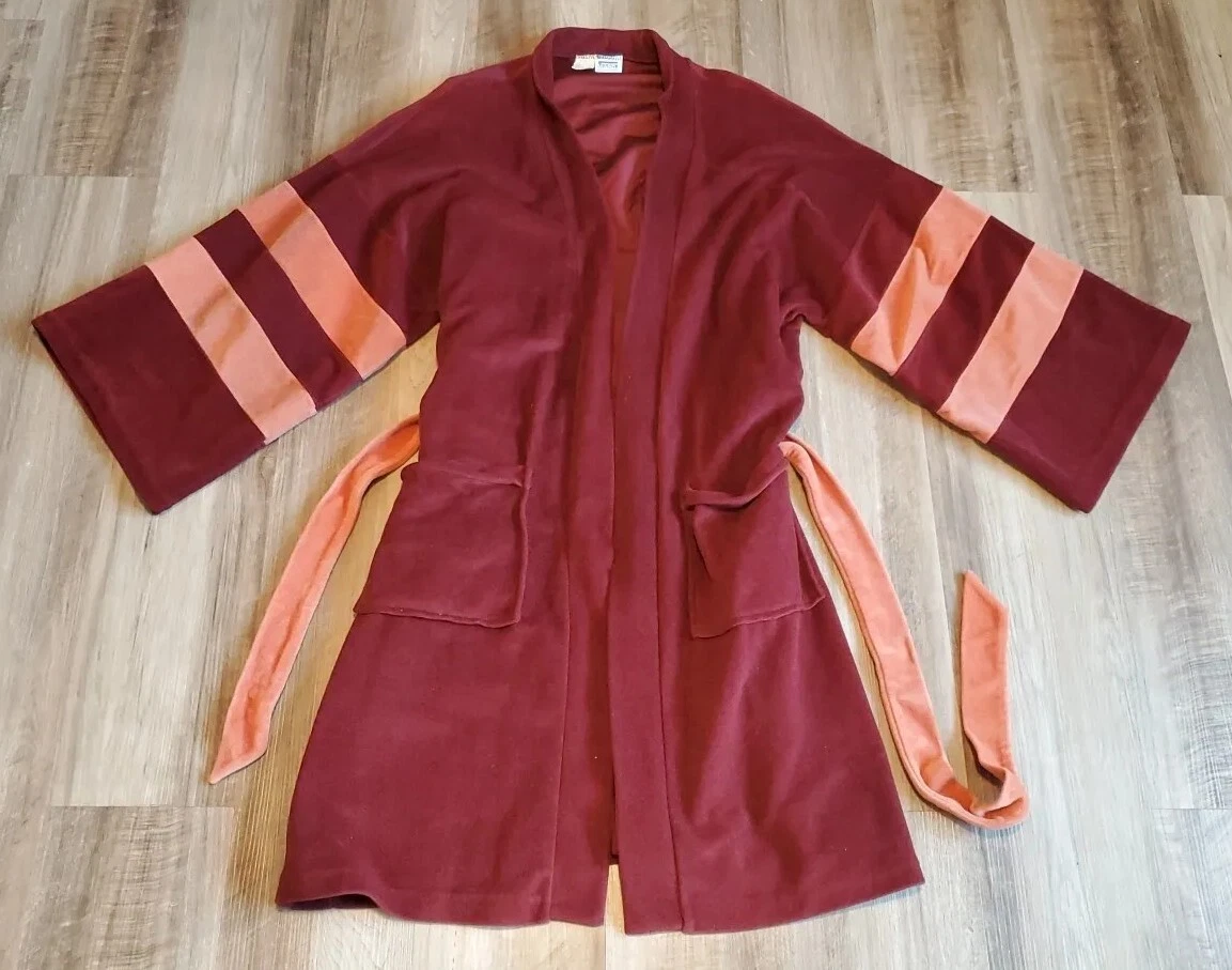
They are going to be an electric fabric that changes color depending on the settings! First Down, Maroon, Second Down Orange, Third down they go plaid...
You know, as a special uniform, Orange and Maroon plaid....
I'd buy it immediately.
Looks like the new jerseys are included in the new game!! Sneak preview!
Timestamp?
Sorry - it's the first team he gets into. Around 0:26 seconds in.
Confirmed, Vick era jerseys with current font, helmet stripe like this past year and no stripe on the pants
I think we are going to have several different helmet combos too from rumors we've heard. I'm sure we'll have the classic all maroon helmet with no stripe as well, along with some alternate logos (Hokies script, maybe Fighting Gobbler, etc.) And Vick-era jerseys in maroon, white, and orange. Perfection.
It also looks like the Hokiestone pattern is in the numbers from the full YouTube video above. Maroon/orange double outline on the chest and maroon/white double outline on the orange sleeves so they got that perfect. Where 'Tech' was written in maroon on the right pants leg like in the 99 throwbacks, it looks like they have put 'Hokies'. Nice nod to that touch even if they didn't put 'Tech.'
Not terrible, yet predictable.
🔥🔥🔥
Man just looked at these again. These are absolute fire. They couldn't have done any better, just an awesome look.
I really only have one problem with them: the ACC patch. Wish it said SEC instead. Otherwise it's a great look!
Take the checks take the losses
I think we'd win more than people think. Especially with the boost in recruiting we'll get from being in the sec
At first, maybe. But I think over time the truth of the VT brand will out.
just like Mizzou, right?