

Heard you wanted to get up close and personal 🤩#ThisIsHome | #Homecoming pic.twitter.com/nD4QjWVCNJ— Virginia Tech Football (@HokiesFB) October 2, 2025
This week's look for @HokiesFB #uniswag pic.twitter.com/hbDgrsM2K6— UNISWAG (@UNISWAG) October 2, 2025
Obviously, NMA stands for No Maroon Anything for those keeping track.
Forums:
DISCLAIMER: Forum topics may not have been written or edited by The Key Play staff.

Comments
I know orange gets a lot of hate, but I'm kind of digging the creamsicle look with the orange helmets
I don't mind the orange but I would prefer a maroon VT to pop and stand out.
We look like the Tampa Bay Buccaneers and not their good era.
I like the uniform. I think the helmet, especially with visor really pops. but for the LOVE OF GOD WHY ARE WE WEARING AWAY COLORS TO A HOME GAME!
This is a wonderful away jersey. Fucking wear orange and maroon at home. Stop the dumbassery.
If we lose, I will know exactly why.
Then, perhaps we can exorcise this creamsicle demon for all time.
its science
Orange Effect game?
then wear predominantly orange. White is the problem, which is also why White Effect games at home is the height of idiocy.
This looks like an away jersey or a UTenn jersey. white effect looks like Penn State.
We should have 3 Effect games. Orange Effect where it is mostly orange uni or AOE. Marroon Effect where its AME. And Enter Night (Black Effect) with black jerseys.
I realize this is no longer an amateur sport but how about keep some tradition and make new ones that actually use other traditions. Fucking White effect... just stupid
This this this this
I'd swap in a "Blackout" or something similar for White Effect 10 times out of 10
I don't know if I've ever thought of this, but a Black Effect or Gray Effect for Military Appreciation Day makes a lot more sense than White Effect. Use a core Corps color.
I like it but it smacks of Tennessee which makes me cringe a bit too
Not quite NMA though as the jerseys are edged with Maroon around the numbers
Very Tennessee but also love this look
"NMA-lite"
Please no UT color connections!
This orange is not the like the puke level of that washed out Tennessee orange.
Their orange looks like the mustard seed poop of an infant in both color and texture.
Immediately thought of this
Just put volunteers on the uniform. This is ugly as fuck.
First thought was "Blech I hate it", after a few seconds it's solidly meh. Don't love or hate. Kind of get the ol Bucs vibes from it
Just. WIN!!
Yeah, send these monstrosities out on a good note.
My problem is there are too many orange / white uniforms out there between Cuse, Clemson, and Tennessee, all nearby or in conference too. Our shade of maroon made us stand out.
Buuuuuuut..... the metallic orange visor absolutely fucks. Give me AME with those visors any day of the week
The uniforms may be divisive but the accompanying video is so funny
I do not get the NMA acronym.
Bottom of the OP
No Maroon Anything
Ah, thank you.
Good to see the 8's get some love after their recent performances
Terrion is indeed a BULLY (on the field)
Okay after watching the video with the orange visor I love these helmets.
I don't care anymore. Just win
Not NMA. It looks like the "TECH" in front just above the visor is maroon.
The piping around the numbers up front is maroon as well, as is the Hokie Bird headshot just underneath the collar V. Its also hard to tell if the shoulder numbers on the side are all maroon.
The shoulder numbers are definitely maroon, but it was the helmet that was described as NMA.
The pics I've seen on social media make the orange look more VT and less that shit school down I-81. More of the modern blaze orange look we've seen rather than creamsicle. Who knows what they look like in person it seems our colors vary year to year.
I'm still not crazy about orange as a base color, but this is 1000% better.
Agreed.
Yeah that's a lot better, updated the OP with the correct coloring.
Now we just look like Louisville... or my monitor color calibration is waaaaay off.
reminds me of the Charlie Coffey era...no thanks
Dam dave, we ARE old, ain't we?
I prefer late middle age.
Sixty is the new thirty....
I'm about the same age as you guys.
Rode my motorcycle from Roanoke to Nags Head and back 2 weeks ago.
Motorcycle to work 5 x a week.
Lift weights 3-4 days a week.
Eyesight is not what it is but only infrequently use glasses and that's to read.
Run circles around the young kids at work.
One day I'll lose the fight against getting old but...
Not Today.
Don't know about you fellow elders, but I still feel 22....my knees and back heartily disagree and remind me I just signed up for Medicare....(heavy sigh)
While my body is on Medicare... my wife tells me I act like a 12 year old!
If you're on a message board, you're old. That's pretty much a standard nowadays
We'll have checkerboard end zones next!
and the team will have to run all the way through the marching band's VT logo formation at the end of Sandman
I feel like this would be hilarious to watch though, especially if it catches on.
Imagine the buckeyes run the entire script Ohio before they can get to the bench
It can work, but only if we do it to the stacked VT.
Oh, shit, we should bring back the stacked VT anyway, with it basically already having the Tennessee T in it.
I have a better idea. How about we take checkerboards, creamsicle orange, the Tennessee T, rocky top, and anything else associated with a certain school in Knoxville and burn it both physically and from our minds?
This guy fucks.
I absolutely hate UT. Anyone that doesn't should live just across the state line from them and have to deal with it constantly. I would gladly root for UVA or any other team playing UT.
This is the way.
sorry Beardfahsay, I am not really about the tV.
Over my empty Ass Pocket!!!
We laugh, but it has happened before.
I'm in that picture somewhere, but haven't been able to find me for some reason.
I'm a fan of all orange everything, but I just don't like this much white... our colors are maroon and orange, lean into it!
not liking the orange jerseys
loving the helmets though, those should be standard white helmets
It undeniably looks great.
While I appreciate the comments about wearing maroon at home, I have to overrule that if it looks great.
But what's more important, of course, is how they play the game.
Personally, I would have done the outer strips on both the logo and the center stripe as maroon. That gapped outline has definitely been a Hokie thing for a while and I do really like how it has synergy with our VT logo.
But other than that, I don't mind an orange look. Our colors are maroon and orange, not maroon and white. Having an equal balance of both is something we should embrace more going forward.
Can't agree more. Orange should be more common place in the uniform cycle. "BuT oThEr ScHoOlS hAvE oRaNgE", who cares. I bet we start winning again, nobody cares. I would however vote that when we wear orange, unless it's an attempt at an AOE uniform combo, we should incorporate some maroon. I for one think the orange unis with the metallic maroon helmets (with metallic orange VT) we had a few years ago would be a sick look.
My personal favorite was the candy orange helmets we wore for the Ohio State game 10 years ago
Give me some version of those, the current maroon and the script Hokies on white and I think we're cookin.
I might've been thinking of these actually. Did we have a maroon version too or am I envisioning things? But yes, these were hot. And if we didn't have a maroon version, we should.
No metallic maroon.
We have our default glossy maroon with the little orange flecks in them if you look up close
We had matte maroons in 2018. They were cool but the team wasn't that good so nobody remembers them fondly. We also did a matte maroon fighting goblet helmet in the Russell athletic bowl in 2012. Pretty cool.
No candy/metallic maroon that I've seen
Ok, you're absolutely right, the matte maroon helmets were nice.
Give me a white script Hokies helmet on a matte maroon with an orange stripe with the spaced VT outline and possibly even a white facemask and I think that's a complete winner of a look. Would fit in nicely with the current branding.
I remember those, and did enjoy them.
Everything is better with matt
Except under the lights. Need the glossy or metallic styles 10 out of 10 times.
I dont like the strip on maroon helmets and I don't know why, but I hate it
the standard helmets are metallic maroon with gold flake
The chrome orange lids with maroon jersey and pants is so fricken clean. Wish we wore this more.
Yeah, that is the very best iteration of the orange helmet.
I don't know what that color is really called (chromed orange?), but I like it, and it looks good with the maroon uniforms.
What happened to the burnt in burnt orange
We eliminated it officially in our 2016 rebrand.
:(
Oh really?! I didn't realize that was an official decision. Just thought we'd had a different shade of orange from Nike for a while.
Are you sure? This website might be outdated but from a quick google I can not find reference to a change in 2016
https://brand.vt.edu/identity/color.html
Ai Response:
"Virginia Tech's official colors, Chicago maroon and burnt orange, have not changed since 1896. The school's brand guide requires using Chicago maroon and burnt orange, and there's no evidence of any color changes in 2016 or any time since their adoption. "
So the names of the colors didn't change, but there was an effort to consolidate the branding more uniformly since there was a wide variety in the maroon that we used, the orange that we used, etc. There have been more purple maroons, more brown maroons, day-glow orange, burnt orange, unsaturated orange etc.
There were specific colors assigned (HEX, RGB, PMS, etc) that were to be enforced across all media. It helped a bit, but there are still discrepancies in how the color is used in a lot of places.
Edit: More details here: https://brand.vt.edu/
That's the academic side. The athletic side uses a different color palate that was unveiled in the 2016 rebrand that effectively aligned athletics with the colors that we had been wearing for a couple decades at that point. To be fair, they still call it Chicago Maroon and Burnt Orange, but they switched the official colors to the more purplish maroon and blaze orange that we had been wearing athletically for a while. Academics rebranded shortly thereafter to more or less align, just lighter shades of those colors.
References to this rebrand have been scrubbed from Hokiesports, but I was able to track down the current Brand Sheet that we sent to the NCAA that is what our suppliers have been working with for years, or at least the one that was last revised in 2018 - https://brand.vt.edu/content/dam/Virginia%20Tech%20Artwork%20Sheet.pdf
There is a good article on this rebrand on TSL from that time - https://virginiatech.sportswar.com/free-content/2016/04/28/virginia-tech...
As you can see, the colors more or less match the colors that we have worn athletically for a while. Our official Chicago Maroon is that purplish shade. Our official Burnt Orange is that Blaze Orange you see in these uniforms.
In fact, if we're being technical about it all, the color scheme of TKP is actually out of date based on our current branding.
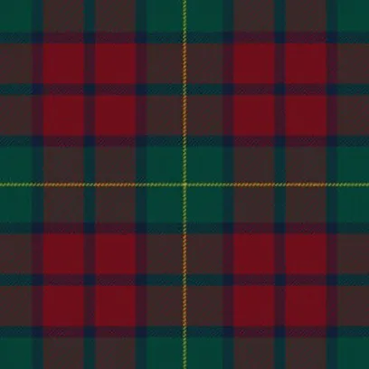
we have a tartan pattern? Why haven't I see virginia tech kilts? Or at least a waistcoat?
https://www.tartanregister.gov.uk/tartanDetails?ref=5668
Kiltist does make one, and it looks like its based on the pattern, but either their camera shading is off, or they butchered the colors - https://kiltist.com/virginia-tech-tartan-kilt.html
I have a scarf in this tartan. It's a little scratchy, but it looks sweet.
My family has a really good looking tartan.
https://www.tartanregister.gov.uk/tartanDetails?ref=2540
Very nice
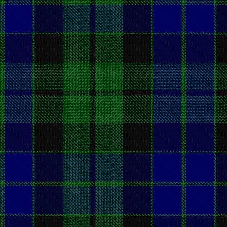
ours is this:
Sadly no maroon or orange of any shade
Mom's side
Here's the rub; the colors on that 2018 branch sheet are not the colors of the uniforms in those photos on the 2016 TSL article. The baseball and softball uniforms in the 2016 TSL link look the closest to my memory of our older colors. Our older colors are a much darker and purpler maroon and a redder orange than the brand sheet or the university's current RGB color standards.
Sure, they use the same name. But they changed the colors to make them uglier.
The burnt part of the orange is incorporated by the corners/safeties when they get routinely "burnt" down field.
That's the part of burnt I never enjoyed.
I like the color, I don't like the flavor of defense.
I read this
as
I was wondering what new collab with Ruthless Records we agreed to.
Give me these Arizona helmets in a VT mix for Orange out. Keep the Orange visor of this week's helmets though.
I agree!
I'm not a fan of the newish orange we've adopted.
But aren't Arizona's colors navy and red?
I thought these looked good during the game
Agree. I like them. Good one-off (or two) a season.
Can we stop wasting money on constant uniform changes and put it back into NIL? That would be great
Its a sunk cost as part of the Nike contract. They aren't going to give us more cash if we limit the uniform changes.
is this the same Nike contract that nets us pennies?
Pretty much.
Yeah, most schools get uniforms and money. We got little money AND a few uniforms, might as well get everything you can out of that uniform part.
maybe if we stop changing our colors on a weekly basis Drones will be able to find someone downfield instead of checking-down to the RB on every drop-back
I had been wondering about the same thing. When I was playing ball, the surety of the uniform colors were certainly a benefit to identifying friend from foe out of the corner of the eye.
Pretty sure he's color blind
Pretty sure he's
colorblindFTFY