
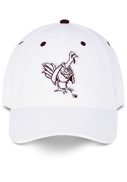
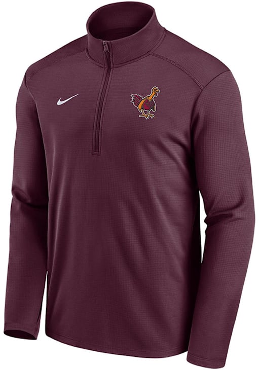
I seem to be seeing it a lot this year on Fanatics and HokieShop, on a bunch of Nike gear, but I've never seen it before. Anyone know where this is coming from. Did Tech stealthy update the Hokiebird without announcing it?
Forums:
DISCLAIMER: Forum topics may not have been written or edited by The Key Play staff.

Comments
I hope not. It is absolutely UGLY!
oof I can't stand that. I wouldn't blame them for not announcing it though, who would want to call attention to this?
I would have preferred a callback to literally every other iteration of the Hokie Bird before this one. This one looks like it's part giraffe and drawn by a crackhead who's only seen a turkey once for two seconds
Like i know a lot of hokie fans have been saying screw Heather Dinich for a while but i didnt think our mascot would take that literally
Afterwards she was probably telling HB that a 3 loss SEC team was better.
I'm was wondering when someone was going to mention our former ACC blogger...
I think that's just a stylized version of the old extended height mascot.
Not a fan. Whatever chaffs the giraffe, I guess.
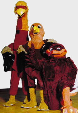
Nightmare fuel.
It's the new Hokie Bird logo brought to you by the same people who designed the new VT logo a while back. Wonder if we spent hundreds of thousands of dollars on it. Probably not. God, I hope not.
My daughter said that looks like a turkey on meth.
The Methkie Bird?
I kinda like it. probably not enough to buy a $100 1/4-zip with it, but it feels retro, and I like older stuff. (Really have never been a fan of the square root of one or the new hokie bird image representation).
Give me this all day over that mess

ol nutsack
I was just about to make a similar comment. That thing looks like a scrote with a hat.
Fighting gobblers all the way, although just realized today as I traveled through South Carolina how similar that looks to the gamecock 🤔
Fighting Gobbler better than Fightin Chickens
ftfy
Still not as bad as the "new" curved VT logo that nobody wanted that we spent $4 billion on.
OK, it's ugly, but I doubt they spent $4 billion on it.
I figured stating such an exorbitant number would surely show my sarcasm, as well as my anger and frustration at spending any amount of money on creating such a dumb logo. However, this must be my fault because nobody seems to get my sarcasm on here these days.
Excellent example of the airing of grievances.
VT posted this on their facebook in 2015, along with a link to this pdf:
https://www.vt.edu/content/dam/vt_edu/about/traditions/traditions.pdf
Guess they're trying to bring back the tall hokie bird 🙃
Ok so I saw this in that link and...
I kind of really like that as the basis for a vintage look.
This is way better than that giraffe neck monstrosity up thread
I said it once, I'll say it again.. Heather Dinich isn't that bad...
I'd say she's neck and neck with that logo
I don't really have a problem with it. I tend to prefer the graphical nature of the fighting gobbler, but this has a golden age looney toons feel to it that I don't dislike.
Not for a helmet logo or anything, but the one on the shirt is fine.
Call me crazy, but i kinda dig it. I like the loony toon/comic book-like aspect of it.
Grok, draw me a Hokiebird wearing a cape in the style of C. Montgomery Burns. That's it! Excellent!
What... THE FUCK?!!!
Kind of reminds me of the Owl from Rock a Doodle

AI generated?
This logo is so hideous, I thought it was a joke.......looked online and it's actually for sale.......OMG, who was in the survey group? Not one to be proud of!
mk
Ya know, I don't mind it.
A turkey in a corps cape, I'm for it. I bet in about 10+ years I bet it'll be a piece folks are scrambling to find.
Where can I find it?
Reminds me of the vultures from the animated Robin Hood from Disney back in the golden age of their movies.
Or Jungle Book
Well they were the same artists.
They re-used a lot of the same sequences between these two movies as well as snow white and the aristocrats, etc. Copy and paste before copy and paste.
And in the era before home video it wasn't like you were going to watch one immediately after the other anyway.
Yeah Baloo and the bear from Robin Hood (can't remember which character the bear played) were the same, they just changed the color.
Little John
His dance sequence with Marion's maid is the same exact dance that Baloo does with Louie in Jungle book.
All the timing is already done, just redraw the new model, really cuts down on the onion skinning and animation tests
I've been trying to put my finger on why it felt so familiar. This is 100% it!
I like this bird, but it doesn't represent VT.
It looks more like a MiLB alternate logo.
Notably, this character is not being pursued as a trademark at the USPTO by Virginia Tech, so no idea where the ™️ is coming from or who is pursuing this bird as a trademark.
(To see VT's trademarks, you can search the USPTO here. Select to search by "Owner" and put in "Virginia Polytechnic Institute".)
This sent me down a late Christmas Eve rabbit hole. Some interesting stuff there. This one was super weird.
That's Hokie Man, he was shown prominently during broadcasts during the 1999 season
Sometime during the 1999 or 2000 season, my elementary school had a VT Football night - basically some players and the Hokie Bird etc there to sign autographs, give us an up close look at their helmets and padded jerseys and answer kids' questions, that kind of thing. I think it must have been the 2000 season because I distinctly remember Lee Suggs being there and he wasn't a starter in '99.
This guy was there too. At 9 I wasn't sure why there needed to be a Hokie Bird and also a Hokie Man, but I remember thinking he was pretty cool. I wonder what happened to him, he stopped being a fixture at games sometime in the 2000s.
didnt we see him at devon hunter's commitment ceremony
No that was that other cringier guy, I forget his name
I remember this guy with a martini glass sized large enough for a lime to be the olive so liver failure might be at play.
IIRC he was a professor at VT. Don't know why he gave up the body paint. I think he took a job somewhere else.
So at one time he was faculty source - an old VT magazine archive.
I believe I also found his Instagram and it appears he is a southern California resident these days.
I wonder if he could be persuaded to come out to our away games at Stanford and Cal, for as long as that particular lunacy plays out.
Ah, then I'm definitely showing my youth!
Angry vulture in a cape? 🤔
Reading the thread after I kind of liked it.
No worries, beauty is in the eye of the beer holder.
I'm trying to find a picture of it but I've come across a logo before that was essentially three small Hokie bird heads laid out diagonally that had V, P, and I on them - anyone know what I'm talking about?
I remember seeing it and thinking it would be a really cool retro logo, then promptly never seeing it again.
That's it!
Don't think I've ever seen this one. Interesting.
a.) I don't think I ever saw that one, and
b.) it would make an excellent addition to my bookshelf.
https://ebay.us/m/V8hLr5
Made by a Hokie. Nate does great work and is a good follow on Instagram.
I'm pretty sure he was on TKP for a while. I reached out to him years ago to create a custom Bruce Smith figurine for a raffle prize in our alumni chapter before he got into 3D printing.
Yeah he is always tinkering with printed figures. He made some incredible busts of Tyrod. He and I collect Hokies cards together so talk pretty frequently.
Don't know where else to put this, and doesn't really require it's own thread...
Happened upon seeing a video of some driverless delivery vehicles in China and saw something that made me double take. Apparently one of the larger private delivery firms over there straight up stole the VT logo
I'm hoping the planes aren't driverless, especially after lifting the VT logo.