The ACC has a brand new logo (but don't tell anyone) pic.twitter.com/zcXRT0nKMc— Brett McMurphy (@McMurphyESPN) May 13, 2014
What do y'all think?
Forums:
DISCLAIMER: Forum topics may not have been written or edited by The Key Play staff.

The ACC has a brand new logo (but don't tell anyone) pic.twitter.com/zcXRT0nKMc— Brett McMurphy (@McMurphyESPN) May 13, 2014
What do y'all think?
Comments
Whoopity-doo-doo....their innovation is shocking
...it's our little secret
It's what dreams are made of.
Looks a lot like the big east logo. Shocking.
Yeah. What are wee talking about again?
...And what was wrong with the old logo?
It wasn't "new".
I think the old official logo had the whole east coast, which contained location of each ACC institutes. After ND and Louisville came in, it probably was difficult to include Indiana and Kentucky in the logo, so they probably said -"fuck it, we'll just keep the letters."
Please tell me this is from Wolf of Wall St.
When did Sam Rogers grow a beard? Most intimidating substitute, ever!
More intimidating than...?
Haha I love this.
"Here you go, everyone on social media, don't tell anyone though"
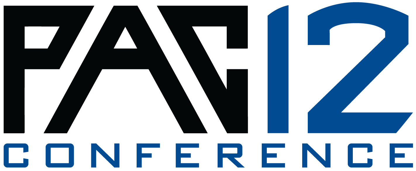
The logo itself is underwhelming but who cares. The PAC12 logo is the gold standard and no one will be able to come close.
i hope there is more to this logo...just 3 underlined letters? there has to be a more formal version (that isn't another map in an oval), right? the Pac12 logo is awesome, we should have just hired their agency...
Can somebody make a copy, can't see twitter feeds at work
Classic #goacc.
All I want to know is that, why is it in ND colors?
Seriously, this looks like some retro 90s logo or something...
Where's the map?
doesnt work so well anymore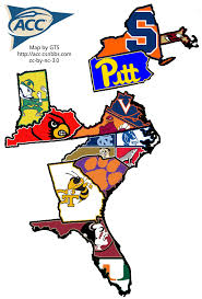
Yeah that would be dumb. Everyone knows VA is all Hokie
agree- VT owns VA ...
maybe have a magnifying glass off to the right
with a blow up of Jefferson'sMistake.
Yeah Jefferson shaking his head wondering where he went wrong...
I think you have to add "Sort of" over the ND logo, since if we're strictly talking football (as the upper left logo indicates), then they're not technically members...Now I see why the ACC went with a bare-bones approach. "How the heck do we deal with ND?"
Re: Notre Dame, I would like to keep my cake err (pie) and eat it too . Looks like with this new logo the ACC has really out done itself. Lots of time&thought must of gone into this.
Shouldn't UVA have to win a game against VT before they get their name on half the state?
Better?
I love how the states of Kentucky and Indiana now have coasts on the Atlantic. Has anyone been to their beaches?
If it means that Maryland and WVU sank into the ocean, than I am all for those states getting beaches of pure white sand....I imagine they would be pretty toxic though for all that was sunk to get them there. It would also mean I would be about a mile from beach front property as the Potomac River now becomes the ocean shoreline.
Anyone else think that logo would look a little bit better if it included the state of MD and had a little blue dot on Annapolis?
110%
Get Navy and we get ND. Do it Swofford what are you waiting for.
1958-1978


1978-1989
1989-1991
1991-2003
2005-2014
I'd say they had it perfected with this one:
I wonder how much they paid some design company to do that?
Well, I don't enjoy. It looks like an airline logo.
BCO put it perfectly
So is the new logo the long-awaited debut of the sarcastica font?
What was wrong with the football superimposed on the Star Trek chest emblem, the sideways arrow?
Meh, I give a shit less about a logo. We're the best conference in college football because we have the nat'l champs...no? The SEC has rode that line for the last 7 years doh.
Pinch me....

I think you put more effort into this gif than the person who designed the new logo.
That makes me much more reassured that Swofford has us prepared for college athletics in the future decades. Probably because the slant on the font means futuristic - zoom! Somebody more capable should do a clip of Swofford as George Jetson.
the conspiracy has finally been revealed. 15 years ago a group of Big East schools got together in secret meetings and decided to infiltrate the ACC under the guise of "conference realignment." The goal: to make the ACC logo look like the Big East logo to prove their superiority. Now with VT, Miami, BC, Pitt, Cuse, L'ville, and ND having joined the ACC, the BE schools hold 50% of the vote. Needing one more vote, VT easily managed to trick LOLUVA into voting for it under the guise of the logo looking "hip"
The conspiracy must go even deeper than that, since half of the other teams had already left the Big East when Louisville joined in 2005. There must have also been a conspiracy to get Louisville in and possibly even to throw games to them so their athletic profile would be high enough to warrant an ACC invite.
Man! The Big East snookered us on the red white & blue theme! We'll never be as popular now... sigh...
Uhh okay. It not offensive or anything, just seems kinda pointless.
look on the bright side, we could be stuck in AAC and have this for our logo:
crap, i looked at my own post:

Kind of has this feeling too..
Will this be morphing next?
I've always liked the simplicity of the NCAA logo.
And here's how you make millions of dollars these days. Imagine the heads of the NCAA are meeting to discuss a new logo. They've hired a big shot branding guy from Madison Avenue to come in and change everything. And, scene...
"Gentlemen, I give you the new NCAA logo. I crafted it in MS Paint in about 7 seconds. This will totally define the arbitrary nature of the NCAA's regulatory regime. I give you the future of college athletics!"

/Everyone around NCAA conference table applauds/
/NCAA President Mark Emmert looks at Madison Ave. guy and says/
fin
As others pointed out, my first thought was that it looks exactly like the crappy Big East. I see it also looks like the crappy C-USA logo. Congrats ACC on further italicizing your letters and calling it a day.
i'm reserving judgement until they officially unveil the logo. hopefully this is just the word mark version of a much nicer logo...example:
less good version...
of...
It's got the mountains, it's got the waves, it's got the PAC and it's got the 12. Can't make a better logo than that.
I love that lower logo. That is fantastic, or as fantastic as a logo can be, at least. Very cool design. Pac12 has it going...
It's like a shield that would go on the side of a championship ring.
DJ Gallo complied all the best slogans to go with the new logo:
http://www.sportspickle.com/2014/05/10-slogans-new-acc-logo
My favorite:

and
are clearly my favorites
http://www.hokiesports.com/pr/recaps/20140529aaa.html
makes me think of this:
Wow, should the VT gain some more forward lean so we can keep up?
Doesn't look as bad in orange and maroon. Have to think it'll look like this on the Maroon jerseys. Thinkin Maroon letters orange line on the aways
This has too many incongruent slants. I just don't the sqrt(1) logo will ever get along with the new (vwoosh)ACC logo.
From the mock ups I saw today, I think that is how they are going to paint it on the lanes in Cassell. Would be interesting since usually it is white.
VT looks like part of a sword or dagger sticking into the side of the ACC logo.
update: perhaps the VT dagger is breaking out from behind the ACC logo?
I actually saw it as the ACC being the hilt, and the VT being engraved on the blade, in essence, VT being the blade brandished by the ACC.
That makes more sense.
Can't tell you how technically bad this logo is.
The effect is a line trying to go left, the A falling over and the Cs have an overbite. I hope they paid less than $200 for this or had it done at GT where "you can do that" and "that" = logo fail. Makes my eyes throw up.
I think you just did.
I guess so! Kinda like starting a sentence, "I don't mean to be rude...".
Or "with all due respect..."

or "i dont mean to be racist but" and they then proceed to say something mind numbingly racist
Are you just really a stickler for these things, or are you majoring in calligraphy
Only when I see aggregious examples of bad design, and even then I try to hold my tongue.
I once was an Art Director and have designed many a logo myself (I've since hung up my mouse). This may not be the designers fault as every client also believes they are a designer. I don't consider myself an expert, but you don't have to be a master mechanic to know the reason a car won't go is because of the missing engine.
so how do we feel about the VT logo? the V is perfectly vertical and the T is italicized...
no argument here, but the post i was responding to seemed to not like the idea of multiple angles among letters in the same logo...
I know, just can't resist the opportunity to throw a Grumpy Cat meme out there. In reality, though, the slant VT logo is very symmetric (to my untrained eye). The angles within the T are the same, and they are parallel with the right side of the V. The left side makes a logical angle with respect to the right side, so it looks good. I think the problem with the ACC logo is that just about every edge forms a different angle with something else and it's a hot mess.
i don't think it's a hot mess, it's fine, but it is a hot disappointment to me. i was hoping for something more Pac12ish...sometimes revolution is better than evolution, and the ACC logo is one of those times...
Does anybody know if the individual schools had a say in this? Or was everything decided by the acc office?
ACC
Too bad this won't work but: < comic sans MS > ACC < /font >
I think you mean: < sarcastica italic > ACC < /font >
ACC?Looks like they got all the letters in the correct order, so I'm going to approve