I think they're pretty slick.
http://sports.yahoo.com/photos/ucla-s-new-alternate-uniforms-pay-tribute...
Forums:
DISCLAIMER: Forum topics may not have been written or edited by The Key Play staff.

I think they're pretty slick.
http://sports.yahoo.com/photos/ucla-s-new-alternate-uniforms-pay-tribute...

Comments
Fugly POS (disclaimer: they may or may not derive from the results of the ol' El Paso bowl)
The pants remind me of pajama jeans.
It's an interesting idea. The skyline looks better on the shirt sleeves than in the UCLA.
Ouch! My eyes!! They burn!!
i am not a fan of black unis for schools with no black (including us). didn't we already beat this to death in the 90s?
They're not black.
dark gray, whatever...
school colors + white, that is all that i like. i also wish we'd see more schools take advantage of the new NCAA rule allowing both schools to wear home colors as long as they contrast enough.
i get it, the kids like it, Nike wants to sell jerseys, blah blah...it doesn't man i have to like it. get creative with the school colors, no need adding new colors.
Gray is the new black.
And I thought Orange is the new Black. I'm always behind.
allmarooneverything is the new black
It *should* be, but Gray really is the new Black. A few years ago, everyone was releasing Black jerseys - and now everyone is releasing Gray ones.
Even we were not immune:

Photoshopped.
The lighter grays (where gray just replaces white and the other team colors remain) don't bother me as much. maybe it's from baseball, but light gray just doesn't bother me. the dark grays and blacks need to go...
Ark State's uniforms are the best of the grays in those pictures IMO
Wow, I never realized how similar our grays were to WVU's. I don't like that. I wouldn't mind if we put out gray jerseys similar to UNLV's or Texas Tech's though. Simplicity is key
Another reason to stick with maroon, orange, white. That way there IS no confusion.
or... just not steal the uniform template from one of our biggest rivals, which is the only other school in college football that wore said template...
I have absolutely no problem with grey. With the amount of Hokiestone we have around campus that its actually a pretty fitting color choice for our teams. We have the ability to pull it off, and pull it off well, but copying WVU's template is not the way to do it. I actually wouldn't mind if grey unis became our standard away look, as long as we do it right.
That would require us telling Nike 'No' at some point, which doesn't seem to have happened in the past. Actually, it would require us using a coherent strategy towards branding. We've never done that.
From everything I understand, the grey jersey we wore this past year was NOT a Nike design. We sourced it to a local uniform maker who designed and constructed on short notice (from what I understand, they were given only a couple weeks to fulfill the order) and they slapped the Nike logo on them, due to our contract. I also believe that not one of the camo looks we have worn over the past couple years were Nike designs as well. Nike also does not have control of our helmets (unless we allow them to design it, as they did with the Pro Combat looks) meaning the Foghorn Leghorn, Hokie Tracks, Camo, and HokieStone looks were all designed in-house.
So yes, we have been saying no to Nike. We've apparently been saying no quite often.
maybe we need to say yes more often, then...
I think they're fucking sick. I like all black uni's for special games. Such a shame that our all black uni's had computer chips drawn in the numbers, it looked terrible.
Without the digital insanity on them, those black uniforms would just have looked like Oregon State, which is not something desirable. Using school colors is the way to go. As diverse as our uniforms have been week to week, we still don't see any discernible increase in souvenir sales. When we win and beat elite teams, our souvenir sales spike, regardless of jersey style.
I really don't know why they're putting an emphasis on the LA "skyline". After living in Phoenix for a year and having been to LA multiple times now, I haven't been impressed with the amount of "tall buildings" they have.
Richmond and Norfolk seem just as big, if not bigger, than the southwest city skylines. Does that mean Norfolk St. and the Spiders should start putting skylines on their shirts too?
LA is sprawling for sure, but here is the view from UCLA's campus...
link did not work, adding pic...
So is the grey on the uni supposed to remind everyone of smog?
That's not smog; it's smug!

For being the second largest city in America... I'm not impressed
Don't get me wrong, I love the city. It's an amazing place and a lot of fun, but it's skyline isn't "iconic" and therefore shouldn't be a part of UCLA's new uniforms. I would rather they use a silhouette of the Hollywood sign or the Disneyland castle(tic) if they want to represent LA
but isn't Disney in Orange County, no LA County?
correct. Disneyland doesn't really represent LA, it's in Anaheim (OC). Other parts of Disney do. Disney production studios is in Burbank, along with WB and all the others. The El Capitan Theater is located right across the Chinese theater.
Not to mention, there's apparently nothing to do downtown.
Who else thinks that the mountains of Form a much more pleasing background to a campus? I know a place like that in SWVa ....
The backdrop to UCLA is Santa Monica and Hollywood... Not a bad view at all. It would actually make more sense to have the city backdrop for USC, which is very close to downtown.
I don't understand the gold stripes on the shoulder. Unless they make a mistake, there is no symmetry to them at all. It's really quite confusing. There is a whole lot going on...there is a patter in the fabric itself, the pattern on the stripes (that doesn't match), the skyline (wtf).
they're trying to obscure the human form, make them harder to tackle.
After the bowl game I would never say anything positive about UCLA even if I did like these unis.
I'm waiting for a football team to rock a full zubaz uni. I know Louisville bball had zubaz type uni's a few years ago, but waiting for it to make it to the gridiron.
Texas A&M was SO CLOSE
Hyped us with this:


and
Flew to the game in this:

Wore this:
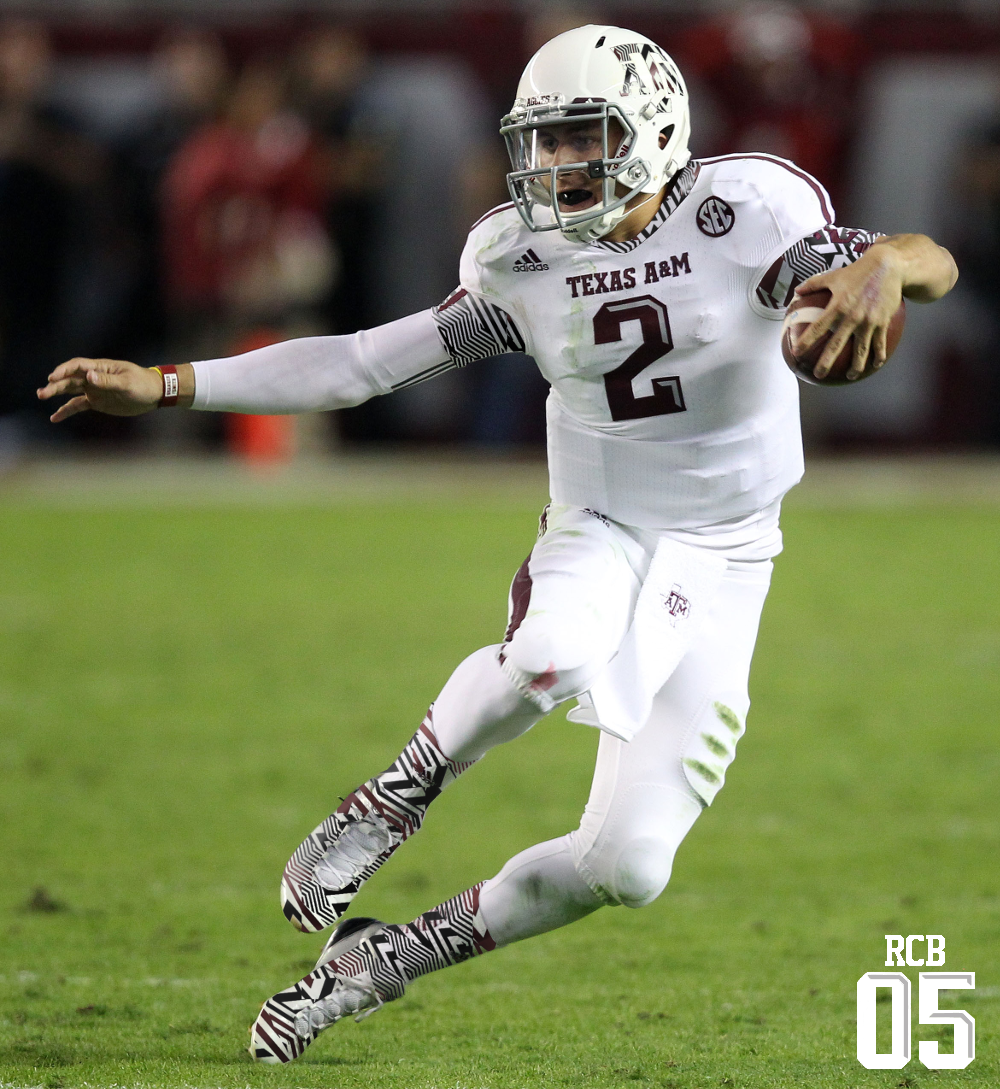
I'm sorry, but aTm

Most disappointing reveal ever.
Anyone else stop at image 6 and stare for a minute or two? Anthony Weiner would be impressed.
What you gonna do with all that junk, all that junk inside your trunk?
If I had to drive by that water tower every day, I would sue the county/city.
Ugly but they will look cool kicking the shit out of the French-