
It looks like the official scholarship offer letters went out on August 1st and I couldn't help but notice the improvement over last year's
Official! Vt 19 #HokieNation pic.twitter.com/yed505A9YC— DuWayne Johnson (@fitch_Boss) August 5, 2014
Second official scholarship pic.twitter.com/6grUo2HaQv— Tim Settle (@tim_settle) August 2, 2014
In case you forgot, this is what we sent to recruits last year:
My official scholarship offer from Virginia Tech that came in the mail today #hokies #hardwork #blessed pic.twitter.com/fRpXqFDP4j— billy shmurda (@Billythekid_75) August 15, 2013
I just remember cringing at seeing that letter (from the font to the fact that it looks like it was printed on an old ink jet printer). I am glad they are stepping up their game, especially in an era of social media where these can be seen by everyone.
Here is a sampling of last year's recruiting letters. Including the infamous "I want to formerly extend a scholarship offer to you" from UVA.
What college football scholarship letters look like: The good, bad and normal

Comments
So Nike sponsors scholarship offers now, too?
VT seems to be really emphasizing the Nike branding a lot and I think it's a smart move. Look at all the pics the coaches have on their twitter accounts getting ready for camp, each was branded w/ a Nike symbol.
Nike will spring for that really nice paper that most people only use for their wedding Save the Dates.
It's a really nice stock. And VT has a ton. They bought like 50 reams.
I only know because I used to work at Dunder Mifflin.
Looks so much better - gotta stay on point with every detail - kudos to the athletic department for the change
High five for CAUS grads.
Have a high five and a turkey leg. Before a few years ago I wouldn't have thought twice about a font on a letter
It's amazing how they condition you over 5 years...for better and for worse.
How about those that started in CAUS but after 3.5 years dropped out and ended up in Pamplin?
a CAUS -TKP caucus! awesome! legs for all
'99 grad myself
No typos and a business font?

I still don't see what's wrong with the formal ones.
Oh man, that took me too long to get.
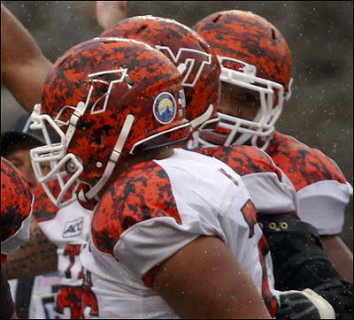
it comes with a preview of our orange effect jersey?
Wait, second scholarship offer for Settle? Does he mean we were the second school to offer him or that we sent him two scholarships?
one every week to make sure we are at the top of the incoming mail pile
"Hey, this is Virginia Tech... We were just sending you a letter to see how you were doing. We've been thinking about you. Have you been thinking about us? This is embarassing... We doodled your name on our desk... inside a crystal football..."
Pretty sure that means we're his second official scholarship offer. Some school beat us to #1.
Oklahoma State was his first
Vast improvement. The old one was a little embarrassing. On a side note I didn't realize we were recruting the rock to come and play again. Awesome. He should do well.

VT is so classy. Its better than "YOU".
I guess we finally caught and fired the wahoo who was sabotaging our athletic department last year. As the article says, "Comics Sans doesn't just happen," and whoever designed the scholarship offer was also involved in putting that awful cartoon-ish Hokie bird on our helmets.
Guess he's back at LOLUVA running their recruiting twitter account and performing the duties of Official Football Photoshop Personage.
I just want to revisit that LOLUVA photoshop thread and thank everyone on here for giving me the biggest set of laughs I've had in a long time. I literally LOL'ed at it. Big shout out to, I think it was GuitarMan and Alum07 for that.
High five to the others on that thread, as well.
I would thank you for all the times you've made me seriously LOL, but there have been too many to enumerate
These look new ones look a million times better. There must have truly been a modern day disconnect with the old athletic department
Now that's completely unfair

What
makes

you

say

that?
We should just call you "Google Image Search Master"
Sounds good to me!
Bet you thought I was going to put an image on it... noooooope
it could also be shortened to "GISM" and when people ask what you are doing...
My company is all about acronyms... I could probably drop that into my resume and nobody would bat an eye
Do you GISM frequently? How much cleanup is involved?
I know I'm in the minority, but the only thing I have a problem with in those pics is the Foghorn Leghorn. The Turkey tracks grew on me a little bit, and I really liked the Hokie Stone; because I didn't really care if other people didn't get it, I knew what it was and how it reflected the university.
My problem with the HokieStone was the blatant, lazy as hell seam right down the middle of it that we didn't even bother to try and hide. It looked cheap, it looked lazy, and it looked very, very small-time. A simple maroon stripe would have solved the issue, but we didn't even bother. So freakin lazy.
Which is also my issue with the orange camo helmets. The way the logo peeled off them during the game, it looked as if the VT's were made of thin masking tape. So incredibly cheap that it was embarrassing.
Which was also my biggest complaint with the grey uniform. Oh, sure, it definitely looked more modern than our current set. Thats because it was a complete, blatant, 100% unashamed ripoff of one of our biggest rivals, West Virginia.
There is basically one cardinal rule you have in uniform design. Don't copy anyone, and if you do, at the very least, do not copy a rival.
And I just plain hated the Turkey Tracks helmet. Aesthetically, in my opinion, its just a bad, bad design.
what's to hate about 3 or 4 carrot laced terds smashed together to form a cartoon footprint.
hahahahahaaha
That might be the most accurate description of the Hokie Tracks that I've seen.
Now that you menion it, I can see where a seam would have been a better call on the Stone Helmets; still like the idea though. And a little attention to detail to make sure the helmet doesn't peel apart would be nice.
I'm ok with the grey unis, there are only so many way to put uniforms together, you are bound to get some merging with other schools.
I'm still fine with the turkey tracks. I see them and I think Turkey, then I think of a wild turkey, then I go to the store and get some Wild Turkey; so its all very circular for me at least.
Look, even if the grey uni was derived from the WVU set, I would have been ok with it. If we had taken what they did and put our own spin on it, whatever, but the fact of the matter is, we took a unique design set from a longtime hated rival, and literally did a color swap and passed it off as ours. I mean, change up the striping or do SOMETHING to differentiate it from the WVU set, and I would have been ok with it. But the changes we did (putting in block numbers instead of a stylized set and dropping the logo from the neck and making it comically large) just made ours look like Wal*Mart $5 specials.
I loved the concept of a grey uniform. Between our original colors being black and grey to the Hokiestone representation of the color, its an awesome look that we should use more often (thinking full-time away unis) but it needs to be a look unique to us, not a design-element for design-element ripoff of a close rival.
Its just Whit being Whit
These should've included a copy of BillDozer's hype video.
Flash drives are dirt cheap these days. It could have been a thing.
If I received a flash drive in the mail with a letter that said "Watch this, get hyped" I would probably do the first, and then the second.
Sam Rogers puts hype videos on regular paper
If Sam Rogers sent out the recruiting letters there would just be a brick in a box. No explanation. But the language shared between powerful men would tell the recruits everything that they needed to know.
I like the new ones. I like, among the many differences, how CFB signs Frank Beamer on the ones this year, versus Coach Beamer last year.
I was actually wondering if Frank actually signed the new ones or if his signature was printed.
I like the flash drive idea. Why not create a pump up video with a video greeting from the recruiting coach and/or Beamer? I know it'd be A LOT of work, but I bet it could make a difference.
Why not just hire Metallica to go to their doors and sing Enter Sandman?
Every since Mariano Rivera retired they've been looking for work...at least according to E$PN. Seems like a win a win.
hey, that sounds great.
So, what exactly is that font anyhow?