Paul Lukas... Well, I mean yay for the shout out to TKP, but I'm not the biggest fan of this guy. He has a very, very high opinion of himself, and is not afraid to share the opinion his snootiness with everyone else. And if you're ever wanting to know where this whole "Washington Redskins should change their name cause its offensive" push began... well, now you have your answer.
Log in or register to post comments about the Virginia Tech Hokies
True, but the positives from this:
-#Whitness that there is nothing to report about weird unis this year for VT.
-he, being of high opinion, turned to TKP for something to report!
Log in or register to post comments about the Virginia Tech Hokies
And if you're ever wanting to know where this whole "Washington Redskins should change their name cause its offensive" push began... well, now you have your answer.
I think we are giving the writer of a blog that critiques sports uniforms way too much credit. There has been controversy over that name since the 1970s. Yes, it's grown quite a bit in the last couple of years, but the push has come from much bigger fish (tribes, politicians, celebrities, etc.).
Is Lukas a vocal opponent? Most definitely. But we are over-estimating his reach
Log in or register to post comments about the Virginia Tech Hokies
Gracias, it does look kind of badass. Hopefully we are running up and down the field all over it the next few years since it seems we will never have them off the schedule...
Log in or register to post comments about the Virginia Tech Hokies
Love it; constructive criticism? Need to add "owned" across/inside the state in the VT lettering style, or for us computer l33t h@x0r5 out there, "pwned"...
Log in or register to post comments about the Virginia Tech Hokies
No, I think it is a great look for them. They do pretty well branding themselves, and this gets the message across pretty darn well. Combine it with their new helmet, and you can see how they're going to work their logo effectively.
Log in or register to post comments about the Virginia Tech Hokies
I don't care about 9 thousand uni combos, I do wish we could keep matte finished helmets year 'round though. Throw a "VT" on the side of these bad larry's and we're in business!
Log in or register to post comments about the Virginia Tech Hokies
As long as the helmet is ONLY either maroon or white, with matching color face mask, and has the VT on the side, I'm fine. The stripe is okay, and it's okay if it's absent. No other colors/patterns, though. Just maroon or white. Matte or chromed, it's fine either way for me. Both look good in the right circumstances.
Log in or register to post comments about the Virginia Tech Hokies
I would assume the gobbler one is "officially" since it's retired from the official acceptable logo list and terms. And, with Whit around, I'm guessing we won't be doing any cartoonish birds or tracks any time soon.
(I can see the matte maroon with ornage/white VT on the sides, with those stripes!)
Log in or register to post comments about the Virginia Tech Hokies
I think Whit has verbally made it clear that after this season, they will be. Since the current uniforms were ordered last fall while Weaver was still in charge, we might see some carryover this season. I do think that is a small chance, though. I imagine there's been closed door discussions that 'encouraged' the old school look be used as much as possible this season. I think/hope/pray that last year was the nadir of that. After this sdeason, I think you'll see that be a very strong consistent effort.
Log in or register to post comments about the Virginia Tech Hokies
I have a feeling that VT will have a Black Uniform look this year. It is just a hunch...but like the surplus of VT gear last year with the Gray look this year the coaches are wearing lots of black which is a different from normal. I feel like they get gear to wear for practice and game day that reflects the years look. I could be totally wrong though.
Log in or register to post comments about the Virginia Tech Hokies
I'd just like to point out that unless Nike hops on and makes us a specialty uniform, there will most likely not be a black uniform. Since the uniforms would have been ordered before the schedule was released and before we knew we were playing on Black Friday, there wouldn't have been a push to place an order for that purpose. Now, Nike could still come in and do something, but it wouldn't have been VT that made the push for black. Just don't get your hopes up.
Log in or register to post comments about the Virginia Tech Hokies
I am not hoping it happens...just making an observation. Last year there was absolutely zero talk of gray uniforms and no one would have thought we would have them...then out of nowhere the coaches are all wearing various gray VT gear in fall camp. Then gray uniforms are released...coincidence? maybe but probably not. In addition to that there has been a push for "Tradition" which would hopefully be bringing back ALLMaroonEverything but could also bring on some black uniforms to show our cadet and early VT football days...without the motherboard look added on them hopefully.
Log in or register to post comments about the Virginia Tech Hokies
Not necessarily true. Supposedly, we in-housed the grey jerseys last year and sourced the construction to a local firm to get them done over the span of a couple weeks leading up to the Alabama opener, with the instruction to put the Nike logo on them to satisfy our contract.
Not saying that will happen for any black jersey, but its not like it CAN'T happen.
Log in or register to post comments about the Virginia Tech Hokies
Slapping a Nike logo on subcontracted jerseys would not satisfy our contract with Nike. The 'in house' story might have been after the fact spin for whatever reason, but there is no way that we source from a supplier other than Nike without also compensating Nike for them, thus doubling the expense of the jerseys. I... would... hope... we... didn't... do ... anything... so... foolish.
Log in or register to post comments about the Virginia Tech Hokies
Do you really honestly think Nike would put something on the field with such poor quality as those jerseys last year when they have been so focused on being cool and hip? Those grey jerseys were an aesthetic disaster, far below the standard of design that Nike has put out in recent years. Far below. I'm sure Nike got paid for having their logo on them, but don't seriously think for a second they designed those things for us to use. The fact alone there was a black Nike logo should have been more than enough evidence they didn't make them. Nike always color matches the team to make the logo a part of the jersey.
Log in or register to post comments about the Virginia Tech Hokies
I didn't investigate as closely as you. I could just tell immediately they were horrible and left it there. I'd prefer not getting too deeply into the 2013 uniform/helmet choice discussion right now. We're kind of opening another can of worms if we get into the discussion of - Somebody made an admin decision to sub out jersey production and pay twice for them. That's worthy of a thread in itself, and most certainly not a positive thought one, either, so I'll stop there. I think we agree about the macro side of it, we might just disagree on the micro path taken to achieve it. I'll just say I feel extremely confident that our uniforms will reflect the professionalism that we NOW have going forward with Hokie sports.
Log in or register to post comments about the Virginia Tech Hokies
Completely agree. With Whit in charge, we're going to look good going forward. Yes, he has said he wants us to be traditional, but traditional doesn't mean boring. Wouldn't be surprised if we are looking really good in the future, all while wearing looks that will be timeless when we look back on them.
Long gone are the days of hokietracks, foghorn leghorn, etc.
Log in or register to post comments about the Virginia Tech Hokies
Leg in total agreement on all that. Looking good doesn't have to mean frozen in time, it just has to remember what makes our brand. I can't begin to explain how excited I am for that.
Log in or register to post comments about the Virginia Tech Hokies
I'm assuming we're going with these as our standard uniforms since the DB Unit was wearing them for this Roanoke.com article: DBU I've always liked this look, it's classic (compared to a lot of the other things we do).
Log in or register to post comments about the Virginia Tech Hokies

Comments
Paul Lukas... Well, I mean yay for the shout out to TKP, but I'm not the biggest fan of this guy. He has a very, very high opinion of himself, and is not afraid to share the opinion his snootiness with everyone else. And if you're ever wanting to know where this whole "Washington Redskins should change their name cause its offensive" push began... well, now you have your answer.
True, but the positives from this:
-#Whitness that there is nothing to report about weird unis this year for VT.
-he, being of high opinion, turned to TKP for something to report!
Whit said at an event I attended that uniforms were ordered for this season before he arrived so "Don't blame me".
Well if he's the reason the whole push got started, then I like him more than ever.
I think we are giving the writer of a blog that critiques sports uniforms way too much credit. There has been controversy over that name since the 1970s. Yes, it's grown quite a bit in the last couple of years, but the push has come from much bigger fish (tribes, politicians, celebrities, etc.).
Is Lukas a vocal opponent? Most definitely. But we are over-estimating his reach
Yeah. The push came from common decency.
Here you go. Pretty sure it's all been said, but have at it:
http://www.thekeyplay.com/content/2014/june/18/us-patent-office-cancels-...
Oh lawd, did I accidentally open that again?
So, am I the only one that thinks the new midfield logo for ECU looks badass?
I love it.
got a link?
its under the original up top...
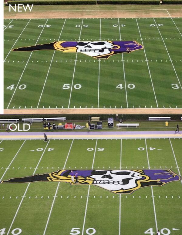
Gracias, it does look kind of badass. Hopefully we are running up and down the field all over it the next few years since it seems we will never have them off the schedule...
I kinda like the old one better.
Where did the one of the Hokie Bird in the NC outline go? Loved that one...
That one?
Love it; constructive criticism? Need to add "owned" across/inside the state in the VT lettering style, or for us computer l33t h@x0r5 out there, "pwned"...
Or expand it to both VA and NC outlines with the caption: "Our State(s)"
edit: vtnerf beat me to it
The one in the original post.
I dunno, I really prefer their old one...
No, I think it is a great look for them. They do pretty well branding themselves, and this gets the message across pretty darn well. Combine it with their new helmet, and you can see how they're going to work their logo effectively.
Agree. I think they should have that logo on their helmet. I believe the did for a few games but I'd make it the default logo.
Their new helmet logo is the pirate without the NC outline. It looks really good, too, if you're an ECU fan. And even not.
I don't care about 9 thousand uni combos, I do wish we could keep matte finished helmets year 'round though. Throw a "VT" on the side of these bad larry's and we're in business!
YES YES YES!!!! This is the one thing that I want back.
Lose the stripe at the top and put the regular VT on it...would look sweet.
Those are some damn good looking helmets
out of all the crazy crap they've done recently these we're my favorite helmets ever. they looked great I wish we'd use that matte coloring as well
Fighting Gobblers forever!
As long as the helmet is ONLY either maroon or white, with matching color face mask, and has the VT on the side, I'm fine. The stripe is okay, and it's okay if it's absent. No other colors/patterns, though. Just maroon or white. Matte or chromed, it's fine either way for me. Both look good in the right circumstances.
IMO, the matte finish looks good up close but just looks dull at a distance from the stands or on TV.
I'd love to see something that said the Hokie tracks and cartoon Hokie Bird helmets are official retired.
Yes!
I do think that our gobbler logo helmets were ok - just take the gobbler size down about 30%
I would assume the gobbler one is "officially" since it's retired from the official acceptable logo list and terms. And, with Whit around, I'm guessing we won't be doing any cartoonish birds or tracks any time soon.
(I can see the matte maroon with ornage/white VT on the sides, with those stripes!)
I think Whit has verbally made it clear that after this season, they will be. Since the current uniforms were ordered last fall while Weaver was still in charge, we might see some carryover this season. I do think that is a small chance, though. I imagine there's been closed door discussions that 'encouraged' the old school look be used as much as possible this season. I think/hope/pray that last year was the nadir of that. After this sdeason, I think you'll see that be a very strong consistent effort.
Along with any orange helmets
I have a feeling that VT will have a Black Uniform look this year. It is just a hunch...but like the surplus of VT gear last year with the Gray look this year the coaches are wearing lots of black which is a different from normal. I feel like they get gear to wear for practice and game day that reflects the years look. I could be totally wrong though.
I'd just like to point out that unless Nike hops on and makes us a specialty uniform, there will most likely not be a black uniform. Since the uniforms would have been ordered before the schedule was released and before we knew we were playing on Black Friday, there wouldn't have been a push to place an order for that purpose. Now, Nike could still come in and do something, but it wouldn't have been VT that made the push for black. Just don't get your hopes up.
I am not hoping it happens...just making an observation. Last year there was absolutely zero talk of gray uniforms and no one would have thought we would have them...then out of nowhere the coaches are all wearing various gray VT gear in fall camp. Then gray uniforms are released...coincidence? maybe but probably not. In addition to that there has been a push for "Tradition" which would hopefully be bringing back ALLMaroonEverything but could also bring on some black uniforms to show our cadet and early VT football days...without the motherboard look added on them hopefully.
Not necessarily true. Supposedly, we in-housed the grey jerseys last year and sourced the construction to a local firm to get them done over the span of a couple weeks leading up to the Alabama opener, with the instruction to put the Nike logo on them to satisfy our contract.
Not saying that will happen for any black jersey, but its not like it CAN'T happen.
did anyone notice the group of guys wearing the black and orange out of the tunnel today? I definitely think black uniforms will happen this season.
Slapping a Nike logo on subcontracted jerseys would not satisfy our contract with Nike. The 'in house' story might have been after the fact spin for whatever reason, but there is no way that we source from a supplier other than Nike without also compensating Nike for them, thus doubling the expense of the jerseys. I... would... hope... we... didn't... do ... anything... so... foolish.
Do you really honestly think Nike would put something on the field with such poor quality as those jerseys last year when they have been so focused on being cool and hip? Those grey jerseys were an aesthetic disaster, far below the standard of design that Nike has put out in recent years. Far below. I'm sure Nike got paid for having their logo on them, but don't seriously think for a second they designed those things for us to use. The fact alone there was a black Nike logo should have been more than enough evidence they didn't make them. Nike always color matches the team to make the logo a part of the jersey.
I didn't investigate as closely as you. I could just tell immediately they were horrible and left it there. I'd prefer not getting too deeply into the 2013 uniform/helmet choice discussion right now. We're kind of opening another can of worms if we get into the discussion of - Somebody made an admin decision to sub out jersey production and pay twice for them. That's worthy of a thread in itself, and most certainly not a positive thought one, either, so I'll stop there. I think we agree about the macro side of it, we might just disagree on the micro path taken to achieve it. I'll just say I feel extremely confident that our uniforms will reflect the professionalism that we NOW have going forward with Hokie sports.
Completely agree. With Whit in charge, we're going to look good going forward. Yes, he has said he wants us to be traditional, but traditional doesn't mean boring. Wouldn't be surprised if we are looking really good in the future, all while wearing looks that will be timeless when we look back on them.
Long gone are the days of hokietracks, foghorn leghorn, etc.
Leg in total agreement on all that. Looking good doesn't have to mean frozen in time, it just has to remember what makes our brand. I can't begin to explain how excited I am for that.
Hasn't Nike been making those shitty orange unis?
I'm assuming we're going with these as our standard uniforms since the DB Unit was wearing them for this Roanoke.com article: DBU I've always liked this look, it's classic (compared to a lot of the other things we do).
I agree. I just wish they'd wear the striped pants with them.
Otherwise, they are just too white and look like ballerina tights from a distance.
Absolutely. It looks awesome.
Is it just me, or is anyone else really into those Kentucky thigh pads...?
I mean that in as weird a way as possible.
Really looking forward to seeing what we're going to wear when we roll into Columbus.
Used to rock the all-whites pretty well, maybe T-mobile style with the stripes on the sleeves.