
Many of you probably know of Clark Ruhland (@hokie20 on Twitter), and probably know him as a uniform junkie (even self-proclaimed).
After the season ended, he made a post that Nike was going to "modernize" all college teams' uniforms that feature the triple stripe on the shoulder. As we all know, these have been the base uniforms for Tech since the 2010 season, and have been used as at least an alternate since the 2008 season. What he believes this meant was that Tech's triple stripes, along with all the other times with the same stripes (e.g. Iowa State) would end up looking something like LSU's or Ole Miss'.
This brought a question to me: Would Tech change their uniforms altogether (and if so, to what?) or would they just go with the modernized triple stripe look?
This is the off-season, and other than the coaching carousel and recruiting, there isn't much to talk about. I think it would be fun to talk about, as Tech has seemingly worn a different uniform every week since 2012 (obviously not true, but it really feels like it with all the camo, mascot and numbers on helmets, etc.).
What would y'all like to see the players wear? Something new, something from the past, or just the modernized look of the triple stripes?
Comments
I hope we go with something totally different. We don't need to be Oregon or anything but I hate our cookie-cutter uniforms. It can be "classic" and "simple" without being the exact same jersey half a dozen other schools already use.
Minimalist, simple, sleek.
Get rid of the extra stripes. The extra detail doesn't add to the design. If it doesn't add anything positive, then why include it? I'm don't mind using the helmet as a means to try new things though.
Wait, so all white for a standard home game?
Yea I think so. No need to dress all fancy when ECU comes to town.
I've never been a fan of home whites in football as the default.
Baseball and basketball, sure.
Maroon is home and white (or lighter color) is away
The NCAA also has rules about contrasting uniform colors. That's why you don't see color vs. color unless there has been prior approval. Given that the norm is that the home team wears a color for their jersey, the visiting team is generally constrained to wearing white.
I just had a thought after seeing this thread and I have yet to see it discussed here on TKP so I want to ask everyone this question. Should we wear #ALLMAROONEVERYTHING on Labor day?
If the game got postponed to Tuesday, white would be out of the question. So play it safe, go with all maroon.
Labor Day game vs Ohio State is Orange Effect.
I'm hoping we come out in #ALLMAROONEVERYTHING anyway.
It looks like orange uni's on labor day then. Sigh
best of both?
You misspelled worst.
Oh snap I did not notice that. Oh well kind of a bummer if you ask me.
we wore maroon jerseys and helmets and white pants in the orange effect game in 2010, so it could happen.
normally they alternate where maroon effect is earlier in the season, then orange later lke 2007,09,11, 13
or orange early in the year, then maroon later like 06, 08, 10, 12, 14...so its interesting they are doing the same thing this year instead of alternating
Maroon doesn't contrast with Ohio State's crimson as much as orange does. I support this change.
Sorry, still can't get the horrible taste of the beatdown we took the last time we wore AME, which also happened to be a night showcase game in Lane as well...
Can't be scared. Bring in the AME
As long as the uniform has Chicago Maroon and Burnt Orange, I'm good.
And doesn't have something completely stupid looking like Oregons "wings" on the shoulders.
Without that, their uniforms 78 out of 84 times a season would look good.
I'm not sure what, to that effect, VT could incorporate into their uniforms but I think the Oregon wings look awesome. Their cartoon duck throwback emblems look stupid to me though.
Not a single athletic uniform we wear in any sport have true Chicago Maroon and Burnt Orange, so you'll probably be disappointed there...
Not sure that is entirely true. In my last year at tech, we were given all new uniforms for the 2008/2009 Cross Country/Track seasons. There was a lot of excitement because we were moving away from the 'dark red' and actually getting uniforms from nike that used chicago maroon and burnt orange.
You can't triple stripe a double stripe.
Not with that attitude you can't
I like it alot
This gif perfectly represents:
-discussions about VT recruiting
-discussions about stick it in
-discussions about uniforms
-recent discussions about the Max Warner hire
Oh,oh...AND...
-discussions about Scot Loefler
The answer is always this

In seriousness, i'm fine with anything as long as the standard uni isn't too busy
The K-Guard sleeve gets me every time.
I think we should update them each week to reflect the number of days we have held the Commonwealth Cup. Maybe a patch on the front.
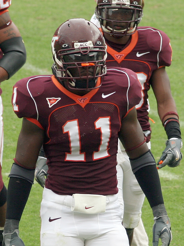
Call me stupid, but could someone explain the difference between VT's shoulder stripes & LSU's? Is it something readily apparent without a magnifying glass?
I was thinking the same thing
vs
Different uniform cuts make it so that the LSU stripes are much longer. Note how theirs come below the arm holes and ours top above them on the shoulders...
You can really tell it's the offseason...when an entire thread gets dedicated to a couple inches of barely noticable striping on the jerseys...
The stripes aren't the only change. Apparently the collar is going to be thicker. Hopefully we'll see what the new uniform looks like with its minor changes at the ACC Spring meetings.
Home: Maroon jerseys with orange argyle with tight white slacks.
Away: White jerseys with maroon argyle with tight cackies.
Numbers only on the back.
Obviously not a UNC or UVA troll because they would have been able to spell khakis correctly
My California naiveness just surfaced. I did know that though but Friday at work has me like:

We desperately need an update to the uniforms. Not that the classic look is bad, but it's boring and while we shouldn't be Oregon or Maryland with a different look every week, but I would really appreciate us wearing a uniform that is immediately identifiable with our school.
Because our school colors aren't immediately identifiable.
Well... as long as we keep orange fairly prominent, which a significant portion of the fanbase wants to see eradicated.
I'm fine with getting rid of orange helmets, jerseys and pants, but yeah, orange has to be there. That ESPN signing day commercial where they showed hats and by the time they got to ours it was scrolling pretty fast, it was the orange VT that made you know that was a Hokie hat in a split second.
I hate when we wear mostly orange and look like Syracuse, Clemson. And the dark Maroon is a uniform color of at least 3 or 4 more schools off the top of my head (Miss St, Arizona State, Minnesota, Central Mich, FSU on occasion depending on the sport you watch).
The colors alone are good, but we don't have like Texas' orange where it unmistakable. I firmly believe having uniforms that identify with us alone is valuable.
What's not identifiable about it?
They are the exact same design as LSU/Ole Miss and about 2 dozen other programs. Especially in road whites with a changing helmet, if I didn't love VT I probably wouldn't know who was on my screen when I pop us on. As a casual viewer it is a generic template design with our colors on it. Which totally made sense in the 1960s when manufacturing was pricey and hard to do different stuff, but I don't feel that's the case anymore.
Because we haven't remained as successful as we were 04-11, Nike has basically put us on the back burner for uniforms, see how ours haven't been updated in 4+ years, and all our alternate jerseys (the greys from Bama 13, both of our Military sets from 12 & 13) are all generic ones with a color swap performed on them.
The whole point is not about being obvious to VT fans, we know we will immediately see it. For casual fans and your other viewers having an identifiable brand look is important and I don't think we have a very good one right now. We've just cribbed a look from so many other schools, but with none of the history of wearing that uniform.
I don't want to go full Oregon, but I think they're a really good example of a design ethos that permeates their uniforms and makes them recognizable regardless of the colors chosen.
You seem to be conflating new with recognizable. New may make unis "cool", but it doesn't necessarily make them recognizable. I would argue that the exact opposite is more likely.
1) VT's unis are similar to a few teams -- LSU, Ole Miss (sort of), UCLA, Iowa St (sort of) -- but not 2 dozen (try to name 10 others, let alone 24). That -- along with the unique color combo -- actually makes them quite recognizable among the sea of black, grey, chrome, computer graphic numbers, taper striping, etc. that will look dated in 10 years.
2) What does manufacturing cost have to do with recognizability?
3) Assuming that new does, in fact, equate recognizable, do you have any evidence that Nike put VT on the back-burner? Or is this just a made-up "fact" to somehow support the notion that VT's uniforms aren't recognizable? How is that VT has been able to come up alternate unis in the last few years that were NOT just color swaps (Bama, Marshall in '13 off the top off my head) yet Nike has put VT on the backburner? Were Bama, LSU, Ohio State, Michigan, Penn St, USC, Texas, and so also put on the "backburner" during their "down" periods in the last 15 year - because they haven't had their uniforms "redesigned" recently...or ever?
4) You are correct that the point isn't that they be identifiable to VT fans, but to the casual fan or others. You don't, however, provide any evidence that the current unis aren't identifiable to the non-VT fan.
5) VT probably has more history with the current uni than any other (although I suppose one could make argument for the short-lived, but long ago and dated looking, Michael Vick era unis). Changing to a uniform design du jour will do nothing to advance that.
6) Oregon's variability and "gaudiness" are recognizable is 1) they were the first to do it 2) they've had some recent success, and 3) they're taken it to the extreme. Everyone else just comes across as lame imitator.
There is a reason NFL teams rarely make uniform overhauls -- and those that do are generally the least successful brands. The NFL (and the SEC for the most part) is superb at marketing and creating brand identity. IMO, this is the cue VT should take, not following the Maryland's and Arizona State's of the world.
1) Look at FCS squads (who are getting a lot more TV time) you'll find its a very popular jersey design. Can I name them all no, but there is a reason the UCLA stripes have a name and can be found at lots of schools (including High Schools) across the country. It is a generic uniform template.
2) Has more to do with the ability to generate unique uniforms at a reasonable cost instead of a company needing to do color swaps on a generic template. Thus why its more reasonable to expect that we could have uniforms that don't mimic another team.
3) As I noted (and look in the Nike catalogue) both of the unis you mentioned were color pallete swapped generic set uniforms with some VT logos slapped on them. They were not unique, they were not immediately identifiable with us, and honestly they didn't look very good. Over the past few years the Bama jerseys, LSU ones, shit OSU and PSU in the B1G have all gotten the updated trim and materials upgrades while our jerseys haven't. Shit Duke got the updated versions in time for their press photos and we are still using last years. I think that highlights my point well enough. They haven't done Pro Combats Unis in a few years (they've reserved that for their teams playing in the highlight bowl games), but plenty of programs have received substantive adjustments to their uniforms and in 5 years all they did was change our TV logo to the modern VT one on the collar.
4) Provide evidence that they are immediately recognizable to a non VT fan (This is basically an empty argument, i say X you say Y and we both stand our pedestals until we grow horase yelling IM RIGHT) But I can provide personal experience that here in Texas when we've been on at a bar and I'm watching people repeatedly have to ask me who is on and why am I watching them.
5) And our history with them has been - 2 BCS losses, 2 years of 7-6 and 1 year or 8-5. So umm unless you think this is history to celebrate, I don't really think these jerseys have much history or value to them for us. None of our Unis really do honestly we aren't a PSU or a Bama which opens the door for us to try and find something new and unique to us.
6) It's not about how many colors they wear, its about the fact that each of their uniforms has key components that make them immediately identifable as Oregon regardless of what colors you put on them. We don't need a million colors, but a unique uniform design point is something I think we need. Everyone sees the wings on the shoulders and helmets and regardless of their colors you go "Oh Oregon is playing".
NFL is a completely different beast from college. Their rules are far more restrictive in terms of what can be done with jerseys and how many you can have so it doesn't really compare or apply.
You can disagree with how much you like the jerseys, but you can't say that we have jerseys that you immediately identify with us beyond what colors the stripes are, and on our white jerseys on broadcast TV (when we wear white helmets), I find it hard to tell who we are if I didn't know. I don't want gaudy Oregon uniforms, I want a uniform that when you turn it on without question you know its us playing without looking at your guide or the scorebox.
I also hate to break it to you we are far more similar to Oregon than we are to PSU/Bama etc. We do not have an identifiable brand design with a long tradition behind it, we've become nationally relevant over the past 25 years with our biggest upswing coming in the last decade. Part of that means defining our brand and creating a look that can carry across our sports (which they certainly don't have right now just look at all the different fonts and logos between football, basketball, baseball), we are in a position to actually do something new like we have in the past. New doesn't have to mean gaudy, and I think it could be better than what we have.
If we are looking for a subtle change to the uniform, consider the shoulder stripes that the Cleveland Browns use. Their color scheme is similar to ours, except trade that awful Brown for maroon. I like the should stripes they have and I think they could work well for us. Although I'm not sure copying anything the Browns do is a good idea. Might be a bad idea just on principle.
As a life-long Browns fan, I recommend doing the opposite of whatever the Browns do. The decisions they make only lead down the lonely path of ridicule and general misery.
FWIW, I just saw yesterday that the Browns are going with a different shade of orange for the upcoming season. The brown is apparently not changing.
It didn't look much different to me. Certainly not nearly as big a difference as, say, the Dolphins various changes in blue or, even worse, the differing shades of blue & silver the Cowboys mix throughout their helmet, jersey & pants...
You know your uniforms suck when you're making the point that they should try to look more like the Browns. I'm sorry but everything about the Browns is awful, especially the uniforms.
Let us not take any ideas from the mistake by the lake.
I think no matter what combination we have, the helmet should feature our current logo. All the television and print that comes from the game is free advertising. If we have wacky helmet and uniform combos then we lose out. No matter if its a white, camo, Hokies stone, etc background just keep the recognizable VT logo on the helmet. I would also want a style that is permanent, a default Home and Away, and then use unique combos outside of that, but keep the style the same for a long time. Penn St and Bama have done this well enough that any college fan can picture their uniforms.
Let's go back to these helmets
my crack at a design from a year ago...
Yes please!
The shoulder numbers need to be white. Other than that, these would be perfect
Jersey numbers and shoulder numbers in differing colors...
Must resist the urge to downvote...must resist the urge to downvote...must resist the urge to downvote....
My vote is for invisibility cloaks. The color debate finally gets put to rest, and the other team can't find us.
Win-win.
I wonder if we'd have been able to score on Wake with those
I'm not sure about that but at least we wouldn't have had to see that ugly offense *ducks*
I have to admit, I saw this thread title and read it as: "2015: Unicorns"
Which, for this community, seemed perfectly in line with expectations.
Can we PLEASE do this?
I don't really like the Hokiestone shoulders but I do like the bit behind the TV logo on the collar. Not sure how well maroon numbers on maroon jerseys would work but I dig it. Thats about as AME as you can get.
I am the opposite. I really like the black Hokie stone pattern on the shoulders, more than if it were a grey pattern.
This is my new favorite
why have I not seen these before?! So good
Up vote over and over and over....etc
Yeah this is more like what i'm talking about
Pretty sure the number is no longer allowed to be same color as the uniform. Also the number font sucks. Everything else about this is great though
This is true. The numbers have to be easily readable from afar. That's why FSU's new white unis had to have their number color changed from gold to garnet.
To hell with that, the border is white, it'll be fine.
Love the turkey footprint on the helmet, subtle and unique touch
The maroon is nice. Everything else screams johnny-come-lately, Oregon wannabe.
nothing about that says wannabe Oregon to me. that shit is hot.
whatever Baylor wears is wannabe Oregon.
"That shit is hot". That alone screams Oregon wanna-be.
k
More characters used in this response than the number of fans at a UVA spring game?
If having the hot shit uniforms that create buzz and excitement with players and recruits creating a unique recruiting selling point and sell like hotcakes to the masses creating giant revenue streams for the Athletic Department makes you an Oregon wanna-be, I'd be glad to have that moniker.
I remember seeing those pictures last year and thought they were awesome. This is what we need to be wearing.
I'd love to have something reminiscent of these uniforms
This does not have enough legs.
These were my favorites, probably because we wore them during my prime undergrad years.
Really the only change I'd want to these is removing the color piping stripe on the pants that are kinda hard to see here and just use our current solid color bottoms.
Why did we ever stop using those?
One million legs to the pic above ^^^^^
Everytime the topic of uniforms comes up I always say ughhhh I wish we could just go back to the ones we wore around 06. The ones since then have looked awful.
Agreed. These jerseys have been my favorite for awhile now. The helmet and pants could be different, but I like these jerseys.
I loved these....I think the helmets without any stripe is just badass...just a great clean look. if i had any suggested improvement it would be to get rid of the thin white piping over the shoulders, and the thin orange piping across the chest. The orange on the collar, at the end of the sleeve, and around the numbers is just the right amount, IMHO.
The piping makes it for me, without it I think these would look bland.
uniformsplayersHopefully we can get a more modern look again soon. The throwback look is growing... well, old on me.
Could we have a LB reminiscent of X. Adibi instead?
I thought those unis were ok. Not my favorite.
I went to the OSU game in Columbus. I have a jersey pre-stripes. It was an eye opener to realize that so did all my fellow Hokies at the game. The jersey with stripes on the shoulder is clearly a minority. Now you can say that the stripes are more recent, or the team has been down in last few years, but personally I would love to update my jersey if you gave me something worth buying. Oh and whatever happened to sewn on numbers not screen print? Make a jersey worth buying please!
This might be what they were referring to. These are concept unis for Florida. Notice how the stripes seem more tapered
At first I thought this was a gag using the jerseys from that Blue Mountain State show. The only thing that could make these more florida would be a denim pattern for the knee length pants.
Who is that supposed to be, the kicker? Where are his arms?
Hate the current uniforms. I was wearing my Ryan Williams three striped away jersey last year and someone asked me what player on the Browns number 34 is. I was pissed because to me, the Browns have the ugliest and most boring uniforms in the NFL. Please can we go with something more modern.
They were grandfathered in.
Great-grandfathered in
If the uniform was purchased before the end of licensing/production, then it's okay. Not necessarily grandfathered, just how it works. So if they have leftover "T in the V" patches, they can put them on a uniform. They just can't buy new patches or have them placed on the jersey from the manufacturer.
Didn't Whit and Co unretire it?
EDIT: Reply to Dcurwin
An underrated choice would be the 09 Pro Combat unis we wore against UVA. I thought these were sick:

I think if we swapped in our normal maroon helmet, I'd be happy with that being our standard road set.
I forgot about those. They are better than the current whites and I agree with the maroon helmet to match.
Yep this is the best uni we have worn since.... Maybe ever. It's appealing, unique, simple and yet complex at the same time. We needed maroon and orange looks to go with it and been set for a while. They still look modern and cutting edge 6 or 7 years later.
"They still look modern and cutting edge 6 or 7 years later."
Yep, I thought it was intriguing that these were worn over five years ago and they still look like a design Oregon would rock today. I'm surprised we only wore them the one time, but maybe that was just due to some marketing campaign for Nike.
Yep... Arizona actually adopted part of this uniform set for their look a couple years later for both the helmet and the pants.
I would actually like to see us adopt something in this regard as our next look. Use the numbering from the Vick era unis (since numbers now have to be a solid color) and I think you have yourself a winner.
I've always thought Zona had some sweet unis. They're pretty loud, but then again so is their head coach.
We actually wore them against Maryland and UVA that year. I was at that Twerp game and have never been treated by hosting fans so badly in my life, but that's for another thread. It was actually a marketing thing for Nike, it was the first year of the Pro Combat stuff. It was just a hand full of programs they picked to wear them that weekend. Remember when we were considered an elite program? Sigh. . .
I loved these!
The uniforms from 04-07 are still my all-time favorites. Those all maroon uniforms that were worn against Clemson are also my favorite AME everything combo Tech wore, with the white and orange leggings. That was Tech's identity right there.
Anything up to 2005. Wow that was a decade ago but yeah... stop at there.
This would be my vote. I would change the font of the numbers though. I think this is a timeless look and a brand that we created where everyone recognized us. Then again, this guy made everything look good
Remember how weird it looked with him wearing under armor sleeves? Now everyone does.
Agree 100%. This was always our best and most recognizable look. Simple, but really sharp and identifiable. I even really like the orange numbers on the sleeve with the white outline. Just the perfect amount of orange, and I love the dark shade of maroon. I don't think we need to be Oregon with our uniforms and have all the modern, flashy jerseys. For instance, look at Michigan, USC, Bama, or anOSU; really simple yet appealing uniforms that have basically remained the same forever. Just as when I see those teams' uniforms, this instantly screams VT football when I see it. I also loved the all white away unis from this era too.
As an interesting alternate/orange effect look, it would be pretty cool to see this jersey inverted with the orange color and maroon letters on the sleeve.
I don't know but I feel we'll see a little more of the vintage tech look. I'm not searching for the quote but Whit has said he doesn't want to go flashy, and wants to retain the VT brand. I have little doubt he had something to do with the solid Maroon look for Miami.
16 year old Hokie here, actually emailed Whit a few days ago regarding the retiring of the vintage logos by Jim Weaver. Here's his response, he seems as clueless as we are as to why Weaver did it.
Hi Case,
Thank you for the note and caring so much about the Hokies and our program to do so. I get similar emails and questions frequently and typically refer the comments across campus to our licensing and trademark office. I will dig a little deeper as a result of your email inquiry and see what I can find out and what the "history" or justification was for the discontinuation of those retro marks in the first place. I am not certain I will have any luck in altering it, but I will certainly check it out and do what I can. Our baseball team still wears the throw back marks from time to time. Thanks again and Go Hokies!
Sincerely,
Whit Babcock
Fwiw dook looks like they got an update to their unis. Similar look to ours so maybe this is the slight modernized change we get too?

Wow, those shoulder stripes are terrible.
Photos for the 2015 poster show no changes to the shoulder stripe (but do feature #ALLMAROONEVERYTHING)
Good eye. Being that the shoulder stripes aren't modified, is there still hope we'll be unveiling some new unis this year?
My guess is that new uni's have not been shipped by Nike to VT yet... Its still kinda early and why would Nike want to risk new uni's being tweeted out/showcased early? If I remember correctly back in my college days we would also use last year's uni for the poster and then come late summer session the new ones would come in.
That all-maroon look is the best, IMO. Classic, yet sleek -- as though you expect to win and don't need a gimmicky uni to get attention and 5 minutes of fame.
What's wrong with maroon pants, white jersey, and maroon helmet for home and white pants,maroon jersey, and white helmet for away? Seems pretty simple to me. And please, no all orange or all maroon
The unis we wore against Tennessee in the chick-fil-a bowl were damn sexy
The away team usually wears white jerseys, football is opposite of basketball in this regard. I'm pretty sure that its written into the rules somewhere that the only way the away team can wear a jersey other than a white or a similarly light colored jersey is if the Home team asks them to do so because they're wearing white, if the away team is wearing a darker colored jersey they are penalized a timeout in the first half. (One of the rivalries USC has with another California team will sometimes have both teams wear their home Jerseys and the home team will take a time out at the beginning of the game to balance things out.)
You are referring to USC and UCLA. In 2008, USC was penalized a time out for wearing their red home jerseys. UCLA countered by taking one themselves immediately. They were resurccecting a tradition because at one point, both USC and UCLA called the LA Coliseum home and would play their games with both teams wearing their home uniform.
However, in 2009 - the NCAA changed the rule and it simply states that both teams colors must contrast. The standard is still home color and away white, but teams can ask for exemptions beforehand from the conference.
The rule was put into place when college football was becoming popular on television and many people still had black & white televisions. So, forcing one team to wear white would make it contrast better on TV. Now that black and white TVs are practically obsolete and everyone has HDTVs, it make sense to allow color on color.
That said, even though the home team traditionally wears the dark jersey, there are some teams that wear white at home. The first that come to mind are Georgia Tech and LSU.
I love turning this game on every year and seeing these teams contrasted against each other. A welcome change of pace from the color vs white we see in every other game.
Just an observation. windows XP is obsolete. Black and white television is archaic.
.....I still have XP on my desktop........
ditto
For what it's worth, someone at the Charlotte recruit night asked Shane something about uniforms and he said he didn't know what would be worn this year but he has seen some things (and that some choice recruits have seen them as well) that the kids got excited for and he thinks will look great on the field. His answer was vague, I was drinking and it was a couple weeks ago so this is all very non helpful, but there are at the very least prototypes in Blacksburg.
Frank will be in Raleigh on the 8th for a Hokie Club event... I'll ask him about it then.
Would love to go back to the uniforms from 99-03...Those were my absolute favorites.