
Looks like it is official that we will be keep the same short stripes as last year. There was some discussion that we may move to longer stripes, similar to LSU, but these don't look to be as long.
Hot off the truck! 2015-2016 Game jerseys with new @theACCfootball patch. #HokieSwag pic.twitter.com/dQGKHaTf3z— VT Equipment (@VTEquipment) June 24, 2015
Yes, the original said longer stripes, but further research proved I was mistaken. My fault folks if I got your hopes up for something new on the uniform front. Posted a little quicker than I should have.
Forums:
DISCLAIMER: Forum topics may not have been written or edited by The Key Play staff.

Comments
meh.
I'm kind of bored with the shoulder stripes. I'm ready for something new and fresh
Had to change the post because looking at some of the others we thought they'd resemble, they aren't nearly as long. Whoops.
I was really hoping for something different this season.
Welp, that looks pretty much the same.
We just gotta warm everyone up to the badassness of the Furman game helmets, and then we can unleash full uniform awesomeness on them next year!
I kinda actually like those helmets and I don't know why. That's usually not my style.
For anybody wondering
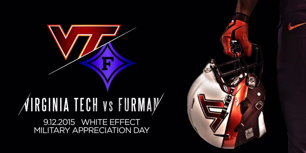
Not usually my style either, but I haven't heard a single person say they dislike these. I wouldn't mind making the permanent move to this style, but with maroon on top, white in the middle, and orange on the bottom.
The white really helps to add contrast so the VT logo stands out more so I assume that's why it was done that way besides these being for the white out game. However, I would like to see your idea in visual form, it's possible the hydrochrome maroon and orange wouldn't blend together as much as I think they would.
I'm meh on them. They look more like a motorcycle helmet than a football helmet.
yup
Your argument might be stronger if it didn't include Eddie Murphy in Miami colors.
From what I can see, the only change is the ACC patch. The longer stripes would come to a point where it meets the hem down the side of the jersey. These keep a straight hem across the shoulders.
Compare that picture with the following:
Now compare the top picture to this:
See what I mean?
I caught that about 5 seconds after I hit post. Looked longer in the picture on Twitter, then I saw where the arm hole was and realized I was mistaken. I seem to recall many thinking that we would be switching as the short stripes were no longer available, but I could be wrong.
Yeah, I heard the same, that Nike was going to force everyone into their updated stretchier fabric template...
Glad to see that's wrong. Our template looks SO much better than LSU's.
I think they look great. Keep it simple.
VT has a good uniform. I see no reason for drastic change (AKA Maryland clown suits).
Remember, it's about football.
I too like simple, which is probably why this is my VT uniform of choice.
Preach it brother! Those are my favorite as well.
It should be noted that this look includes BLACK socks. It finishes the awesome look.
Exactly. I know a lot think this looks dated, but I think this is classic. I just don't think the shoulder stripes add anything to our uniform. Those orange shoulder numbers were unique combined with the simple dark maroon jersey and helmet. Kind of how Michigan has simple uniforms but that easily distinguishable helmet, or Alabama with the numbers on the helmets that stand out. I thought this uniform was great.
Yeah I really appreciate these jerseys more and more now. I would say maybe modernize the lettering (the font) but other than that keep it like that. It has a nice old school feel like Alabama's, but yet it's classy. Plus it speaks to who we are, a humble, blue collar, Southern football tradition.
They were/are my favorites. They should go back to them and never change.
These uniforms with inverted Furman helmets (see above posters for idea). Give it to me now
AND DEANGELO SAYS "GIVE IT TO ME ROSCOE!!!!"
Awesome unis, awesome outcome. Coincidence?
I miss him (Roth) already...
Man, that team could have been so good. Beat Texas A&M 35-19, Syracuse (who happened to be decent back then) 51-7, and Miami 31-7. Lack of focus, poor leadership by players, and Bud's 4-4 scheme was that team's undoing.
Of all the silly uniforms we have had over the last few years, what is so hard about going back to this one for a big game?
Plus, it would be cool to see these uniforms on the modern day field.
Love those uni's.
Agreed. I love them...classic, clean, and historical. I would just like to see the striped pants with the maroon jerseys instead of the practice pants that they currently wear.
The solid pants look great. Striped pants make the look too busy.
Nah...it looks like we ran out of money and couldn't afford coordinating pants. They need some sort of stripe/piping.
When you start adding too much stuff it doesn't look clean, and that is the case with the pants. Take for instance the uniforms we had with no stripes and numbers on the shoulders. Those uniforms have a clean sharp look to them.
Edit: After taking a second look the times I don't like the stripes on the pants are mainly when the pants and jersey are different colors so the stripes don't match. In the picture I posted of Tyrod at the Orange Bowl those look good because the jersey and pants match.
Welp, that certainly is disappointing.

Seriously wish we would have gone in a different direction with the unis this year; I too am tired of the shoulder stripes. But, as long as we're winning, we'll look good in anything.
Yeah, the shoulder stripes definitely looked a lot better in 2011 than they did in 2012.
Do we know what numbers they are selling this year? I LOVE my Logan one but lets face it this will now have been 2 years since he graduated.
I assume Kendall's 11, Bucky and the always popular 7, and maybe either Brewer's 12, Ekanem/Coleman 4, or Dadi in the 90 are possibilities.
That also raises the question of when was the last time we had more then 2 jersey numbers for sale? IIRC we had 3, 17 and 7 all at once in 2012?
Wait they sell jerseys based on popular players! Did anyone let the NCAA know about this? I'm sure they would have a lot to say right?
God I seriously think the single greatest tweet from any ESPN reporter were these from Bilas: http://www.sbnation.com/college-football/2013/8/6/4594858/official-ncaa-...
I agree. Would it really be so difficult to throw a few more numbers out there?
I bought a few 3's and 4's when Logan Thomas and David Wilson were around, but it's kind of stupid when I dress my my family up and they all have the same numbers. I did what I had to do at the time, but could we get a little variation of a theme going on? Why not a 7?
#3 could be a nice one to have. I think Stroman is going to be a star this year, get the kid the ball somehow! If hes not gonna play much on defense, he has to be on O in a limited basis.
Here's my #sources, but nothing of substance, I just like telling you all just in case.
Next season is the season we're getting new uniforms - Nike is going to completely revamp us so our sports have a sort of coinciding theme. It will have something to do with the fact that we're updating our logo to rebrand us and make it more modernized. Also, these #sources said black uniforms for the NC State game.
But again, just #sources so take from that what you will.
I hate this re-branding thing. Is it more than the VT logo, b/c I find it (VT logo) to be fine just like it is.
If anything, it's gonna be something subtle, as far as I know. Changing the colors of the outlines/borders and stuff like that. Won't be a shift from the retro TV to the new VT or anything like that.
If what I suspect is true, there might be a minor tweak to the VT logo, if only to standardize our colors as the ones that we've been using athletically for the better part of the past 20 years. They also might delete the double outline from what has been leaked, but I highly doubt they round the edges off, especially after the harsh backlash when the concept was leaked.
I think the main rebranding will come in the form of an updated HokieBird logo, updated typeface, maybe a new tertiary logo, and a standardization of these brands across all of our athletic programs. Right now, our design aesthetic is different from one sport to another, and there seems to be a push to get them all reigned in to better show they're all under the same umbrella, and not necessarily all working independently of each other.
BRING BACK FIGHTING GOBBLER MERCH!
^THIS!!
Fighting Gobblers instead of Hokies? Yes please.
Just picked up a few of these in patch and sticker form!

I love that old logo, I have it in toilet seat form.
At first I was thinking that this crossed the fandom sanity line and then I thought about this in a man cave bathroom and became incredibly jealous
Yep this is great-
When we sold my Mom's house I removed my dads, and it will have a place of honor in our new place, my wife's opinion be damned.
Are you referring to the branding ideas presented at the last BOV meeting? I know Nike showcased several, modernized VT and HokieBird logos at the meeting. I think they should leave the VT logo as is but some of their HokieBird logos were nice. They're trying to actually make him look like a Fighting Gobbler, much more badass, and less like a character you would find on Looney Tunes.
The VT logo will see the right colors within the near future.
Is everyone ignoring the black uniforms for the Friday night game or is that just not a big deal anymore?
Black Friday I dare say. I hope they do it and Nike makes them incredible. I personally loved the 2010 all blacks.
Those uniforms weren't great. The numbers were unreadable from the stands. I'll take the grey ones we wore against Alabama over the black ones.
I was not a fan of the grey Bama unis. They looked cheap and something you get for a rec team... At least, that was my impression. I liked our geys pants with maroon jerseys and Hokiestone helmet that we wore against Maryland later that year howerver
Agree. Grey unis vs Bama were bad. I'm not against a grey uniform, but what they wore were very cheap looking.
Saying something is cheap looking is not very enlightening in to what about the jerseys you don't like. I'm going to assume it is because you think they look plain, not enough color highlights on the grey jersey. I'll take those over unreadable numbers any day.
I think he's referring to how the gray unis looked to have somewhat of a baggy fit around the shoulders. Looked a little like a high school uniform in that regard. I like the idea but I think Nike could have executed a little better.
Nike could have done a lot better. We pulled out a new uniform for a big game and it was a dud.
If I remember correctly, they had some grey/silver pants too that looked like rec league pants. Thankfully, they weren't worn and they went with the maroon.
I just thought they looked cheap. I think our current design with grey and maroon & orange stripes would have been much better.
Yeah my initial opinion of the gray pants when the pic of James Gayle wearing the gray uni originally leaked was that they looked AWFUL. I thought the pants looked good in person though when we wore them vs Maryland with the maroon tops and Hokie Stone brain buckets (thanks for that one AJ Hughes).
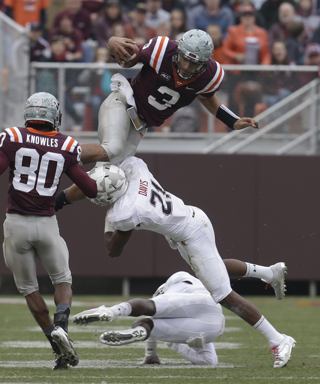
Yea I saw the picture of Gayle the day of the #BEATBAMA game and actually laughed out loud.
I heard the only reason we didn't wear all grey was because that picture got leaked. So, yay for Internet leaks?...
I'm pretty confident that an internet leak had little influence and it was probably an internal decision by coaches or players.
Well.... that's because Nike didn't execute that look.... We had a local shop make them up in the weeks leading up to the game, and had them stitch on Nike logos because of our contract.
Those jersey's aren't the greatest in the world, but it's not like they are terrible either. I see us keeping up this base uniform set w/ a couple alternates each year. Nike probably already has like three concepts to use for our next set of standard unis, but I wouldn't expect to see them until Beamer retires.
Well, I'm just glad that my Isaiah Ford jersey i just got for Christmas is still the current jersey style...
I'm just glad there's only 75 days left until kickoff, and I'll be a tad more glad tomorrow when there's 74.
Why don't we add props to the uniform? I'm thinking like a broadsword or battle ax or something they the players can hold on the sidelines when they are not in the game. Maybe Beamer paces the sidelines in a chariot or something, because he's getting older and stuff. I think it'd be good for recruiting.
I also think having the players parachute into the stadium during Enter Sandman would be a cool effect. Not every game, just once in a while to keep the fans excited. Sorry, I'm getting off topic.
I just want these back
Yeah...but only if they wear the cartoon Hokie bird helmets.
I just want Tyrod back

In that uniform.
This for the orange effect against OSU would make me happy.
Ugh.... that game
Why did you have to post a pic from that friggen game.
iirc RMFW didnt go to classes for three days after that
Worst part of that game, to me, was that I did it as part of a Hokie Club bus trip. Drove up from Raleigh at noon, tailgated for a couple hours. After the game, sat in Blacksburg for 2 hours in a traffic jam, not finally getting back home until 4am.
And I had to work the next day.
Neither did the entire UNC team
He said 3 days, not 3 years.
I spent the afternoon carving a Hokie pumpkin, then kind of wanted to smash it.

We're pumpkin twins!

I could not agree more! Definitely one of, if not my favorite of all time. Just sayin'...
Another year passes that I can save $90 on a new jersey! Honestly, i don't mind these one bit, but I am ready for change. If there are legs to the rebranding initiative across all sports, that would be a very welcome (and long overdue) thing. One font, 2 colors, 1 set of logos, etc. It has to go beyond the uniforms and find its way to signage, paint, etc all over campus. Let's get the gardeners to ensure the VT hedge behind English Field aligns with the new branding, too! Let's do it right!
Change for the sake of change is a dangerous thing. You run the risk of getting jerseys you don't like.
IMO the current design is by far the most boring out of the uniforms we've had since I enrolled at tech in 2002. I don't need some off the wall design, but damn, can we get something a little more exciting?
It was fine as a throwback, but when we kept them, it just seemed lazy.
Exactly. The first season I was cool with them. Got me a Ryan Williams one. Four years later it's time to move on.
So true. When you think throwback, you think once in a blue moon, special kind of uniform.
And I don't think they look bad, but just so meh. Nothing special about them. Boring.
I don't mind keeping the same look, but I wish they at least updated the material. A lot of other schools, even smaller ones, at least have the flywire collars, which isn't even the newest template. I was hoping for the Mach speed template for this season.
I was kinda hoping for the mach speeds as well, I did a concept a few months ago for shits and giggles and got it published on Uni-Watch.
I really like those designs. I think Nike should take a look at them. Do you have a version where there isn't an intermediate color between the shoulders and chest area?
I think the helmets would look good with that style of stripe.
Like these designs much better than the current "vintage" uni. In fact almost anything is better, notice how the team has declined under this era of uni-blah
Combo on the bottom right is absolutely amazing
I don't think they are all that great.
I'd love something like this:
Those uniforms would be awesome and recruits would lose their minds.
I'd probably just keep it all maroon instead of having the black on the sleeves and change the pants, but this has good potential. It reminds me of the Michael Vick Era unis
This concept has been floating around for awhile and it looks great. I'd have to see the other uniform combinations but the mostly maroon looks sick.
NCAA rules require the numbers to contrast with the jersey color, so unfortunately this (in the current form) is a non-starter.
And that's fine. You could make the numbers orange.
I just like the whole concept of the uniform.
I know :(
Totally agree these uniforms are incredible. Babcock did mention in his interview with Andy Bitter they were considering adding some black to the color regimen. I think it's killer.
I really like this concept for the helmets, pants, and shoes/socks. I think the jerseys need some tweaks (but this may be my personal taste). I don't like the numbers on top of the shoulders and I think you could probably keep the same color on the shoulders as the torso. Maybe vary the accents on the neck and underarm depending on the jersey and have a seam as the opposite color just to put a little bit of something in there. I like to keep things simple. Our current jerseys, while simple, look cookie cutter and there are like 5 other teams that have the same general uniform. They don't have to be ridiculous like Maryland but I do want them to be something unique so when you see them you think VT. I feel like we have that that with our color scheme, when you see orange and maroon you think VT. I want the uniform to be the same way.
Gawd, please no on those uniforms. Looks like something Maryland would wear, if you added a few state flags.
It just looks like you're trying too hard. We don't need a bunch of contrasting colors and weird segments on a uniform.
The stripe on the helmets is a nice touch, though. Make in an alternate.
I could actually get behind orange uniform parts if they looked like this.
I like the simple shoulder stripes. It's a clean and classic look
More importantly, AJ Hughes is back.
Never really understood the fascination with the LSU uniforms. Talk about meh. They're so boring IMO and they literally wear the exact same color combination and helmet about 95% of the time, with the exception being the occasional purple jerseys. Yeah uhh, yawn.
On the other hand, I actually like ours a lot and come on people, we've only been wearing the throwback unis for like 4 or 5 years now. The plain maroon VT helmets are getting pretty boring IMO, but luckily we usually throw in a few spicy mash-ups every now and then.
I still don't understand the fascination with uniforms in general.
My favorite uniforms still are Penn State. That old school nothing look with the black cleats says a lot by saying little.
*Cringes in anticipation of the Penn State jokes to follow...
I understand some people like the classic look (PSU, ND, Bama), but I think they're horribly boring. I mean, I think the circus look of Oregon/UMD is a bit too much, but theres plenty of room in the middle
The point is that the excitement is in the football being played.
Of course super-plain doesn't work for everyone. Look at Purdue.
I like simple, clean lines. VT has a pretty good balance.
No joke, but I think Penn State's uniforms are the most . . . awful thing out there.
At least Bama has #'s on the helmets and stripes on the pants. I like those uni's.
I wish we would go with the 2003-5 era uni's. Oh, I wish we would go all-maroon more often.
I wish . . .
I LOVE these lids. Absolutely awesome.
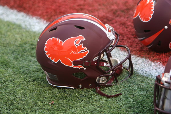
I agree
The gobbler in a gloss maroon would have been awesome.
I loved the idea of the gobbler because I wanted to see it for years, but I thought it just looked like a big orange blob on tv.
wholeheartedly agree
Fine for an alternate, not as the standard.
absolutely. Maybe the loluva game every year? Unfortunately it's a no go because that logo was retired the day after these were worn. Whit's not going to dig up old logos when they are looking at freshening up the current colorways across all sports.
And, Whit has said that he intends to have the VT on the helmets as much as he possibly can. Seeing that '15 unis were ordered last October (with combos for the helmets) I imagine we'll have VT on them for every game this year.
Made me think of the cartoon Hokiebird and turkey track helmets. Some of the most cringeworthy things I've seen on a football field.
Bring these back! And Tyrod! and RW in the background!

Those helmets looked goofy with the asymmetrical helmet stripes. That is my only complaint.
Any chance of the chrome look maroon helmet? It has been shown before
I'm not sure if Tech is ready to make the jump to chrome helmets. I would honestly rather see us go the other direction and wear more matte helmets. The ones we have worn that were matte were huge successes.
The stripes of any length, blow. Give us any iteration without stripes. I guarantee the jersey sales are down since they went to the stripes. Look around on game day and see what the fans are wearing.
I think you are wrong
The fans are wearing whatever was on sale when they bought a jersey.
You'll find successful seasons and player numbers. Fans aren't making their purchases based on stripes/no stripes.
F Stripes! I'm on team plaid!!!
So, a uniform made out of a plaid like this?
I imagine people would have strokes watching that pattern on running players on TV (like how some suit and shirt patterns look all weird on TV).
Your picture doesn't show up for me
It's not the length of the stripe... It's how you use it.
If you don't make the stripe fully disappear, no one will be happy. This is not a tip, this is a deep thought.
And even if you do make it disappear, a significant portion will be unhappy
And if you reboot the uniforms to the 1999 'classics', a portion will be unhappy
And if you overhaul the uniforms to something edgy and fresh, a portion will be unhappy
And if you stay the same a significant portion will be unhappy
You can never please everyone.