
As many of you are aware, we are in talks with Nike about a potential rebranding of the school down the line, with potential teaks of the logo set we have, to standardize our VT logo, as well as our colors, which will come alongside a new uniform set in 2016 as well as an overhaul of the Merryman complex (which might already be green lit. Not sure about it, but the Hokie Club Facilities page certainly makes it look like its happening). Not sure how many saw the renderings of the Merryman renovations that circulated earlier this year but one thing that really stuck out to me is that orange glow that is prevalent throughout the aesthetic for highlights. Which also happens to be the same orange glow that appears in this helmet wherever light hits it.

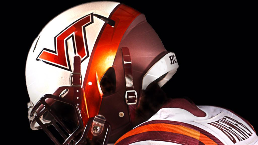


So it does make me wonder. Is this a foreshadowing of what Nike and our administration have planned for the future of the VT look, or is this just a pure coincidence. It certainly seems like there's enough consistency through our new reveals there might be something to this.

Comments
Nike is going to make us orange?! But orange is awful. Why can't Merryman just be #AllMaroonEverything? /s
Personal opinion though, but I love the orange on grey. It's a great look with the right amount of pop without overwhelming your eyes.
I really like the way its coming across, with the maroon/orange blend, with the orange almost being the pop of color out of the maroon base.
When done right, it looks really good. In these renderings, and with the helmets we're wearing this year, so far, they are doing it right.
It has an "orange represents the burning fire within" type of design intent. I like it. Sharp eye to pick that up.
Also, looking at those two helmets, the VT is clearly bigger (20%?) on the orange. Something we will go to on all helmets?
I believe so. I know they tweaked it to have it look like our standard VT logo where the width of the leg on the T is equal to the space between the V and that leg, and I believe that allows for them to make the logo bigger on the sides, as it makes it longer.
I actually prefer the look of the smaller one. There's probably a reason they did it that was in the first place
The smaller one is probably smaller because it wouldn't look right on the motorcycle helmet at the normal size (either the "old" normal or the "new" normal).
Deleted
Maroon should always be the primary color , orange accent only. However, whatever the color stop trying to be klempsum and win more games.
I would be good with the orange being the glow orange but I hope maroon stays as the primary focus for the athletic department. Use orange for the orange effect games as the primary and for the accents but maroon is VT's brand. No other school has the maroon color like us and we should keep that as our focus.
I thought the womens soccer was going to kind of be a sneak peek at the new focus. If that's true, this is what they wore the other night.

Call me crazy but I really like the "glow orange" as a night time color. It pops when it's darker out and looks amazing under artificial lights. During the day however, I 100% want the tricolors or maroon helmets. They sit better with natural light and give the orange metallic helmets a "big game" feel.
That being said, I see the Navy-esque lids being a one time deal for this year only. I say that only because the VT is the "tighter" version and doesn't have the proper spacing. Yes, they could change the stickers, but I think the new lids for the military appreciation game are a really nice touch that we do every year!
I'd be satisfied with either of these new helmets becoming the default helmet down the line.
And yet we still can't get a sticker that doesn't overlap the vent hole.
Excellent point.
I don't know how excellent it is when the point is what is causing the problems...
Hey, don't go advocating rounding the edges of the logo...
Like this?
Either of the bottom 2 would be str8 up tragic
Agree, and I'd go a step further and say anything but top left is tragic. I don't care for the new colors. Unless it's just an illusion, the maroon on the top right looks more "purpley", if that's a word.
Still wouldn't solve the problem. The problem is with the upper corners.
Rebranding = selling more gear. I'm for it. I already have a dozen fitted hats, what is a few more
I don't care if I'm in the minority - i love the new look / colors! Keep it up Whit!
I'm not one to usually spend money on helmets and such (mainly because I don't have it), but if there is an option to buy the mini or the full size of the new brain bucket, they will both be sitting in my office a week after they go on sale. Besides the issue with the sticker covering the hole I think it's one of the most solid helmets we've had.
love the helmets but the interior design in those images is less than inspired. the wall graphics look great but the actual interiors pretty dang boring.
Those are just a couple hallways in the offices themselves. There were many more renderings released showing more of the public areas, including main entrance, foyer, conference rooms, class rooms, etc, that look much better. They're not looking to completely gut Merryman, just to redo the decorations.
do you have a link to the other renderings for Merryman?
VT BOV Presentation
Section starts on Page 12... Merryman Renderings on Page 30
Facility upgrades begin on Page 74... Potential English Field expansion on Page 90... There's also renderings of a potential expansion of the softball facilities, a renovation of Rector, and a new on-campus golf facility.
would the merryman update include the cassell portion, where baseball/soccer/basketball etc have their space? it's pretty reminiscent of a high school down there
I believe its a complete overhaul of the entire interior. If you notice above, one of the renders on the Hokie Club site is for a hallway to the Olympic Sports coaching offices.
Thanks for pointing that out - would be nice to turn that into a recruiting strength for more than just football