
The VT Equipment twitter account just posted an image to hype up the game this weekend, and, sure enough, there's the orange helmet right there next to the ECU one.
So looks like we're seeing these again!
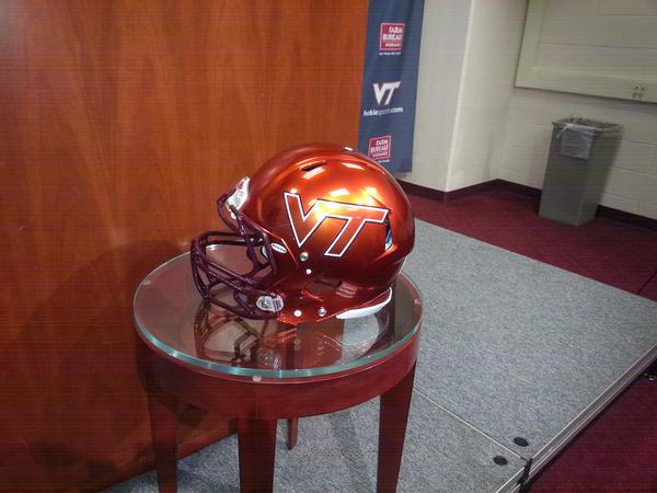
I'm guessing with white jersey and pants.
Forums:
DISCLAIMER: Forum topics may not have been written or edited by The Key Play staff.

Comments
Good! I'm a big fan of those.
I'll be a BIGGER fan if they can notch a win wearing them!
So going purely by our performance in the different helmets this season, we just doomed ourselves to a loss.
More like.... we'll be starting Lawson against Pitt
*Feverishly knocking on wood*
Knock that off, it's a family website.
guess he's going dipped... full or 3/4?
rekt
Ha ha ha.....I read on eleven warriors before the game where one of their guys was saying he hopes they don't wear metallic helmets cause they are doomed in those. That's when I was like crap.....now we're home with metallic helmets....we're gonna lose....and we did.
We better put up some big numbers in those helmets. If we blow this game those helmets should never be brought out again.
Big fan of the white ones we have been wearing. Also a big fan of our standard Maroon, hope to see those soon.
Can we make the VT maroon this time?
Can the VT actually fit on the helmet this time? I'm loving the striped helmets because the VT fits on the dang thing!
I believe it's about using a VT sticker that has proportions inline with university standard. Although that's kind of awkward because the tri-color helmets appeared to have the old, squished-up one (which I think looks better, FWIW).
Has the university officially "chosen" its standards that they'll be going by now? Or is it a matter of getting rid of all the old, non-standard ones going forward?
They've always had a standard, it just wasn't followed well. Going forward, they are trying to get to the standard. (even though the helmets we wore the last 2 weeks doesn't meet that. But I believe they were green lighted in the spring and the new focus to make things right has been a recent push. The orange chrome lids had the "correct" standard.)
It is dependent on the style of helmet. If players choose styles that dont have that vent hole then the sticker fits fine.
Can't they just make the helmet maroon?
I wish they would just make the mini-replica for these!
HokieAD@vt.edu
I noticed they left this helmet off of the souvenir cup at the Furman game, even though they included the Boise helmet and the helmets we wore the past two weeks. I've always wanted a flat maroon with white VT.
Just FYI, all the helmets for this year haven't been released yet. I hear the best is yet to come....
....do tell....
If I knew exactly what it was, I would.
They were tight lipped on the details, just mentioned that we haven't seen them all yet and they liked the final surprise.
They kinda let the whole "there is another helmet in the works" thing slip, but I'm still trying. May need some coupons from PeteBuddyWilson.
#sauces
It's not #sauces it's #marinades
Can confirm: more coming. Methinks some shiznit will be lost in the not-too-distant future.
Rumor (no credible #sauces) is Black for NCSU.
Did anyone save the powerpoint from the Nike rebranding powerpoint / did it have anything black jersey related?
No
Boo black. #AllMaroonEverything
I can neither confirm nor deny at this time....
#sauces
So it's confirmed :). I'll start marketing immediately.
Kinda like when you get caught in the NFL. If you didn't you deny. If you did, so say I cannot confirm or deny /s
Well I'm flattered you think I'm a credible source.
I've heard the same thing from some decent "sources"
The best have already been worn, never to be topped...
Damn good lookin helmets right there
OT: I came across this on ebay the other day: Link (This isn't my own auction, by the way)
To my knowledge no replicas of this helmet were made, so fans of this helmet might want to get after this one.
should be noted, starting price for our helmet is $102.50. The same seller has a UVA helmet listed, starting price, $1.04
loluva
Absolutely. I love these helmets. Didn't they retire the fighting gobbler logo, though?
Sadly, yes.
Yeah.
BUT, I would love to have the matte maroon with the "new" VT logo (proper spacing) on it in White/orange outline with the orange & white stripes that are on the old fighting gobbler one.
You lost me at the orange stripe.
I think he's talking about the asymmetric center stripe
^^^this.
Looks like the gobbler's getting nut-punched by the chin strap.
That helmet, and this one are my two favorite
This logo will forever be the GOAT. We've been wearing the old school uniforms for like 5 years now, but for some reason we retired this logo? Doesn't really make any sense to me at all. This helmet/logo will always get the upvote.
Edit: And yet after posting all this, I just realized I still have the military appreciation helmet as my avatar. LOLZ
wow, I really dislike that logo actually.
The issue I have with it is the T looks like Tennessee's way too much.
Good call
More often than not when I wear this shirt I get asked if I am Vols fan. So...I love the shirt but I hate that.
I have no idea why were still wearing throwback uniforms after retiring the throwback logos.
It will all be over with when Nike rolls out the new branding...
And our throwback shoulder stripes are worn by a few other teams too, so at least we aren't the only ones.
Feels like we got lazy in the uniform department when they first rolled out those white ones, and then kept wearing them. And then got maroon versions.
And then I knew we were in trouble when orange versions popped up.
We don't wear "old school" uniforms...we wear a classic style of uniform just like several other schools currently wear. Big difference. FWIW they seem to work really well for those other schools
And that logo could also be described as "classic", but whatever
Actually, the current uniform was designed by taking different aspects from various old uniforms that were worn by this school.
So it's the exact definition of "old school."
The original news release: http://www.hokiesports.com/football/recaps/20080418aaa.html
The helmets kept changing, and the TV logo was ditched a couple of years ago. But we still have the various stripes.
I didn't realize these uniforms dated back to 2008.
These look great close up, but on TV the gobbler just looked like a big orange blob.
Yep. Agreed.
I think it would have looked cool with a gloss maroon gobbler on the matte maroon helmet.
fingers crossed we'll see this look at some point:
Hey now, let's not get crazy. There's more to life than just putting flashy crap on the field to impress recruits.
Unless it works. :)
I like that as well. Not a fan of the chrome orange. The helmets last weekend were decent. I just feel maroon is our dominant color and should be worn as such.
FORREAL DOE. I would love to see us wear JUST this helmet for an entire season, home or away game doesn't matter.
Much as we have man crushes on some of the players, I think most of the guys here prefer they boys wear the rest of the uniform as well.
I don't think I'd mind seeing Brewer out of his uni... Good grief, but that man is attractive. And I don't even like facial hair!
I was going to say something like "I hope you're a female", but that would just sound homophobic. So I'll just say to each his/her own!
^ was the first girl on TKP. But I'm sure there's plenty of man crushes on him on this site, too ^_^
Not a fan of #TEAMNOPANTS?
Brazzers logo? Now who's feverishly knocking on wood?
GIF
context NSFW
Just to be on the safe side, link it instead...it was actually born out of a funny "unnecessary censorship" post, which, in context, is pretty obvious. Since it's been given a Brazzers tag after the fact, that can sort of change the implication...and people's work filters.
I do love these helmets. And coupled with the maroon uni...it was sweet.
But at the end of the day... this weekend we better beat the shit out of ECU, damn it.
Me likey the orange glitter.
The tri-color is sharp too......up close......is it just me, or from a little distance, don't they look like white bicycle helmets on our players, LOL?
You know, it just donned on me... those helmets remind me of the aliens from the Stargate movie for some reason
I want to see what these look like in a day game. I think they lost something under the lights at Lane. Sunlight should make the metallic effect pop.
It's gon' rain.
Yup, The Weather Channel is saying a there is a 100% chance of rain on Saturday in Greenville, NC.
What on EARTH are these things
Ugly
*Figurative downvote for how atrocious these are* haha... not a fan of the mirror helmet fad AT ALL
Regarding that chrome thing with a photo of a fighting gobbler...
Maybe if it were chrome maroon or orange it would be good. Not sure about just the pure chrome.
Maroon on chrome always look purple to me. And add the orange and it just hurts.
Maybe if we play a game in Mexico
moved, for clarity.
I would love for these to be our standard Home helmets with all maroon uni and the Maroon be our Away helmets with white uni
I'm really excited to see these helmets again. I seriously think they might be my favorite.
Gotta say the helmets we've worn the past two weeks are pretty awesome. I dig those lids. I hope we keep using them (we've scored almost 100 points wearing those helmets in two games). We'll see how the metallic orange works out this weekend. But I do think they will look good with the white uni's.
I'm a big fan of the orange helmets and the helmets that we have worn for the last two weeks. I think they look awesome and are a step up from what we have been wearing over the years (Hokie Bird helmet, Hokie Bird track helmet, the digital orange camo, etc.). But I will say that I would like to see our standard maroon helmet at some point. 4 games in and we haven't worn it yet?
I swore I saw a picture from practice this week (I assume it was this week and not an old image recycled) and the team was wearing maroon brain buckets. I know it's been said before the team usually practices in the helmets they'll be wearing that game week.
Yes, but if it's a special helmet they'll only use them the last couple days so they don't get too messed up before gametime.
Orange lids, white jerseys, maroon pants.
Credible #sauces here.
I don't see that looking good.
Looks pretty good to me....
That does look good. Hope it looks that good on the field.
Oh hell no.
Just the messenger...
But I do like the look of maroon pants with a white jersey. Not so sure on the orange helmets, though.
Edit: Meant to reply to EddieVT
I want this back, and I want it now. Bryan Randall and all.
Confirmed:
Maybe they'll break out this one:
I see what you did there, but maybe that's better as an INSIDER joke...
The treadmill looks like NC there. I think we could get it in the shape of VA and not lose anything.
We could also get it in the shape of Charlottesville just for giggles.
I don't think a burning dumpster makes for a very good logo.
A burning couch would be West Virginia.
You could have TimeCop hold the leash, though.
Or TN
We have diverged so far from what I would find acceptable that I don't even know how to respond anymore. The more choices we have, the more we have BOTH strayed from our brand identity AND failed to find anything that is an improvement. I like some components of what we have done, but it all just seems like such a mish-mash now. I'm not a uniform traditionalist (read: I like Oregon's uniforms...but they have gone off the rails the last few years) but I desperately need to see some consistency. Switching the logo around is awful, never do that. Changing the proportion of the logo to the helmet size is fine, but that proportion should then be locked in. Don't go big logo, then back to normal size logo.
If we are still letting the seniors pick the uniforms, Whit Babcock needs to nip that in the bud. He has a multimillion dollar company to run, you can't keep muddying the brand. The football team, and their uniforms primarily, is the key marketing interface of the entire university. Develop some rules. Introduce some cohesiveness.
No Maroon helmets until October!?!?! Has that ever even happened before?
It was said in another thread that in the mid 2000's we had the mentallity that we expected to thump everyone we played and that feeling is gone now. I could be reaching a bit but that feeling went away for me around the time we switched to these "old school" uni's. They, to me, look dopey and not intimidating at all. I thought our unis in the early and mid 2000's looked beast. Like i said, I could be grasping at straws but thats part of what message boards are for.
PS-I like the orange lids
Whether we win or lose has to do with a lot more than the uniform we wear that day
I want a matte maroon helmet with "HOKIES" in print on the side. Tired of throwback VT logo and cartoon turkeys.
You're going to see the current VT logo exclusively for at least the next couple of years.
Thankfully

And by that, we mean the university standard VT logo, which you see on the orange helmets from earlier this year. The ones from the last 2 weeks have one that doesn't comply, but they had to be grandfathered in because we couldn't get the decals corrected in time before the games.
I also wouldn't be shocked to hear that the reason we haven't seen the maroon lids, yet, is that there has been a delay in getting the decals for the standard helmets produced.
It was probably mentioned in another thread, but what's the difference (brand wise) between the two VT helmet logos for this year?
Start here...
http://www.thekeyplay.com/comment/reply/10031/305386
Am I the only one not seeing the difference (other than color)? The spacing of the V and the T and the alignment of the bottom of the T and the bottom of the V is the only thing I can pick up.
Here's the thread that came from, with some other responses below that one (it's about 60% of the way down the page.)
http://www.thekeyplay.com/content/2015/august/27/bitter-blog-babcock-offers-clarification-player-fines-shuts-down-entire
Basically, there should be enough room to turn the logo 180*, and the T fits between the V and T. On the helmets we have been wearing for the past several years, this cannot be accomplished as the spacing is too tight. (It should fit with the outline...the one in your avatar would fit withOUT the outline, but not with it.)
Basically, the width of the space between the V & T should be the same as the width of the bottom of the T
Then isn't the width of the space between the V & T too big in this helmet?
Not when you factor in the outer edge of the maroon outline
It just looks off in this image because of the lighting, and the fact your eyes are playing tricks on you. The white is the more dominant outline color on that background, so your eyes are trying to make you think the white is the outline, making it seem off, but if you pay attention to the maroon, its actually correct.
my eyes are just fine, thank you.
While I like these helmets, I would appreciate them with a more modern looking set of jerseys and pants.
Give it a year.
Have a feeling the helmets we're seeing this year is a bit of a tease for what's to come. Sounds like we're working with Nike to refresh our look going forward, (no logo updates included, from what I have been told #sauces)
Our #sauces seem to be of the same flavor variety.
Would that be sweet, salty, or bitter?
Umami?
That makes me feel better. Get the logo right. Develop a new set of uniform combos that are consistent yet interchangeable (initially what Oregon did). Profit.
Hmmm.....
I can't figure out what to make of this.
Moist
Leg. But I was more of referring to the helmet part.
It would make more sense if there were a backlash against the new orange helmets.
I hate to say this, and maybe I'm color blind, but I kind of feel like these helmets come off a bit red, at least at night. This is unfortunate considering we wore them against OSU. Did anyone else think this?
I love these helmets, though, I think they'd come off more orange in the day.
Everyone's eyes are different and we all see color differently. I will debate you for days on things that are purple/dark blue. I've noticed a lot of people call things yellow and I'm thinking THAT'S ORANGE! I've also noticed people call things orange and I see bright red. I'm not colorblind at all, but I firmly believe we all see colors slightly different.
the dress was green
I still think that dress is White and Gold! If you know what I mean!
You know, I wasn't even thinking about that dress when I was typing this. That whole thing was just absurd to me. Besides, I was really talking about subtle differences in overall colors, re: reddish looking helmet.
I dunno man, it seems like it's a bit more than a slight difference using those examples
Back in one of my college philosophy classes, my final paper was on the idea that there is no way to prove that any two people actually see the same "color" when they see any given named color. For example, I see red as what I call "red" and you see red as what I call "blue." We both call it red and don't even give a second thought to the difference because we can't see from each other's eyes.
Ok, I'm done with the orange helmets. 0-2, time to retire them.
0-2 in maroon pants. Just saying. #teamnopants