
A look at the new word mark? https://t.co/5FY97Dqrub— Clark Ruhland (@Hokie20) January 16, 2016
Thought I'd drop by Green Vina factory in Binh Duong, Vietnam & increase production on VT gear
Thx @Nike! pic.twitter.com/L46DYIUuvp— Whit Babcock (@WhitBabcock) January 16, 2016
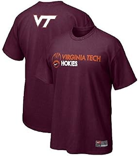
As a reference, this is the current one
Forums:
DISCLAIMER: Forum topics may not have been written or edited by The Key Play staff.

Comments
Word mark?
Basically, it's a particular font or form to a brand name. The script font of Coca Cola is a wordmark.
So, font....to us plebeians.
+1 for the mention of the plebs. I miss the Roman Republic.
Actually, I think "word logo" would be a better definition.
Just using the Eagles as an example, their logo is the bird on their helmet. But their word mark is the "EAGLES" painted in the end zone.
So what this post is hinting at is that the font in our word mark might be changing.
XKCD
That's great! I'm going to use this from now on.
That AND the Irish exit with a twist.
Before you make your exit, tell someone something random that you would love to have at that moment. "Man, I would love to have a bath right about now." When everyone realizes you're gone and starts asking where you are, that guy will pop up and say, "I don't know! He said something about a bath and that's the last I remember seeing him!"
What's the difference?
Different font.
Kinda reminds me of some text I've seen on Oregon shirts. Of course they get the whole 9 yards treatment from Nike.
That is a totally badass Oregon shirt
I kinda like the old one...
#ProgressIGuess
I feel like I've seen the "new" one before; it probably was from a jacket that wasn't Nike.
This kind of scares the crap out of me, but I guess we will see.
IN WHIT WE TRUST
LET THE REVOLUTION BEGIN!!!
I am actually a little disappointed that we are getting our Tech gear from Vietnam. I hadn't realized that before.
I assume that's where Nike produces their clothing so therefore we also get ours from there. Just curious though, where did you think it was coming from?
While it makes little difference to me, coming from the family I do I can see where some people might have reservations about it.
I understand your point, but in a way, isn't that sort of what we were trying to do over there? For the record, I am a Vietnam Era Vet.
Edit: Also for the record, I am not talking about the American jobs going overseas issue.
I assumed India or Thailand.
Vietnam?
There is very little large scale clothing manufacturing inside the US anymore.
Didn't we just change this like 3 or 4 years ago?
Wonder if itll be like any of the "leaked" ones from the Board of Visitors presentation last Spring?
Any pics?
As long as it isn't a rounded off V. I'm good with it.

"Alex, I'll take current mark with new colors for 1,000"
Anything other than the all sharp edges can go to hell
Great post - I'd upvote it...if only it were true...
Maybe 10 programs in the country can get away with no changes, and half of THEM have strayed in varying degrees at some point in the last few years (see Notre Dame; Nebraska; OSU; Oklahoma; Michigan; Texas). In fact, outside of PSU, USCw, 'Bama, Auburn(?), Wisky(?) I can't think of a school that HASN'T done it. We certainly can't presume to be above it.
I think the prevailing "wisdom" that uni's have gone nuts to lure recruits is short-sighted. Recruits learn to love the colors of whatever school they think will best serve their own interests. This stuff is for Nike more than anyone else - TV, retail, etc - and it's not like we pay for them, right? We've suffered through some truly awful iterations (Ninja Decepticons v. Boise, one-orange shoulder monstrosities, the aaaaalmost-cool grey/maroon ensemble v. Bama, those (gag) turkey (gag) track lids). But some have been absolute fire, including pretty much everything we wore this season, and I for one am happy to do whatever we need to do...to keep us...out of Adidas or UA. Yuck.
"If it makes it more fun for them, I'm good with it." -CFB
Just, PLEASE DEAR GOD IN HEAVEN, no rounded corners on the logo. What are we, a skateboard company?
FWIW, there are no logo changes coming. The only thing that's going to happen is a standardization of colors and proportions. Whit said as much. The leaked documents were a brainstorming session from Nike people and are not actual proposals or logos being considered by VT administration.
i like the one we've been using for the last decade or so. the new one looks a bit like a non italicized version of the ACC logo font to me (and that's not a compliment). I guess at the end of the day, as long as we are consistent and build the brand around it, it will be fine.
i also see the VT logo on the gray background appears unchanged, so all that angst over the leaked Niki presentation may have been for naught. glad they didn't mess with it.
I was a big fan of the old one, aka Gil Sans font. I even try to work it into my projects at work when I can. New one is fine but I'll still use Gil Sans with pride.
I can't give an example but this isn't new, or at least not "secret" or something. I swear I've seen this wordmark a ton on stuff around campus the last year or two.
Doesn't look like it has the usual "sharpness" of a Nike-made logo. Almost like a cheap knock off or Under Armour.
That's some Star Trek font right there...
That's just what I was thinking, sort of TNG-ish.
Whit visited a sweat shop?
Well, with Nike's advancements in moisture wicking materials and technology, they are attempting to reduce the number of "sweat shops"
I mean the work they're doing isn't glamorous, sure, but not a lot of people's work is. I don't think Whit would be sharing pics of it if it was the stereotypical "slave labor" sweat shop people tend to assume every factory in Asia operates as.
Ohhhh.....I just thought that he had shown up at Freshman Chemistry lab at Davidson.
Nailed it.
The stories I could tell about the things in those labs before they tore Davidson down...
I didn't even know they tore Davidson down. But I did find a webcam of the renovation. There's even a link to a time-lapse view.
Cool.
Huh... If I'm not mistaken this actual wordmark was part of last summer's leak, part of which was posted above
Please no rounded font...!
I'll tolerate just about anything as long as it includes getting closer to Chicago Maroon and Burnt Orange. Too many uniforms in the past have looked more like purple or reddish-maroon and Clemson-ey orange.
Also, no rounded edges. Rounded edges are, by definition, not sharp.
Didnt we just get a new court in Cassel with the current font on it? I may be the only one, but I like the current font.
Personally, I don't they can improve on the current one.
perhaps one day these gems will be brought back....
Absolutely, as far as logo's go, those are my favorites
I like those, too...as a change of pace. However, I remember when we changed to the square root of one and the foghorn leghorn because everybody hated the old ones
The square root of one isnt a bad logo by any means. I do like the old TV and the old gobbler, although I can remember when I was younger when that logo was still in play, not being able to recognize that it was a turkey trying to fight. It always looked like a headless turkey to me.