Bests:
1. The drunk wave on Tulane's helmets. Awesome logo.
2. Buffalo. Squeaky clean.
3. Really like the look from SCAR. Simple and bold.
4. Pitt script on errthing.
Worst:
1. Notre Dame's baby puke green.
2. WVU's helmet stickers. God, but it with fire like everything else in your state.
3. Pitt's throwback.
Want to see on TV before judgment:
1. Ohio State's alternate throwbacks.
2. Purdue's new alternates.
Log in or register to post comments about the Virginia Tech Hokies
The Good:
1. UNC vs. UGA Color on Color
2. Pitt Scipt and Pitt Throwback. The throwback should stay. Hate the "gold" they have now. Looks like snot colored helmets
3. FSU spearhead arrows on field
The Bad:
1. Houston Downgraded
2. anOSU alternates, Vertical stripes are a bad thing
3. Wisconsin's numbers, gut reaction
4. Notre Dame Shamrock Series Helmet Color
The Ugly:
1. Cincinnati, The Bearcat on the sleeve is laughable
2. Iowa State, why are their should stripes so long?!
3. Notre Dame Rotating numbers, 1 number is fine - but all single digits?
Log in or register to post comments about the Virginia Tech Hokies
Also, look for the Hokies to be doing color-out games on Sept. 17 (white, against Boston College), Sept. 24 (orange, against East Carolina),and Oct. 20 (maroon, against Miami):
#sauces
There is no orange uniform this season. They were not ordered from Nike. We still have the orange helmet we wore last year, but the logo is now white instead of clear.
Log in or register to post comments about the Virginia Tech Hokies
Not a fan of the all white on the orange helmets. Also, saw images that make me think orange helmets are more chrome than metallic, which I'm also not a fan of.
Log in or register to post comments about the Virginia Tech Hokies
Back in the day, the effect games, especially orange, just reflected the crowd. But then they came out with the orange jerseys, and it's been going downhill from there.
So, in 2006, I would agree with you. But in 2016, I've seen enough to be scared.
Log in or register to post comments about the Virginia Tech Hokies
That's true. Every year since 2008 we have had an orange jersey for orange effect except for 2010 and 2015. Though I would have expected an orange jersey to be shown when we had the new uniforms released.
For now, I'll stay cautiously optimistic that we won't wear an orange jersey or pants and then melt down into anger and sadness when I see an orange jersey.
Log in or register to post comments about the Virginia Tech Hokies
Some commentary on that article:
-BC -- fuck Matt Ryan
-FSU -- cool idea with the field arrows.
-Miami -- If you're going to generate a jersey schedule, maybe there should be some more variety in there. One green, and then the rest appear to be the standard orange at home, white away.
-UNC -- the pads on the dummies in the tweet pic look like they have girl parts.
-UVA -- I've never been a fan of helmet numbers or nonsymetrical designs, but at first glance, these look better than some of the horrendous combos generated by Mike London's staff. What worked well with the red and blue of Richmond does not work for the orange and blue of UVA.
-VT -- aren't they some sexy bitches?
Log in or register to post comments about the Virginia Tech Hokies
I was just scanning through to see if anyone dropped the obligatory "fuck matt ryan" yet, if not, I was going to do so, cause seriously, fuck matt ryan.
Log in or register to post comments about the Virginia Tech Hokies
OK State did the same thing that VT did with the foghorn leghorn helmets. Put a huge logo on the side (The Cowboy), which will get covered up and unsee when the chinstrap is applied. Why don't people see this coming?
Dig the WW2 Air Force helmets though, you can see those even with the straps on.
Log in or register to post comments about the Virginia Tech Hokies
I also really dig Iowa State's white helmet, Tulane's new additions, NC State's diamond logo helmets (O'Cain approves), Pitt's throwbacks, and South Carolina's red helmet.
Some bad things are Under Armor's obsession with the diagonal thigh stripe, Notre Dame's under the lights uniform, and thigh pads with logos being worn with white pants. It's basically the wet t-shirt contest of college football, just conjures opposite feels.
Log in or register to post comments about the Virginia Tech Hokies
I guess Murland either isn't doing anything new this year, or are waiting until game weeks to unveil the new crash test dummy uniforms...home and away leaked here...
Log in or register to post comments about the Virginia Tech Hokies
WVU with the 125th logo sticker for the opening weekend. Whenever I see them do soemthing like this:
When #WVU kicks off the season next Saturday against Missouri, we will honor 125 years of Mountaineer football. pic.twitter.com/lfRZGoDmAA— WVU Football (@WVUfootball) August 27, 2016
See also this throwback, to the early '70's
It makes me think of this:
Log in or register to post comments about the Virginia Tech Hokies
Penn State Uniforms on the Uni-watch list because of a number restriction from Nike? Pretty sure Nike limits all numbers for their jersey's to schools...
Log in or register to post comments about the Virginia Tech Hokies
I don't think this warrants it's own thread, but it deals with branding and I know there had been talk about how crappy our equipment truck was compared to other schools.
Anyways, it looks like we have an 18-wheeler now instead of a smaller truck. It looks good, not gonna lie
So, seeing UVA's uniforms in action on my TV screen....
Those helmet...Blargh. Skipping the part where the "V" looks better with a "T" than with scissors, the white "V" with orange outline and scissors is a better look. They went with an orange "V" with white outline and scissors. Plus, the numbers on the other side were the opposite -- white numbers with an orange outline.
Short version -- pick a color scheme and stick with it.
Log in or register to post comments about the Virginia Tech Hokies


Comments
So, my best and worsts NOT INCLUDING VT or UVA.
Bests:
1. The drunk wave on Tulane's helmets. Awesome logo.
2. Buffalo. Squeaky clean.
3. Really like the look from SCAR. Simple and bold.
4. Pitt script on errthing.
Worst:
1. Notre Dame's baby puke green.
2. WVU's helmet stickers. God, but it with fire like everything else in your state.
3. Pitt's throwback.
Want to see on TV before judgment:
1. Ohio State's alternate throwbacks.
2. Purdue's new alternates.
For some reason, I don't know why, I liked Pitt's retro looks. Agree on Buffalo tho, and I think Purdue's will look good on the field.
Because they're awesome. They should wear them every week
Looks like a high school uniform. A good one, mind you, but it's not my style.
That's kinda how I feel about Pitt's standard uniform. Take that Nike Swoosh off and replace it with a Russell 'R' and they could be Georgia Tech
Definitely awesome. They should switch back to those.
To Piggyback off of this:
The Good:
1. UNC vs. UGA Color on Color
2. Pitt Scipt and Pitt Throwback. The throwback should stay. Hate the "gold" they have now. Looks like snot colored helmets
3. FSU spearhead arrows on field
The Bad:
1. Houston Downgraded
2. anOSU alternates, Vertical stripes are a bad thing
3. Wisconsin's numbers, gut reaction
4. Notre Dame Shamrock Series Helmet Color
The Ugly:
1. Cincinnati, The Bearcat on the sleeve is laughable
2. Iowa State, why are their should stripes so long?!
3. Notre Dame Rotating numbers, 1 number is fine - but all single digits?
Is this a WV thing that is NSFW?
Was I the only one who thought the cleats Notre Dame is rocking were Bean boots at first?
So awesome. Despite some not liking them,
feel like they were a great choice.
I thought Nebraska's were sweet.
I like Minnesota's "brick" stickers they will use as helmet stickers. Would love to see us do something similar with Hokie Stones.
Why don't we use Hokie Tracks? Those always look good on helmets. /s
Just an excuse to use the GIF.
Pitt throwbacks are hot
Tulane Green Wave octopus guy is funny
Penn State is lazy
Notre Dame throwback is tight
Pitt and Notre Dame? Really?
I'm with ya on Notre Dame, Horse. They look good.
#sauces
There is no orange uniform this season. They were not ordered from Nike. We still have the orange helmet we wore last year, but the logo is now white instead of clear.
No orange uniforms?
Not a fan of the all white on the orange helmets. Also, saw images that make me think orange helmets are more chrome than metallic, which I'm also not a fan of.
I think that just means it's an Orange Effect game where the fans wear orange. It doesn't necessarily mean the uniform is orange.
Back in the day, the effect games, especially orange, just reflected the crowd. But then they came out with the orange jerseys, and it's been going downhill from there.
So, in 2006, I would agree with you. But in 2016, I've seen enough to be scared.
That's true. Every year since 2008 we have had an orange jersey for orange effect except for 2010 and 2015. Though I would have expected an orange jersey to be shown when we had the new uniforms released.
For now, I'll stay cautiously optimistic that we won't wear an orange jersey or pants and then melt down into anger and sadness when I see an orange jersey.
There is no orange jersey this year. Lookout for the orange helmet that game, though.
Some commentary on that article:
-BC -- fuck Matt Ryan
-FSU -- cool idea with the field arrows.
-Miami -- If you're going to generate a jersey schedule, maybe there should be some more variety in there. One green, and then the rest appear to be the standard orange at home, white away.
-UNC -- the pads on the dummies in the tweet pic look like they have girl parts.
-UVA -- I've never been a fan of helmet numbers or nonsymetrical designs, but at first glance, these look better than some of the horrendous combos generated by Mike London's staff. What worked well with the red and blue of Richmond does not work for the orange and blue of UVA.
-VT -- aren't they some sexy bitches?
This is the first "fuck matt ryan" post I have seen on this site that doesn't have 100 legs. Maybe you should bold it so it stands out more.
Edit: Ok. Up to 20 now. Much better.
I was just scanning through to see if anyone dropped the obligatory "fuck matt ryan" yet, if not, I was going to do so, cause seriously, fuck matt ryan.
OK State did the same thing that VT did with the foghorn leghorn helmets. Put a huge logo on the side (The Cowboy), which will get covered up and unsee when the chinstrap is applied. Why don't people see this coming?
Dig the WW2 Air Force helmets though, you can see those even with the straps on.
Kentucky has such a clean set of uniforms.
I also really dig Iowa State's white helmet, Tulane's new additions, NC State's diamond logo helmets (O'Cain approves), Pitt's throwbacks, and South Carolina's red helmet.
Some bad things are Under Armor's obsession with the diagonal thigh stripe, Notre Dame's under the lights uniform, and thigh pads with logos being worn with white pants. It's basically the wet t-shirt contest of college football, just conjures opposite feels.
If you think Kentucky's checkerboard jerseys look clean I would hate to see what you think is messy.
These Kentucky jerseys remind me of Croatia's soccer jerseys, which are definitely beautiful.
Beautiful and clean are two different words.
Def remind me of that, love the checkerboard.
Certainly not a jersey with a small checkerboard accent on the sleeves....
I guess Murland either isn't doing anything new this year, or are waiting until game weeks to unveil the new crash test dummy uniforms...home and away leaked here...
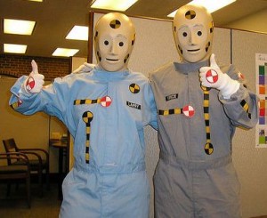
I love the HokieStone Unis. Now we just beat the Piss out of Tennessee so can wear those uniforms again.
WVU with the 125th logo sticker for the opening weekend. Whenever I see them do soemthing like this:
See also this throwback, to the early '70's


It makes me think of this:
And what is up with this whack helmet stickers, WVU?
This would have been a better choice.

They last said they were undecided on using those during the season or not. The best thing they could do is burn them all.
Penn State Uniforms on the Uni-watch list because of a number restriction from Nike? Pretty sure Nike limits all numbers for their jersey's to schools...
Air Force looks AWESOME in my opinion but I've always been partial to the A-10 and other planes with the shark teeth.
I find that many of the armed forces academies have awesome alternate looks lately.
They definitely have been killing it. This one was my personal favorite a couple years back.
I loved these, especially the helmet, which we copied off of. Would have also loved Keenan Reynolds to have won the Heisman last year
I dig the helmets a lot but I don't think Nike could have found a more awkward looking body as their model for the unis.
Actually, they could.
I see that picture, and I think this:
That P40 look AF helmet wins the internet everytime it's posted.
I don't think this warrants it's own thread, but it deals with branding and I know there had been talk about how crappy our equipment truck was compared to other schools.
Anyways, it looks like we have an 18-wheeler now instead of a smaller truck. It looks good, not gonna lie
I'm with the writer, that Battle at Bristol patch is borderline obnoxious.
So, seeing UVA's uniforms
in actionon my TV screen....Those helmet...Blargh. Skipping the part where the "V" looks better with a "T" than with scissors, the white "V" with orange outline and scissors is a better look. They went with an orange "V" with white outline and scissors. Plus, the numbers on the other side were the opposite -- white numbers with an orange outline.
Short version -- pick a color scheme and stick with it.
Interesting that UCLA restored their shoulder stripes to the larger classic style and "everyone is excited"....they get it.