
With @HokiesFB tweeting out the grounds crew preparing the field, I figured we should delve off topic into a discussion of the field design; both for VT and comparing to others.
You know it's real when the lines are going down pic.twitter.com/Y34hGRciQA— HokiesFB (@HokiesFB) August 31, 2016
THE SEASON IS ALMOST HERE!!
Disclaimer: Nothing but props to the VTGroundsCrew. They do a tremendous job preparing the field to not only be safe, but also look great.
Let's examine Worsham Field:
Midfield Logo: We actually can't go wrong here. The VT is consistent and uses great brand recognition.


It even looks good in Lane Stadium North!

Endzones: Consistently strong with "Virginia Tech Hokies" in white, bordered by O&M.

Thoughts on ACC Championship where endzone has Maroon as a solid background?

What about this ole classic? For some reason I always liked this, maybe not for use today though.

Sidelines: The one thing that bugs me about Worsham Field is the thin sidelines. I feel like most fields utilize a thicker sideline, which makes the field pop.
Lane - 
Neyland (UT) - 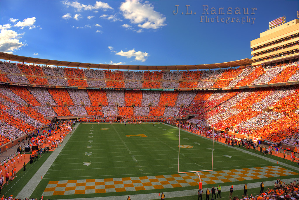
Memorial (Clemson) - 
Tiger (LSU) - 
Do you think Lane should use a thicker sideline? Do you think they should alter the endzone design in any way? Midfield Logo? How about some minor details that could improve the field? What's your favorite thing VT has done for field design (Frank Beamer Signature, Maroon effect, Orange effect, etc.) Which college stadium has the best field design?
Comments
Pet peeve time - Put 'VIRGINIA TECH' in both end zones. The one with 'HOKIES' just looks barren and sad in comparison
relevant:
Also, I hope they outline the end zone lettering with orange or something. It doesn't pop if it's all white. I'm assuming they'll get to it, but dammit, I want it to be Saturday NOW
As close as we can get to having it...

I got curious...

Then I got really curious...

i like both of these...thick boundary lines is a must-have IMO...the fully colored end zones looks good to me but I think it looks just as good with out the maroon fill
Make both ends zones orange text on a Maroon background and the center logo white
Either that or one end zone white text on a Maroon background and the other white text on an orange background with a white midfield logo.
Doesn't get much more VT than that
Orange Text was hard because it needed a white outline.

With a thick border around the field you need some color in the endzone. The all maroon feels like a bowl game though, so maybe more what clemson does with theirs. Maroon letters that take up the whole endzone.
YES. Or at least if they insist on putting "HOKIES" in one, switch it to the South endzone. When it's in North the field reads HOKIES VIRGINIA TECH (since the midfield logo is upright to the west stands) and it drives me crazy
I always liked the tiger eye on LSU's field.
I think it would be cool to put down an orange or maroon (whichever pops more) 25 yard line in honor of Beamer.
LSU's fade of the tiger eye is one of the best midfield logos out there IMO.
agreed, a part of me wishes they did that with the Hokie eye
I painted this on a beer pong table once and ever since have thought the bird looks cross eyed in this logo.
I've always been a fan of ECU's mid-field North Carolina/Pirate hybrid as well.
I'm just not a fan of logos that span 30 yards of the field. Seems a little excessive to me
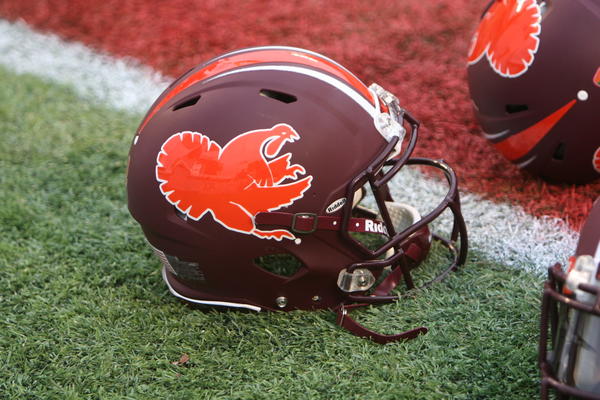
I know we don't officially use it anymore but I always thought the old school Fighting Gobbler logo at midfield would look great.
DING DING DING DING
WINNER WINNER TURKEY DINNER
I think that Frank Beamer signature should be on the field for the rest of time. It's a subtle, but fantastic way to honor his legacy.
edit: I think people are getting confused. I didn't mean to name the stadium after him. I meant this
It's already Worsham Field.
It is indeed Worsham Field, however there is no bigger living fan of Frank Beamer than Wes Worsham. I am willing to bet Wes would be first in line to support an idea of this nature in regard to CFB. That being said I think the signature on the field might be a little too strong of a sentiment to have permanently on the field for eternity. The idea someone shared above with regard to painting the 25 yard line either orange or maroon would be subtle and become iconic IMO.
"You are looking live at Frank Beamer Turf at Lane Stadium/Worsham Field. I, unfortunately, do not see Katherine Webb in attendance today, but I remain hopeful."
Yeah, that feels like a bit much.
I agree that they should use the thicker sideline, like you said it makes the field "pop" and just looks better overall. I personally would LOVE to see them use the Beamer tribute logo at opposite 25yd lines this season, I thought it looked great last season. As far as the endzone goes, I think it's fine as is, but I think Alum's comment about making them say "VIRGINIA TECH" in both zones is a good idea.
Beamer tribute at the 25s is a great idea
How about this?
this picture disappoints me...It looks like "HOKIES" is going in NEZ...would prefer "VIRGINIA TECH" in both ends
It did
Another Pet Peeve time...
We have a school specific font that we just spent a few years with Nike developing that is supposed to unify the brand in everything we do athletically... Why have we not put it on the scoreboard and padding, yet?
It's in the works I guess. They have been changing things out the last week.
Time and money. It's the same in Cassell; the scoreboard may or may not get changed during the season and the floor won't be repainted until next summer.
Why are the K and the I touching? All of the other letters are spaced appropriately.
It goes weirdly deeper than that. In the end, it really makes sense and is the best overall look for the typeface. It seems there were sacrifices in the process of the design. The first thing I noticed is why the angles of the K and I touched but the angles in the H and E don't. Fix that. So, one option is to make the K 'taller' which lessens the width of the letter and creates that same space we see in the angle not touching the vertical parts of the H and E without having to push the letters away from each other. But then I would guess the width of the K, as slight as it would be, would look completely different with the rest of the typeface and even seem like a different font entirely, especially against the E and S. So after realizing that isn't the solution, the next step is to leave the design of the K as is and mess with the kerning. So you push the I away from the K. But then it ruins the consistency in negative space across the typeface. The width of the inner negative space of the 'O' and the width of the inner negative space between the arrow point of the 'K' and the 'I' right now are the same. Even though that also seems slight, Hokies would look like two separate words if they made the K and I not touch. So overall, I would bet this was the best design for the HOKIES typeface, despite the play button shape the negative space creates. That was their sacrifice in the design. I'm personally a fan, I think it's clean, modern and innovative which embodies our university's M.O.
Sorry, you probably didn't ask for that response but I thought it might be of interest to some people to shed light on the possible thought process behind the design.
Please don't apologize for providing useful insight into a topic of discussion.
It looks less about spacing and more that the designer set a standard that they kept true to.
It looks like it is the only one with odd spacing but it isn't. Actually the designer has consistently removed spacing wherever the "I" is next to a letter with a "V" shape. So in "VIRGINIA" the "V" and "I" are touching, as are the "I" and the "A" at the end of the word.
This rule applies to the "K" and the "I" in HOKIES because the "K" is designed with a clear "V" shape.
Good point. I hadn't even looked at Virginia Tech typeface. Definitely creates a consistent design in full context. Just the nature of the K creates that arrow with the negative space.
And if you look at the negative space in the E and rotate it 90 degrees to the right, you get a door to another dimenison...no? Just me?
Like the FedEx logo hidden arrow, all I can see now is HOK < IES
New logo does look awesome.
We need to stop being so tight with our paint budget and get thicker sidelines and other embellishments. The alternating thing they did at the spring game was great!
Whenever we get back to the ACCCG, they can do whatever the hell they want with the endzone lol but I've always like the maroon effect midfield logo. Agree on the north endzone looking barren.
We should put the fighting gobbler logo at midfield.
Great idea! Which color, though?

Maroon base... thin orange outline
Orange on the field for us is nooooo bueno if its not counterbalanced with more maroon
This was a bad look for Worsham Field:

Maroon. And then we can paint the field Hokie Stone
PLEASE WHIT MAKE THIS HAPPEN
As long as we don't change the field to orange artificial turf, I'm a Happy Hokie.
Then we could pull the ole orange everything jerseys on the completely orange field like Boise State does with blue.
Did. Until the NCAA outlawed it.
Shows how little I follow Boise State.
I'd love to see the thick stripe around the entire field
I love the Idea of the Fighting Gobbler Logo on the 50 yard line. Also agree that the sideline needs to be thicker.
The 32 yard marker needs to be in a different color. Black or a school color but it should be a permanent fixture
Frank Beamer face from Georgia Tech game in center
I do think this is killer for a throwback, but given the time/money/effort spent on the rebranding with Nike, including the new wordmark font, I thin this will never appear on Worsham Field again. In any form or color scheme.
And along those lines of the rebranding, I feel that the days of doubling up the "Virginia Tech" in the endzones is over also. This may not be seen for some time...

Random story but I ran into Wes Worsham about 10 years ago and he was complaining that the school moved his seats off the 50-yard line. Had to make room for bigger donors or something like that. My response was "How can they move your seats? Its your field!"
From what I can tell they moved his seats to the bench next to the backup QB. Dude is always on the field, when did he ever sit down?
And I think we should paint the VT at the 50 whatever color the game is...so for the Orange Effect it should be orange, Maroon Effect should be maroon, Military Appreciation should have the flag, and just do white for the other couple of games.
TL;DR for a lot of posts on this thread. Sorry folks.
I like the LSU purple-gold alternate color scheme in the end zone. I also actually like Tenn's checkered pattern too.
I guess I'd like the new VT-style writing with some orange / maroon combo of the LSU-style end-zones.
How about their alternate field look?
At least you did the yard markers properly. The LSU mock ups had to use numbers every 5 yards because Louisiana.
With all the LED technology, we could change the color every game! /s
I am currently imagining something that is right on the border of spectacular and awful, involving fiber-optic turf.
Invent the Future!
Maybe LOLUVA could use LED technology to ghost in a crowd?
Imagine if, instead of blades of grass, we had "blades" of fiber optic cables so we could display/project images like they do on the ice at hockey games.
They've already done it with a basketball court...
I'll throw my idea into the hat. thanks Mstrawther for the source image.
I like this...a lot
Perfect
this looks really good. Just curious...what would it look like if you mirrored the colors in one endzone?
Gorgeous!
Put Frank's signature on the 25 yard lines and the ACC logos like we do now and those are complete winners.
Seriously though, why don't we try something like this? Looks so much better than the relatively plain Jane look we have had for the past 15 years now.
Someone should send them to Whit and ask.
I'm gonna guess the answer is the same as the one for the scoreboard and padding replacement. Time and money.
These are great!! I think I prefer the bottom one just because you get more clear contrast in the endzones but when I posed the question I was actually thinking more along the lines of the top image. You definitely delivered!
Too much. You either need to have bold white sidelines or no coloring in the endzone. Can't color the endzones and the sidelines without it being an eye sore against the green of the grass.
Apologies but I'm going to have to disagree here...
There's a key thing about every one of those pictures though, it's the same color on both sides. You're wanting to mix maroon and orange all over the field. That doesn't look good.
The new font is awesome. "Virginia Tech" looks so good in the endzone, it would be perfect to be in both. As stated above, the "Hokies" looks so small and out of place...
I was looking at the tweets from the grounds crew, and I felt like the Hokies looked bigger than last year. So I did some sleuthing
This is from today -- new font
Last year -- "Hokies" in North Endzone as well
It looks like it fills up the end zone a tad bit more. Still not ideal, but it doesn't seem as empty.
I can see my seats in that top picture :)
It does look a tad bigger, not much though. I think the font for this year definitely makes it look better than it was last year, so that is good.
Why don't they put facing fighting gobblers in the "HOKIES" end zone to fill it out?