
[@CoachFuente]
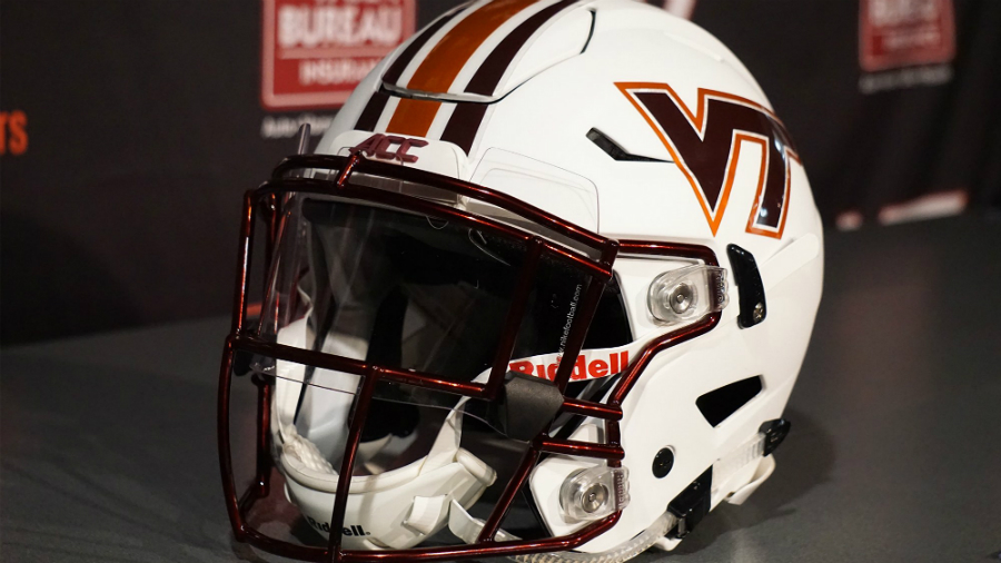
Virginia Tech is busting out new white lids for its Belk Bowl matchup with Arkansas.
HokieNation - We're breaking out some new gear for the bowl game. What do you think? #HardSmartTough pic.twitter.com/tXeGuuYPlh— Justin Fuente (@CoachFuente) December 23, 2016
Bringing the heat this bowl season!! #24Straight pic.twitter.com/ogBLQtk8pF— HokiesFB (@HokiesFB) December 23, 2016
Section:
Comments
Pair this with all white or white jersey/maroon pants combo and we will have ourselves looking sharp as we restart the 10 win streak.
Maroon jerseys for the bowl game
eh, it'll still look good.
We seem to rock when we are maroon jerseys and maroon pants...dressed for business.
The helmet looks so good it would go with any color scheme.
A couple more angles:
I'm a little worried these will be a burn hazard. Because they are FIRE.
We're gonna more fire emoji's....
I think you a word
Hopefully they replace these going forward.
I agree, I like this helmet, but I'm more than ready for a refresh on our white helmet.
This is actually one of my favorite helmets they've worn over the past 2 or 3 years.
We can only hope. This helmet paired with maroon jerseys makes it look like the players are wearing bike helmets.
I agree, we are not Navy, we are Virginia Tech, we can fine tune our helmets and keep getting up, no need to steal from other teams (helmets or plays). I liked last years bowl helmets, this years bowl helmets, our orange metallic helmets last year, this years orange effect helmets, and our new look maroon and white helmets with the stripes in the middle. The Battle at Bristol helmets and blackout helmets last year were cool as well. Let's go 1-0 this coming week and get back to 10 win seasons!
Agree. I'm tired of it.
I like all of the other helmets that we've worn this year. Same design but different colors. I also like that the logo hasn't been messed with
Ok helmet for one time deal vs a directional U, but it's way outlived it's usefulness.
Big fan.
Man I'd love to see them try this chrome orange on the maroon helmets... Have a feeling that would look great.
My wallet is going to combust when the helmet auction rolls around this year.
I'm dreaming of a white christmas.
IT'S LIT, FAM.
These don't look all that new. I've seen similar ones circa Logan Thomas. Same design but logo had the big V and the little t inside it.
Similar, but with some changes.
Outside of the tricolors, this will be the first primarily white helmet that VT has worn at least since Beamer started coaching where the facemask is maroon. This will also be the first time we've had the orange and maroon spiked stripes with the white helmet (though the 2014 stars and stripes helmet being the first spiked stripe on the white helmet, those were patriotic and not Hokie). The base of this helmet is also matte white, which I am pretty confident we've never before worn.
Its derivative of previous looks, but it is a completely new look for us. I like it.
Also looks like the facemask is metallic/chrome as opposed to just "shiny" maroon
...I'll be right back, I seem to have made a mess in my pants
You should avoid crapping your pants whenever possible. Just for future reference.
Logged in just to give this a turkey leg.
Meh.
Outside of the throwback helmets we wore vs. UVA last year, this is probably my favorite non-standard helmet that we've had.
Chuck says it all. Two thumbs up.
That two thumbs up was for the metallic orange helmet with all maroon pants and jersey!
I absolutely love this look, especially the matte white. But I don't imagine it looking that great paired with maroon pants and jersey.
It will look good, but definitely not as good as an all white uni.
agreed, this should be with an all white uni.
I imagine we'll wear maroon jerseys and white pants with this helmet. White/color/white is pretty standard. That's a normal look for Penn State, Stanford, etc. Actually, Louisiana Tech is wearing it right now in this bowl game.
I think they're awesome. The maroon face mask is great.
I'd prefer the white jersey instead of maroon...
The hard tapered stripes make the current hodgepodge of number fonts, stripes and logos even more of a stylistic disaster.
Hodgepodge? Everything's been streamlined and reduced since rebranding. Expand?
Tapered stripes, traditional stripes, 90s style logo, slim rounded contemporary number font, wide sharp angled collar, pants with no stripes, motorcycle helmets, and so on.
It's a mess.
You're saying the various elements don't go together, not that they're inconsistent. I can see that.
Huh? Where did I say that? They're both. They're inconsistent and they don't go together. A hodgepodge mess.
It's look like they just looked at the various components separately and never considered what they look like together. The parts don't go together and the sum is hard on the eyes stylistically. Too many conflicting lines and styles.
Sorry, I didn't say you said that, I said that's what you're saying (that's what you mean/imply). It's a figure of speech. Which I misunderstood or we're not using "inconsistent" the same way.
I meant I think the elements (tapers, colors, stripes, fonts) have been consistent game-to-game (every number has had the same font; every helmet stripe has had the same taper; every VT has had the same spacing; every orange orange, every maroon maroon, this season). But I can see where they don't work in combo with each other.
Wait, is this marcb2? I think I hear the phone ringing, maybe we can discuss this another day. Have to go, bye!
(p.s. no offense intended)
I see what you're saying now. Yes, they are consistently inconsistent...or maybe it's the other way around? Either way they are a mess every game - some more than others (something, something, motocross helmet...)
The tapered stripes on the helmet became standards this year-- they were on the maroon and orange helmets too.
Maybe I'm wrong but these seem even more hard tapered.
There is one number font....it's even used on the field...
Yes...and your point is?
Ok, let me rephrase...the number font, the logo, the various stripe conventions, the collar, the motocross helmet, the sort of orange helmet are of hodgepodge of elements from differing eras and conflicting styles.
A total mess.
Meh, it looks like auburn's helmets. I like more maroon and less white.
Exactly what I thought too. Like a lesser version of Auburn.
Better than the helmets UVA is wearing in their bowl game.
I still prefer all maroon, but I guess the hogetts have too similar a color. Uni's don't mean that much to me though.
Would like to see this stick around.
I'd be fine with this in the future:
All maroon
Maroon helmet, maroon jersey, white pants
All white with this helmet
Maroon helmet, white jersey, maroon pants
I agree with this. I think we should keep these for an icy white look on the road for big games.
Exactly. This helmet at ND would have been sweet
Very cool lids. Just wondering if anyone knows what the hexagon shape is on the front of the helmet?
It's part of the design of the helmet which flexes to help reduce the impact of hits. Read more here
Yeah ok but can we finally ditch the throwback unis
Its a conspirescy! Looks just like the newest espn logo!
[](https://postimg.org/image/nmxib8gh3/)
Great helmet I really like how they did the helmet stripes, number font and lettering this year
Do we have the same unis next season?
Saw this on Twitter with a side-by-side. Disney marketing through VT Football.
Also for the record, I love the new helmets.
Anyone heard anything on these? Was hoping to see them again this season but it's been quiet.
IIRC these helmets were a part of the helmet auction this past offseason so unless they made more they won't be showing up this year