
The rumors are true. Beamer's website says this is the beginning design stages for a "Hokie Stone" helmet. #Hokies pic.twitter.com/jUqOhbWzQE— Andy Bitter (@AndyBitterVT) September 19, 2013
DISCLAIMER: Blog posts may not have been written or edited by The Key Play staff.

Comments
Embedded.
I'm actually okay with this.
I say we bring these back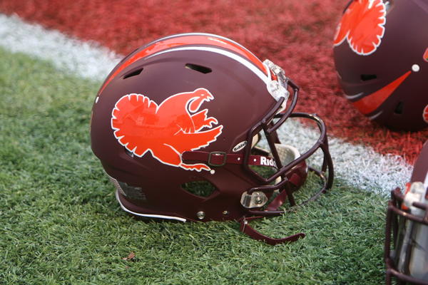
This. A million times. Exactly why its my avi.
Maybe I'm alone her, but I think these are really cool. Throw a maroon VT on the side and I really like em.
Yeah I think they look weird with just Hokie Stone but I feel like a maroon VT would make them look a ton better.
When I saw this I was reminded of that oft used phrase- "we were just one block away"
I refuse to believe this is really happening. Surely this is some sort of joke. We've made some BAD decisions regarding helmet and uniform design, but this is beyond any of them. Nobody outside of VT understands what Hokie Stone is or what it means so there is no "brand identity" in this design. Just, no.
This is awful. Like you said, no one outside of Hokie Nation knows what the heck is going on.
My only hope is that they go ahead and get the pylon logo out of the way on this helmet...
My user name is Hokie Stone so I'm going to play devil's advocate to your comment for a second:
NO WAY THIS IS WORSE THAN THE CARTOONS LAST YEAR!
That's true but that's kind of the point of the helmet... to showcase what is a very unique tradition at VT. And people will defintely know Hokie Stone about after we wear these. As for brand identity, this is definitely detering from the norm (if one even exists any more) but its doing so using a very disntinct VT tradition (not just slapping goofy designs on a white helmet.) And if you layer on the VT logo and wear this with maroon unis/pants with orange trim well... its may look crazy but its definitively VT.
People know who the Hokie Bird is though. Did we think they looked horrible? Absolutely, but they were easily recognized without having a VT on there. Nobody would think these were VT if this is what we used.
Well no one knows what anything is until they are shown it the first time. The cartoon Hokie Bird isn't a universal constant embedded in conciousness from birth. Some designer created it in the 90s.
Every VT fan recognizes Hokie Stone the second they see it because, after their first day on campus, they saw it everywhere and learned about what it was and why it was unique to VT. But they didn't always know what it was, they had to see it first.
So when VT trots out of the tunnel wearing these people are going to say "what the hell is that?" and then they will know once the announcer explains them.
If it's on TV and the commentator says, "this is Hokie Stone," and explains what it is, then people will know. It's called learning. It's what happens within the confines of Hokie Stone buildings. I like 'em.
Yep, I totally agree. They would be bad ass w/ all maroon everything.........if we ever get to see those again...
honestly i dont think that matter in any way shape or form, what "hokie stone" is would be explained during the game when this was worn. and not only that if you are watching our game or at our game then ya probably know who we are. "brand identity" is a much different thing now with the way media works. and when there is a vt slapped on the side of it then boom
I agree x3_Hi. I thought this had to be some kind of mistake. So I investigated and found the uni design people had made a mistake. This design was supposed to go on the receivers gloves after the Alabama game.
I see what you did there.
No. I make fun of my friends from UMD so much because of how disgusting their uniforms are. Don't give them ammo to shoot back at me.
This is just another really bad idea in a long string of really bad design ideas for our Unis....who the hell is in charge of these? They need to be fired. We should write a petition.
It has potential to be cool but.... no, just no
I dont know, I think I'm actually thrilled about this. No one outside of VT needs to understand the importance of Hokie Stone. Every VT fan understands it and that's all that matters if you ask me. Possibly add a VT to the helmet and I think its pretty cool
Well
1) it's not really a matter of understanding
2) as we've learned in recent history, well designed and 'cool' uniforms are a nice leveraging tool for recruits
3) our players WANT to look good, and I think psychologically, if your players like the way they look they're more likely to play well...and we need them to play well
These helmets are hideous, regardless of who understands what Hokie Stone is. There is really no reason that our equipment department needs to be rolling out stupid ugly designs. We clearly haven't done a good job designing unis lately (the only 'new' unis I kind of liked were the black ones we played against noise state in) so I think we should take a page out of Bama's book and just go old school and traditional. Pick one uniform style and pattern and stick with it. It's classy, and if we can't make the flashy ones work that's our best bet.
I agree with you about sticking to one design, nothing beats #ALLMAROONEVERYTHING, but honestly Im getting tired of wasting my energy bitching and moaning over terrible unis when we really have no say in the matter. I mean lets be honest, these arent the WORST helmets we've ever worn. That award goes to the foghorn leghorn helmets from last year with the hokie tracks being a close second. As long as a VT logo ends up on the helmet, Im fine. Then its like we're emulating Oregon; they have a shit ton of helmet designs, but they ALWAYS have an "O" somewhere on the helmet. Ive also come to notice that what football players and recruits seem to like is usually the exact opposite of what the fans like (See Maryland circa 2011, the players loved them). If it makes the players happy, fine. And finally, we dont exactly have the pull that Alabama does where when people ask why their unis never change, all they have to say is "because we're Alabama." They've been winning national championships for years. If changing things up gets recruits in the door, so be it. (It just damn well better have a VT on it somewhere)
I agree with HOAT and what he says below about how this has potential. I think the idea of a single stone and a chiseled look could work. The design that is featured above? Not so much. I understand where you're coming from in regards to Bama having that pull and not changing their unis and with Oregon and how they always have an "O" on the helmet somewhere. Yes I think VT should always be on our helmets and I'm sure this helmet will get a VT somewhere on it....
I would love to have new uniform designs every so often....IF THEY WERE ACTUALLY GOOD DESIGNS. The problem is that we haven't had a really good uniform design lately so I don't have confidence in trying out new things anymore. Not until we get somebody else in charge of selecting/approving the designs.
Again, I completely agree with you about changing things every so often. But its like you said, things get changed way too often and more often than not, they're terrible. This has lead to our entire fanbase cringing whenever they hear about a change coming before they even see anything. The fault falls on the shoulders of whoever has been giving us the unis. I still try to have an open mind though, regardless of how hard they make it (I did not like the grey unis. at. all.)
*Counts down days until Weaver retires*
Of course, now I'm imagining Darth Weaver. Thanks guys
I get the Hokie Stone thing. I'm a Hokie.
I just think the rest of the world is going to be thinking..."Doesn't Virginia Tech know that most buildings are made of bricks? Not really a big deal."
Am I the only one who loves this?
Nope.
See my comment above
What's my name?
Nope...I'm right thur with ya....
THIS HAS HUGE POTENTIAL AND I LOVE IT. Sure, the initial mock up looks terrible. We don't need to see all those colored stones in there, just stick to one grayish stone color and make it look chisled a bit. Boom.
I also think that it should be matte instead of glossy. This has some real potential. Definitely needs to be gray and black instead of that yellow color...
I won't deny that the idea has potential...but based on the initial design and the track record of whoever seems to be designing our unis, I don't have a lot of confidence that we'll get a good helmet out of this. We should just stick to what we know.
If it ain't broke, don't break it.
I was hoping that the helmets would be carved out of Hokie Stone. Now THAT would be bad ass.
Helmets carved from stone!!!!
That's... interesting
Somewhere along the way, a memo was misunderstood. Someone probably said "hydrochrome" and someone else heard "Hokie Stone" and went with it. That's the only explanation for something like this.
I'd rather have the lunch pail depicted on the helmets than this. my lord these are hideous.
Unlike a lot of people it seems I actually kind of like them. HOWEVER, I also liked the military appreciation helmets but thought the uniforms were just plain awful. Thus I can only assume the uniforms for these will also be pretty bad.
At least no more hokie track or cartoon helmets are showing up.
This is actually the second design I'm pretty sure. The first one was terrible. When I saw it in person, it looked kind of cool. We just have to wait to see what uni will go with it. That is what will make or break the helmet.
Since this is happening, the big question is if we will wear a special uniform with it. Here are some concepts:
I like option 3
Only because I want to actually put a number to how many people like this and how many don't, please use my upvoting and downvoting to share your opinion on this design. Upvote if you like it, downvote if you dislike. I'll start by downvoting myself.
first of all...I don't think you can downvote yourself. Secondly, I refuse to use the downvote unless absolutely necessary (like if someone says something tasteless or offensive)...therefore I won't be downvoting you but consider this as my vote. (I won't upvote you, if that makes you feel better)
Unfortunately I can't downvote myself (Damn you Joe for putting sensible logic on the voting system) but as far as downvoting for the sole purpose of this, don't worry about it for me. I've got plenty of turkey legs to spare.
I'll reiterate that I like the CONCEPT but I do not like the initial implementation. Upvote
And for the exact same reasons...downvote. (except, as stated above, I refuse to actually downvote)
I totally went for the down vote. I don't like this rendering of it, although I'm not 100% opposed to the idea. If they get it right then it *might* look cool. I just wish we would stick to a basic uniform (#ALLMAROONEVERYTHING) and then just do a special 1 or 2 the rest of the year.
I actually liked these a lot:
We beat the piss out of UVa in those unis. But, then again, we beat the piss out of UVa in a lot of different unis.
Wish those were our standard away uniforms. Those were so sick. Very aggressive but at the same time clean look.
Looks like Yahoo has picked up on it
http://sports.yahoo.com/blogs/ncaaf-dr-saturday/hokie-stone-helmets-thin...
I still like the helmet, but god is this what things have come to?! Even yahoo making fun of us!? Someone, please, I'm begging you, go become our uni designer...
BRING THIS BACK!
What happened to brand identity? I predict they look awful on the field
Note: Can anyone tell me why a Google Image search for "Mike O'Cain and Brian Stinespring" produced a picture of Seal?
I like it and here are my reasons....
- It's unique. Sure, lots of schools have stone architecture, accents and finishes. Embracing it on this level is awesome. Anyone can do camo, hydrocrome, flat black or put a stupid design on a helmet. NO other school can pull this off!!
- Recruiting - The recruits will like it. This beats the hell out of last year's domes selection.
- Players - They will like them too. They are surrounded by Hokie Stone for 5 years. They will buy in and rock these helmets hard (get it...)
- Visual Appeal - These will look good on TV. Sure they don't rock my world while I am sitting in my office, but they will look good on TV and from the stands. Especially if paired with the right uniform combo - Maybe Grey pants (from that James Gayle pic we all thought was fake for the Bama game) and Maroon Jersey... Look, I know it's not the #ALLMAROONEVERYTHING that we all want, but times are changing and this isn't two turkey tracks slapped crookedly on a white helmet. Side note - We will see the all maroon again... just be patient.
- Campus Exposure - I hope we wear these for one of our "big" (lol) home games that ESPN or ABC covers. The announcers could talk about the helmets then show a segment on the campus explaining Hokie Stone. This gives us a chance to show off the place we love. Great for recruiting students and all the alums can get all excited when they see the old science building on TV during the game.
I LOVE IT!!!!!!!
I'M SORRY FOR YELLING!
I will reserve judgement until we see final color/finish/decals.
I will say, the earlier rendering someone on TKP did with the racing stripe as HokieStone was more effective because of how subtle it was. This makes it look a bit...heavy...
When Sam Rogers comes out in a #AllHokieStoneEverything uniform looking like The Thing and runs over a MD cornerback, you guys are gonna love these.
Related Note: We are gonna wear these for MD, there's no way we're not. And they will wear turtle shell helmets and its going to make your TV explode.
My guess is the GT or UNC game.
GT is on National Television & UNC will be a big recruiting weekend.
I would prefer UNC. Recruits eat this stuff up
It looks like really cheap kitchen vinyl flooring.
I agree about the flooring thing. I like the idea, I just think it can be executed better.
The "beginning design stages" gives me hope. I like the concept. Make it a bit more gray, maybe increase the contrast so that there's more of a shadowed effect to the stone, and slap a maroon VT on there and I'm pretty happy. I would have preferred a maroon helmet with the VT filled with Hokie Stone (or some type of stripe for an accent), but I think this could turn out alright.
See, I'd be okay if there were Hokie Stone accents. Give me a Hokie Stone stripe down the center or a Hokie Stone VT and we're good. This is just too much in my opinion.
That sounds like it would look great. This.... this does not.
it's like i wanna like them, i do. i like the idea. . .but i see that pic and i dont like it
A turkey leg is deserved for any Curb reference
As I said above, I like these. But that assumes the rest of the uni is done right. Throw a VT logo on there with maroon unis/pants and it's badass.
However, given how our unis have looked over the last two years I fully expect them do something incredibly goofy with it. Hope not though.
Ugh! Please NOOOOOOOOOO!
If it were more like the background of this website, it would be better - more of a solid grey granite
Flatten the image and throw a maroon VT w/ orange border on there and we have a winner.
Oh, and put them with this.
Where did this come from? I actually think that looks good - but the hokie stone helmet will probably look like too much. I have zero confidence in us designing an attractive uni combo.
EDIT: And by us I mean VT, certainly the key play user base could design something better.
Something I came up with while bored at work one day.
This is awesome, VisualBasicHokie. Nicely done. Extra turkey leg.
I love it. It looks 3D and has a lot of potential. Tone it down a bit, slap on maroon VT logo, and lets go out for drinks.
Does anyone actually have proof that "recruits and players love all the uniforms"? Or is it just conjecture used to justify our athletic department's complete lack of design sense, taste, subtlety, brand consistency, and tradition? It's like we got saddled with the Nike Design Practice Squad...
First post, freaking love TKP.
There was a quote a little while ago about how Shane Beamer said that the recruits love going to the Equipment Room and seeing all the uniforms. Apparently last year's military appreciation combo was a huge hit.
Well that makes me feel moderately better. I don't mind the occasional departure from the standard uniforms and some have been done well. I also don't mind situational uniforms like orange helmets when we play in the Orange Bowl. It's just the VOLUME of special occasions and random uniforms we crank out. I doubt we're going to actually wear the same kit more than once this whole season, that bothers me.
Somebody did a mock up a while back with a maroon helmet and a VT logo with hokiestone inside...that looked pretty nice, actually. This, not so much.
Think about it this way...
Our defense can be known as Rock whilst our offense can be Hard Place. That way, whoever plays us will be in an awful place.
Plus, the hard-hitting safety would rock the receivers/ball carriers/water boy with the helmet in the game. I'm done.
I think if we're going to incorporate hokiestone into the helmet we should use individual hokiestones as stickers for the helmet. I realize it's not our tradition to put stickers on the helmets, but it could look really cool to have player's helmets slowly morph from the standard maroon to a hokiestone pattern. Of course the sticker plan requires the same helmet to be used every game, which apparently doesn't fly with weaver.
I don't know if anyone saw the NFL article about how players are fitted for a helmet in the preseason so they can't change their helmets during the regular season anymore (so, for example, the Patriots can't wear their throwback uniforms because they would have to change helmets). Can they please make this a rule in college? For the sake of this not becoming a reality?
I showed this helmet design to a friend that is a Texas Longhorns fan.
His response: 'I'll trade you UT's consistent, classic uniforms for VT's ability to actually tackle people. Deal?'
I can't stand 99% of the things that the uniform department churns out, but I, for whatever reason, actually like these helmets. I guess it hurts on the national and recruiting scale, but I actually LIKE that people won't know what it is. It's time for everyone to learn. Keep in mind that "this is the beginning design stages". Do we have proof that recruits/players actually like all of this stuff..? And I agree with most of the comments above that this could all come crashing down with some sort of idiotic uniform pairing..
I too think it has some potential and there could be advantages:
1 The opposing team might think they are about to run into a stone wall and stop in their tracks allowing JG99 to get 46 sacks per game and BF31 to get 12 INT's per game.
2 Imagine the horror in the minds of linebackers and poor defenseless DB's when they see SR45 coming at them with a full "Hokie Stone head of steam" in 3D, they will turn and run in the opposite direction allowing TE14 to score 15 TD's per game.
This is starting to make some sense!
A lot of people outside Virginia have heard of VT but don't really know much about the school. This helmet and all the other novelty helmets they've worn over the last few years is building a constant theme in their minds; We don't have a consisient university symbol and our football team (by far the most visible part of the university) will wear whatever gimmicky graphic they can't sell that month at the local t-shirt shop.
Whats next, a Burruss hall helmet, a duck pond helmet, or something thought up by the Virginia Pork board!?
Pylon logo perhaps?

So the hokies have worn the classic VT helmet for the first three games this season. I haven't done the research but I feel like that is the longest stretch with the same helmet in 3 years. This, combined with the NFL banning helmet switches, led me to believe that Virginia Tech has decided to stick with ONE helmet since they are the leading institute in researching helmet safety. I was imagining that if they were to alter a helmet more than the military appreciation one, they would use the maroon shell and add the pylon logo that you just mentioned.
Sidebar: apparently switching helmets doesn't allow them to break in properly, which can be dangerous. The design can be switched but the base color cannot. This is now an NFL rule but not NCAA
I'd like to see a scientific study that proves that helmets need to be broken in for player safety. I could see how it would be comfort related, making the padding fit to your head better, but that's why they wear the helmets in practice beforehand. Considering we have the most prominent helmet safety rating system right now, that professor would speak up if there were any real danger to changing helmets.
Correct me if i'm wrong, but didn't we only reuse one helmet last year, turning the orange VT on white to the HokieBird asymmetrical helmet? I'm pretty sure we auctioned off the turkey tracks ones before they had the potential to be reused
I'd like to see it too, believe me. I was shocked when the NFL came out and said that--but at the same time the NFL are actively trying to reduce concussions more than any other league, so they may be on to something. I think it has to do with the padding conforming to the players head, maximizing safety. A brand new helmet is obviously safe, but it would seem a broken in one is even safer, per NFL. I would like to see Virginia Tech release something in regards to this.
Are players still allowed to wear the VSR-4? I know Tom Brady and a few others used to sill wear it. If so, this is one of the most hypocritical rules ever. If a helmet is discontinued for not being safe enough, it should be banned immediately.
I dug a little more and found an article by Uni Watch. Turns out an anonymous source close to the NFL believes the rule was released in order to prevent lawsuits. The VSR4 is discontinued but a lot of NFLers still use it, so when a throwback helmet is used, it means a player has to switch to a current helmet...if an injury is sustained they could claim it's because of a new helmet.
I don't understand why the VSR isn't banned, like you said.
I don't believe there is any logical/scientific reason for the helmet rule. Helmets are made of plastic. They do not get stronger the more you wear them. In fact, they get weaker. Fine/invisible cracks appear through impact. Since the are designed to work as a holistic unit, these cracks can effect the safety system. They will never be stronger than when they are new.
I'm sure the nfl did it for legal protection and mostly to "protect the brand". $6B business!
That being sad. Love the Hokie stone concept. Hope they improve it before final production and put it with a decent uniform (the gray Bamas and camo Marhalls are bush league...low budget high school looking). Nike can do better (reference white pro combats and the black Boises).
Please see my previous post. and I agree, Nike can do so much better.
That... is not bad. Much better with a logo on it, that's for sure
We're supposed to wear the pylon logo as the main logo on a helmet this year....perhaps this is the one?
I'd like to see it not as bright, maybe a duller looking Hokies stone, with a lighter maroon VT looking like it's etched in to the stone. Wish I was better at visually representing my idea. I need to get a job where I can play on the internet during the day, slanging pills is taking away from my THE KEY PLAY interactions.
This what need to happen.It needs to be a all white helmet vt in hokie stone with all white uniforms, with hokie stone stripes on pants and numbers very little maroon and white.Any else will straight up suck!
Barstool likes 'em; good enough for me.
http://www.barstoolsports.com/barstoolu/super-page/virginia-tech-hokie-s...
How about we take the energy, thoughts and effort that we are putting into helmets and work on fixing our offense. A top 5 ranking and am eventual crystal ball attract recruits much more than a helmet..
..btw, my opinion is that these are the worst helmets ever...do what someone else mentioned, a hokie stone stripe down the middle, stone stripes on a maroon jersey and cracks some skulls..
there is absolutely NOTHING sleek, fast, hard-hitting, fly-to-the-football about rectangular chunks of stone.
What makes the hokie stone a great building material choice for one of the finest universities in the land which is nestled in the mountains of Virginia makes it a not-so great choice for football uniforms.
The only thing I don't like about this helmet is that whenever I see it again for the first time I keep thinking it's more FSU colors than VT colors.
If we are wearing Hokiestone on our helmets we better be freakn pounding the rock and owning the trenches. None of this p@s%y football.
Well how else are we supposed to score our pussy touchdowns?
The helmet has a lot of potential. The potential to be awesome and the potential to be a disaster. First they need to come up with a pattern so the HokieStone is constructing a dome, otherwise you get that weird warping around the curves. Then they need to put a logo on it so it's not so boring. part of me wants to see a larger stone on either side of the helmet with the "VT" engraved into it.
My only complaint is that there aren't any gargoyles.
gargoyles perched on each shoulder pad. i love it!
Needs a bold chicago maroon VT logo, but definitely an improvement over the Hokie Tracks.