
Well outside of COVID-19 and the ramifications of it, there ain't much else to talk about right now.
So the heck with it.
Tampa:
Whose jersey are you copping first?#GoBucs— Tampa Bay Buccaneers (@Buccaneers) April 7, 2020
Atlanta:
Atlanta, this is for you. pic.twitter.com/VVwVrKznOp— Atlanta Falcons (@AtlantaFalcons) April 8, 2020
LA Rams (new logo, uniform still TBD):
LosAngelesRams pic.twitter.com/n8q4KDUZeJ— Los Angeles Rams (@RamsNFL) March 23, 2020
Browns:
True to ourselves.True to our loyal fans.True to who we'll always be.https://t.co/VwRW3sfRSx pic.twitter.com/HbQYZQEu9N— Cleveland Browns (@Browns) April 15, 2020
4/20 Update:
Surprise! Patriots make their Color Rush Uniforms their standards going forward.
The look we love, promoted to primary. Order now: https://t.co/SxB09Sfb9X pic.twitter.com/sfkUq81OUp— New England Patriots (@Patriots) April 20, 2020
4/21 Update:
LA Chargers:
told ya. 😏 pic.twitter.com/2HD94YFatP— Los Angeles Chargers (@Chargers) April 21, 2020

Comments
Pretty disappointed in tampa bay, wanted them to force Brady to wear those creamsicles!
I'm surprised they didn't change the team name to TB12
Tampa Bay looks good. The only way you can make those colors work is by being simple.
Atlanta is alright. Black and red is hard to mess up. The uniforms they had before looked childish in my opinion so these are an upgrade.
The Rams logo is horrid, and I believe it blatantly copies off of a small college out west.
The Chargers have the best uniforms in sports...maybe. The powder blues are incredible.
Let's hope my Browns went back to simple uniforms. The rumor is they will look like the old stuff, which is a welcomed change.
Tampa Bay's new uniforms are almost identical to the Falcons' previous uniforms. So which are they, good or childish?
So Atlanta copied TB's set from the early 2000s?
stripes on the pants and shoulders are vastly different
All the NFC South teams love their black or close to black uniforms. Always found it odd, especially since Carolina and Tampa wear white for home games the first half of the season anyways to beat the heat.
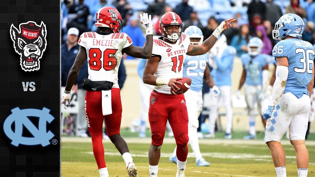
Tampa Bay looks like NC State
Do you mean their old uniforms? Because these were their uniforms from the last 2 years:


They used these in 2017
I wish the Redskins would go back to wearing white at home games all the time. Atlanta's uniforms look awful.
The Redskins have made tremendous progress in uniforms recently, finally bringing back the classic white on burgundy look on the road, instead of the stupid white on yellow.
So ideal for me would be burgundy on gold at home, white on burgundy on the road, and never go monochrome unless it's all white.
Or hell, go #teamnopants if they could get to 10 wins without digging themselves into a 3-6 hole first.
The white on burgundy is the classic look that they wore all the time during the 90s unless they were playing the Cowboys in Dallas. Then they wore burgundy on white. That's why I would like to see that be the format. However, I would like to see white on white for big home games. It reminds me of Sean Taylor picking up that blocked field goal against the Cowboys and taking it back just short of field goal range, only for a personal foul facemask at the beginning of the return to give the Skins an extra untimed down to kick the field goal.
I am partial to the red up top and gold pants combination the Redskins wear.
I like the throwback colors when burgundy was darker and deep gold
They could also go to the spear logo and get no complaints from me. Make the official name Skins and get that monkey off their back.
I think that name might cause other problems.
If there is a name change, my vote would be to change it to "The Hogs" in honor of the o-lines from the Super Bowl era teams of the 80s through SB XXVI.
✅ It's an organic part of the team's history
✅ It's unique
✅ It's not offensive
Man. Proud of my team for that one. Good stuff there.
I don't like the new look ATL ones at all. That style of lettering above the numbers like that makes em look like a team that is in the XFL or something
I hate jerseys with the teams acronym, abbreviation, or nickname in text on the jersey, so I agree. That's why I wasn't a fan of the orange jerseys we wore with "Tech" on it.
The 2017 UNC ones?
2017 unc orange jerseys said "Hokies" on the front, I'm relatively certain.
The 2013 digicamo jerseys that were mostly orange and worn against marshall said "tech" on them.
My all time ugliest VT uniform
Its not just that the template is ripped directly from WVU's at the time, but it was an ill fitting mess. And that orange VT logo just doesn't work that well.
2013 was a disaster for our uniforms. We had as many uniforms as Oregon at the time but no clear template or pattern. We broke these out for some unknown reason. We had those horrible camo ones. We wore the Hokie stone helmets with the 1872 logo on it for some reason. We broke out all orange for the first time since the 90s. On senior day we wore gray pants and the Hokie stone helmets again. It was a disaster.
Yep.. WVU copy jerseys in just 2-3 sizes... just look at how Gayles fits- it doesn't.. and shiny silver all polyester pants from 1996. Joy. Against #1 Bama on national television. I would have started trying to get out of the Nike deal right then.
IIRC a poster on here mentioned these were not done by Nike, but by a local group. They just had to put the Nike patch on because of the contract.
Which furthers my point. It doesn't take Nike 5 years to make special uniforms for Oregon or Clemson
Please take a look at Alum's post. This instance was not on Nike or the poorly negotiated contract with them.
I had some #sauces back then that told me those weren't even done by Nike. The desire to do something one-off came too late for that game for Nike to be able to fulfill, so we basically just ordered them from a catalog, like a high school would do. We sewed on a bunch of swoosh patches to not break our contract with Nike and that was that. I want to say that orange camo uniform that year was the same kind of deal. Hence why the Nike emblems on each were in black and not a team color, as is standard on all other Nike on-field apparel.
And yeah, looking into it, I think this is exactly what happened. Had to do a little digging, but there's a distinct difference between these two (and the camo from 2012) and all the other game worn jerseys we've had. Namely, these are the only 3 football jerseys I can find that we've worn since... hell since the Starter years, where there is a tag on the neck....
2012 White Camo
2013 Grey
2013 Orange Camo
And for pretty much everything we were wearing before, during and after those games....
2005 Orange Sleeve
2007 White Jersey
2009 Tyrod Era Maroon
2010-12 White
2013 Maroon (note the ACC patch is different)
And a quick Googling shows that the standard for other schools is to not have that tag on the jerseys that are worn during games, at least from Nike.
The jerseys Nike does for us have a size tag with a number (like 44). The ones "off the rack" have a letter size like XL.
For real, need to go back to Starter. Those guys took care of us.
I got physically ill the first time I saw these. Still makes me angry seeing them.
I agree. I remember ripping on it back in college. It looks like some cheap knock-off you'd find at K-Mart (which I know no longer exists). For a big game like that, I wish we kept our normal uniforms, I was embarrassed to see us run out the tunnel on national TV in those.
Yeah I was thinking about the 2017 UNC ones, you're right it did say "Hokies" and not "Tech". I merged that and the 2013 digicamo ones in my brain. They were both bad in my opinion.
OP Updated with new looks for the Browns and Patriots. Chargers new look is expected later this week.
If they are giving the Browns lightsabers maybe they will actually compete on the field?
So the Patriots are copying VT's old shoulder stipes now?
That was their color rush from 2016 that they're making permanent.
I really like them personally.
Just waiting on my Tom Brady jersey preorder to ship. I had read the rumors that we were reverting back to our older designs. Once we signed Brady my preorder went in.
So, I imagine these meetings went like this:
"We need to sell more merchandise. What if we made new jerseys to sell?"
"Brilliant thinking boss!"
"Oh, college football does a lot of jerseys how do we do what they do?"
"Make some jerseys and tell people about them!"
"Okay, but what is the worst way to do so and is most annoying to everyone involved?"
"Videos on twitter with weird lighting!"
"Awesome, do that."
Apparently they might be relaxing the one helmet rule for the NFL going forward, which would open up legitimate throwback opportunities for teams around the league.
Kay Adams (swoon) said she will reveal the new Chargers jerseys tomorrow.
9:45am Eastern.
I'll have it on here shortly thereafter
Is she going to be modeling it? Because I'd be okay with that.
Yep.
I honestly didn't know who this is. I do now. Highly qualified indeed.
OP Updated with new Chargers set
The Chargers look pretty slick.
those are so sexy.
Chargers unis were already the best in the NFL. Now they're even better.
ATL jerseys are dope. I know some people will hate them because they aren't from the 70s, but they will likely become the most recognizable based on the sheer simplicity of the design.