
The Poos Hoos appear to have accidentally unveiled their new uniform set on social media the other day...
Silly Hoos, its been 14 years of the Commonwealth Cup residing in Merryman, not 13. Though, I can forgive a Hoo for not being able to count past their fingers.
Forums:
DISCLAIMER: Forum topics may not have been written or edited by The Key Play staff.
Comments
Honestly I think they are kind of sharp. The ones they have worn the past years looked really cheap but I give them credit for trying to emulate the on field product with their uniforms. Now it'll just be like my golf game, look good play like shit.
Those'll do the trick.
Man, are we fucked.
/S
Shush, don't ruin it!
They play like da Bears and now they look like them too. Excellent.
Found the bears fan!
Screen name checks out
It could be worse; you could be a Redskins fan...
Blue 13 looks like your typical Hoo lineman, so props to them for that
The only difference is, if you put that mannequin in front of a quarterback, it may be able to block.
Silly EPW, even these mannequins couldn't block the 48 defense.
Jimmy Johnson now plays defense?
Kim Cattrall just got a recruiting text from Bronco.
The biggest joke is them using the state flag for photo ops since we own this state when it comes to football.
An all white flag would be more appropriate for them.
Not a fan of the 2 different colored stripes on the helmet.
The uniform and pants are fine for the most part
Looks like they are the latest team to adopt the anti-serif numbers
Anti-serif: not really sure what to call them, but instead of a flag/stroke added to the number, a small chunk is removed. Michigan State was the first team I noticed that used them, but now they are EVERYWHERE.
I mean, we did it better....

I think this comment is the one that got you past VTGuitarMan for turkey leg count????
My favorite VT uniform personally.
Their orange just looks like a turd that's been flushed three times but still won't go down
What do you eat exactly?
You must not eat enough Flintstone's chewables.
I sprinkle diamonds on everything I eat for 2 reasons
#hardthingstogether means taking a picture between two mannequins?
Have we received an official confirmation that we're getting new uni's next season?
Yes.
Is this Auburn?
I believe Auburn's colors were chosen because their first head coach was a UVA alum, so kinda?
No. We will be going with UVA stole them from Auburn.
I'd be a lot more interested in seeing ours.
As far as UVa goes, you can dress them up, but you can't take them anywhere.
Took them behind the woodshed for over a decade now.
We need to keep doing that, but the real interest now needs to be Miami and FSU.
they'll lose in those unis too!
So do we burn down the AD HQ when our unis are unveiled with similar shoulder stripes but different colors? I will start making torches...
If we get another uniform with shoulder stripes...
Well, fuck.
I haven't been the least bit impressed with any of the graphic related stuff I've seen from Ruhland.
Are you making a general comment or implying he designed the uniforms?
General Comment. He's been involved in several things related to sports graphics, and he is commenting by not commenting on having some knowledge of whatever is going on with our uniforms. If he's had a hand in what was chosen for the design, I'm not getting my hopes up.
He is a part time graphics designer, part time nascar spotter and is not designing the VT uniforms- Nike's Mid-Atlantic cohort does that with rubber stamp from Oregon at some point- but the guys in Beaverton that design Durant's shoes and Ohio States uniforms aren't "designing" VT's. At any rate, Ruhland does "some" promotional designs for VT, and is very connected to the program, but he is not the only designer and certainly doesn't have final say on anything you will see on the field.
Where are we storing the torches?
The only place with enough unused space: Scott Stadium.
I feel like torches and Charlottesville may not be a great combination right now.
Leg for Earl
/ABORT
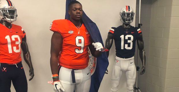
Very underwhelming, and is the flag bearer one a "throwback"? There is a "new" orange one in the back with the new font- the front orange one makes no sense unless it is a throw back.
The look on this kids face is pure regret... haha just made me smile. Kinda like knowing no matter what uniform you wear the future will be bad for UVA
Hello darkness my old friend...
Statement: on uniform reveals, you use your most well know player.
Question: who the fuck is this guy?
Ben Smiley. Class of 2019 recruit
Devyn Ford on his OV
The guy with the flag is a current uni, and the two on each side are new. The two stripes on the helmet on the right is kind of a throwback. Similar to the helmets worn back in the Welsh era, except there is a white space between the two stripes.
Really hoping for a maroon and white version of the uni's we wore against UNC. Those were cleeeeeeean.
It's a Tide Ad!
I've heard that it will be something similar to those. Haven't heard anything about the stripes though.
Bedazzled shoulder stripes
If it keeps the clean look while incorporating both school colors I'll be a fan. The orange ones we wore were just not VT enough for my tastes. Maroon jerseys without orange will leave me with the same complaint.
UVA and VT get their gear from the same Nike affiliated "local" place, so I would not be surprised if they are similar.
How funny would it be if they were EXACTLY the same?! Just different color.
Any idea on timeline of announcement/design release?
Late spring/early summer.
Can confirm that those uniforms were a one time deal and wont be our new uniforms.
To me, at a glance these look a lot like what folks think VT's new ones will look like. Funny how the UVa version isn't getting any kudos, but VT's version is awesome....
Personally I think they're both...bland and safe.
Well, yeah. Theirs is orange and blue, ours is orange and maroon. Thus....
Looks like Tarzan, plays like Jane
If we keep the shoulder stripes then I hope we go with this model. I think the maroons with an orange and white stripe would look clean and modern. Would also work well with the helmet stripe that we are supposedly keeping and with the new number font. Simply add those stripes to the uniforms to a maroon version of uniforms we wore against UNC and we are in business.
No.
Make it work, people!
I. WANT. SHOULDER. STRIPES
I WANT SLEEVE STRIPES! LIKE THIS:
"But then we'd be copying Auburn and Florida" - half the people on this board.
Well if you look closely at that tweet of all the 2018 signees as cartoonish looking characters...to me, that's kinda where the stripes look to be located.
Give me the Fighting Gobbler on the shoulders.
How about Argyle uniforms? But not the UNC kind...

I want them to look like this... Except short sleeve, the white is maroon, the black is maroon, the orange is orange, and the Flyers logo is a giant gobbler (screw having to have the numbers on the front)
I wonder if this new uniform set would come with the rumored revision to the VT logo?
Glad I saved that to my imgur account before they took it down off the website.
The amount of hand wringing that goes on over uniforms has made me agnostic to them. No matter what the athletic department comes out with in a few months we'll all get to listen to a vocal minority deride them every chance they get until we do this whole song and dance over again in ~5 years.
Feed the beast!
Stop playing games with my heart Alum.
That's how you get to #1...
It's funny cause it's true. While VTGM rose to dominance by posting emma gifs, Alum gets legs by posting controversial comments. People who agree upleg him. People who disagree refrain from down voting because you aren't supposed to dv opinions. me? I just try to increase the noise to signal ratio and make people laugh.
I would really like to see a more modern version of the 99-03 uniform. There were numerous pictures like the one below making the rounds a few years ago. Something like this would be awesome.
Would be so awesome.
Give me that helmet back!!!
But in all seriousness, I loved the matte maroon.
The matte helmet finish looks really good in maroon
I loved the idea of the gobbler on the helmet, but it didn't look good on TV. It just looked like an orange blob.
Up close...cool. Regular footage..blob.
I think a matte maroon helmet with gloss maroon gobbler would have been cool.
just like the hokiestone helmets, hokiestone camo pattern, hokie stone...well everything hokie stone looks great up close but looks somewhere between nondescript and crappy on TV.
Wait...I thought we were changing to JT's new logo..