
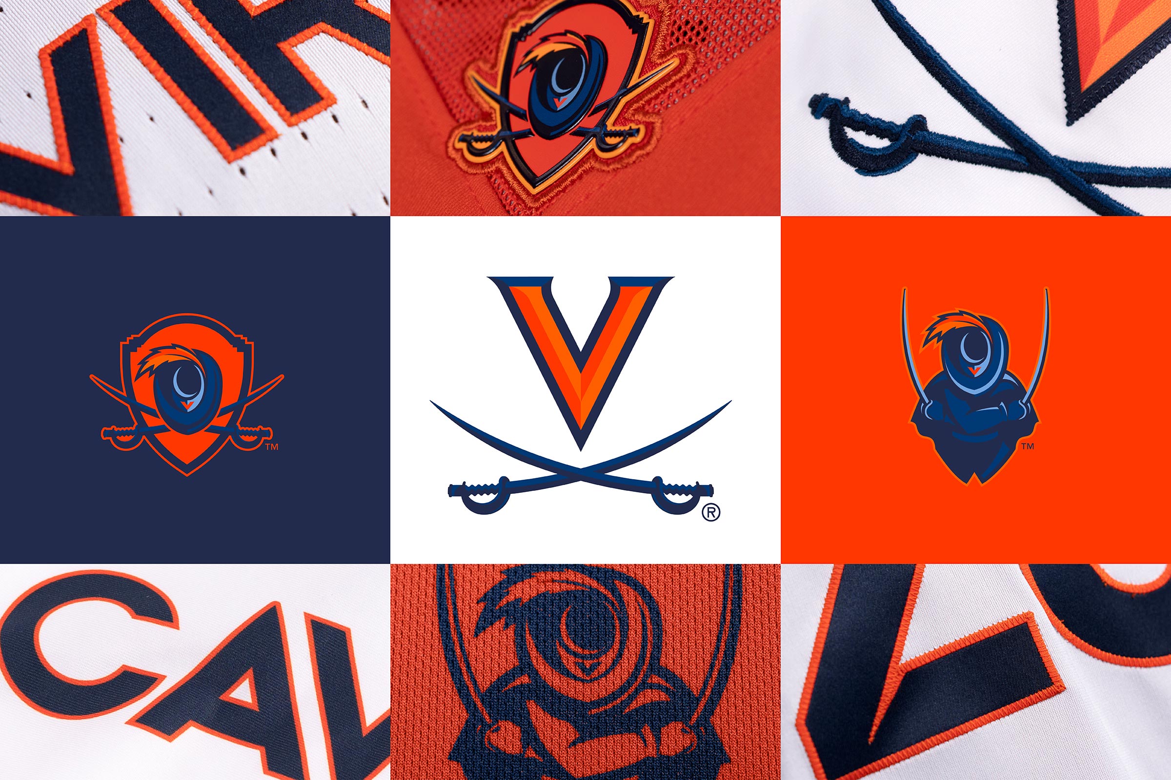
UVA released a new brand identity today..
Looks like the Cavs embodied their feelings over how they feel about their football program and made CavMan hold his head down in shame.
Also, the font type appears to be a pretty close rip off of Virginia Tech's re-design from a few years back.


Forums:
DISCLAIMER: Forum topics may not have been written or edited by The Key Play staff.

Comments
lmao.
ROTFLMAO
They had a chance to rebrand and kept the scissors logo?
And they're using about half a dozen shades of blue in that head hanging whateverthefuck logo. Way too busy.
I'm not going to throw too many stones until we stop wearing dark pink jerseys. Think our brand coloring is way too loose when it comes to athletics.
But yeah, theirs is busy I agree.
This ⬆️ Gimme that dark maroon
I agree, it is way too busy. If I were them, I would bring back their old Cavalier logo from the 80s and 90s and modernize it.
They didn't want to move away from the "Hard Things Together".
that looks like something orange circling a drain so fast that it's blurred. Seriously, orange toilet seat and someone threw a feather in as they flushed.
or a butthole...it could also just be a butthole.
my first reaction was "why is the new logo an anus?"
?????????????????????????????????????????????????????????????????????????????????
Oh, this needs to go plaid.
UVAnus
Actually...THIS needs to go plaid. Thanks for the laugh!
I now officially like this better than LOLUVA!
They're just trying to rebrand from being pussies to being assholes. Everyone knows they're both
They both get....
a Bleached UVAnus, if you will
My first reaction was similar, but with a fun twist. To me it looks a lot more like female anatomy.
I thought the same thing at first glance!
FINALLY checking this show on because it's on Netflix. Been binging it.
I thought of this when I first saw the new logos
It looks like a vagina with ginger pubic hair over the clitoral hood to me
they hate us cause they anus!
It's referred to as the butthole cut.
Kind of has a vaginal look to it.
Dopey Scissors State University strikes again. Just like everything else in Charlottesville, this is an abomination and it's embarrassing to the Commonwealth as a whole.
Those are terrible.
I mean, this works just as well:

LMAO I JUST REALIZED WHAT THAT SHIT REMINDS ME OF
If that's not his mom in the mirror taking his picture, I'll wear that hat in public.
Nothing personnel kid
Arms crossed. Field of vision obscured. Slow and obvious attack or defense from that position. Horrible form.
Pathetic display of swordsmanship.
Anyone else play DOTA?

or there's this comparison:
Well i'm never playing Pangolier ever again.
if they had just added the shield (which uses the dome motif) with the current V and sabers look, it wouldn't be bad.
But the rest is just sooo busy. There is what? 8 colors in this logo?
edit: also, how does one wield two swords and a shield?
Beveling a logo is always a mistake. Unnecessarily complicates the design, which is going to look like a mess in print and media. And while I like the concept of having a logo with a shield, I don't think the execution here was good.
And, why is the shading of the hat brim different on the shield logo and the person? Inconsistencies like that just aren't good. And lets be honest, the person logo is just cringe inducing bad.
Don't mind the new font. Getting rid of the serifs is a good thing, and I don't mind the new number set. But oof, they missed the mark on the logos themselves.
And its very fitting of them to introduce Carolina Blue to their color palette. At least they're not hiding what they actually wish to be.
The shield logo just bothers me.
I really like the shield itself. Rotunda at the top is a nice touch, I have to give credit for that. The hat is alright, overdesigned but alright. The swords included absolutely make it a visual mess.
Its almost like they were torn between two prototypes, one with the hat centered within the shield, and another of the hat in front of the swords, and instead of deciding, they just went 'fuck it' and combined the two together and called it a day.
I'm actually really pissed they stole our old font. I really liked it and wished we stuck with it instead of our Star Trek crap we have now.
Zorro?
updated:

When I opened this to read it, the first thought I had was why they didn't just use the above picture.
Now that's funny
This is now perfect. No more legs, please.
But that's the most plaid-worthy picture I've seen in months. It must go plaid. There is no other option.
I take no pleasure in saying this, but other than the logo with the person, not too bad.
boo
Make it plaid.
They should have learned from us 5 years ago... Just because Nike says you can rebrand doesn't mean you should rebrand....
Sometimes its better to just say no
Not gonna lie, I kind of like the Hokie bird in the bottom right, but the one on the top left, uh no. Just no.
HAHA I had the exact opposite reaction. I'm kinda digging the hokie bird in the top left.
All I see is a triceratops.
Sure if you want your Hokie bird looking like it is on crack.
well, it's working just fine for another ACC team...
We. Are. Virginia. Tech.
We don't need to copy them or their style.
This is why we need to explore non-Nike options.
The Atlanta Thrashers are back, baby!
There is a reason why VT and VCU are the design schools in Virginia.
I watched the video, the colors are inspired by a sunset in the blue ridge mountains.
Bronco seems to be really into it.
Sun setting on their National Championship. And holding onto the Commonwealth Cup. Funny how they rebrand when they win one game. All good though, it'll be another 15 years before they do it again.
The V with the scissors is the best of the choices (yes the scissors are still dopey but visually...)... In addition to resembling anatomy, the ones with the goofy hat and the dopey scissors kind of remind me of the Magic Eye books and posters. If you stare at them too long, they start moving causing more nausea.
The person/scissor logo looks pretty bad or at the very least, goofy. I rather like the shield logo but it needs the colors tweaked. There is too much orange and it especially looks bad on the orange jersey. Orange should only be a highlight. I think if they made the shield white, kept the hat and sabres navy with the orange highlights, it would pop a lot better.
Hey remember when they tried to rip off the Philly Phanatic?
even that mustache is less embarrassing than their new logo.
That's a mustache that ends up with you buying a cargo van and scribbling FREE CANDY on the side 10 years down the line
I have confirmed that the swordsman is actually The Man in The Mirror.
People not familiar with UVA and Cavman are going to think it is a giant eye with a weird eyebrow. I am very familiar with LOLUVA and Cavman, and it took me a while to see the Cavman hat. I was so confused at first.
These are really really bad.
And does Cavman wear a cape or large coat? Why the awkward shape as backdrop to the Cavman silhouette? Again, I saw a giant eyeball with weird eyebrow sitting on top of a short pudgy body before I noticed the outline of Cavman's actual body.
He wears a red face because he's so embarrassed.
If you had this face, you'd be embarrassed, too
And yes, for those keeping track, I do believe that is a 2005 BCS Championship Game patch from the Orange Bowl when USC pistol whipped Oklahoma. Why the fuck CavMan is wearing it is absolutely beyond me.
Cavman wears a grass stain from falling off his horse.
It almost looks like he's about to cut his own head off
They could have reverted to Sabre, the wahorse...

So I googled this to verify this is something that LOLUVA ACTUALLY had and not just something we, as the official hate club of LOLUVA, made up. It is real. In the course of my research, I found a discussion thread where they posted this picture we doctored up. It even has "The Key Play.com" in the bottom corner.
Link
I understand the urge to burn or bleach your eyes after looking at a LOLUVA site, but it's kind of amusing, because at least a few of them think it's every bit as horrible as we do. Note that the urge to burn your eyes with gasoline and a torch subsides after about 15 minutes of leaving their page.
This reminds me of a bad anime character with a fat body and pointy legs.
That is exactly how I saw it at first.
And I thought it was a giant eyeball with a weird eyebrow.
Why is there a big hoof print in the background?
Now I can't unsee this...
Look like crap but they currently hold the commonwealth cup so...
... so we can't say that their logo looks like a butthole?
something about blind squirrels and nuts...
I think the typeface, the V with the bevels and serifs looks really good, as do the updated swords. The cavalier looking down would be good for a t-shirt with some sort of a slogan, but not to put on a jersey.
I have to admit the updated look cool even though it's a bit confusing.
Are they trying to join the XFL?
Looks like a guy who refers to girls as "m'lady".
I read like half of these comments but let's be real
We just lost to that team.
I'ma wait a minute before I criticize cartoonish logos or their stupid decisions
Eh, fuck em.
I'm right with you.
Plus our "new" school logo with the curve in it is terrible and a huge waste of $400k.
And, it just hit me that the hat looks like the bottom of the toilet seat on my son's potty training toilet.
I can't unsee it. Every time I look, I see toilet seat.
Is no one going to mention that word mark/font? It's called Gill Sans and it's our former official font. Sloppy seconds.
Okay, yep, its definitely a hole. But it's sort of an ambiguous hole, a uvaginus?
The Fighting Balloon Knots
The Running Chocolate Starfish
Will they be serving hot dog flavored water at games now?
Pretty sure someone is going to jail if they play stick it in against these guys now ...
Curious question... Is there an example of a logo redesign that was loved initially?
I think this one is pretty terrible as well but I think change is hard for everyone when it comes to team logo so I was just trying to think of an example with a positive reaction and nothing comes to mind.
Islanders fans took to the streets after they got the Gorton's fisherman logo.
I don't remember when NE Pat's changed from Pat Patriot to the flying Patriot, but it was a nice and welcome change.
It's Kenny from South Park
Oh my God!!! They killed Kenny! Those bastards.
I logged on just to make sure someone pointed this out. Thank you!
All I can think of when I see the new... CavHole? (Slightly NSFW)
I see Cav Man is a fan of Megadeth and JNCO jeans.
If I'm being honest, I'm having a difficult time telling the difference from their old branding and identity:
clearly, he's holding the sword instead of falling onto it. That's progress, bruh
Art imitates life. Or something like that...
Is this the picture that they're referring to in the following tweet?
Looks like they will be changing again. Apparently the curves in the handles of the swords are racist.
psst.
https://www.thekeyplay.com/content/2020/june/16/ot-hoos-changing-their-logo
I want to know who looked at this logo, saw the massive anus front and center, and proceeded to think, "Let me delve deeper into the finer details of this amazing piece of art. Oh my goodness! Those sword grips are patterned after the serpentine walls used to hide the slaves from the upstanding students living on the lawn!!"
You didn't have to dig into it. UVa was proudly advertising that the handles represented the serpentine walls....
UVa Athletics Announcement
They made it very clear that this symbolism of covering up slavery on their grounds was a key piece of their brand that they were prepared to build around going forward.