
Virginia Tech began its renovation of the Merryman Athletic Facility in January. It's one of many planned facilities upgrades Tech's undertaking. The $2 million Merryman project seeks to enhance the entrance of the athletic complex.
"We raised, privately in gifts and pledges, around $2 million, and that will be spent on the entire second floor of Merryman and as it comes down the ramp to Jamerson and into the football offices and all those hallways," athletic director Whit Babcock told The Key Play in January. "We have great bones to the building, but we felt like we needed to freshen up a little bit, remodel a little bit, and that will help the look and brand of the place, but that will help recruiting as well."
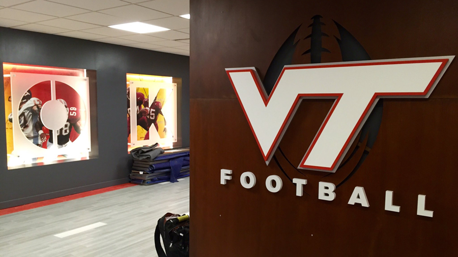
The Hokies football staff Twitter shared photos of the work in progress which highlight the modern look.
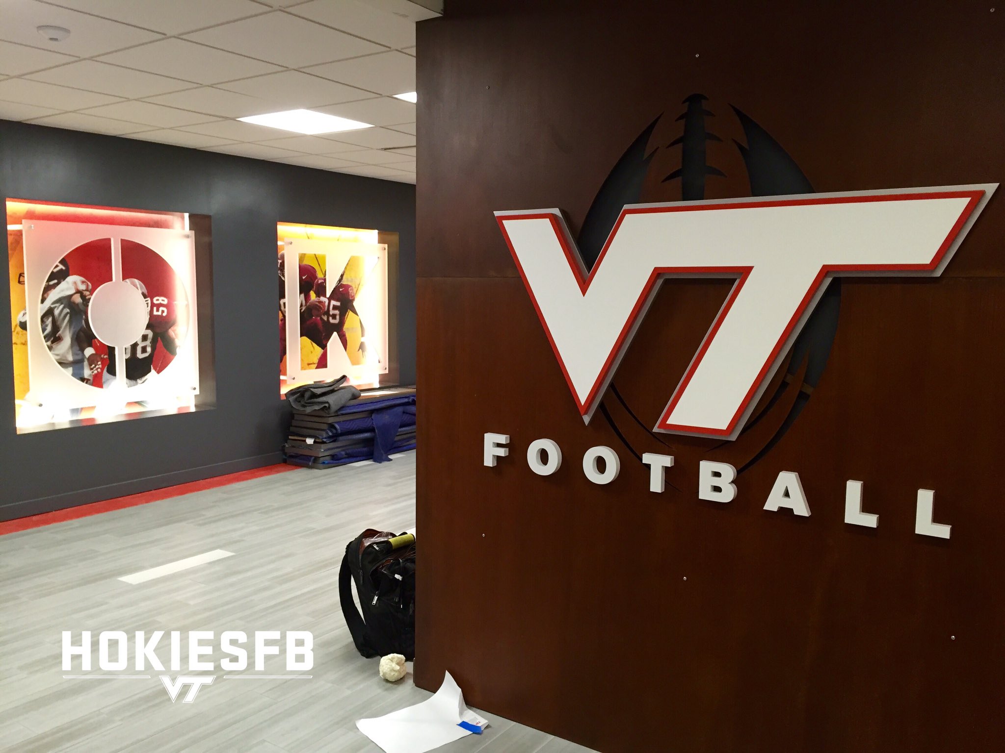
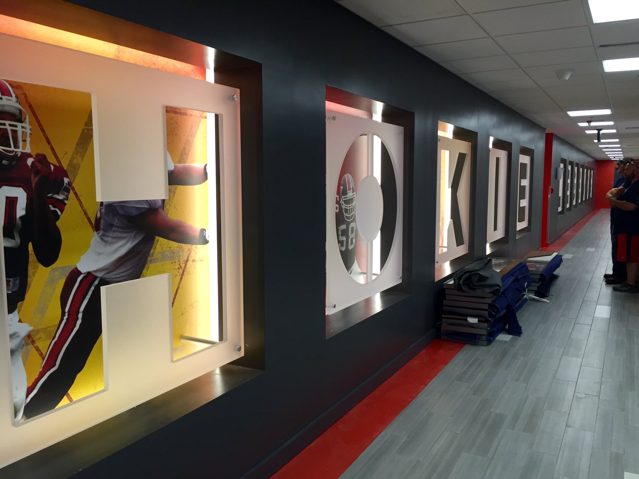
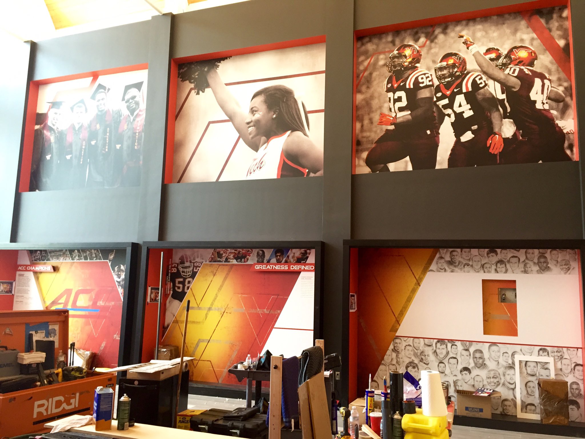
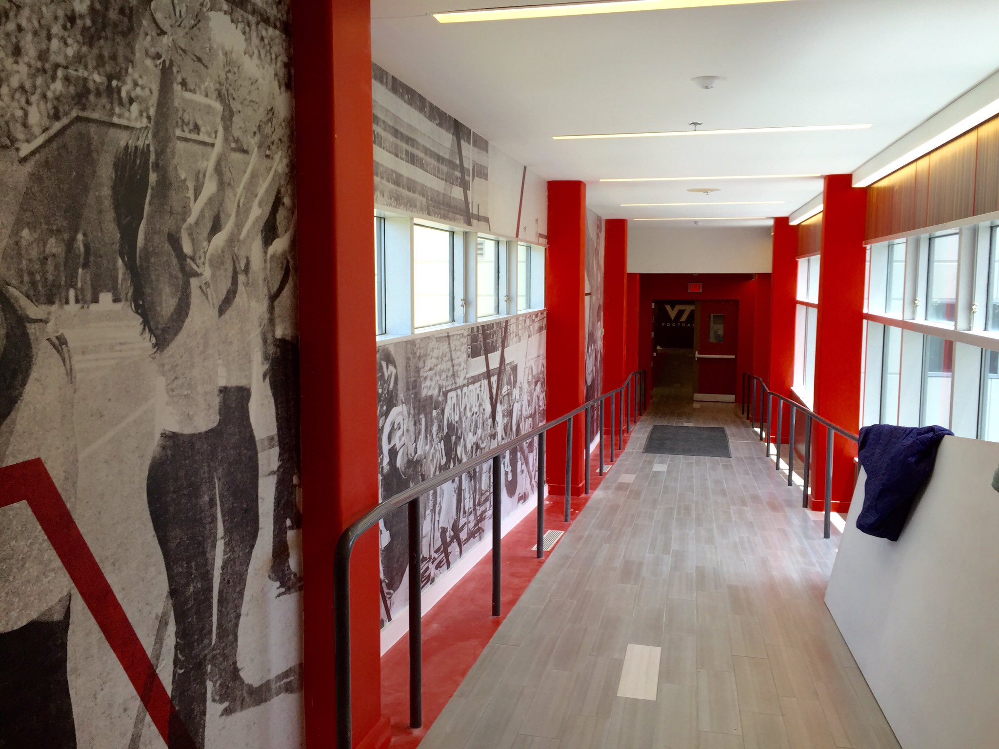
The revamp is set to wrap this summer, and the finished product will include: dramatic displays of the football program's historical achievements, famous student-athletes, tributes to coaches, and memorabilia, as well as interactive stations, current information and highlights.
Comments
Beautiful. Seems like it would help with recruiting.
Indeed, a beautiful building and upgrades, it's just a bit sad the academic side doesn't get this kind of attention. A lot is invested for a few....
Entirely different budgets. Have you seen the Moss Arts Center? A lot of money went into it. Much more than the Merryman upgrades
Updates and renovations are widespread across the academic and residential sides of campus too - the only thing that lacks money/improvements that fails in comparison to other big schools now on campus is Squires Student Center.
You should check out Moss Arts Center, Lavery Hall, Goodwin Hall, Davidson Hall, Pearson Hall, and the New Classroom Building next time on campus. Everything being built/renovated on campus these days is better than what Athletics can even hope of.
I sure do hope that Deangelo Hall is in the works too.
A Slye comment indeed...
All of these puns just make the thread a bit Fuller.
It really depends on how many buildings they can a-Ford to build
Only if the Buil-Durkin keep up.
I'm getting Fullwood
My sources said it's not done yet because the school wanted to make it look Fuller.
If you're going to name a building after Mama Fuller, you should probably Teller first.
Make sure it's Fayscon the North, for sunlight.
I've actually heard several rumors that Tech is going to build a new student center and either demolish or designate Squires for something else.
The plan that was mentioned several years ago, which is probably still in the master plan somewhere, is to turn Squires over to the Music and Performing Arts Departments since they use many of the studios, practice rooms, and offices already. Then a new Student Center was being discussed and one possible, and likely, location was Dietrick Lawn, across from Cassell.
having lived in EAJ for 3 years, that would make me sad. But then they've already gutted the dorm since I've lived there and I can remember walking out of west AJ and seeing the practice soccer fields where cochrane, student services, career services, new hall west, and harper are. So I guess change is inevitable
If you don't like change become a firefighter. Where the motto is 200 years of service unencumbered by progress.
Is it just me, there's a lot of yellow in those graphics, right?
All the accent lighting appeared orange from the pre-construction artists renders, so once its all complete, it'll come together nicely.
Of course, looking back, I am completely wrong
I wish this picture was the reality. The over picky designer in me does not like the finished product compared to the renders.
The biggest difference being the drop ceiling.
They might still be getting rid of the drop ceiling. In the last picture the ceiling seems to match the rendering.
If they are, they aren't doing it anytime soon. You don't begin finishing touches before you remove a drop ceiling.
I'm guessing there's enough being hidden by the drop that they realized they can't remove it, and decided to save money by not touching it
I can't quite tell in the picture but they might just be different ceiling tiles and still be a drop ceiling. I would think that they still need a drop ceiling there to access wiring and what not, but I may be wrong.
the render and the built product are both drop ceilings
Ehh... look at the render again.... they were planning to raise that ceiling up a foot or so
You can tell because the dimensions above and below the boxes with the letters are the same in the actual product, which translates to the render... except for where they planned to raise the ceiling....
Side note, I really should get back to work...
Don't think they were going to raise it, they just added a design element that made it look more raised that wasn't implemented.
Amended that comment too late for your reply... But yeah, the dimensions on the render account for exactly what we got and then a raised ceiling... and we never raised the ceiling
I don't see the same thing you see. I don't think they were drawn to raise the ceiling. Doesn't matter either way since the finished product looks worse than the renderings.
look above the Hokie letter cutouts in the wall. The width of the built product is much wider than the render. The render shows the wall and the stylized roof extension coming down. Together it is the same width as what shows on the finished product. they are both drop ceilings.
also there is no way you can have downlights like that without having a drop ceiling.
*sigh*... you might be right
And the fact we can even have this convo is indicative of how they missed the mark on the actual vs the render. I'm guessing that white border below is a lightbar of some sort, which would have been sooooooo much better than what we have.
yep, I think it was meant to be a recessed wall with down lighting to make the orange stripe really pop. The render is a bit sloppy with these two lines when it gets to the hallway, but considering that the width above and the below the cutout lettering is the same, that would be my guess
wow, someone actually downvoted our high five gifs....
She is a Wahoo...
At first, it just looked like they went with the darker anthracite on the walls than the light grey they had before....
But then I saw the ceiling in the actual hallway vs the render... *facepalm*... they were soooo close....
yep, it's missing the style and swagger the designer put into it. The finished product isn't bad but it could've been damn cool had they followed the designer's intent.
Yep - plus, they replaced Danny Coale with a generic VT.... how do you replace Danny friggen Coale with a generic logo!?!?
(yes, yes, I know that's not actually Danny, but a rendering made by Clark Ruhland, but whatever, still counts)
Yeah, drop ceilings are a little Office Space-y.
I would imagine after a loss, someone could certainly be having a case of the Mun-days...
Sounds like this is still a work in progress. Hopefully the updated ceiling and some lighter paint will help to enhance the look and bring it closer in line with the renders.
I think brighter accent lights behind the H-O-K-I-E-S lettering will help to enhance that as well. However, as one previous poster noted, there does seem to be a lot of yellow in those images behind the letters.
But what the hell do I know, I have no eye for this sort of thing. Hence leaving all the home decorating to my wife.
The ceiling with those slit lights is in the third pic (with the cheerleaders) but is executed very poorly.
It's like the rendering has components of both the cheerleader pic and the H-O-K-I-E-S pic, but the reality is worse in both conditions.
What I dislike the most is the anthracite on the walls, makes the place feel dated and cavelike. The lighter gray in the renderings was much better.
I don't think that is gray. I think the color scheme was entirely white or off white. The light gray is likely the difference between the down lights that are offset from the wall line and the rear mounted accent lights within the wall
The ceiling with those slit lights is in the third pic (with the cheerleaders) but is executed very poorly.
It's like the rendering has components of both the cheerleader pic and the H-O-K-I-E-S pic, but the reality is worse in both conditions.
What I dislike the most is the anthracite on the walls, makes the place feel dated and cavelike. The lighter gray in the renderings was much better.
And I guess that's orange on the tile trim and columns, but it sure as hell looks red in some pics.
This is just awesome. I am stoked to see what the finished project looks like.
I got to see the construction first hand earlier this week heading into a meeting in Merryman and I can say it looks better in person than it does in these photos. The orange is very bold in person and there's lots of great tributes to Beamer (obviously) that haven't been shown yet including photos from his final games. Also, lots of Fuente graphics in there too already - photos seem to be from the Spring Game. The yellow someone pointed out above isn't as 'yellow' in person as the orange and dark gray almost overwhelm what used to be off-white and wood. Things seem to be moving quickly and I expect it to be finished on time before the end of the month. The whole place looks much better and the modern vibe reminds me of my recent visit to Clemson's stadium/offices.
If you follow HokiesFB on Snapchat they posted another update on there today.
Side note: Construction workers are wearing Bama National Championship gear - wrong place people.
Just saw the snapchat. Looks much better overall.
Especially love the big solo Hokies in the NFL panels. Kids love Kam
The drop ceilings really looked out of place. Kind of like redoing your kitchen but not having the money to replace the old 80s cabinets. However, the finished product is looking nicer and nicer.
Interesting a lot of the murals are of the last couple years. Recognize the last two OSU games, hokie bird with the new scoreboard. Wonder if they'll keep updating or if andrew motuapuaka will be enshrined.
I like some of these graphics wayyyy better.
Loving the new update this morning. I need the helmet case in my apartment.
Here's the video if you don't have Snapchat
I like that they have permanent displays up for all of the trophies we get to keep. You know, orange bowl champions, sugar bowl champions, commonwealth cup...
Dont forget that Black Diamond trophy. Makes the arguments between me and wvu fans much easier
Strange how we got a slew of commits just as they revealed the new Star Trek font.....
Coincidence?............
yes
Fonts are the new uniforms. Next it will be Pokemon.
It looks really good. My only thought was they should have either used bigger mannequins or put pads on the mannequins. The jerseys look... weak.
...Hilgart is still working with them. Manneguin heights and weights won't be released until after they report for camp...