
http://www.espn.com/college-football/story/_/id/20445137/uni-watch-new-a...
Looking at the Miami, UNC and NCST uniforms has me really wishing we would drop the stripes as soon as possible.
Bring back the classics!


Forums:
DISCLAIMER: Forum topics may not have been written or edited by The Key Play staff.

Comments
While we don't have the greatest deal with Nike, I am so glad we are not an Adidas school.
I'm also glad we're not Under Armour, as some of their proceeds to to support Terrapin football. Yuck.
Adidas is on the come up. You just happen to tear your ACL guaranteed.
Forgot to mention how random it was that they included UCF with the ACC schools. I assume they are trying to join. Any chance the ACC adds them and UCONN?
You'll notice that the UCF helmet is included in the UVa section. Clearly, they had nothing to say about the Cavs and needed to fill some space. After all, what is there to say about them when after you've run out of synonyms for almost mediocre?
It looks like things are a bit disorganized. The mention a possible color and logo change for Pitt and then show the UVA tweet about the cleats. And in the UVA section is the UCF helmet.
Pretty sure it's a typo. There's a tweet from "@UVAEquipment" about cleats where it mentions a secondary logo and color change for Pitt, and the UCF tweet is where it talks about UVA switching the color of their cleats.
Remember, this is ESPN we're talking about, the "worldwide leader in not hiring enough editors" even before their recent financial struggles.
Also, no chance UCF is added to the ACC. Big XII, maybe, if they also pick up someone else from the southeast.
Y'all downvote this, but I'm about to speak the dam truth. The Classics are boring and not really iconic either.
Aww cmon, you know you love the 'back in my day' levels of curmudgeonry that occurs whenever our uniforms are brought up
Perhaps, but I still prefer them to the clown suits of the Maryland Terrapins.
I would never downvote another's opinion VT_Fencer. Do you like the stripped jersey? What would you want to see in the near future for the team? We need something slick for recruits.
I'm meh on the striped jerseys, probably because we've had them for so long now. I don't have a lot of hard opinions on uniform design. When it comes to Tech uniforms I like just about everything we've done for alternate uniforms over the last 7 years, for what that's worth.
My position is that you can only get away with a plain, boring uniform if it's iconic. If you strip away the insignias the average college football fan can still tell that a red helmet with a red/white jersey and white pants is Alabama. If you look at all maroon or all white with a maroon helmet I don't think your average college football fan would say 'That's Virginia Tech' right off the bat. Admittedly, that could be cured if we were nationally relevant, but I'll stick by that point for now.
That makes sense...ironically I prefer our practice jerseys instead of our game day ones. In the end as long as we get the W I'll be one happy Hokie.
Alabama has no problem grabbing recruits without gimmicky uniforms. Success>flash
Counterpoint: Oregon
Bama has a GD WATERFALL in their locker room! They still do flashy shit.
So its agreed! We win 4 national titles in the next 10 years and then go to the JV practice pinnies as our default uniforms.
I halfway agree but I'm giving you a leg for the dam truth
You are correct. They are overrated. They are only really popular because a) Mick Vick wore it and b) We went to a National Title game in them
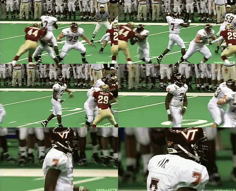
We literally played in a NCG with these uniforms. How are they not iconic?
There's nothing that screams Virginia Tech about an all white uniform with a maroon helmet and lettering. If you took that uniform combo and removed the logos your average fan wouldn't be able to tell the difference between Virginia Tech, Texas A&M, and Mississippi State.
Ours would be the ones with the swoosh.
Okay, but in no game scenario outside of someone stealing your gear pregame (coughGT 2007cough) will you be playing in a uniform without the logos. If easy-to-recognize-minus-logo is the metric we're using, I don't see the point.
And I still like them best. Simple, clean, and a promise of brutality to the opponent. Then again I don't Hate anything we've done uni wise since then with the exception of the foghorn leghorn helmets.
The point is the uniforms are not iconic because there's nothing about them that distinguishes Virginia Tech from other schools other than the VT.
This is the strongest argument for shoulder stripes
LSU had the shoulder stripes before we did. Probably other teams too.
Yup, Ole Miss has them too.
UCLA
Exactly. When we have the most unique color scheme is all of sports, why don't we utilize it?
I'm not saying I want orange uniforms, but we don't need to be rocking all-white so often.
Exactly, that kind of success makes them iconic.
They are iconic to functionally 0% of people who were not already Hokies though, thats the problem. Recruits today werent even born in 1999, they have no emotional connection to MV7 in a clean white or all maroon everything other than another highlight clip on youtube.
Give a slight modernization (ie update logo, small/unobtrusive orange stripe on the pants with a small logo on the hip) to those AME with the orange numbers and HAWT DAYUM those would be sexy.
I'm a visual learner. Please provide a picture :-)
My entry from the custom uniforms thread? Just with different font and not Wilson.
I don't think the numbering color combo is allowed. Th number would have to be white or orange
That strays a little too far from the original than what I have pictured. On second thought, perhaps what I'm thinking is take this uniform, add the new lettering style, and change to maroon pants. That with our Belk Bowl helmet would bring the fire.

I just think we should bring back these exact ones and not touch them
I remember when the '04 uniforms came out they were pretty universally hated among the fan base (particularly the orange v-neck, which was supposed to be a literal nod to the letter "V").
Our identity was the '99 look. I still think we peaked with thet uniform - although I do like the strips on our current one. I hate all the poorly executed "Oregon" stuff we have been doing over the past 8 years.
The '04 uniform was the one that sent us down this terrible path.
Bring back the '99. Get off my lawn.
They were great, but also as bland as we can get. Sometimes plain is good, but there was practically zero design to them outside of the number font. The mid-2000s uniforms peaked in '09 in my opinion, as they were a great balance of orange, maroon, and white.
I think we should bring back Vince Hall
You dog, Hall was 9. Adibi was 11!
These are some mock ups of this exact concept that I posted a few weeks ago. I think it looks pretty sweet with our new number style and current tapered stripe helmet. Don't know if both the white and orange piping should stay or just one or the other.


Also think it would be sweet to incorporate some Hokie Stone patterns into the maroon uniforms. Here's a rough concept of what I was thinking on the shoulders and sleeves. Similar in look to the back of the current basketball jerseys.

Couldn't find a good pic of the maroon basketball jersey, but this is what I'm talking about. Very subtle Hokie Stone pattern would be cool to incorporate.

See, even he missed the single orange sleeve.
Just make the numbers all orange. Then they're legal, and would still look pretty good.
Maybe it is just because that's when I attended VT, but I'm in absolute agreement. Those all maroon (no stripes, no piping) uniforms were just tough looking. Intimidating without needing to resort to some lame blackout uniform.
The all white roadies are so clean and classic too. They looked like "we're here to take care of business." Loved it.
GIVE ME ALL ORANGE UNIS WITH WHITE AND MAROON STRIPES
/s
via GIPHY
Make it the right color orange, and not the bright safety orange.
That is the right color orange. They officially changed to the brighter shade with the rebranding. Also slightly tweaked the maroon as well.
I don't care for the stripes, but I also don't want to go back to plain jane uniforms. I love the single orange sleeve uniforms because they're something different. When/if we ditch the stripes, I hope we have something relatively unique (but not Maryland levels of unique).
I know we're not supposed to downvote opinions, but surely we can make an exception for that opinion?
They're the best uniforms VT has ever worn.
hahahaha someone actually did downvote it! Love it. The hate keeps me warm.
It wasn't me. I will give that comment a leg. Just not any that express that opinion.
Nope. I particularly loved it when the guys would wear the undershirts backwards for the harlequin look. *prepares fire extinguisher for incoming flame war*
Leg to counter stupidity. Uniforms I don't like in order of least to most liked:
Stripes < Single Orange Sleeve (SOS) < Solid Orange/White < Solid Maroon/White < Hypothetical Orange Feathered Wings Over Maroon (Oregon with Maroon and Orange instead of Green and Yellow)
I can't read anything followed by watch not in Fantana's voice.
Vince Hall says get off my lawn.
ETA: holy yuge picture. I like these in maroon more, which has nothing at all to do with the fact that I have one of these in maroon, but all the pics of vince in maroon were gigantic.
I feel like signing up for a bunch of fake accounts just so I can give this post more legs. I hate, Hate, HATE the stripes!
I think it'd be kinda awesome to go really old school and whip these out for a game. Gotta love that pose too.
Wait, wait. I thought VA TECH is not cool. I'm confused now.
I know I'm cool with it as long as its not pronounced "Vah Tech". I personally cringe when I hear that.
Besides in that uni, that's THE LEGEND BRUCE SMITH!!! That's a classic.
But it still pales in comparison to the ALLMAROONEVERYTHING unis!!!

Not sure where we were discussing this (were we?) but the David Hale Va(h)Tech Twitter situation still lingers. He's changed his handle to #DaHale. (If you missed it, VT fans tore into him on Twitter for typing VaTech; cooler heads prevailed, but the joke continues)
I don't like the current uniforms. I did when they came out. Was a nice throwback adopted to permanent. But they're tired.
I didn't like the plain ones when they came out. Looking back I like them. But remember thinking "wow, wish they were more trendy" (must have Hokie Stone!).
All that said, we need a refresh. Something modern and different.
I was really disappointed reading the ESPN Uni Watch and all they said about us was raised letters on the helmet collar.
Modern version of the 99 unis would be sweet
UNCs uniforms look great, and actually like ours from the OP
I don't know how I feel about the so-called raised letter trend.
Agreed. It looks cheap, like a grade schooler got to decorate the helmet with wood blocks, printed would have looked better.
Disagree. I think it looks really cool.
Yeah, I think that's what makes it unappealing to me. Looks sorta like this.
This was a tweaked 90's look I did a few years ago with old ACC logo, etc, but I like simple with a little more orange, so this is what I came up with. Obviously there could be white, orange(?) variants, updated font, etc...
I like it.
1) I'd move the numbers to the side of the shoulders
2) Add the new number font
Can we just compromise and go with the '05 uniforms?
04-07 was my favorite by a long shot. But yes I would be okay with just about anything without the damn shoulder stripes. It seems most people don't like them, and most uniforms without them look sharper and more sleek.
Same here. Loved those unis. Also loved the ones like from the 09 Miami game. They were simple, but man, looked pretty badass at times. Kam made those look incredible. And for whatever reason, seems like they only got used for about a season and half before they went to the stripes.
You know what, I like those as well, they were kind of edgy (literally, the numbers were super edgy) and relatively unique, but as you said they were short lived. Wore those the majority of 2008 and 2009 IIRC.
Sooo when is KJ Henry launching our new unis for 2017?
Gotta love what Adidas is doing with scUM. 15 different uni combos for 12 (maybe 13) games this year. /s
You need that many combos if you're going all the way in the playoffs like Miami. /s
When you're back, you should come back in style!
*bak
I love the finances..i.e. quadruple VT's Nike deal
I say take off the stripes on the shoulders and throw some turkey feathers up there! Aka see oregons duck unis. I think it would be an awesome combo especially w the matte maroon helmet w the gobbler on it.
Thats what I've been saying in every uniform conversation since I saw Oregon's unis (2009), and comment on it on every uni thread since I joined TKP.
I'll apologize first because i'm not sure how to produce the uniforms like those above me (If anyone has a recommendation i'll try to do mock ups). Personally I think a combination of old and new may work. I think the general consensus is that the '99 uniforms are the definitive look. However, I would have jersey and pants for our three colors (even orange, I actually like these a lot). This serves as a base for the edits I would make.
--I would say keep the pants plain, give me our logo and a nike swoosh and nothing further
--Keep our new numbering, but keep it color consistent , so if we have white numbers on the chest and back, then keep it for our shoulders.
-- The above feeds into this point, I like the use of hokie stone, but keep it subtle in side the numbers. It's difficult for me to describe but essentially using the water mark we use for the back of our bball jerseys but inside the numbers. Bama did something similar with a houndstooth water mark in their pro combat uniforms.
-- Take the stripes away I think the only accents that I would keep are similar to the 2013? v neck and arm stripe, a simple color break so the jersey is not too plain.
--It may be unpopular but I liked and would keep the striped helmets from last year, it looked sharp (maroon, orange, and the white use in the belk bowl), but can be persuaded to move on (although a plain orange helmet gives me anOSU nightmares).
I think this gives an underrated classic look a modern update without going full Oregon.
Sounds like we will be utilizing Maroon, White, and some other facemask. "Saving the best for last." Very interested as to what this could be.
Give me more of those chromed facemasks from the Belk Bowl.
I"ll throw my idea out there for sh*ts and giggles. Inspired by the Hokie Stone baselines in Cassell.
I like these. Can I get a VT in the thigh pads?
From the link in the OP: I really like the block letters on the helmet bumpers, but the back of our helmet is so damn busy. Starting to look like a NASCAR. I guess it will give opponents something to read while chasing Cam and Dragon to the end zone.
I like the helmets a lot.
Too much Hokie Stone on the shoulders
Wow. Love these.
Digging this design, wouldn't mind something like this at all.
could you just put the Hokie Stone on the side of the shoulders on the jersey?
This is fantastic. I love the incorporation of the Hokie Stone pattern ala our court floor (integrated branding anyone?) With just enough orange to highlight the uniform. I'll admit while I like the orange numbers we've never really used that (white is always our maroon jersey # color) but that's the only critique (it's also easier to see white on maroon which is an NCAA rules qualification for the coloring, must be visible from the press box which orange could work for but white is guaranteed to).
If the stripe were tapered or a window like our Battle at Bristol ones that might also be a cool convention (i like how Nike adjusted the pants striping for Michigan State this year which I think that shape would look great with that filler and outline). I would also think the pants would get a VT logo on them opposite the swoosh as that seems to be our current trend (and i like it, Florida moved theirs off the stripe to a similar front side position this year). Similarly I would suspect translated the helmet strip would end up at 3/4 length to leave the back open for the variety of stickers and logos we put back there.
What's super sad is that this is better than literally anything Nike will produce for us with our trash contract.
Noticed this morning from a Hokie Sports tweet. The women's soccer team utilizing the maroon w/ hokie stone embedded. Big fan of this style (could easily use VB06Hokie's version and see the maroon, white, and a black uni set).
Those soccer kits are pretty sharp.
Here you go, kept the orange numbers on the sleeves to mimic the '98-'03 jerseys but updated the chest numbers and truncated the pants stripe into the pants template.
Amazing. Props for taking the time to edit together my suggestions!
I instantly wish this were our kit now.
With any luck Nike is watching and will be paying you shortly for your fantastic design (don't let them low ball you).
Love the maroon, unsure on the white.
What if the white uni replaced the maroon hokiestone with gray, then changed all of the orange on the jersey to maroon? That would look pretty sleek.
I had the same thought. On the white uni, replace the maroon hokie stone with white/gray hokie stone (like the numbers on the maroon uni) and change the orange on the shoulders and neck to maroon.
The maroon jersey is excellent, and I agree about the white.
Really, I don't mind the white one, but the one thing that stands out is the name plate on the back... the fact that it breaks up the pattern is a sticking point to me. I'm not sure how gray would work either, because the issue remains that the pattern is broken by the name plate and it just sticks out so much more with a white jersey. It just blends better on the maroon ones.
Other than that nitpicky detail, these are fantastic concepts!
I don't care who y'are, them are sexy.
Ladies and Germs, we have photographic evidence of maroon helmets (maroon cages, with the orange and white pointed stripes) and maroon pants, via @VTEquipment.
#ALLMAROONEVERYTHING in the forecast...
Are we considered the away team? If so, one would be led to the conclusion of AME
No, we are considered the home team. WVU will be wearing all-white.
We are the home team via VT_Football
Don't look too much into that. They're just getting everything ready. There were a few bait and switch last year leading up to the game by following the account.
They're packing the road boxes. Cuzzin's is wearing all white. We won't also wear white jerseys.
Bet you 10 legs we go AME.
I hate these guys...
/s
Our Nike deal is an embarrassment and highway robbery. Whit needs to address this big time and if it means switching apparel companies, so be it. To have a deal similar to Marshall and Purdue and less than GT, NC State, Navy, UVA, WVU, etc etc is a crime. I hear that a Weaver underling simply extended the current deal for 8 years about 3 years ago at a time when these deals were exploding/tripling etc. Of course Nike couldn't wait to have VT in the fold for Marshall/UCF dollars. Whit needs to fix this, and if Kevin Plank wants to write a buyout check and give us 80% of Wisconsin's deal, I am 100% for it.
Agreed, that Nike deal is out of whack. I'd hate to be outfitted by UA, but I would like to see an outfitter value VT closer to where it should be valued at.
I really like Nike, but one thing that ticks me off is that when you go to the fangear section of the Nike website, the VT logo isn't displayed. I mean seriously, dafuq! WVU, WSU, and Oregon St are displayed. I'd personally feel quite comfortable arguing that VT is a bigger brand than those.
Whit will do a better job when it is time to sign a new contract. Weaver dropped the ball on the negotiation and could have done a MUCH better job. Whit had to sign the contract when he first started, but it would have been tough for him to tear up the contract as soon as he arrived when the terms had essentially been agreed upon.
I hope we remain with Nike. Adidas sucks for football.
Awesome
That the new tweet just has close ups of the jersey, helmet, and pants? You can tell that it is last years maroon helmet, but you can't see anything with the jersey and pants.
Is it last year's uni or something different?
Reveal
There were two separate tweets referencing the reveal that showed photos / footage from last season.