The stacked VT needs to be in our rotation permanently. Have a throwback game every year where we wear that look, both home and on the road.
From just a pure aesthetic viewpoint its a great logo, and something we should embrace far more than not. In fact, I'd go so far as to say it should be our full time logo in baseball and softball.
Log in or register to post comments about the Virginia Tech Hokies
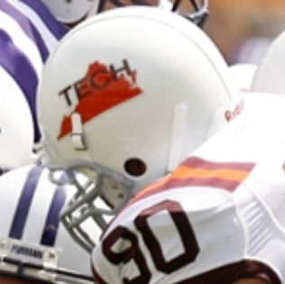
Been more than a decade since we've had a non-text helmet design? That's surprising to me. The gobbler should definitely make a come back if we do another image helmet but I'd love something new.
Would be sick if we had a black uni with the helmet being Metallica's black album (Faint Virginia Tech in the Metallica font with the snake in the corner l)
Log in or register to post comments about the Virginia Tech Hokies
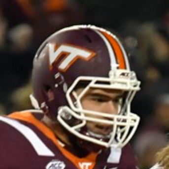
Classic look: maroon (somewhat sparkly, IIRC), no stripes, standard VT. Looks awesome, and my second favorite helmet.
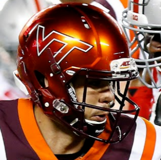
Call me crazy, but I liked the shiny orange with VT. Looks sharp, but would be improved with a maroon VT, rather than an orange VT outlined with white and maroon.
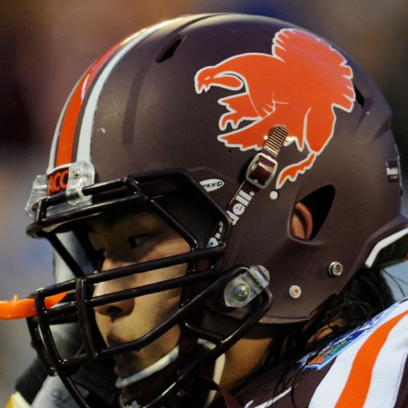
But this, this is the best helmet by far. Matte maroon with the large gobbler logo in orange. Would be even better without the stripes. Bring these back, Brent!
Log in or register to post comments about the Virginia Tech Hokies
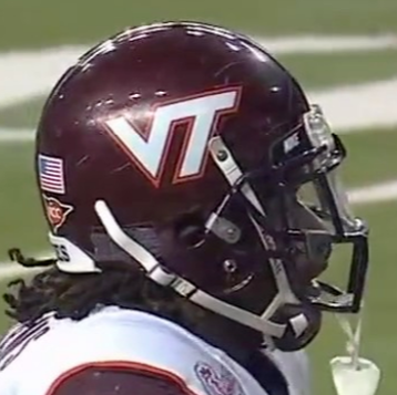
Its so weird, I never noticed it at the time, but now whenever I see one of the helmets from the 1990s-2010 era, I can't not see how janked up the logo was before we fixed it. The T was too close to the V originally.
Compare before:
To After:
Log in or register to post comments about the Virginia Tech Hokies
The different varieties of maroon from nearly black to purple is really shocking. I think I prefer the stripe in the middle or the paint needs to be sparkling. In general I think the matte helmets all are inferior. I agree with a throwback game each year and maybe alternate the stacked VT and the state outline and TECH on white every other year
Log in or register to post comments about the Virginia Tech Hokies
I agree with a throwback game each year and maybe alternate the stacked VT and the state outline and TECH on white every other year
Throwback game every year with the stacked VT, but if you want to bring back that other logo, something like this should be the full-time Worsham Field design going forward
Log in or register to post comments about the Virginia Tech Hokies
We seriously need a Throwback Weekend in lieu of an "insert color" effect. Everyone just wear their favorite vintage Tech pieces to the game. Put highlights of great teams on the Hokie vision during time outs. Put full games from the 99 year on the TVs in the concourse before kickoff. Use this field design (or older).
Like Darlington's throwback weekend in NASCAR but it's VT
Log in or register to post comments about the Virginia Tech Hokies
Disagree heartily on helmet stickers. Nothing like seeing a player line up for the first snap of the year with a helmet covered in stickers for...what? Managing to put on pants each day?
Log in or register to post comments about the Virginia Tech Hokies

Comments
Hot take: I loved the White helmets with hokie stone logo and the Fighting Gobbler helmets
Thanks for posting, homie. The graphic design nerd in me loves stuff like this.
Ah yes, the foghorn leghorn helmet. Got to be the worst.
For the basic "cartoon" depiction of the helmets, here's a link. This can be crossed with the actual photos to see how they looked in the real world.
http://www.nationalchamps.net/Helmet_Project/acc1.htm#vt
Somewhat surprised that we've never slapped this on a helmet before:

That's a missed opportunity.
IMO, it doesn't get any better than these three:
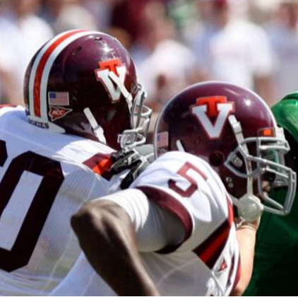
The stacked VT needs to be in our rotation permanently. Have a throwback game every year where we wear that look, both home and on the road.
From just a pure aesthetic viewpoint its a great logo, and something we should embrace far more than not. In fact, I'd go so far as to say it should be our full time logo in baseball and softball.
Been more than a decade since we've had a non-text helmet design? That's surprising to me. The gobbler should definitely make a come back if we do another image helmet but I'd love something new.
Would be sick if we had a black uni with the helmet being Metallica's black album (Faint Virginia Tech in the Metallica font with the snake in the corner l)
Classic look: maroon (somewhat sparkly, IIRC), no stripes, standard VT. Looks awesome, and my second favorite helmet.
Call me crazy, but I liked the shiny orange with VT. Looks sharp, but would be improved with a maroon VT, rather than an orange VT outlined with white and maroon.
But this, this is the best helmet by far. Matte maroon with the large gobbler logo in orange. Would be even better without the stripes. Bring these back, Brent!

Its so weird, I never noticed it at the time, but now whenever I see one of the helmets from the 1990s-2010 era, I can't not see how janked up the logo was before we fixed it. The T was too close to the V originally.
Compare before:
To After:
The different varieties of maroon from nearly black to purple is really shocking. I think I prefer the stripe in the middle or the paint needs to be sparkling. In general I think the matte helmets all are inferior. I agree with a throwback game each year and maybe alternate the stacked VT and the state outline and TECH on white every other year
Throwback game every year with the stacked VT, but if you want to bring back that other logo, something like this should be the full-time Worsham Field design going forward
That looks good to me. Just paint the whole endzone already! If it's really a grass health issue, then wait until the last or second to last game.
We seriously need a Throwback Weekend in lieu of an "insert color" effect. Everyone just wear their favorite vintage Tech pieces to the game. Put highlights of great teams on the Hokie vision during time outs. Put full games from the 99 year on the TVs in the concourse before kickoff. Use this field design (or older).
Like Darlington's throwback weekend in NASCAR but it's VT
End the white out and black outs. Just have throwback weekend with white unis and one of the old logos.
Was "VPI" ever used on the helmets, excluding the leather ones?
The camo look (all variants) needs to erased from memory and never spoken of again
And we need helmet stickers. Hokie tracks would be my choice.
Disagree heartily on helmet stickers. Nothing like seeing a player line up for the first snap of the year with a helmet covered in stickers for...what? Managing to put on pants each day?
Especially when all pants pants the same.