
Wait, did you guys want Orange unis? 🤔#ThisIsHome | #OrangeEffect pic.twitter.com/OKkloQiNIe— Virginia Tech Football (@HokiesFB) October 16, 2024
pic.twitter.com/5F8UKPeYVb— Virginia Tech Football (@HokiesFB) October 16, 2024
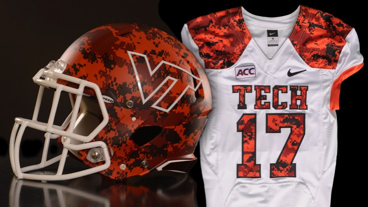
Hokiebird on the collar and Virginia Tech on the front. Not sure we have ever done either of those before.
Also, color swapped arm numbers meaning we get maroon on the sleeves. This is very reminiscent of orange jerseys that were available for purchase in the bookstore right around the Vick era but never was worn on the field. Always kicked myself for not buying one at the time, might have to make good on that now.
Also, it's nearly identical to the orange uniform we wore against UNC a few years back, just with Virginia Tech instead of Hokies on the front and the color swapped numbers.
/cdn.vox-cdn.com/uploads/chorus_asset/file/9522857/usa_today_10359719.jpg)
Should look excellent under the lights!
Update:
One final piece for todays unis 😉#ThisIsHome pic.twitter.com/eTlRzKfvXL— Virginia Tech Football (@HokiesFB) October 17, 2024
Oh god, that's nice

Comments
So, so pleased with the uni overhaul this year.
It's the part of the preseason hype train that aged the best
Me too. I like them a lot.
When I was a little kid, Orange was my favorite color. Then I grew up.
Orange is a terrible color for a sports team. That's why there's not a single pro sports team that I can think of that wears an orange uniform. I would not only be for firing whoever keeps deciding to putting the Virginia Tech football team in orange, I'd be cool with banning them from the state.
Not sure if joking, but if serious...
Phoenix Suns
Baltimore Orioles
Philadelphia Flyers
Anaheim Ducks
Miami Marlins
Denver Broncos
Cleveland Browns
Cincinnati Bengals
Chicago Bears
Miami Heat
Miami Dolphins
San Francisco Giants
New York Knicks
New York Mets
Utah Jazz
Oklahoma City Thunder
Charlotte Bobcats
Houston Astros
Detroit Tigers
Edmonton Oilers
Tampa Bay Buccaneers
Yeah, I admit that is a lot of teams lol. I should have said very few teams have Orange as the primary color for their uniform. Because it's an ugly color for a uniform.
Also, I'm not sure almost any of even those teams often wear Orange uniforms. The Heat are red and black, the Dolphins usually wear blue, etc.
And we don't often wear orange uniforms either
Denver Broncos, Baltimore Orioles, Cincy Bengals, OKC Thunder. To name a few
I definitely didn't think very hard before making my comment.
But I'll still point out that the teams you listed have some of the stupidest uniforms in sports. The Orioles have ridiculous looking uniforms when they aren't in black.
Fun fact- for decades the NFL forbade gray/tan/yellow jerseys because they look terrible on TV. Only did the stupid Nike "color rush" Thursday games change that. From 1960 to like 2015 you had to wear a dark jersey or a white one... the sort of dark jerseys were not allowed.
i did not have "someone moves the goalposts after being simply fact checked by dcwilson" on my Bye Week Bingo Card
I'm going to pretend you didn't say that....
The only orioles jersey I don't like is the City Connect jerseys, and I really don't like that the City Connects replaced the Friday night Orange jerseys. Other than that I think the orioles have some of the best uniforms in baseball.
Orange was my favorite color growing up, still is, fantastic color for everything. I had an orange accent wall in my home office with orange chevron curtains Orange is best!
Orange is the new black.
Since they weren't ordered from Fanatics and appear to be designed for us and new, I'll allow it!
no, I did not ask for orange. no Hokie who had to endure Charlie Coffey wants orange unis
Whatever you say, dear
more like, "what was that again?"
Love it. Orange effect games should be #AllOrangeEverything, and then these unis shouldn't be worn again to the next orange effect.
glad the uniforms match the crowd effect for the game this time.
Look
I'm not normally one for the dominant orange unis, but these are cool. I rock with it.
... but you'll never catch my ass wearing dominant orange ANYTHING. lol
I think the jersey design is really cool, and I hope they go up for sale.
I do wish it was white pants though. Or a maroon helmet on top. White, Orange, Orange just feels unbalanced to me.
I like every component of these uniforms, but I would combine them differently.
I wished they would've done an alternate white helmet with the T in the V, fighting gobbler, or script Hokies. Or at least flip the VT colors so it's more orange. I think any of those options with prominent orange coloring would have tied this combo together better.
AOE, pls.
But like this.
I dig these. I was hoping we would do the Hokies script on the front like our orange basketball unis, but even so these are very slick.
At least there's no huge shoulder stripes on them like our previous orange threads.
Normally not a huge fan of orange uniforms, but I'll have to admit, I like these a lot.
I'm guessing that statistically teams wearing hunting orange jerseys like this force fewer interceptions than teams wearing dull/natural colored uniforms. How does a QB miss or not see a defender when they're wearing this color?! Has this been discussed before? I feel like this is a valid point that teams should explore and take into consideration.
For this reason and without actually doing the research to back my speculative claim, I am generally against wearing uniforms of this color.
Think about a QB dropping back...is it not easier to see holes and openings in a secondary if the defenders are wearing these brightly colored uniforms? And it has to also be visually easier for an offensive coordinator in the booth to see and recognize coverages and things the defense is doing.
I know just how we can disguise our DBs....
Wouldn't this also apply to teams wearing red? And a lot of teams wear red.
this certainly applies when I play madden/cfb. However, I struggle with one team being white shirt colored pants and the other being colored shier white pants looking the same
IIRc there was a study done regarding INTs and teams that wear uniform shirts that are close to endzone colors and there came out a statistically significant increase in number of INTs.
So Whit. are we finally going to paint the endzones? Also would this not also lead to fewer completions as your QB might have a hard time finding the WR?
Our QB would be specifically looking for it and passing to it, whereas the opposing QB would be looking for his guys and relying on peripheral vision to keep track of defense.
Side note to this line of reasoning... like everyone else, I watched the final catch 100 times in the Miami game. I wondered at the time, would Felton wearing white gloves (or any color other than the maroon ones that look similar to the football in the crappy pixelated replays) have helped make it clearer to call a catch? I wonder if glove color has any statistical relevance for receivers and defenders as far as official reviews.
I know julian edelman has said on his podcast that they used to try and have the same color gloves as an opponents jerseys to make holding less obvious. He has some stories about belicheck yelling at him for red gloves and getting caught for holding
No, I don't think the color of his gloves would have made his hands more visible in Charlotte.
There is something to this. From my perspective as a high school QB, I actually liked throwing more on the road because we wore all black at home and all white on the road. Much easier to find your open guys while scrambling when they had white jerseys on.
I'd prefer just the ones from a couple years ago with Hokies and white shoulder numbers because I'm really not a fan of maroon on orange. But these are nice for sure.
These jerseys are nice! Hopefully play like we did in that UNC game!
2nd best orange uniforms we've had.
I think these will always be my favorite orange uniforms.
Only if we get to bring back Tyrod!
I would like to pair these with a matte orange helmet. AOE, but not the shiny Orange helmets circa J. Fuente days, F that guy :) Matte Orange. My 2 cents.
Hmmm
I honestly think that might be too much
But give me a white helmet with the script Hokies in orange and I could definitely be on board for this jersey set
My preference of those four is bottom right.
I think the Script Hokies looks the sharpest on its own, but adding the Script would look disjointed with the other fonts on the rest of the uniform.
Looks like the only acceptable compromise is Tech-Squatch

Agree! All Orange Everything. I like the bottom right one as well. I like the AOE, which is going to highlight how bad Fuga's oversized white shirt hanging out will look. Wish he would stop wearing that.
100% agree. One of those orange helmets with maroon jerseys would look nice, but AOE is a lot.
Well shit, I didn't actually think it would happen, but alrighty then
They did it Mikey, the athletic dept did it!
So....beautiful...
I need that helmet
That helmet in the bottom left is absolutely sick. Love the matte finish with the old TV logo.
I seem to recall our best winning percentage is orange unis
Ah, the long-lost Vick era orange alternates! Love the maroon sleeve numbers, always wanted to see this orange alternate of the base maroon jerseys. And a couple nice touches with Virginia Tech on the chest and the Hokie Bird. All three uniforms in this set are absolute fire.
Why do they keep scheduling the "effect" games for cold night games? This is going to be the coat effect game.
"Why do they keep scheduling the "effect" games"- I leave it at that. It's not original, IMO
I think it's fun to see the stadium decked out in a single color. Tennessee Checkers their stadium. PSU does white outs, every does it, because it's fun.
I think the maroon and orange effect games are cool. Are we still doing a white out game? Wasn't a fan of those.
Yea I could do without a white out
That was game two and not well announced.
White outs have been typically the first home game of the year, for military appreciation.
I like when teams do stripes as well. Looks really good on tv and shows that the fans aren't just showing up, they are at least engaged enough to worry about what color their section is supposed to wear. It's a little thing, but I think it looks good.
Agreed we blatantly stole it from A&M, to which i was like why isn't everyone wearing g maroon anyways.
Someone is going to buy an orange VT hoody or orange VT jacket they wouldn't have otherwise bought in order to fit the orange effect. Probably several someones.
My winter coat is Maroon. They will have to be happy with that.
it's not winter yet
Will be low 40 degrees plus breeze tonight. Not winter but not warm.
Same. Between all 5 of us we have exactly 1 orange VT shirt and it's gonna be covered up by maroon
I don't feel so bad, everyone in our hotel is in maroon, no orange
When we had season tickets we would always make sure to coordinate with the effect games. I didn't even think about looking when I bought the tickets to this one, it was just a spur of the moment thing anyways
Hope you guys enjoy the game! We were thinking of coming but football practices got us
Yea, that's why we decided to come, Thursday night game doesn't interfere with baseball/softball/cross country.
I miss the old days when the effect shirts coordinated what time of year they were having the games. Very fortunate to have some long sleeve orange and maroon effect shirts
Pro tip, you can put an orange shirt on OVER a coat or jacket. I understand you may have to size up. but don't we all have at least one orange shirt that is too big?
New helmets as well ❄️ 🔥
YES!
Now someone design a maroon script helmet!
Hot take here: the orange unis are so-so. Orange pants with orange jerseys is a bit much.
Also, my uncle pointed this out, but the inconsistency in font is really annoying. His text:
So Hokies have one font for their helmets (script), a different new age font for "HOKIES"in the end zones, a third different type font for "Virginia Tech" across front of jerseys and a fourth all caps font for last names on back of jerseys...
No two fonts are same.
I think the end zone and front jersey are supposed to be the same but they do not look like it.
I want to go on record as not being in favor of the "new age" font. I don't think it'll age well.
They are the same. The end zones are just outlined, while the one on the jersey wasn't.
The Hokies in the other end zone is also the exact same as the one on the hip
The outline explains it. Thanks. I copied/pasted his text verbatim, noting they were supposed to be the same but i couldn't figure out why they looked slightly different.
White pants with that look and we're on good shape.
Who has the data again? Thought I've seen orange unis have the best record of all
who got #1?
Illinois ugly throwbacks. They were certainly unique, but I wouldn't call them good looking.
oh I love these
The helmets were pretty cool, the uniforms were
To each their own. I love it all, you hardly ever see retro mean "100 years ago" and I think it should be done more
I don't mind the style as retro...it's the colorway of blue and orange that makes it unappealing to me. But the vertical striping just screams midwest to me so it works for Illinois.
I'm comfortably in the middle between you two. The helmets are pretty cool. The rest of the uniforms are meh. I don't love 'em. I don't hate 'em. I'm sure it was cool for the players and I bet some of the fans loved it. Otherwise, hardly noteworthy.
We should have beaten them to it with our retro uniforms.
So the best part of the unit is covered by logo.
The helmets were pretty sick. I liked the jerseys too. The pants just... were not flattering? Idk they just looked like they fit weird.
Flesh pants are never a good look. I thought the helmets were too much, but I did like the design of the jersey.
The helmets alone got them the #1.
The helmets took an average of 15 hours to paint each. They had an artist working almost a year on these.
That is pretty incredible and the artist did good work, its just a personal preference thing. I don't think those style throwbacks look all that great with contemporary unis. That being said, I'm glad they went for it, things have gotten a stale since the crazy shit everyone was doing in the early 2010s.
You mean like these??
Lol yeah. That and the tactical M&O disaster we wore. The pendulum just swung too far and everyone's uniforms got boring. Nike hasn't helped the situation either with their new templates.
The old "clown colors in a blender" look.
Yeah, that's them.