Eventually we are going to look back on this era and wonder why in the hell teams were so gung ho about wearing clothes so skin tight we should just call them what they are... spandex, much like we wonder why fashion in the 90s was about looking like a middle schooler grabbed his dad's shirt to wear before walking out the door.
Log in or register to post comments about the Virginia Tech Hokies
Being a Maryland Native, I fucking love that flag. I've been looking for a version where the red is replaced with Chicago Maroon, and the yellow replaced with Burnt Orange.
Log in or register to post comments about the Virginia Tech Hokies
Then, in the follow up tweets, I was reminded of something from the earlier TKP thread about the presentation to the Board of Visitors, and future uniform consistency. Someone said something about the fonts, colors, etc, being consistent across the board. Coupled with the Nike reset coming next year, this made me think that this may be a clue as to what we'll see. Given this, take a look at the number font on the ladies v-ball unis. This could be what the numbers on next year's football jerseys look like. Kind of a Chicago Bears font. This could be a good look.
Log in or register to post comments about the Virginia Tech Hokies


Comments
Nike is still better. Michigan went back to them for a good reason.
Beat me to it. I'd go Nike all damn day
Ungrabbable uniforms wouldn't have saved Gunner Kiel.
Still prefer Adidas

What is that? A uniform for ants?? It has to be at least 3x that size!
http://bleacherreport.com/articles/1959760-us-speedskating-team-reportedly-slowed-down-by-under-armour-uniforms-in-sochi
Let's hope their football Uniforms are as great as their Olympic gear.
Why does the Maryland model have a gut?
Crab cakes?
The Cincinnati guy has a significant pair of love handles as well
Ungrabbable? - The Pruitt Tear Away Jersey was a way better design:

Also having a freakbeast who's not human helps.
All that link did was remind me how much I hate Maryland's uniforms.
There. I think that's what you meant....
Cincy & ND have these new UA unis too.
Eventually we are going to look back on this era and wonder why in the hell teams were so gung ho about wearing clothes so skin tight we should just call them what they are... spandex, much like we wonder why fashion in the 90s was about looking like a middle schooler grabbed his dad's shirt to wear before walking out the door.
UMD Helmets are sick though.
In the sense that they make me want to throw up, yes.
Barnum and Bailey are missing a football mannequin.
Being a Maryland Native, I fucking love that flag. I've been looking for a version where the red is replaced with Chicago Maroon, and the yellow replaced with Burnt Orange.
Regardless of origin, that design is too busy for a flag, let alone a helmet. Then again, I'm partial to the simpler, more consistent helmet designs.
just sent you a tweet...for the flag...
Could you send me this as well? @vtmikeruss
@BuryHokie? Thank you very much sir!
So glad I just realized who you are, you are soooooo MEXICO!
speaking of bad flag designs
I'm going to have to watch some more of these.
All I could think about after clicking the link
Soooooo what makes these "ungrabbable"?
Who grabs?!!!
On a semi-related uniform note, I'm putting together some pieces from the VTEquipment twitter. First, we get these new women's volleyball unis....
Then, in the follow up tweets, I was reminded of something from the earlier TKP thread about the presentation to the Board of Visitors, and future uniform consistency. Someone said something about the fonts, colors, etc, being consistent across the board. Coupled with the Nike reset coming next year, this made me think that this may be a clue as to what we'll see. Given this, take a look at the number font on the ladies v-ball unis. This could be what the numbers on next year's football jerseys look like. Kind of a Chicago Bears font. This could be a good look.
Whoa! You're right! I'd love to see that Chicago Bears font on a VT jersey. I'm pumped now!
As a packers fan, seeing that I'm all
I don't even like the Bears. But I do like fonts!
That ladies volleyball uniform rocks. They did a nice job with it.
I posted some of the follow ups, and was kind of thinking the same thing. This as a template would be pretty sweet.
The Maryland uniforms look like NASCAR meets renaissance fair.
... meets scary clowns.
And gets mauled by the circus juggling.....
BEAR
All I see is crash test dummy.
something about "ungrabbable" that makes me think of Stickum
The Original "Ungrabbables"
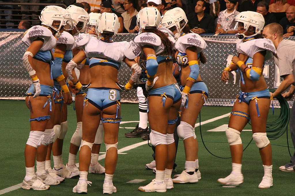
I... I wanna... I want to give you +1000 so bad, but... It won't let me
Now THAT is something I could get behind...
From my point of view, there is plenty there to grab.
I see it, too.
I don't know, those look very grabbable to me
*SELF IMPOSED DRINK FOR TARDINESS*
Under Armour's early prototype, about to be tested:
I guess Under Armour's hope is that if it's unattractive enough, nobody will want to touch you...
Hence, "ungrabbable".
I would venture a guess that there would be much less QB under center and more shotgun snaps.