
This morning's edition of Hokie Tracks features abbreviated and futuristic thoughts. Alex will have something much more substantial to chew on around noon today.
Houshun Gaines and Adonis Alexander did not owe Hokie Nation an apology after a possession of marijuana charge and indefinite suspension from the football team. However, the pair addressed their situation sincerely and responsibly.
— Houshun Gaines (@HZGfrom252) April 28, 2016
#36 pic.twitter.com/7OeMs8iyjW
— 36clips (@Adoniskaaaaa) April 28, 2016
I would be surprised if Gaines and Alexander never returned to the team, but it's the first time Justin Fuente will publicly discipline his players, and it will be interesting to see what standard he sets.
Virginia Tech released its refreshed brand identity, cleaned up VT logo and uniforms. In January, Whit Babcock prepped everyone for slight changes to Tech's uniforms. The result of the work with Nike's "Graphic Identity Group" was unveiled the night before the spring game. I don't have Tim Gunn's eye for style, but that won't stop me from sharing my thoughts.
Old on new on Clean&classy. New uniforms will have maroon, orange, white & special black/gray options. 1TEAM pic.twitter.com/IqdwMgA48j
— Whit Babcock (@WhitBabcock) April 23, 2016
A single, sharp stylized VT logo was long overdue. Tech nailed that.
The futuristic font... ¯\_(ツ)_/¯ When I was some single-digit-years-old my dad took me to a museum which had a computer from the future. The display creator(s) didn't have the foresight to imagine an approximation of an MacBook Pro, instead there was a PC reminiscent of the times except the 'Z' key was centered in between arrow keys. Perhaps they were Doom fans.
Fonts in the future will be so smooth and your eyes will feel like they're being massaged when you read words in their type. They'll adjust color, brightness and size automatically for optimal clarity.
Tech's new font knows the future will be different, but is blind to specifics, so instead it just got radical.

As for the uniforms, I prefer the old ones better because they knew they wanted to be retro.
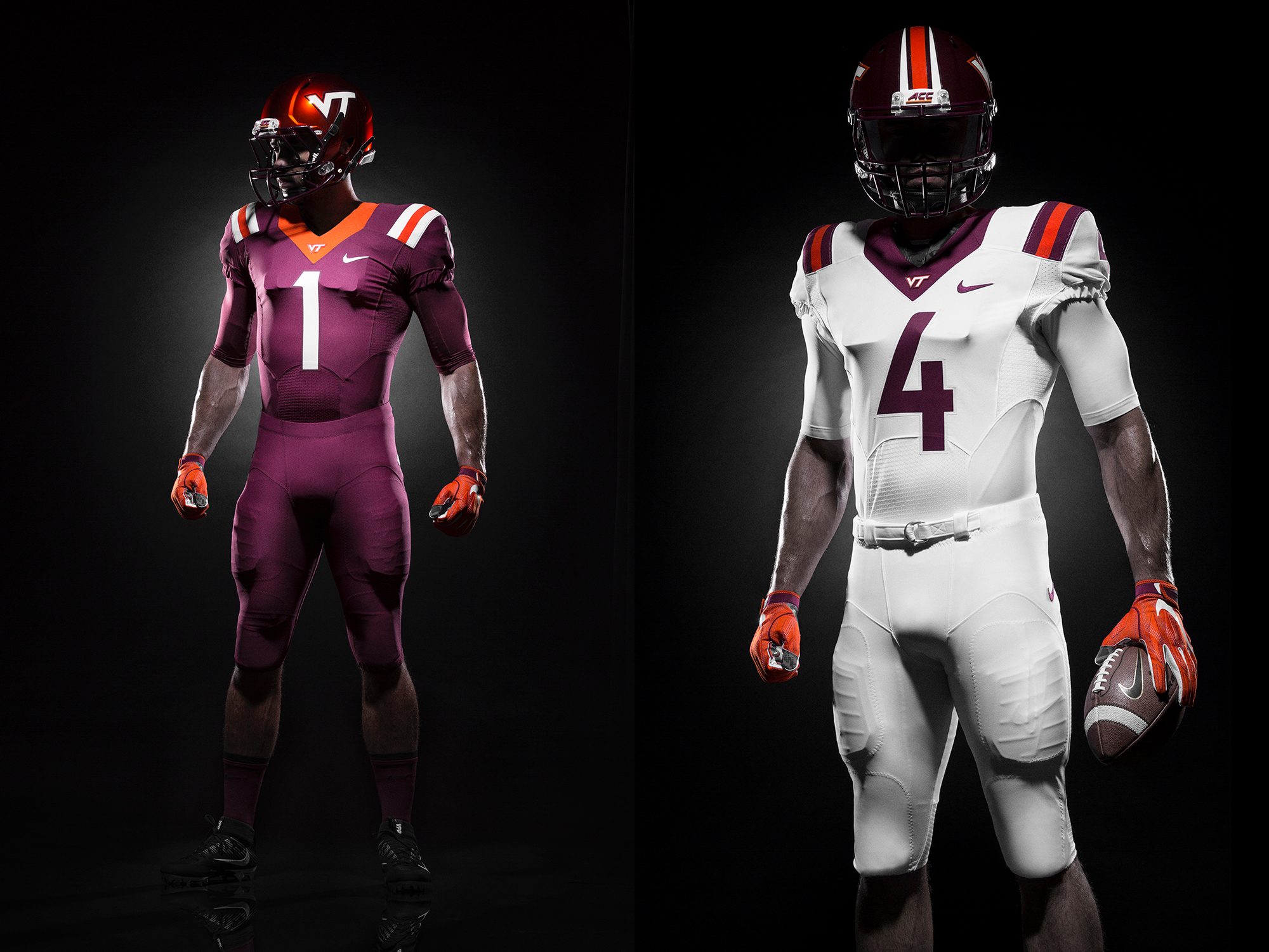
These are disjointed. The shoulder stripes were a holdover, and diminish an otherwise clean modern look. Nix 'em and they grade out at 💯.
Hendon Hooker discussed his recruitment at the Opening Regional camp in Charlotte. Hooker committed to Virginia Tech on March 24, but he told Scout his recruitment is still open and he plans to take his five official visits.
Virtual reps might be the next best thing. On the football field, experience is the best teacher, but being able to re-live and re-analyze previous snaps is subtle advantage Tech will have this summer. ESPN spoke with Fuene and Brad Cornelsen about VR's impract on preparation and recruiting.
"It's a huge teaching tool for the quarterback position," offensive coordinator Brad Cornelsen said. "You're seeing almost what you're seeing in a real-life rep. Once you put those goggles on, you control what you're looking at, you can move, you can take a drop in a meeting room and make quick decisions. It's one thing when you have all kinds of time and you're sitting in a classroom and you're saying 'hut' and making a split-second decision. That tool bridges that gap a little bit. The guys have taken advantage of that. It's something that can continue to help us."
Six away from the first 100 in the door to The Key Players Club. Thank you for your support of TKP, and as soon as it hits triple digits I'm going to crunch some stats on its initial guests.

Comments
so I'm guessing that this week you'll be setting the weekly format for content output we can expect during the season? Hokie Tracks on Mondays? Good start IMO
Also, I'm with you on the uniforms. I don't like the stripes on the shoulders at all. Just makes something seem off. Not a fan of that. I think without those stripes, these uniforms would look really damn sharp!
I think many people share this opinion on the uniforms. The shoulder stripes are attempting to maintain a very uneven grasp on a "retro" look on an otherwise modern uniform design. Drop the shoulder stripes and we have a very sharp, modern uniform. Either way, I just want to win more football games.
...or at least have the shoulder stripes match the stripes on the helmet (where the outside stripes taper away). Just looks sloppy.
I think tapered shoulder stripes would look silly. No one complained about the difference during the Russell Athletic Bowl.
I am ok with or without the stripes. They never really bothered me that much. The new stripes may be a subtle nod to the Corps though as they almost reflect an exaggerated version of rank insignia on military uniforms... or maybe not...
I don't have a problem with stripes, necessarily. I just think it looks forced and IMO it was poorly executed. I think they could have made the shoulder stripes work but it just seems in-congruent the way it's done here. It would have looked better to just do away with them altogether. I'm sure the stripes were kept for political reasons. It is possible that Nike's first proposed concept lacked the stripes and when it was mandated that they be added back in they sloppily threw them on there to get it done and please the client. Of course that is all conjecture. That's just how this feels to me.
There's an interesting idea... much like helmet stickers, we could have the shoulders of the uniforms be empty and start stitching on stripes (pillars?) on an individual player basis as the season goes on.
Interesting idea, something I've never seen before. Don't think it would fly as there would be to much uniform inconsistency. I think the numbers would look much better if they had an accent color.
Agreed. The shoulder stripes are just really worn out and don't fit at all with a more modern font and number design. But I think it was mentioned elsewhere on here that Beamer absolutely loved the stripes, and these uniforms were ordered before he announced his retirement. Plus, I'm sure we didn't want to completely do away with the stripes the second Beamer is gone, so I imagine they will linger for a little bit longer. I'm hopeful we can do a complete overhaul for next year. Take the stripes off and I think this is a sharp outfit.
I hate the purple, and don't care for the stripes with the new clean lines. I really don't care that much about the uniforms, but will not buy a jersey for myself in that color. My wife likes purple, maybe she'll get one.
it's maroon
I like the Chicago Maroon, which is red mixed with brown and looks like the leaves in the fall, not the Burgundy or Mulberry, which show up on both the maroon and the purple color wheel, as they mix in blue instead of just brown. I also prefer the Burnt Orange, like the leaves in the fall, better than the traffic cone orange. Maybe I'm just old, or like the stuff that goes with my warm complexion, but I prefer the colors of VT stuff from before 2000.
I think the images just have lighting that make them look different. A big push within the Athletic Department was to standardize our color palette to what it should be. There were many versions of the logo, using many versions of the colors, and Whit has really made a concerted effort to get rid of discrepancies. What you're seeing should be as close to the true Hokie colors as Nike makes.
I really hope the lighting is what makes it look that way. Scroll the uniform so that it is bi-sected by the TKP banner and see the difference. I have worn out 80's hats and hoodies and won't get rid of them because I like the colors on them so much better than the post 2000's. These uni's look to me like they are heading further down that path.
I agree! The way it looks on the Nike uniforms comes across as more to purple than maroon. I feel this way when I see the jersey's on TV. As you said, there should be more brown and less blue in the mix. I was excited when I heard they were standarizing the color shades. But this does NOT look Chicago Maroon to me. The color on TKP banner is a better Chicago Maroon, IMHO.
i guess I'm confused then. I thought our colors were Chicago Maroon and Burnt Orange. Is that still not the case?
colors look different on computer screens than they do in person. Bear that in mind when critiquing colors in pictures posted on the internet.
The new colors are not even close to Chicago Maroon and Burnt Orange....they are closer to Mulberry and Tomato Red. Kville Hokies nailed it.
This was one of my initial reactions, too. It looks like we went purple instead of maroon. I'd have to see it live to be sure but it seems like it isn't quite maroon anymore, and the orange feels way too bright instead of...you know...burnt. We should be closer to Texas than Tennessee with our orange.
For everyone who wants to see the new uniforms without stripes, here ya go! Courtesy of MS Paint:

I honestly think they look really sleek!
Sweet. But, I've never been a huge fan of the solid white away unis. White over maroon? I like that, even if it does look like A&M. Short of that, at least the strips beaks the white a little. Never did like them on the homes.
I love solid white for away or at least alternate away, think 2006 WF destruction or 2007 Virginia game. We look cool as hell.
Edit: Virgil's hell
This looks better but kinda plain, it's hard to figure out who the white team is.
But if that maroon uni had an orange number, I think it would look sicker than sick. I've wanted to see a uniform like the one on the left with an orange number for who knows how long.
Dammit Joe, that last little plot point got me to dive in...
Yep same happened to me. I also had a little extra money lying around for once.
Me too!
I'm right there with you guys. This website is by far the best Virginia Tech football and basketball coverage anywhere, and in the past year, the coverage on all sports has been superb, whether it is the staff or the community posting.
+1. Viva la Key Play! (Mostly made this post to see the Key next to my name).
I did not like the new uniforms at first, but after sitting on it for a while i don't mind them as much. Really it is just the shoulder stripes not really matching the helmet stripe (one seems modern one seems traditional). I am ok with the shoulder stripes w/o the helm stripe in the left picture above. I would prefer the shoulder stripes off with the helm stripe on the left picture above.
In the end, if we win a lot of games or make a title run ala 1999 they will be everyones favorite (like the 99' uniforms).
No one is talking about the pants! Why couldn't they have done something cool with the pants? I feel like I could overlook the shoulder stripes if the pants were more than just a solid color with a Nike logo.
You're right, they are way too plain. Could use some stripes. /s
My problem with that is that the pants either clash with the shoulder stripes (unless they're the exact same design) or otherwise just become a distraction, a la recent Oregon or Maryland efforts. Too much going on in too many places is a bad thing.
I get what you're saying, but maybe some piping or a VT logo on the hip, or UT Prosim on the rear waistband.
The 1872 Pylons logo that Hokie Hounds is currently using as an avatar would look good on the pants, front right hip near, the waist band.
I hope you are wrong on our currently suspended players. I hope they can grow from this incident and return to the team and the school that they wanted to come to.
I said I'd be surprised if they never returned, meaning I think they'll be back.
Not enough caffeine, I sit corrected.
Does that mean you change your seat, instead of your stance?
I think you misread what he wrote.
Ditto
If you remove the shoulder stripes you have plain jerseys.
yeah, so? what's wrong with plain jerseys? I think it's a clean, modern look and I would like that. The stripes don't necessarily need to be removed. I just think they were poorly executed. They don't flow with the rest of the uniform. I'm no designer but I can tell when something looks goofy. I'm sure that a properly trained designer could make stripes work in a way that didn't look goofy and discontinuous.
Its not modern its retro. It would be almost identical to the uniforms of the early 2000s, which is inherently not modern, or even back to the Penn State or Alabama Jersey designs which are obviously not modern. New "modern" Jersey designs have typically had more stuff on them, not less. Those old styles look clean but they aren't modern.
perhaps I'm confusing the stitching and panel seams and cut of the fabric to be modern. I wouldn't consider the cut and fit of the uniforms to be the same as uniforms of the early 2000s.
I like the clean look. Whether it's modern or retro may be an issue of semantics. That's beside the point.
I think something can look modern without having all kinds of silly designs on it. Is a clean look automatically not modern?
I think the semantics are all over the place and that is confusing. I think what the majority of fans want to see is the "classic" Jersey with just numbers and take or leave the collar.
I would argue that the Penn State and Alabama designs are classic, not retro. Some things never go out of style.
Stripes: I don't mind the idea of the stripes but, like others have said they look misplaced on this modern uniform design.
FONT: By major beef with this uniform redesign is the font. It is awful and I would go as far as saying it is embarrassing. Looks like some terrible sci-fi movie font. It's not crisp at all.
Helmet: Stripes on the helmet look pretty cool though.
Numbers: I like the modernization of the numbers on the jersey. Looks very crisp and clean.
I would be more embarrassed if our football team played like UVAs than I would about the type face of the text.
No argument there, however UVA being a terrible football program doesn't make that font any better. I'll live but, just wish the font was different. Oh well.
I think it will take a little while to get used to it but I think it could have been a whole lot worse. It grows on you.
I don't mind the stripes on the white uniform at all, but it doesn't work on the maroon, I don't think.
Took the plunge and now only 5 more!
Probably more than that. 2 more of us also jumped in this morning
This post seems to have sparked an uptick in the Key Players Club, haven't seen this much movement on a single day in awhile. Excited to see it.
Alright... about the new font... I like it. Its definitely stylized, but in a good way. Just a little tweak that took us from generic to unique, which is something the entire Athletic Department has been needing for a while. And I like the fact we standardized the logo. Now if we could just go around and fix all the funky VTs around campus that are just plain wrong in their dimensions, that would be great. Lets start with the ones on the iron gates to Lane, and the one above the entrance to the Tunnel in Lane.
That being said, I have a feeling these uniforms won't be around long, and we're going to see some special one-off uniforms this year that will give a hint to the direction we're going down the line. The only reason we still have the same template that we did is because Frank wanted it that way, and the uniforms had to be designed a year in advance, at a time when we weren't considering the thought Frank might not be coaching when they are debuted. You don't keep the tricolor and orange chrome lids around if you don't plan on developing uniforms that blend better with them down the line.
Oh, and about the actual uniforms, I actually kind of like them. The font change is perfect, and it gives a nice mix of retro with modern. Its like the 2010 Camaro of muscle car uniforms. Its not perfect, and it has its issues, but it just works and it stands out in the crowd. I mean, what we had before was a carbon copy rip of the LSU template. By changing the fonts, its a unique style that's pure VT. Personally, I think it'll look great on the field.
My only complaint about the font is the rounding off of the V, N, and A. Considering the logo has sharp lines, and Nike offered a rounded off version for our unis which we turned down, I would have liked them to be pointed (sharp) too.
Yes...this! I love the classic, crisp VT logo but it looks bad with the retro sci-fi rounded-ish new font! They seem like opposites to me.
I actually think the typeface screams VT, and its because there are enough subtle hints to the actual logo to make it work.
The angles of the diagonals in the V and A are the same as the angles on the VT logo. As such, the 'cuts' on the R, A, E and H all have the same angle as the VT logo, and as such, all align with the and of the 'T' in our main logo. You will also note that all letters except the I have the same weight width-wise in the wordmark. This aligns with the proper VT as both the V and T should have identical widths (the area of each being essentially the width of 3 segments of the line, with gaps having the same width as the logo). Knowing this, you can then say the wordmark is actually built off the styling of the VT, and they both play well together making a good brand.
Yes, now I agree the rounded edges do appear out of place, but when you consider the alternative, you'd either have out of place points jutting out of the wordmark or letters that needed balance adjustment, making them appear smaller to ensure points aligned with the rest. So to avoid this, they rounded edges, and made it stronger.
I agree with just about all you wrote. The problem is that for all the sharp lines and angles. it throws the look of the words off when the parts that should be sharp are rounded off. That's the thing that annoys me. I'm sure there is a way they could have matched the diagonals and still keep those points sharp, just like they did with the VT logo.
Now we're criticizing specific letters of a font?
Is it weird that one pair of pants has a belt and the other beltless?
100!!!
I gotta hand it to Joe, he definitely knows how to manipulate his pawns... er... motivate the great people of TKP to come to action!
Hey look everyone is a Monday during the offseason!! Uniform talk check, player issue check, player development check.....
via GIPHY
/S
Great job Joe, just attempting some humor on a Monday
I hate Mondays!! Fetch me another!
via GIPHY
I guess the "Bell Play" was the precursor to the Key Play
I hope I can still shake it like Maggie Smith when I'm 80
So Hendon Hooker is keeping his recruiting open? Did Fuente back off the stance that he wouldn't accept commitments from players who felt that way?
Hooker taking on all suitors instead of committing, never saw that coming
Those helmets are straight fire though.
Nice messages from the Gaines and Alexander. Being a college kid presents a lot of learning experiences, hopefully they learn from their mistake and move onward and upward. I would be surprised if Fuente nixed them from the team completely, but unfortunately they caught him at a bad time in having to set a precedent right out of the gate. Go too soft and risk more guys pushing the rules and getting in trouble, come down too hard and maybe lose some players thinking he is a martinet. If this was the SEC, they would be suspended for one half of a game of their choosing, but I'm not saying that is a good thing.
Towards setting a precedent, I would lose a lot of respect for Fuente if he just kicked them off the team. That doesn't create any kind of experience to learn from and doesn't help develop these kids at all, something he's said repeatedly is a top priority. While some sort of punishment is certainly in line, there's no reason to compromise values just to look tough. You'll earn a lot more respect and inspire much better behavior by making a measured response that's what's best for the kids long-term, not a knee-jerk reaction.
Damn y'all, 12 new members into The Key Players club today (and perhaps counting?). I am blown away, thank you for your support!
No one in here had mentioned the most important part about the new uniform...THE SHOULDER NUMBERS ARE BACK!!!
Jerods accent cracks me up. Seems like a pretty level headed kid though, he's got that going for him.
I hope the time was spent planning and testing the perfect margarita recipe. I get the sense that these uniforms are going to be short lived and almost a transition set. Seems like the "rebranding" didn't finish before the uniform design deadline. I am willing to be next year we will see a few more modifications.
Exhibit A on how to know if your fan base is or is not willing to accept change.
....what am I missing?
I'm guessing its the fact that people are bitching and moaning about relatively minor updates.
That being said, I think the tone of most of the complaining is that people were hoping for a massive makeover, and are pretty disappointed that the update was literally changing the stickers on 2 existing helmets and changing the font of the numbers.
oh okay. Yeah that makes sense, I guess.
I agree with you that the complaining is about the lack of actual changes to the uniforms more than anything else. That being said, I think this post just reinforces that we've been fielding essentially the same uniforms for years now which kind of goes against what I think he's trying to say. It's not that we're moaning change. It's that the change isn't significant enough.
I would have just been happy if they had gotten rid of the damn shoulder stripes. I'm not a fan of those.
I don't mind them at all... but at this point, they're essentially becoming a symbol of the downward trajectory at the end of the Beamer era. From now on, when you see one of these uniforms you're going to correlate them with a disappointing season. We need to get away from that as soon as we can.
you might be right here. I still think that if we win 12 games this season we need to change the uniforms to get rid of the stripes. Or change the stripes so it looks like they were part of the original design for the uniforms. They just look so forced. The uniform design just doesn't seem tied together at all with them. It's, as Joe so accurately stated, disjointed.
these might be my favorite jerseys
I thought these jerseys were great. We got those and they had the futuristic number font going on and were very cutting edge, and then after two years we went retro. Complete 180. I never understood that. We also started sucking after Danny Coale caught that ball, so we had 2 good seasons in striped jerseys.
I feel like now that we trashed those futuristic themed jerseys after 2 years we can't go back to anything similar, so now we've got space numbers and retro stripes.
There was A LOT of pushback from the upper level donors about this uniform. Many thought we had ventured too far away from the 'VT' look they were used to, so we quickly abandoned it.
Waahh, I'm old and rich and don't like these new fangled jerseys or the forward pass.
And it wasn't just them that complained. TSL went into full 'wtf' meltdown mode when they were released. They were embraced by the student body and young alumni, but unfortunately they were released right in the heart of the timeframe our Athletic Dept couldn't have possibly cared less about what they thought. It was all about appeasing the big money donors back then (I'm sure many of which had already reached Pinnacle Status and stopped giving)....
which also was a helping hand into the huge issue we're having now with the Hokie Club and being so far behind in terms of athletic $
UGH TSL and old people struck again... years ago... but I digress, I liked those uniforms. But I probably liked the 04-07 the best.
Yes. I didnt even realize how similar they were until I saw the 2015 launch of the new jerseys and didnt realize it was 2015 until I looked at the schedule on the bottom.
People say they want a massive change, but they are flipping out over a 1/4 of an inch extension of the collar, at most, typeface change, and the consolidation of the color schemes and branding usage.
I dont know if it was the way it was hyped that just let people down, I dont know, but theyre virtually the exact same jerseys for the last 5-6 seasons.
Preach it, brother jobus!
I've been a part of 2 massive overhauls to the uniform. When we went to the 2004-2007 uniform, people hated it to begin with, but then we won a lot, and people quickly loved them, and many consider it to be a true classic. Then we made a HUGE change to the 2008-2009 uniform and people (especially on TSL) flipped a shit about how ugly they were. Once again, we started winning and people loved them.
Funny thing is, when the throwbacks were worn in 2009, and then went full time in 2010, people loved them. Then we started losing. Then we lost almost as many as we won. Now they're universally hated.
Winning cures everything.
I too really liked the throwbacks when they first surfaced in 2008. But A) I don't think anyone thought they would become our uniforms for the rest of eternity, and B) I started getting turned away from them when they started putting stripes on the pants and even the helmets at times with no regard whatsoever of how the color scheme of the stripes matched or the fact that not every piece of the uniform needs very bulky bland vertical stripes.
Holy stripes, Batman!
^It'd be cool if we incorporated "HOKIES" on the front of the jerseys a la "THE HERD" in the picture
A few people have already said it, but I think the source of all the butthurt is that we were all but promised a major uniform overhaul and got a few adjustments. I don't think people hate the stripes as much as they are acting, I know I don't, but we just want something new, like we were told we would get. And the fact that the stripes stayed but the numbers changed to an disjointed motif just gave us something to harp on.
you might be right. I can only speak for myself here. I have NEVER liked the stripes. That being said, I'm not the one wearing the uniforms so I don't typically voice my opinion on them. I don't think they're that bad. I'll admit that I'm disappointed in the changes (or lack thereof, really) but they could still be much much worse. I was really looking forward to those stripes being gone but I guess I'll just have to get over the fact they're here to stay.
I have opinions on uniforms. You probably don't agree.
Let's talk about politics instead. Or music.
TKP, where arguments about uniforms have equal passion to those concerning politics and religion. Still not quite the same level as pie/cake, though.
Or backup punters and long-snappers. Real issues, man. Real issues.
Someone has to be the parent here!
via GIPHY
Move on and
via GIPHY