
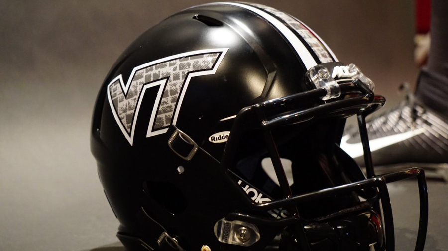
Virginia Tech released its long anticipated Battle at Bristol uniforms on Saturday night. The Hokies will pay tribute to the Corps of Cadets and rock a Hokie Stone look against Tennessee on September 10. The color palette is a nod to Tech's original colors of black and gray. Burnt Orange and Chicago Maroon were first worn in a football game against Roanoke College on October 26, 1896.
Swag on deck #BattleAtBristol pic.twitter.com/vHvNeg2AO9— HokiesFB (@HokiesFB) August 20, 2016
Hokie Stone. The black and cadet gray of 1891. A tradition like no other!! #BattleAtBristol #ThisIsHome :turkey: pic.twitter.com/ECpJeid8Hg— HokiesFB (@HokiesFB) August 20, 2016
The uniforms made their unofficial debut when safety Devon Hunter, the No. 1 recruit in Virginia for 2017, sported them in a tweet earlier in the evening — a brilliant and savvy move in its own right. The Indian River product is on an unofficial visit to Tech.
HokieNation nothing but LoveYou Ready #BattleAtBristol #ThisIsHome pic.twitter.com/HxpG7PGeYD— Devon Hunter (@devonhunter11) August 20, 2016

Comments
Genius move to let Hunter unveil them.
I suppose we won't know for sure until he commits.
Even if he doesn't, it can't hurt our reputation with other recruits in the future when they know going in that one of their own was able to try on and even break the news about a special uniform.
Just trying to clarify, what do you see as the downside of swinging for the fences if he doesn't commit? Not doing it with a different recruit? Egg on our face? Future recruits expecting red carpet?
I think it would look weird for VT to give this to a kid who then commits somewhere else.
Fair enough. It is a risk, hopefully calculated, but I'd be surprised if it gets remembered by many outside of Hokie fans, Hunter, and maybe some others he is close with.
I don't think there's all that much risk -- it's all in good fun. I was just saying it's only really "genius" if he commits.
I like the way Kam Chancellor put it:
I need that jersey.. Don't put it on if you ain't gone claim it... Cement design only for the #HitSquadHokies #LPD https://t.co/c5AGSmQmmj— The Enforcer (@Kam_Chancellor) August 20, 2016
Seriously, they better have shipped jerseys to all current NFL hokies!
Whether I end up personally liking them or not... more alternate uniforms please, and use them more than once each!
...*unable to stand up from desk*
I tried tucking... no dice
Ut prosim, motherfucker.
I'm here to serve, but with attitude.
"You just got served "
All in favor of referring to these as the UPMF uniforms say ay.
As much as I love our maroon and orange, this was done very well. I like it a lot.
I wish there was just a little bit more maroon incorporated into the design but otherwise, I like them. Plus, I'm sure they'll look a lot better after we beat Tennessee...
I'm with you. I like them, I do. But a little more color accenting here and there could've been cool.
Either way, this Is just further getting my hype levels way past 9000.
Meh. Not my taste at all. I'm a purist and want to stick to maroon.
If it's what the players and recruits like so be it.
Reminder to new members, it is against community guidelines to downvote for opinions.
You are not alone. I don't like them either. Wife likes them even less. We each have our tastes and opinions, and I like the primary school colors. These unis just don't look like VT to me.
These unis are badass that is all
Exactly what my wife said, "they're ok, but they just don't look like Virginia Tech". She likes the maroon and orange, and she hated the other Hokie stone looks as well for the same reason. She loves Hokie Stone, just not on the unis. I'm betting Nike probably looked into incorporating the stone look with maroon and orange, but I'd have to figure it's probably tough to find a aesthetically pleasing combination to make it work. My opinion, the jerseys are ok, but the helmet is bad-ass!
Depending on how much of a hipster you want to be with this, one could argue that the black and gobbler gray are the purest VT colors of all.
Yes, you could argue that point, but it has been even longer than the near fifty years I've been Hokieing that black and gray were our "pure" colors. Maroon and Orange are Hokie colors to me, but I know things change with time. Seems like this obsession with new color schemes is mostly a generational thing, and I'm in the senior section now, so you youngsters get to drive the train. I can't help what I don't like but it isn't going to make me any less of a Hokie fan to see them in unis that, to me, look almost comic book-like. No worries, I'll get off your lawn. Y'all have fun with it, I'm just around for the football, not the fashion show.
Bad. Ass.
Or, as Huey Lewis once put it "Sometimes, sometimes, bad is bad."
We're gonna be all like the Rock in these uniforms, and Tennessee is gonna be like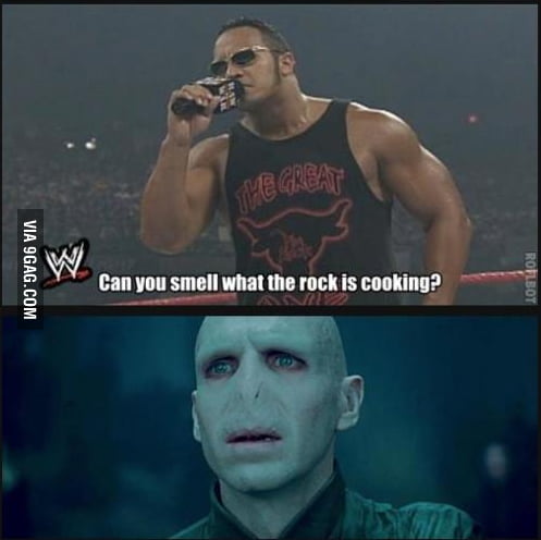
That would be an interesting match-up: Dwayne "The Rock" Johnson vs. Voldemort.
Hot Damn! I was expecting to be disgusted by these, but wow, they are awesome! And we finally got the Mach Speed uniforms that I've been clamoring for! I guess we won't get the Mach Speeds for the primary uniforms; it doesn't seem like teams with shoulder stripes have them. Win or lose, I hope we wear these again!
Is it just me, or is Sam Rogers a bit more tan in the picture above than usual?
edit: tan, and corrected the stupid autocorrect for Rogers.
I think it might be just you, because you're seeing an extra "d" as well.
If we win, I'll love them.
These unis are SICK. LOVE that helmet, one of my favorite lids so far. Wish they had put a little more O&M in there, but overall they're beast. Good job Nike!
Into the helmet and pants, meh on the jerseys so far but I feel like they'll look much better on tv. But I guess we still can't get the spacing right between the V and the T...
I like these a lot in their own right. My broader thought is that things are going this direction for recruiting if no other reason, particularly for non-blue-blood programs. I don't think a game here and there with alt uniforms hurts our identity, and so long as it doesn't start to I want the staff to do things like this to help attract talent, even if just a very small edge.
The purist in me won't be satisfied until these make a return to prominence

...on the other hand, I really enjoy winning football games and good recruiting is crucial in the accomplishment of that goal, so if flashy uniforms works, it works.
They will bring them back as "throwbacks"...and I'll cry, cause I'm old.
Those just are some damn pretty uniforms. It was exciting to turn on the tv and see those
That also could've had something to do with the guy wearing the uniform
Am I the only one that thinks these jerseys are ruined by the orange number on the shoulder?! They'd look 10X better if both numbers were the maroon with orange trim
Completely disagree.
I disagree as well. That's what helped make the uniform.
These were the uniforms while I was at Tech as well, may have something to do with my opinion.
I am a purist as far as uniforms go, but considering what a lot of our alternatives have been, this is absolutely sick. I love em.
Agreed. Same boat. Ive always been a fan of the retro unis but as far as alternatives.
These are without a doubt. The best alternative uniforms virginia tech has ever worn.
Im sorry but those are positively badass. I get that o&m is our thang and in general ill always prefer our school colors but as far as a blackout type uni goes....couldn't get better imo.
These unis are the definition of "BAD ASS". Honor the past but speak to the future!!!!!!!!!!!!
The Tennessee fans commenting on the uniforms are reminding me of just why I can't any of them. They do this every. single. year. Enter the season thinking it's going to be 1998. Can you imagine being that cocky? It kills me. Just ask Ohio State about 2014... I know each fanbase has its own bad apples, but I've never seen Tech fans act like this. If Tennessee were wearing these uniforms, they'd be iconic. I've seen enough versions of the smokey grey UT jerseys around town to last me a lifetime.
(sorry for the rant)
Would be hilarious for a mass Hokie Twitter movement to only send kind statements to the UT account / fans. The USC-Alabama stuff got a lot of run, but there is no real animosity there, and fans are trying to create it.
"oh yeah, well UT fans walk old ladies across the street"
"the worst part of Tennessee fans, they always give a penny"
"once saw a UT fan steal - the hearts of many by helping a homeless man"
I love em
Incredible.
(Mike Tirico voice)
Pros: the uniform is effin' sweet. I love it.
Cons: honestly doesn't feel very VT to me
Love em. They look so freaking cool.
I don't particularly like them, but I'm really all for anything that gets us away from the cookie-cutter stripes for a game.
Also, I understand we were going for the whole "old cadet" thing with the black/gray/white but a little bit of maroon or orange to highlight some parts of it (particularly orange in the numbers) wouldn't have hurt.
While I love the uniforms and appreciate them as a tribute to the campus, but I don't really see a tribute to the Corps in these uniforms. It wasn't even until last year that any cadets lived in a Hokie Stone dormitory. The color scheme doesn't match to any of the Corps uniforms (to the uniforms benefit) and I don't see any of the subtle inclusions of Corps symbols or dates that some of the previous Corps tribute uniforms have had in the past. Great uniform but I give it a fail in terMS of tribute.
Hokie stone is literally all over campus. That's as true now as it was back when it was a military school.
And my grandfather's old cadet uniform from his Old Guard days was primarily grey and dark grey. Which at irs time was matching to the Hokie Stone on campus in every building. So it seems to fit.
Perhaps its not as symbolic as you want but I don't see why it needs to be to honor the VT corps. Its captured the identity of the campus, Hokie Stone, very well. That and the color scheme are a tribute which I think is successful. They also have the contemporary appeal of using black, which looks great here.
Rob's point was that the corps dorms have never had Hokie stone until the most recent rebuild of rasche and Brodie. So the Hokie stone part is clearly not a nod to the cadets. But I agree that the black and cadet grey is.
I understand his point. My point is the corps is more than a group of dormitories. Despite those dorms not having Hokie Stone the school was at one time entirely military and at that time the rest of the campus did have Hokie Stone. So it is a nod to the cadets because both Hokie Stone and the corps were VT history from the beginning.
And in fact, they're building new Cadet dorms that will be in Hokiestone and tearing down the old dorms that are made of brick.
It's not just Hokie Stone.
If you look closely, it's camo Hokie Stone, similar to military uniforms (BDUs).
Having had to wear the uniforms for four years I guess it's more a point to me that the colors of Hokie Stone vary from the uniforms. It may seem subtle to some but it's noticeable to me. The uniforms look the better for matching Hokie Stone than the uniforms. I have no issue with the uniforms honoring the campus or its dominating feature but that's not what the designers said was their intent. All the original campus buildings were built with red brick and yes I am aware that the Corps is in the process of transitioning to Hokie Stone dorms but for 144 years they lived in brick buildings. It wasnt until around 1910 that a serious effort was put into building with Hokie Stone. They even moved away from it in the 1960s for a while which is why several key buildings on campus dont have Hokie Stone facades. The point was that other than the Hokie Stone they don't seem to have incorporated any other Corps items that previous Corps tribute uniforms have or new ones not previously used. No Skipper, no 1872, no Flaming VT, no Corps crest, or other basic symbology that could have been incorporated if tribute to the Corps really was intended. In terms of camo pattern I guess I don't see it. I work in an office that creates all the camo for the Army and it just seems to me to be a standard stone pattern rather than camo. Again I think these are the best alternate uniforms we have ever had and do work well with the school just not so much the Corps.
My wife, who was in the military, thought it was a camo pattern right away. The first thing I saw was Hokie Stone; the first thing she saw was camouflage. When she pointed it out, I realized she had a point, as modern camouflage is pixilated.
Seems to me it's Hokie Stone, but pixilated like camo, and in black and steel grey. Then there's the video where the designers say it's intended as a tip of the hat to the Corps. At the end of the day, as long as they look good, and they do, does it matter?
Does it need to be so literal though? Must the Hokie Stone natural color variation be present? Does there need to be an overt symbolism like the skipper, the crest or something? Or can artistic license be taken on a medium such as a football uniform?
The artists are focusing on the unique interlocking pattern of how the Hokie Stone is layed and the neutral grays of the cadet uniforms that also link to Hokie Stones. But again, its artistic not literal. Those are inspirational not definitive.
As I said my grandfather graduated in 1939 when it was a military school and when he took me down to VT my first time he had 2 immediate memories. One was marching off demerits on the Drillfield over Thanksgiving holiday and the second was Hokie Stone buildings that lined the Drillfield. I suppose because he had to look at them for so long whilst marching off said demerits.
I appreciate that the school started in red brick, good correction, but I have never met anyone that says VT is known for red brick. It is known for Hokie Stone, and for a long time the corps where the only ones using those Hokie Stone buildings. Does it make it less Corps now because civilian students now use those Hokie Stone buildings as well?
It didn't to my grandfather and his friends, so I don't understand why it does to you now.
for anyone interested here is a great archived video of those days, red brick and Hokie Stone buildings both
https://digitalsc.lib.vt.edu/VPIFilmVault/A%2087
I don't think the natural color variation is a must. But I think it would be awesome to have it.
50 Beard Points to the badass unis that spell doom for the Volunteers
love 'em.
i hope it emboldens the team to play lights-out against the Vols to victory when they represent the university (and state) in this uniform. props to Nike...
like the black and orange circuitry design for the Boise State game was a hit for many of us on campus, i hope this uniform is received just as well with the young Hokies on campus now.
Theyre kinda cool. but it wont even look like its Virginia Tech out there playing. Kinda hard going crazy cheering on a team in black and grey uniforms, when they arent your teams colors at all. And Im about tired of the weird uniform schemes. It really has no effect on recruiting and we have more uniform combinations than we have wins the last few years. I actually think it has a negative impact on our performance somehow. We dont win when we wear this crap. (Ok we did beat Marshall in the last minute the other year with some crazy helmet) It started in '05 and we lost to Miami wearing one orange sleeve. (we beat BC with it) But until proven wrong, I think we play better with a standard uniform. Needs to be some research done as to why. But damn we have played some ugly games with some even uglier helmets.
I seem to recall an article coming out last year stating the exact opposite. Anyone else remember that too?
But i don't see how you can say this. New uniforms always appeal to players, recruits and existing rosters. If that weren't true then there would never be reaction posts about them, but there always is. Maybe not quantifiable, but not inconsequential either.
I saw an article last year where recruits hated Alabama and Ohio State's uniforms, but it doesn't seem to stop them from bringing in 5 stars every year and NC's at the end.
That would be what is known as an outlier.
Yeah, but I'll trade boring any day for the number of national championships Bama has. Not hating on the uniforms, though other than the Hokie stone, I don't think it looks like Virginia Tech without maroon and orange. But, I don't care as long as we win in them.
Well you can't just trade in one for the other unfortunately. Otherwise we would just go back to the 2000s uniform and win all the National Championships.
It was literally unveiled by a recruit...
The gesture will have an impact, but the uniform wont. Who knows, we might not even land him. So it hasnt had an effect on recruiting.
To suggest uniforms don't have an impact on recruiting is just factually wrong. It's been proven. And look at the recruits' reactions on Twitter. They clearly love them.
I'm also not sure what you meant when you said it's kinda hard to go crazy rooting for them in alternate uniforms. If you cheer for your team less because of the color scheme they're wearing, I think the problem runs a little deeper than the uniforms.
Yeah not cheering for a team because of their color is racist
/s
Well, I don't know about you guys, but I can't bring myself to cheer for any team that wears blue and orange.
I did cheer for Syracuse when UVA was choking away their chance at a Final Four in March
In that case, it's science.
Because you were really cheering that the ACC was getting a better payout from the tournament, and you chose the best option in that game.
Were you cheering FOR Cuse, or AGAINST the Hoos?
How do you prove something like that a fact? The poll of recruits was just about uniforms in general, our regular uniform looks fine. The poll wasn't about alternate uniforms, or am I wrong? I only saw chatter of it on here. The fact is we have played a lot worse in the last few years with a bunch more uniform combinations than when we didnt. Our recruiting rankings havent gotten better either, if anything worse. I really dont mind a different uniform every now and then, but its no longer special.
Actually, if your looking for correlations, you will find them with the current stripes on the uniform. VT fell from national prominence with the standardization of the stripes on the shoulders. So, anything other than those hideous stripes is definitely a plus.
Well we ought to be raking em in then. A uniform will not be a deciding factor for choosing where to play. Its just not, if someone is choosing between UVa and VT, its not a factor, or if youre deciding between VT and Alabama its not a factor. Its something to talk about for a few days, thats it. What would make a difference if we started winning these games. We lose players to Alabama and Penn St all the time, maybe it we keep clowning up the uniforms, we can get some those.
Is it the DECIDING factor? Of course not. No one is suggesting it is. BUT uniforms DO play a role in getting the school in question the limelight in recruits eyes, which can lead to them getting more involved with that school in the recruiting process. Facts are facts, uniforms do play a role in recruiting players.
Recruiting is not done through singular methods, it's accomplished by a multitude of pitches.
New Uniforms/Alternate Uniforms give 3 benefits: Relevance, Visualization and Player Satisfaction
Oregon made their program relevant through uniforms. Every other program is following that model because it was successful. New apparel and alternate uniforms are now expected.
Programs have been putting recruits into uniforms for visualization for a very long time. It's been going on forever. Nothing new, but meaningful nonetheless.
Finally, new/alternate uniforms increase player satisfaction. And no matter what any fans says, me or otherwise, about which ones we like or dislike none of us are out there busting our ass every day to play, risking injury or perhaps never even seeing the field. It's a reward for them more than anyone else. That's noticed by recruits. (Heck, online forums like this are noticed by recruits)
no one is saying alternate uniforms alone make a recruit sign their letter. But no one except the recruit knows the singular thing that will make their decision easy, and so it all becomes contributing factors to their decision. Unless you are Bama or a handful of blue chip teams, coaches at programs like VT need those tools. Without them, you're bringing a knife to a gun fight.
Uniforms didn't make us lose those games. Uniforms absolutely have a positive impact on recruiting.
Thumbs up to that. Seems like it shows VT as an innovative, forward thinking
school as well with a design like this.
Studies showed that teams played better on average in alternate uniforms, not worse.
Do uniforms affect pitches or handoffs? i.e. visibility?
Good question. I'm not sure but I would guess teams with brown uniforms make it harder to identify the ball carrier. I also wondered if Boise State's blue on blue did anything other than assault my eye balls.
NCAA mandated that you cannot wear a full uniform that matches the field so closely. Specifically BSU cannot wear all blue at home.
That's good. I'm sure that is also directed at the teams with the red and the grey turf. They all look terrible.
Outside of Boise is there anyone at the FBS level that has a colored field? I know there are plenty at the other levels but I can't think of another FBS program that has one, not off the top of my head anyway
Well, we have a green field.....
Although that rule means that teams like Marshall can't wear all green.
Coastal Carolina (moving up), and Eastern Michigan.
Not nearly as egregious as EWU.
Aren't they FCS?
...or LSU...
LSU's Tiger Stadium to feature purple turf next season! It's an April Fool's joke that first surfaced in 2010 and comes back year after year, most likely because, spring after spring, it fools multitudes of Bayou Bengals fans.
Read More: Did You Fall For This April Fool's Joke: Tiger Stadium To Feature Purple Turf | http://710keel.com/did-you-fall-for-this-april-fools-joke-tiger-stadium-...
LSU's football field is the only field in the country with the yard lines labeled every 5 yards. They do it so their fans can keep up
Oh...I know it was an April Fools joke.
I figured you did. Was just trying to save some other poor soul from betting on it one day because they saw it on TKP.
wiki/List_of_college_football_venues_with_non-traditional_field_colors
excerpt: Boise State's "Smurf Turf" was the first (1986) college stadium field to be any color other than traditional green. BSU holds an international trademark on any non-green field, not just blue; the enforceability of such a vague trademark has been questioned. It has licensed the right to use blue fields to several high schools as well as the University of New Haven, and also issues free licenses to any school or team that uses a color other than blue or orange (BSU's school colors). They also gave license for a blue field in Tokyo Japan for a Japan American Football Association school.
Holy thread resurrection, Batman!
Do you happen to have this article? It sounds like a great example of correlation and causation being different things. Did they control for which team was expected to win?
Gives me vertigo and does nothing to reinforce the VT brand. Like when Campbell's Soup changed their logo to: "Campbell's Soup...For When Mom Is Too Drunk To Cook".
I figured we would have a grey/black uniform for this game, but I didn't expect this. Initial though was "eh", but they're growing on me some. I'm not sure how I feel about the entire jersey being Hokie Stone instead of it essentially being an accent (like the pants).
Some random thoughts:
- I've been wanting to see a maroon helmet with the "VT" in Hokie Stone, so I'm excited about this.
- The recruits will love them
- It is a big step up from when we were doing the Hokie Bird and Hokie Track helmets
- I thought they looked really cool in Devon Hunter video compared to the pictures
- They'll look great on TV.
- I'm going to need that mini helmet
"cement design"?
As a civil engineer, I cringe at how many things are wrong with that statement. Oh well, I still love Kam!
My first thought as well..maybe it's a hip term the kids are using these days, like "solid design." But Bam Bam Kam can call it whatever he wants
I am a huge fan of this of this look!
Don't put it on if you ain't gone claim it...
Well played Kam.
Brad Clontz sighting. #braves
Seems like a lot of work went into the design. They're innovative
and creative. Good to have after some efforts in the past that weren't
nearly as good.
I have one question, what are the players thoughts?
They are the ones wearing them
Seems positive on the snapchat posted this morning.
Click "the seniors approve"
These give me a giant hokie stone in my pants
Bad Fawking Ass!
I like how Kam says the "hitsquadhokies" ha.
This might be unpopular
Joe, I apologize in advance for my tirade
Guitarman, if you need to downvote this to oblivion, I understand...I just need to get this off my chest
I think it is funny that all these self proclaimed "purists" are on here pining for more orange and maroon uniforms. Look, I like O&M too but they're not even the school's original colors. You're not purists or even old fashioned traditionalists. You're selfish cynics who are afraid of anything new and different. Get over yourselves. Trashing this uniform (a uniform that seems to be loved by coaches, players and recruits alike...whom all happen to have opinions that actually matter, to boot) does absolutely nothing productive. I can think of at least one poster here who is probably currently drafting an open letter to Whit. Before you do that, please consider this. The uniforms are intended to go back to original VT colors (black and grey) and in some way honor the rich military history of this school. They are iconic. And to all those folks who are trying to say these uniforms stray from the VT brand, get out of here with that garbage. Your narrow view of the VT brand are colors that aren't even original and a logo that was invented less than 50 years ago. These uniforms exemplify VT by showing off Hokie Stone. You can't try to tell me that Hokie Stone isn't part of the VT brand. The name Hokie Stone HAS THE WORD HOKIE IN IT for crying out loud. Hokie Stone is very much a part of the VT brand and has been much longer than O&M or the [square root of 1] VT symbol...
If you don't like the uniforms, fine. Be glad that we'll never wear them again after September 10th, 2016. But don't go publicly trashing them because they don't fit into your idea of what branding should be.
/rant over
Bingo
the [square root of 1] VT symbol...
Damn I never noticed that logo is a square root symbol until reading your post.....
Anyone pissed about these uniforms, must not like the entire Merryman/Jamerson renovation. Other than the little bit of O&M sprinkled here and there, the colors are peppercorn (dark grey), popular grey (light grey) and pure white. So an open letter to Whit would be about as useless as...something something loluva.
No need for the apologies in the beginning. You knew this would get up-voted.
Who is this post directed to though? I'm reading an older version, but I only see one guy that didn't like it, and to me it seemed that it was because he has been a hokie for 50 years, and just wanted O&M for the game. Can you blame him? Have you been a hokie for 50 years? Why does it matter if people are politely disagreeing with the uniform? No one is being disrespectful here.
I havent posted anything football related in 20 posts
fair point...at quick glance I saw 4 or 5 posters who didn't like them. A couple specifically referred to themselves as purists. One other poster, who I know TKPs, hasn't posted in this thread but tweeted last night that he very much doesn't like them and cited specifically the lack of O&M, the school's official colors.
And I didn't know this would get lots of up-votes necessarily. I apologized to Joe and anticipated censoring because my tirade bordered on personal attacks (referring to people as selfish cynics) which I believe is against the guidelines. I needed to get it off my chest despite the fact I knew I was pushing the envelope. If this post remains up and continues getting turkey legs or gets pulled down or downvoted to blurry makes no difference to me. I feel better having expressed myself to the community. I can move on now.
I loved your post, just didn't think apologies were required. Its TKP PC bug that goes around that seems hypocritical to me. Theres no need to apologize for posting your opinion because everyones opinion is supposed to matter.
Know what I mean?
TKP and PC.........
Two things I never really associated with each other.
Maybe not here, but people hate them over there
My favorite comment:
I can only name a handful of schools that haven't run a single alternate uniform and they all have longer and more storied history than VT.
Not to mention... Outside of Bama, you kinda do.
Not to mention....
The irony is that all the unis you posted were from Adidas, who gave us the "learn the alphabet line" brought to you by the letter U for ugly, and RVAHokie showed us all Nike schools which at least kept themselves somewhat in line with the school's identity rather than just a letter.
All Red Nebraska and Wisconsin are wtf bad, I remember seeing those.
I totally remember that Nitrogen vs. Tungsten game in the 3rd and 4th pictures,
A lot of weird isotopes on those teams.
I generally think FSU's regular uniforms are pretty nice, and the black FSU unis w/the garnet helmet were probably the best executed black uni I've seen.
Would be surprised if there isn't a segment during the airing of Battle at Bristol where announcers discuss VT's uniforms and how the tie back into the campus. Seems like a pretty solid marketing tool.
Won't happen that segment will be filled with info on Smokey's last flea and tick exam.
Please sir, if you don't mind too much, I would like to reserve the right to have and express my opinion, just as you have the right to express yours. Thanks.
I have the utmost respect for you fish, and my comment was not directed at you. You never proclaimed to be a "purist" (which btw, sounds arrogant AF) and that is what sort of riled me up in the first place....the elitism of that statement (which, again, you never made) got to me...but I realize these uniforms (or any uniform, for that matter) are never going to be liked by everyone...everyone is welcome to their opinions.
accept this leg as a token of my gratitude to you for keeping me in check :)
And a leg back atcha for this post. Definitely wasn't trying to keep you in check, you have the right to rant, it is part of what makes this site fun to visit, just got a little chafed by some of the invective and felt like I was in the crosshairs for stuff I didn't say. You clarified that and I appreciate it. Truth is, I'd never have commented in the first place if the first person who said they didn't like them didn't get downvoted for saying so. I can be pretty perverse that way, myself, even when it is counterproductive. Soo, in the spirit of conciliation, and to try to say something nice about the uniforms, I will say that I kinda like the looks of the helmet. As for being a purist, I absolutely am a Hokie purist and elitist, but I try to save that for being a HOKIE in general, not for stuff like uniforms which are ephemeral. Interestingly, last night I was reading a book (Slow Burn, by Ace Atkins) and ran across a quote that seemed appropriate. I offer is as a light hearted ending to my post. Spenser says, "Every generation laughs at the old fashions, but religiously follows the new." I think its just supposed to be that way, and I accept it, whether I like it or not.
VPI, I don't like them and stated so but have no problem with your position. Don't burst a blood vessel. Its not worth it. I do believe that when Joe Casual tunes into our game in November and we are in ahhh white and maroon he won't quickly identify us whipping the snot out of uva. It will take a bit for him to realize, "hey that's the team that smacked TN back in September.
Don't worry. No one but VT fans tune into the UVA game.
You are right! Notre Dame!
Good thing there aren't DVR guides with team listings or on screen graphics with team names to clear up any confusion...
You know, because fans have such a rough time identifying Oregon, who hasn't worn the same uniform twice in something like 5 or 6 years now...
To play devil's advocate, I think you are basically getting worked up over an opinion. There are gonna be people that don't like the uni, there are gonna be people that like the uni. Why does one side need to get offended by the differing opinion? The reasons behind each person's opinion isn't something you can really dispute or get upset about. I say just move on.
Everyone has a right to their opinion on TKP. No harm in sharing yours.
I disagree with you that those who want Tech to stick to maroon and orange are cynics. They just have a different opinion. Black and grey were Tech's original colors, but everyone reading TKP grew up with and has known nothing but maroon and orange. I personally like the new uniforms, but I see where they're coming from.
VT football started in 1892, and Orange and Maroon were voted in as official colors in 1896.
Perhaps I took my rant too far. I didn't mean to belittle the opinion of those who don't like the uniform. That's not what riled me up. Seeing fans trash this uniform because it doesn't have O&M seemed arrogant to me (and, in fairness to TKP, most of that was on twitter...not TKP). I may have taken the "purist" comments the wrong way but that seemed elitist to me and it got to me.
That being said, if one does not like the uniform, that is fine. To call it an atrocity publicly is a bad look IMO, though. And unnecessary. Just say you don't like it and leave it at that. Move on. That was the point I was trying to get at. I was a bit heated and in the moment.
I am not a fan of us doing the wacky black jerseys but these are pretty damn cool. They are one thousand times better than those AWFUL black jerseys we wore against Boise State. They are better than the black Beamer jerseys from last year.
While we seem to do these alternate jerseys every year and a bit too often in my opinion, I'm all for it for the biggest attended college football game in the history of the world. I also get that the recruits love them.
Main concern: We did beat UVA last year wearing those awesome throwback helmets, but we never seem to win big games wearing crazy alternate jerseys.
Has any other school had a top recruit unveil a new jersey before? Is this a first?
I'm not sure if you're being sarcastic or not. What we are wearing has literally no impact on the outcome of the game. L-I-T-E-R-A-L-L-Y
I know it logically doesn't. But then why do we always lose when wearing them?I'm going to ahead and edit after thinking further about this....
The uniforms themselves have no bearing on the actual game. But they do have a (slight) bearing on the players. Are the players going to be sitting in the locker room before the game thinking about how badass they look out there on the field when in reality they should be thinking about their assignments? I know in high school we got some awesome new gloves and the entire lacrosse team was talking about them for days leading up to whatever big game was on the schedule. The coach said something along the lines of "stop worrying about how your hands will look out there and worry about catching and passing." Does all the buzz about the uniform take away some concentration the team should be placing on the game? Just a thought. Again, I like these alternates alot and I usually hate the alternates.
Maybe it's more of our record against big teams in big games than it is the uniforms.
Exactly.
Actually I think when you consider the Nike one off Uniforms, we tend to play very well in them.
2009 - white Pro Combat, beat Maryland and Virginia
2010 - black Pro Combat played arguably the best game we ever had against a top 5 team, and couldn't hold on.
2010 - throwback uniform and went undefeated in them beating FSU in Charlotte. Stanford kind of spanked us in them, but the orange helmet didn't help.
2005 Miami with that orange sleeve, I can't really count because it wasn't a full overhaul, it was just a small tweak they did for a few teams, but we definitely shit the bed in them.
2014 Alabama grey Uniforms don't count because we in housed that and the only Nike post about then was the logo we were contractually obligated to sew on despite having them locally made.
We played pretty well in that game. We just got housed on special teams.
It was 2013. The defense played great. Offensively Thomas went 5-26 and they couldn't do jack outside of one big run by Edmunds.
Yeah, that's more what I remember. 11 of his incompletions were due to dropped passes. We did not, as a team, play well in that game.
The grey uniforms went well with the stone hands we showed up with.
Over the past 5 years, we've lost every single game where I didn't eat Honey Nut Cheerios while watching College Gameday during the morning before the game.
Why do we always lose when I don't eat Honey Nut Cheerios while watching College Gameday before the game?
Because of our uniforms duh /s
Eat your damn Cheerios.
Dammit man, if Honey Nut Cheerios works, eat the F_ing Honey Nut Cheerios.
Strange. I've found that our record doesn't change at all on days where I eat Honey Nut Cheerios.
Then it's OK if you eat what you want. Only works for rvaHokie21.
Boom... This is Hokie Stone executed will on a uniform. Now give me that pattern sublimated on the numbers and stripes going forward and it's be awesome.
Compare this:
To this:

The execution here is so much better than before. It's polished and refined. This is why you work with Nike to do these things and not in house them, because this is what Nike does. They take your idea and make it work. Very, very glad we have an administration that gets it again, and hopefully we can take this relationship further to again become one of their premier programs for football like we were 2005-2010 before we backed away.
To be fair, the older Hokie Stone helmets looked decent with the logo on them, though I agree the Battle at Bristol helmets look sharper. It's hard to beat matt black in terms of a crisp look.
That's just a rendering. The execution of them was poor, with the obvious seam running down the middle and the warping of the pattern around the curves. That always bugged the hell out of me.
I have to ask, when do these jerseys go on sale to the public? I want one.
Not sure if that's a rendering or not, but it's what the helmet looked like. You're right about the seam, but they still looked pretty good. OK, I like the new ones better, but only if they win wearing them.
Much better than these.
We still have the GT Game!
Kylefullerhighfivingref.gif
So I haven't gone through all the posts yet but based on the reactions among Hokie fans on twitter and Facebook the uniforms are getting mixed reviews. Then there is the Tennessee fans coming out of the woods on Twitter like crazy trashing them and the team. Up by 30 at the half, starters pulled in 3rd qt, winning SEC and making playoffs. I'm really starting to get the Vols hate.
Id say its overwhelmingly popular with a slight scattered chance of grumbling unsatisfaction.
It's gonna be hard shutting up Vols fans with the preseason hype at #9 on the ap polls. Just gonna have to shut em up on the field (hopefully)
The jersey on the other note looks awesome and I've seen a ton a positive reactions towards. Only people I've noticed hating on the jerseys are from older traditional Hokies (which I can completely understand) but that's just the nature of recruiting now and on field flashiness, you can thank Oregon for that. I'm all for it! look good, feel good, play good!!
Only people I've noticed hating on the jerseys are from
oldertraditional Hokies.Eyes roll, steam comes out of nose, straps on faceguardless helmet, realizes it must be coming from a younger hokie who says the same crap I probably would have said as a young man, then smiles and thinks to self we all want to kick Tennessee's butt.
Certainly, I am decades older than you, but I like the uniforms, a lot. I do think that the maroon (and maybe even the orange with some dark trim) would work just as well with this design.
He's not saying that all older Hokies hate them, but that the hate is generally coming from a collection of people who tend to fall under that demographic...
He's not wrong
what Alum said. I'm not trying to attack the older generation by any means, just stating an observational opinion. Looking forward to watch our Hokies do damage in hokiestone!
I just wanted to say I do like them, but of course didn't simply say, "I like them." That's too easy. Light-hearted banter is often hard to discern on the internet. I was well aware that nowhere in your post did you say all older folks dislike this uniform. Those that do have their reasons and are not necessarily wrong. Ultimately it doesn't matter, because one thing that age has taught me is, that once the brass makes a decision, they seldom like to change it. We're wearing them and Homer says Tennessee is going to take a whipping.
For some reason, when I look at that gif, I can almost hear her saying it. Weird.
Then don't head over to Volnation, I made that mistake and as much fun as it was watching the Buckeyes eat crow after all their belting of superiority, these Vol fans are nauseating. No offense to our new poster you seem to be even keeled, but good lord I get it now why so many people dislike Tennessee.
Crap edit in reply to Fireman
A little of topic here, but I think that's what makes TKP so great. We aren't always belittling everyone we play for everything under the sun. Outside of LOLuva and that's because they deserve it. Every other message board I've been on there's always plenty of posters just lighting into other people for no good reason. We may make some lighthearted jabs at times but that's about as hateful as it gets. TKP rules. That is all.
You know what else makes TKP great? That it's free, but alas it takes money to run the site. Now I'm sure you are wondering how you could help with that, well I'll tell you. Join the Key Players Club.
I agree wholeheartedly. I will gladly join when I have a job and money to spend on such things. Still a full time student as of right now.
Understand. This was more a PSA than aimed at you, you just teed that up so nicely.
The more people understand how important giving is to the future of TKP the better. As well as how important the Hokie Club is. So you'll get no complaints from me.
Me on some other sites: I hope we have a great game and no injuries. I think VT has the statistical edge in these categories. Your team is good in these categories. Should be close.
Some other sites response: Watch your mouth. You're very close to being banned. How would you feel if I talked trash in your house?
These are likely what most Hokies will run into at Bristol. Remember: obnoxious and delusional.
It is why I cannot stand anything pukey orange, rocky top, or getting too close to Knoxville.
Don't go read tweets on @fuentefootball's twitter unless you want your blood pressure up. I am disgusted. Isaiah Ford's mom is right though. God is good and He sees everything.
I saw this on twitter the other day and thought it was related to all the chatter on here about the Tennessee trash-talkers.
edit: And no, this isn't my tweet. We share the same handle -- just didn't realize it until after I created this account. Oh well.
Clark is a spotter. "Down from the roof" must have been the Bristol xfinity race Friday night. .
So by his logic only alums can talk shit?
More of an indictment of the noisier elements of a team's fan base, than of individual circumstances.
(ref.: see "Miami, U. of")
The alum/non-alum discussion is always a slippy slope.
VT welcomes all fans, alums and non-alums alike.
I'll be honest, it does have VT elements obviously which is good; but it doesn't "feel" very VT to me. Maybe I'm just used to seeing maroon and orange as a majority color. That being said....I LOVE these unis! That may be contradictory but whatever. These uniforms feel badass to me. Additionally, the fact that they let Devon Hunter break it first is awesome, it shows that we're going all in with getting our in-state talent back. One more thing, these uniforms are getting major buzz on the interwebs and considering we haven't had a lot of buzz nationally the last few years outside of beating OSU two years ago, it's important to do things to get our brand out there and get noticed by key recruits and the media. These uniforms do that, so hopefully things like this translate into what we all we care about at the end of the day: the on-field product and wins.
After sleeping on it, I like the jerseys more than I did originally. I do think having the entire jersey in hokiestone is a little overkill versus just having accents the way the pants do, but there's a reason I don't make the big bucks as a designer at Nike. I do remember that I liked the 2013 (?) hokiestone helmets much better during the game as opposed to when their pics were first released, so I expect to like these under the lights at Bristol. Has Tennessee released their alternates for the game yet?
Edit: I think part of the reason people are saying these don't scream VT is the number font--it's brand new and we're not used to it yet. The font has also grown on me, but I think if these still had the old block numbers maybe the brand would be better recognized. Not saying they should go back to the old for this jersey, but I think that plays a part in the complaints. If that makes sense...
Hey Tennessee, welcome to old Valyria
Well, once the team wears them, they'll definitely look like Virginia Tech. No way around that.
Really excited about the jerseys. Hope outcome is better. I went to Boise St game wearing the Nike Pro Combat jersey. It is still a cool look to me.
Tired of the Vol comments from left field, peanut gallery, and the like. I get it all the time around here, but seeing the dumb comments on social media is aggravating me.
Also the "brick" comments...it's Hokie Stone.
Hope these will be available for purchase.
I know how you feel. They have their bad fans but so do we. Every team does. It just seems that UT has an annoyingly obscene amount of them. Difficult as it is, it's best to just ignore it because those trolls, either online or in person, want you to respond. It's what they enjoy doing for some reason. That's a topic of discussion for another day though. Just take solace in knowing that we have a wonderful university that outpaces theirs in many, many facets outside of football. Here's to hoping we outpace them in that as well this year.
Yeah, I'm getting more and more antsy about the game. It's getting worse on social media now that uniform was revealed and the race is over. I've already been sent 3 different versions of Blaney's car wrecking. I mean, I get that they're confident, and why wouldn't they be? They're stacked this year. But the arrogance is unreal. Shouldn't they know better than to trash talk after karma has found them time and time again? They literally have no doubt that they'll win. I'm just praying for a win. I have to live with these people, and they won't be as classy as we were after the 37-14 W in Atlanta in 2009.
I live in Nashville and it has been awful. It is almost as if the last 17 years of terrible UT football didn't happen.
I love how I'm such a villian for occasionally having an opinion that runs counter to the group that I'm reviled (though not by name) in other posters' posts.
Like I don't have other things to be concerned about right now...
George, take it away.
That's a lot to read through.
Here is my take at a summary. The good news is: some of us like them, some of us don't, opinions are our own, other opinions aren't always the same as ours, that's cool and shows we aren't lemmings, and we all want to try to beat UT and have a good season.
The bad news is: football hasn't started yet.
These uniforms are for VT fans and no one else. I think that's a problem. I like them. I like that we take pride in the hokie stone as something that makes us unique. The problem is that a neutral viewer doesn't care about hokie stone. A neutral viewer might say "Oh thats neat" when an announcer explains the significance. But next week when we're back in O&M, it will all be for naught.
We just made moves to unify our athletic brand and gear. We already have a unique quality in that we are the only O&M program in the country. A push for that would have far more have helped us as a brand on a national stage. These unis might do something for our school brand but I think they're a big missed opportunity for our athletic brand.
In other news, UT is wearing orange and white.
Rocky Top News tweet
I don't know whether to make fun of them for being unoriginal or to cry a little because, traditionally, the powerhouse teams don't need to go for gimmicks...
The number of teams that have not done an alternate or special uniform in P5 is down to a handful and Tenn isn't one of them, they have done them before.
Don't cry, Argentina. We can dirty their uniforms up a little bit. Give their laundry guy a headache come Sunday.
The tweet only states that they are wearing orange and white. It doesn't mention whether or not they will be their "traditional" uniform or some alternate uniform. Maybe they will try to one up us and come out in a Purina Dog Chow checkerboard pattern like they paint their end zones.
mmmmmmmhmmmmmmm
I have no sympathies for UT but I have to say, I really like the way those jerseys look. They were done really well. But your point stands. Nearly every team in College Football has used alternate uniforms. Some good. Some not so much.
There were also these pumpkin looking things
Also FSU... http://uniformcritics.com/swag/fsu-black-helmet/ (sorry cannot embed/paste photo on work comp.) They've worn several alternate threads, including a black look. While the helmet (the spear) remains constant, the color schemes are swapped out. Oh. St added quite a bit of black into theirs on occasion and has an alternate (throwback) this year as well. ( http://ftw.usatoday.com/2016/06/ohio-state-new-alternate-uniforms-2016-s...) Seems most of the so called "powerhouses" just tweak the colors or go for an all out throwback as the alt. vs using whole new designs and colors. ND as well in recent yrs with the Shamrock series. Off hand, 'Bama, PSU, LSU, Fla, OK, and Iowa are major ones that come to mind that haven't changed much, if at all, from their base design. UT is def not one to call the kettle black...
Which is funny, because....

Oklahoma
Alabama

LSU

Florida

Iowa

The only program who hasn't really done anything different uniform-wise at all in recent years is Penn St. But that being said, all things considered I'd rather us not model ourselves after them at all right now... Just saying...
haha..great finds..this made me chuckle
what about USC?
Southern Cal?
Chrome helmets, for starters
yeah, I meant Southern Cal. They are USC to me. South Carolina is and always will be SCAR to me. Just like whenever anyone says OSU I think of Ohio State. If you mean one of the other two you're gonna have to write it out.
Yeah, figured as much. Plus, considering the look of SCar's regular uniform, its not worth putting out what their alternate looks have been.
Always amuses me that there's always the B&M about how all those traditional powers never wear special uniforms and how we should strive to be just like them and never change things up and raaaaaaawr.... You know, ignoring the fact that essentially everyone not named "Penn State" has worn at least one special alternate uniform or uniform tweak in recent years, and by breaking out our own alternates we are, in fact, actually acting like one of the traditional powers...
not to mention the fact that we aren't one of the traditional powers so even if they didn't trot out alternate uni's on occasion why should we be obligated to be just like them? I'm fine with Tech doing what Tech wants....fans be damned as long as the players and recruits like it...right?
Anyway, I've liked some of our alternates and I have disliked some of them. I usually try not to get all up in arms over stuff I don't like...but these new ones for Bristol are awesome IMO. If I had the money, I'd totally buy one of those helmets if they go for sale...those things are slick
I think I am cool with whatever they come up with, but I agree with whit that we need to keep the sqrt(1) on the helmet. That is our instant point of recognition.
I mentioned this at the gym the other day and everyone was like, "NUH UH, THEY ADDED THE NUMBERS TO THE HELMET LAST YEAR" Although in all the images I see, they're all number 42, I don't get it. PSU uniforms are lame.
Side note both the Oklahoma and Iowa unis are pretty tight. Florida really didn't go too far off the beaten path.
My best friend went to PSU and he hated when Bill Obrian added the names to the backs for that one year. I think when it comes to college football they might be the most over the top purists when it comes to uniforms
That was my point to the original post. The major ones that were then pointed out above were still in the same fashion of their school's base look, ie, UF, AL, LSU, and OK. Fla has been wearing that set for quite some time and it's merely a different jersey/pant color combo of their same standard base uniform. All LSU did was change a their helmet from gold to white, but it's still the exact same helmet. Alabama added a designed seam, really going wild there Tide.
Iowa's is the most changed of any of the bunch pointed out, and I admit, I had never seen those before.. OK's is a minor tweak with bolder colors, but it's their standard OU helmet and a OKLAHOMA across the chest
Yea, they changed, but most are still along the lines of their "normal" base look with a few tweaks. I'm not saying they never changed their look, but the major ones aren't going very far at all off the well beaten path.
Ah, I see what you meant. I don't think you have to go too far off the path to get a really fresh look, like Oklahoma did. You certainly don't need to put Maryland's flag on your helmet, although I seem to be in the minority in that I like those.
Can't speak for some of the other schools, but I know Iowa has had several throwback/special unis.
This one is pretty solid.

This one isn't
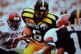
Not so bad

meh

vet day special unis

and what I think was their best one-off against Minnesota.

Why is Iowa wearing Purdue's colors?
Maybe their jerseys were stolen from the locker room.
That had to have been the most pathetic of the "special uniforms".
Or maybe the one with the most ingenuity behind it.
Or maybe you're right and they're just pathetic
Simultaneously most pathetic AND most ingenuity.
From AP:
Four Virginia Tech players had to wear loaner attire from the home team after their own white jerseys disappeared from Bobby Dodd Stadium before Thursday night's game.
Glennon and fellow quarterback Tyrod Taylor were among those who had to wear white road jerseys provided by the home team. Also missing: the jerseys of two defensive starters, safety Kam Chancellor and cornerback Brandon Flowers.
The Georgia Tech jerseys were altered for the Hokies. In addition to the names being handwritten on the back, the "Yellow Jackets" name across the front was blacked out with a black marker, as was the manufacturers logo.
The Yellow Jackets wear Russell attire, while Nike is Virginia Tech's official supplier. So, the Russell logo was colored over and the Nike "swoosh" was drawn in beside it.
Replacement jerseys arrived for everyone except Glennon during the first half. Flowers and Chancellor changed into their Virginia Tech jerseys before halftime, but Taylor -- perhaps in solidarity with his fellow QB -- remained in his Georgia Tech jersey.
Most importantly, they won the game.
Someone has some jerseys worth some money now: Tyrod, Flowers and Channcellor, all NFL starters now.
Definitely very cool memorabilia.
Interesting how Georgia Tech and thievery is a recurrent theme.
No, their kettles are gray.
They're not orange. I'm happy. Go Hokies.
I am a fan of the uniforms or at least ambivalent, but not a real fan of the helmets. I would like some maroon or orange on them.
One step closer to redemption...
I think my favorite helmets of all time are the ones we wore against UVA last year. Maroon with the VT on the side and a single orange stripe down the middle and smaller white stripes to the outside of the orange stripe. With the white face mask. That is a good lookin' helmet IMO
I like the base helmet too, but I'd rather have a maroon facemask.
I like the contrast. But definitely the normal all maroon is right up there among my favs
I don't like the stripes on the shoulder and I don't like stripes on the helmet or the white facemask. Give me back the 04-07 unis and all maroon helmet. I think our new uniforms would be exponentially better without those damn shoulder stripes.
I agree on the shoulder stripes. I don't like them either. But if we're stuck with them (which, it seems we are) we might as well put a stripe on the helmet...
You get rid of the shoulder stripes and suddenly that helmet with the stripe isn't as cool to me....
In an ideal world we'd go back to these

These would be my second choice easily.
Anybody know if you can purchase the jersey, like they did for the Boise St. game?
Waiting on Nike to decide.
Do you know if that is something they have said they will announce by a certain date?
I think the obvious point is people (including myself) would want one to wear at the game.
Almost positive it won't be announced prior to the game.
Seems pointless after the game...I feel like much fewer people would be interested at that time even once we've won.
There's a Nike shirt on alumnihall.com that's black with faded hokie stones.
It's not quite the jersey but similar.
If its anything like the orange helmets from last year, they'll only sell replicas if we win
I really liked those orange helmets too :( I'd be willing to see them in action again this year.
I'm not going to the game but I want to wear it before the game, at lunch, while I watch the game on TV, while eating a bowl of cereal, in the office, while sleeping.....the possibilities are endless
guaranteed I'd spill mustard on it within 5 minutes. But it's a battle wound I'm willing to take.
Hope there are lots of Coleman Fox fans out there, because we'll probably only see #16s.
I'm drinking lol...
So...... basically Abandon All Hope Ye Who Hope to Wear in Bristol
Any updates?! I circled this day to remind myself please post if you find the jersey for sale!
http://www.bookstore.vt.edu/ePOS?form=shared3/gm/merch.html&item_number=...
Here ya go!
Are they serious? That is supposed to be a replica jersey? It doesn't even say Bristol or have the details that make or break the design. :/
Thanks for the link, though! Appreciated.
I'm with you, was at least hoping for a Bristol patch like in the pictures
Or at least the ACC logo. Disappointed in the replicas.
Looks much better in person than in photo IMO. The VT is sewn onto the collar, yes its missing a maroon ACC patch and the Bristol patch-> which you can't find anywhere?
However I will be getting the maroon ACC patch online and will iron it onto the Jersey then probably frame it for my office, got a perfect spot for it on the wall.
I understand casual shoppers won't notice or care, especially since it sold out already, but that product is an absolute embarrassment.
You can tell they had no intention of selling these until they announced them and there was a ton of demand and they just rushed something out with a Hokie stone design on it.
Thanks, not exactly what the players were wearing but still kinda neat
The replica looks more like a soccer kit.
Can't embed on iPad:
Here is one laying on counter at store, in my opinion it looks cheap and not close to what team is wearing. They are also already sold out.
https://twitter.com/vtnova/status/772790726073647106
Ugh I wish I saw this earlier, I decided to buy one... guess I if it is a hot day it looks pretty breezy. Black shirt underneath or maroon?
Announced by Tech a while ago....they will be available to buy!!! Taken from VT football twitter account.
YOU ASKED, WE DELIVER!
Our @BattleAtBristol jerseys will be available for purchase online Sept. 5.
Stay tuned! https://t.co/FJkiz63K21
These unis are stone cold (pun intended)
The only question i have is, when will I be able to buy one of these jerseys?!
Tweet says Sept 5 online, but who knows if you can get on campus also.
Yes, who, that's the one.
Bookstore link
Against my better judgment, I'm going to lay out my opinion (Jesus Christ, that can't be emphasized enough) on these uniforms. Yes, I did call them "atrocities" in a tweet, but using the humorous definition of the word, "a highly unpleasant or distasteful object." Truth be told, they're not atrocities; it was just a gut, instantaneous response to something that wasn't maroon and orange (and gut/instantaneous things never happen on Twitter, ever).
As I clarified to a friend last night, my problem isn't with the uniforms. My problem is with when we're wearing them. BaB has been billed as "college football's largest game ever," to be remembered for decades and generations to come. (Or, at least for the five years until they fill in Lake Lloyd at Daytona and F$U and UF face off there.) The point is, when we look back at the event, or even when a casual fan tunes in to it, we're not going to look like the instantaneously-recognizable Virginia Tech team that's clad in our usual maroon and orange. Playing a Tennessee team that is going in orange and white, if we came out in #ALLMAROONEVERYTHING, how incredible would that color-on-color game look?
Of all people -- and I can't believe I'm crediting the other side here -- UT's athletic director, Dave Hart, laid out why Tennessee was sticking to their standard orange and white home uniforms even for this game on the biggest stage. He said it so well that you could change every reference from UT to VT and it's basically my argument.
Now, I'm not going to get into the "traditional" debate here and talk about the original school colors that were in place for all of four years before we switched to our current combination because it was unique at the time (and, to my knowledge, still is). All I'm really contending is, we could've waited to roll these out for the only home game in October -- Miami on a Thursday night -- turned it into a blackout game, and they still would've had the same awe-inspiring effect, reverence, and following they do now.
Exactly. This is a game for brand recognition. These uniforms do not achieve that.
I understand the point, but it would make more sense if we were the home team and could wear all maroon or our typical home jerseys. Perhaps since we are the away side Whit felt it was a chance to go for an alternate to make a statement that way, as white is not our primary colors.
Or were we allowed to wear our home jerseys as well?
Nope.... we were labled the 'white' team - maroon wasn't an option.
thanks Alum. Then the branding argument really doesn't fly for me. Going alternate uniforms makes a bigger statement than wearing white any day
Could have done color on color though no? Clemson and UNC did it fine. So did UCLA USC.
Incorrect. The contract shared on TKP says maroon or white.
Contract
Ooh, nice pull Hokiemacho +1
This makes things interesting. now I am conflicted.
I love these jerseys and if they are at this caliber I think an annual Hokie Stone iteration is a fantastic idea BUT if we could have gone allmarooneverything or maroon I think I would have stuck with the branding.
Seems to me they could have gone All Maroon with the Hokie Stone Logo (on Maroon) Helmets.
Would have looked sharp!
Also, would have promoted more uniformity (!) regarding maroon in the stands, to balance the horrid Tennesee Orange.
I couldn't find the color stipulation, but that was a horrible scan of the contract, so no biggie. If we could have worn Maroon, we should have. Those Hokie Stone unis are tight, and we could have worn them against liberty for a military appreciation game on Labor day weekend, or the aforementioned blackout for the thursday nighter.
Point 5 of the contract:
"The University of Tennessee, home team and Orange jersey, and Virginia Tech, visiting team and Maroon or White jerseys."
Note that color vs. color requires NCAA approval, IIRC.
And there's the key... I'm not sure we were going to get that approval, hence the stone unis
Well they could've at least said we tried to go for a maroon jersey and it was denied. However the colors contrast so much that I don't see what the problem would be. This is a neutral site game and UNC and UGA both wore home jersey's at a "neutral" site game in ATL.
If we didn't share a color with Tennessee, it probably would be easier to do traditional color vs. color uniforms. But maroon vs. orange might make the field look one-sided.
Yeah felt the same way. Might be pretty hard to distinguish the two teams.
I mean home just means that they have first choice of uniform and the away team cant conflict right? We could have done maroon in some form if we wanted to.
if you are right, then I definitely agree. If Alum is right, then I disagree.
To have color vs color in a game, you need agreement from all parties involved, and I think it became clear that we weren't going to get approval for our standard maroon. Those in charge were hoping to have both teams wear special uniforms, and its still TBD if Tennessee is going with a special alternate, but they had the option to stick with their regular homes by being the home team. We were allowed only the white uniform or a special uniform. We took option 2.
Woulda been such a great chance for an all maroon vs UT orange game. Oh well
Devil's advocate:
It is a new era for Virginia Tech. We have broken the shackles of a anemic offense and have embraced the new offensive schemes. Maybe the commentators will point out that this is a new team that isn't afraid to put up points and be flashy while doing it.
That said, I've never been concerned with uniforms unless the are fugly to the point of embarrassing (e.g. the Foghorn Leghorn outfit). The most important thing is actually winning the game.
As far as the new era is concerned, that's my exact point. We JUST unveiled a new unified athletic brand. And on the biggest stage people aren't going to recognize who we are
Yes, yes they will.
There will be a 'Va Tech' in the on screen widget ESPN will use during the broadcast, and it will be on a black or grey background. And all their graphics will have the VT logo when giving the description and/or stats for our team and players over the course of the game. They will dumb it down to the point where only mental morons won't be able to figure it out.
As I have said before... Oregon hasn't worn the same uniform twice in something like 5 seasons. They have absolutely no issue with people recognizing them immediately when they tune into a game.
That's because Oregon has branded the entire idea of alternate uniforms. If you see a flashy uniform, the first thing everyone does is compare it to or think of Oregon. That's what good branding is. Following in their wake is not the same.
So you look at our uniforms and think Oregon?
We aren't the Charlotte 49'ers, literally everyone who watches college football knows who we are.
My hope is that people remember the uniforms a lot less than the headline "Hokies Upset Vols in Front of Largest College Football Crowd Ever"
This is a really good point I hadn't thought of. How cool would it have been for them to be all orange and us to be #allMaroonEverything? Tough choice
Counterpoint to the branding issue:
2000 Sugar Bowl, national championship. VT, with arguably the most unique color scheme is all of sports, playing in their biggest game ever, wore all white uniforms with maroon helmets.
So, change the white to black, and what's so different about these Bristol uniforms (other than the black helmet)?
The difference here is, we were the away team because we were ranked #2 and, as such, wore our standard away uniforms. With F$U wearing their standard home uniforms, both teams in this game were "on-brand."
If I had to choose between white and alternate, neither of which have maroon or orange, I'll go with the alternate if it looks awesome (this year, it does). 10 years down the road people aren't going to remember what color our uniforms were...they're not going to care. I don't even remember what color our uniforms were when we beat Tenn the last time
away uniforms aren't "on brand" though no matter your #2 or not. It's an advantage thing and/or a color distinction. In that case and in this case alternate uniforms are the better choice because you can make a statement with them.
This looks pretty clearly our brand to me
That's clearly our away uniform.
This is our brand
I wouldn't even say it's clearly our away uniform. Lots of teams wear white
Maroon jerseys aren't our brand. O&M is our brand. That's my point. Using the away uniforms doesn't take us away from O&M.
Ok, then using a different color than white shouldn't matter. As long as there is enough O&M for you which is more of a personal bias. But brand should be achievable with white or black
Edit in response to your edit: Yes, O&M is our brand but when used as the primary color palette. our brand is definitely not White Primary, O&M accents.
And these new uniforms have essentially zero O&M. White or black isn't the discussion. Looking at Hunters video you can't see any O&M, and I doubt you'll be able to on TV either.
As I said, personal bias. I am fine with it because they supplemented the O&M accents with something I find equally brand worthy. In this case Hokie Stone. Has any other team had a stone jersey? I honestly don't know, but a Hokie stone alternate uniform iteration is not a bad idea at all, especially if they look this good.
Off topic but what is Brewer up to these days?
About 5'7".
About 25 interceptions
His instagram shows he's been fishing in Alaska
Im with you on Team MaroonEverything.
I do really like these black/gray unis though, I was pretty hyped about them initially but could you imagine if they were all maroon everything with the hokie stone overlay
Special uniforms for a special game get people talking about it even more than they already were.
I agree, almost every UT fan at my work has seen our jerseys, love them or hate them. They do not have a comeback at all because they are wearing basic color combo. Lots of jokes and trash talking, but it does come up in conversation quite a bit.
#AllMaroonEverything holds a special place in my Hokie heart. It almost brings a tear to my eye and makes the yells louder. However, I do see the marketing and historical aspects and a way to show the nation we are cool enough to try something new on a big stage. I will be ordering the jersey without hesitation. Only drawback is the #16. Maybe a #1 will be offered? (Or not, because it belongs to Ford?)
They're selling #1 in our regular maroon this year, but it would really be a downer if you have to get #16 on this design. I'll probably pass if that's all you can get.
Yeah i had a hard time shopping for jerseys this weekend. I love the new number font, but the replicas look terrible and the numbers on the back look too small. I ended up getting the only med. #1 with the old font they had left (which was also full price and a rip off if you ask me). I was also gonna get one for my brother, but he ended up not even wanting one when he found out those were his only two options
Get used to that... Probably highly unlikely you'll be able to buy anything with a player specific number in future years. Many programs are only selling with the year as the number or a number that is important to the school. This way they won't run into potential lawsuits with players wanting to be reimbursed or have a cut of the proceeds from their own jersey sales. I would bet we'll only be selling jerseys with the year or 25 from here on out unless it's a player specific Throwback like the Vick and Chancellor ones this year.
Hey, it's just my opinion, and not even my wife generally cares about that, but winning will do more for brand recognition than anything. It doesn't matter what we wear, we lose and ESPN and other outlets will make no comment other than those were cute uniforms as they talk about Tennessee's march to the championship game.
that we're not going with our true greatest uniform, anything with the Foghorn leghorn helmets.
No.
And yes, I recognize you were joking.
Joe, is it possible to kick people out of the TheKeyPlayersClub?
Asking for a former friend.
/s
You're acting like 2012 wasn't a great year!
Regarding old school O & M versus the stone uniforms, it's such a special
event and having equally special uniforms seems like a cool idea.
As has been pointed out, and I agree with the point, the thing that will be remembered about who played in this game is who wins it. I may change my mind on the unis when I see them in action, and a big win can change perception, but as for the football universe at large, it is just a matter of who won.
Jorah Mormont loves these unis #greyscale
Somewhat unrelated but I couldn't find a better thread and didn't think it deserved its own. So I'm kind of digging the new uniforms this year, the changes are subtle with the numbers and the collar but they look sharp.
I was thinking of buying one but I was disappointed to see that the ones they're selling still have the old "thinner" design around the collar instead of the new thicker outline from Saturday's game. Anyone have an idea as to why they did this? Maybe next year they'll get them updated?
Also, did something come out from the O'Bannon case about not selling jerseys with the numbers of star players--why are we selling #16?
The number is 16 for 2016. They'll probably just keep offering the current year as the number, and then even if it coincides with a certain player, they can claim precedent of just offering the year.
I was all set to get a #4 jersey, because of Hall, Royal, Wilson, and now Ekanem and Evans. (Basically, it's been the most consistent good number.)
I suppose I'll have to wait 88 years.
I bought a #4 back in 2008. Good ol' Eddie Royal. And indeed, that jersey has served me so well over the years.
I bought a #4 for David Wilson. Its a good solid number and I'm hoping Ken and Jerod serve it well this year.
I think I'm obligated to say I prefer the No. 3 jersey
Got myself a sewn on #4 in 2004... It has served me well over the years
I have a 4 for my bud Andre Kendrick!!!!
Funny story, right when I got my acceptance to VT, the first thing I did was go out and buy a football jersey. In Raleigh, wasn't that easy to find a VT jersey, even in 2002, but I managed to find a #22 white one at a local sports store. I was fairly naive at the time, and I remember wondering why there was no name on the back of the jersey, especially when the Nike tag and barcode were labeled "VT22SUGGS"
I wonder if this will lead to more players requesting to wear the jersey of that year or their graduating year. For instance, if Bucky had requested to wear 16 because he knew a lot of people in the stands would be wearing it. Or 17 because people will be wearing it his senior year (after he forgoes the NFL draft again).
So everyone needs to get their Josh Jackson jersey next year!
Anyone get the Bristol HokieStone replica?
yes, I snagged one ASAP
I got one and received it on Wed. but was I expecting more of a typical football jersey. This is like a soccer t shirt like jersey - I was just wondering others opinion on them.
For $80 I was expecting sewn on numbers, but at least with this style the numbers and logos won't rub off like they could if they were screen printed...
True. My other tech jersey numbers and stripes are cracking apart
seems more like a thicker dry fit... was not expecting sewn on numbers, patches or anything like that.
If they were to have made replica's like that easily would have gone for $200 plus.
I didn't think it'd be sewn on numbers, but figured it'd be vinyl or screen printed numbers like the other jersey I have with nicer fabric collars. At first I was pissed about it but doesn't seem too bad I guess. Then theres the wife who thinks its a hideous generic rip off t shirt..so I'm getting pressured to get rid of it :/
Bought it online Monday morning and it's supposed to be delivered today! Can't wait