
Yep, it's the offseason. Where the football drought leaves us mere mortals to lament the fact that no football is being played, and long for the days of French's enlightening film reviews and TheFifthFuller's fantastic "FOE"Rensics.
Which leads me to show everyone something of the utmost importance. THIS is what the offseason was created for. Now let me be clear, this helmet is purely concept, and not an actual helmet creation (thank God) at this point. Without anymore fuss and muss, here it is: (NOTE: The HokiesFB Twitter did not come up with this concept, but retweeted it from a fan.)
This VT concept helmet is pic.twitter.com/ssXcxcIbT3— Kenny Ferrell (@HardHitt3n) March 12, 2017
Its Foghorn Leghorn meets Metallic Orange meets.......hideous? Awful? Disgusting? Whatever synonym for "bad" you choose, it definitely elicits this reaction (from me personally):
Anyway, I hope this helmet never becomes a thing. They should burn this concept. Immediately if not sooner. Carry on fellow Offseasoners, the Spring Game brings the hope of football games to be played.
Comments
I see a badass looking hokiebird on the helmet, not foghorn leghorn.
eh..... thats bad but I still think these are the worst.

Sorry - i kinda like it except for the fade to yellow on the top, and the top half of the facemask should be maroon as well. I could see this looking ok with AME jersey and pants. I agree with avtfan that his picture is the worst, tied with the same white helmet with the hokie tracks.
Fair enough. I personally think it's busy. Too much going on in my opinion. With some adjustments maybe it'd look better, but I personally just want to see the VT or the old VT logo on our helmets. Not the Hokiebird.
Thanks -and don't get me wrong - it is busy, and i prefer the classic look too....i would never want this as an all the time helmet - just could see it as a one and done. certainly doesn't make me want to throw up in my mouth like those god awful Maryland helmets from a few years back....
Both the "foghorn leghorn" and "hokie tracks" helmets fall into the category of "worth logging in to comment on how bad they are".
So I'm logging in just to to say that those are terrible.
And the only way to make it even worse is to put it on an orange helmet.
Also, it's only MARCH! Pay attention to basketball already! VT has a team going to the dance!
At this rate, it will be a long, LONG summer!
&
Perfect, if VT ever starts a dirtbike team.
Foghorn Leghorn ain't so bad. I think the Hokie-turds helmets are the ugliest:
you take foghorn off of there put a maroon VT and you have a decent lid.
Anything with foghorn leghorn is going to be bad.
The transition to that damn bird is all Bill Dooley's fault. He wanted to play down the whole turkey thing. That's why the mascots got shorter and shorter, thicker, necks.
But, I will say I don't mind the mascot. But, the cartoon images of it are terrible.
Holy fuck. That's terrible. Let this never be spoken of again.
[ mod edit: FTFY ]
It's not so much the decal as it is the 2-tone facemask. I personally don't like the fad of vomiting all sorts of colors and patterns onto helmets (see Maryland).
BUT...
If that's what gets the 4*-5*'s to start paying more attention to us, then I'm down.
Leg for finding a way to bash the Maryland Clownsuits by reference.
I like this helmet.
Pair this with our All-maroon-everything look, or even our orange combos and we'd like sick.
Sorry not sorry.
I actually like it too. For what it is - a one-time deal. I think it would be a fun, different look (except if that is a fade to yellow as opposed to just lighting - I do not want it fading to yellow just metallic orange). However, I would not want to see these several times a year.
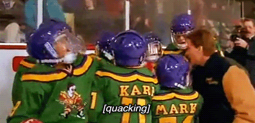
This helmet looks like something coach Bombay unveils right before the big game.
Maybe but I would expect Trinidad to wear that before the Ducks.
The sequel jerseys might be ugly, but these jerseys are dope!
Them's fightin words right there
You guys sound like a bunch of old farts bitching about Rap music.
I chuckled...
This is actually kind of hard, so I'll be pretty specific. These orange helmets alone are some of my favorites, but I don't think we ever wore them with the right uniforms. The maroon unis lessened their potential.
Agreed. Pair these up with All whites, or grey / black and it has more oomph I think.
Getting closer and closer to:
From 2004 to 2011, we won at least 10 games every season. We started wearing the Hokie Bird/Hokie tracks on our helmet in 2012. From 2012-2015, we went 7-6 three times and 8-5 once. Let the record books show that if we wear any form of our mascot on our helmet that we will plummet into 4 years of mediocrity.
Not bad.
These are hideous. Never in a million years.
However, someone should pass this along to the hockey equipment managers. I could get behind this as a goalie mask.
Somehow.
Putting the Foghorn Leghorn or Fighting Gobbler on my mask like this is at the top of my "If I could do it over again" list.
I say I say, these helmets is damn preposterous
What? These helmets do not stop us laying the smackdown on lolUVA. I like them.
We could come out wearing blindfolds as helmets and be able to stick it to LOLUVA though.
I thought they were cool. And i noticed a lot of players and recruits though they were fire.
I like it on a shelf but its just too busy to look good on the field in my opinion.
it just seems like the logo is too big, if they were to be on both sides. pair it with the right uniform and maybe the player's number (like the black "25" on the Beamer helmets from 2015 UNC game) and maybe you have a good concept