
Recent Comments


Lololol!!!

The star trek numbers sort of go along with the star trek collar, I think.
Oddly enough, I liked the collar from last year, so "no changes really needed" was the right answer.

It was on twitter, so it must be true...

That photoshopped uniform on the right looks a million times better. Its the orange collar that is taking away from the clean modern lines. But I think with the orange collar gone, the shoulder striped should stay. IMHO.
The orange collar must go.
I don't mind the stripes. I'm just not a huge fan of the collar.
Maybe it will grow on me. Probably not.
The numbers are OK.
Agree -- except the new numbers aren't even okay.
That's crazy.
We need a Hokiebird emoji.
Disappointing. I could like-ish most of the individual parts, but I think they somehow clash when put together. I don't mind retro "athletic" such as the stripes, but looks bad when paired with the cartoonish retro disney futureworld.star trek font. Personally, i was hoping for "modern" or "tech" coming through with in a cleaner look, not a cartoon futuristic way. I was hoping for more use of the secondary colors..ie the charcol gray.
I agree. Today is a huge game for both teams. Miami hasn't shown the killer instinct all year. We had several opportunities during regular season to secure the 3rd seed, but ended up losing games to teams like the Orlando Magic. While we still got the 3rd seed, it was by way of a 4-way tie and extremely good fortune after blowing a 26 point lead in Boston.
Charlotte also was very hot to end the year and hasn't looked anywhere close to it since the series started. What better time to do it now than game 3 at home down 2-0? Today's game worries me a lot.

I saw on twitter that Beamer was a big fan of the shoulder stripes and he is the one that wanted them. The uniforms were approved and ordered prior to his retirement.

I like the white and I like the font of the number.

I don't like the orange collar.
If I changed it, I would remove the shoulder stripes. They have never bothered me, but it is time for something different. I would have something similar to the Michael Vick years. Maybe add a thin orange and white stripe up the side of the jersey similar to the women's basketball jersey

Clark Ruhland made an edit in photoshop and posted it to twitter. Remove the shoulder stripes on the picture to the right and I'm a big fan.
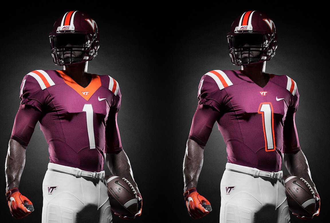
I will say that I like the maroon helmet with the extra stripes, and I like the orange chrome helmet with the solid white VT. I also like the new font on the lettering. New and modern. If you watch the video in the official release they state that it is almost like it is chiseled like Hokie Stone.

It's amazing that Charlotte only lost by 8 the other night. I know it wasn't a close 8, but they were in position for a late run. Loss of Batum hurts, but maybe we can go small and shooting fortunes change. Charlotte has been pretty good at home this season, hopefully the crowd is there and we can squeak out two games, get Batum back and make it a three game series. Not likely, but a win today and there is belief.

The more I see them the more I like them. Interesting that the Jersey from approx. 2004 that everybody loves also had a large collar.

Leg for the total recall (oops).

I don't get the hate either. I like the orange numbers and the basketball jerseys.
I'm glad it was minor. Watching the brand video from the link, sounded like they wanted some major things. I do like thw gray color pallette. Would be cool to see a throw back all gray look.
I like the new font and I see it as an important step in having a distinctive brand but I think the uniforms are half-assed and I think everyone should be outraged. It's like Nike thinks that they changed our font so they don't need to put much effort in the other stuff. I hope Whit is not going to take this crap and lets it be known to the Nike staff. Maybe I'm looking into it too much but this is a sign of a lack of respect IMO.

after going through 70+ comments on this thread, i've come to the conclusion that change is very hard to accept. i'm in the same camp, too, but i usually adjust much faster than those clinging to their favorite, classic designs.
if there are any positive takeaways from this, it's that (1) i'm happy Nike chose us for a "refresh" to unify fonts and logos throughout all sports programs and not just football and (2) if the players like this, then i'm for it, too.
there were selective things i disliked but after walking away from it and reading VT Athletics' take on why they did this, i'm now OK with it. what we're seeing now will become "classic" 20 years from now so i'm of the opinion that i better get used to seeing these uniforms as i get older supporting the alma mater.
as for the "Star Trek" font, i get that it's tied to our "Invent the Future" tagline and our heritage as a land-grant institution with a heavy STEM focus. and it makes sense, too (to me at least).
just my two cents...

South gate entrance isn't letting anyone thru to behind south endzone...turns off at the baseball field. I'm behind the vet school (fyi all the spots back here are filled.)

Anyone have a lead on a parking spot near stadium?

You know, I've seen so many different VPI to VT uniforms over the decades, I have lost any real care about what they're wearing unless they show up in something stupid. I mean, when the game's on, I'm not sitting there critiquing the fashion choices and seem to get used to about anything we're playing in.
That said, it has been fun reading all the wailing and moaning and hearing the gnashing of teeth.

I wanted the shoulder stripes gone. I was hoping for something more like 04-07 which was so cool. I even liked 08-09 more than what we've been on recently.

I'm in lot 1 and its full
What. Is. The. Problem. With the orange numbers???!? What are people seeing that I'm not? I can see the numbers just fine! If anything, the white numbers look like an afterthought.

SPRING GAME UNIS ARE STRAIGHT FIIIIYAH
#allorangeeverything
v.
#allmarooneverything