
Recent Comments

They were/are my favorites. They should go back to them and never change.

Alumni Hall has em for cheaper than at Nats Park. I got this one with a discount code for $24 and free shipping 2 weeks ago actually.
http://www.alumnihall.com/p-23664-virginia-tech-new-era-nationals-hat-ma...
The VT/Nats hats at Nats Park are one of those psuedo-maroon and orange colored hats which looks discolored and absolutely awful imo.

He thanks you for crediting him.

Exactly. Talent doesn't buy you skill or size. Michael Thomas is an excellent receiver, but other than him it remains to be seen if the other OSU receivers have the skill set. It may well happen, but it is a low percentage way to try to win a game, especially when your receivers (not named Devin Smith) didn't show the ability last year.

Well, I'm just glad that my Isaiah Ford jersey i just got for Christmas is still the current jersey style...

^THIS!!

BRING BACK FIGHTING GOBBLER MERCH!

🏝NO BAD DAYS🏖🤙
|
11 years 1 month
# | Virginia Tech Athletics: Hokies hire Jon Laaser to Replace Bill Roth Gah I thought thats what I was seeing but I had managed to mostly ignore it. Now I cant stop seeing it and its unnerving...
If what I suspect is true, there might be a minor tweak to the VT logo, if only to standardize our colors as the ones that we've been using athletically for the better part of the past 20 years. They also might delete the double outline from what has been leaked, but I highly doubt they round the edges off, especially after the harsh backlash when the concept was leaked.
I think the main rebranding will come in the form of an updated HokieBird logo, updated typeface, maybe a new tertiary logo, and a standardization of these brands across all of our athletic programs. Right now, our design aesthetic is different from one sport to another, and there seems to be a push to get them all reigned in to better show they're all under the same umbrella, and not necessarily all working independently of each other.

Foster's top dog on every down.
If anything, it's gonna be something subtle, as far as I know. Changing the colors of the outlines/borders and stuff like that. Won't be a shift from the retro TV to the new VT or anything like that.

There are some other articles on that site..breakdown of ACC DB coaches (Torian Gray has longest tenure)

I hate this re-branding thing. Is it more than the VT logo, b/c I find it (VT logo) to be fine just like it is.

Exactly. I know a lot think this looks dated, but I think this is classic. I just don't think the shoulder stripes add anything to our uniform. Those orange shoulder numbers were unique combined with the simple dark maroon jersey and helmet. Kind of how Michigan has simple uniforms but that easily distinguishable helmet, or Alabama with the numbers on the helmets that stand out. I thought this uniform was great.

to be fair it's a bit harder to contribute at schools when you are sitting behind other elite players compared to our situation atm and most of the guys he listed are in their first or second years.

I just spent the better part of my "staycation" watching Michigan State and Alabama take on Ohio State from last season, and I have put together a couple of subtle changes that the Buckeyes used on offense to be more effective than they were against VT. However, the biggest takeaway for me is that the Spartans and the Tide didn't pay attention to the lessons from the VT game. The column is in the editing process and should be published soon.


Preach it brother! Those are my favorite as well.
It should be noted that this look includes BLACK socks. It finishes the awesome look.

🦃 LEG KING 🦃
|
11 years 1 month
# | Virginia Tech Athletics: Hokies hire Jon Laaser to Replace Bill Roth lol I'm sorry... I couldn't get past the picture...


Those jersey's aren't the greatest in the world, but it's not like they are terrible either. I see us keeping up this base uniform set w/ a couple alternates each year. Nike probably already has like three concepts to use for our next set of standard unis, but I wouldn't expect to see them until Beamer retires.

Here's my #sources, but nothing of substance, I just like telling you all just in case.
Next season is the season we're getting new uniforms - Nike is going to completely revamp us so our sports have a sort of coinciding theme. It will have something to do with the fact that we're updating our logo to rebrand us and make it more modernized. Also, these #sources said black uniforms for the NC State game.
But again, just #sources so take from that what you will.
If the season is hurdling ever closer, why does it feel like it's crawling?
Great minds think Hokie.

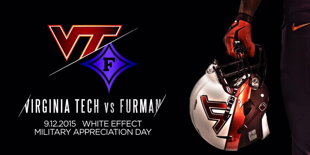
I kinda actually like those helmets and I don't know why. That's usually not my style.
For anybody wondering

I'll be there, section 202... GO BRAVES!