
Hokies are #33 in list. Can't say I like or get the design for us (supposed to be a Turkey head???), although the subtle feather pattern in the maroon base is slick. Jayhawks and Trojans are probably the best, Baylor not bad. GT the most interesting from the ACC. TCU Horned Frogs is kinda cooI, but don't think many of the raised designs would pass muster for wear or safety. What do y'all think?
College Football Helmets Re-Imagined by AI

Forums:
DISCLAIMER: Forum topics may not have been written or edited by The Key Play staff.
Comments
You know, if you kept the base design and colors but swapped out that weird logo for a set of Hokie Tracks, it might actually work. Or perhaps a more stylized/updated Fighting Gobbler logo. I like the feather details though.
Most of the time, all it takes to make exciting uniforms is to design them like sports cars.
I think our design is supposed by a stylized "V" for Virginia and then some like talons that a bird may have? The feathers are cool, I also like GTs
I think they need to add a yellowjacket to the hive.
I dig it. Thanks for sharing.
While Oklahoma State's doesn't make me think OSU cowboys right away, its a cool looking helmet.
A handful of them are pretty cool but I think most of them kinda miss the mark
I hate to say it, but Miami was actually one of my favorites that seemed realistically possible. I love how Stanford's was just a Stanford helmet lol.
Also, please Ole Miss, just do it:

This reminds me of a 90's commercial with a cartoon shark. Either the game Shark Attack or Monster Shark trucks.
Obligatory
I think those shark toys that were in that video might have been the ones I am thinking of... Street Sharks.... but I think there were a couple of other commercials too that has a similar cartoon shark.
Street sharks had their own cartoon
Could be what I was remembering. That was a long time ago...
street sharks!
Dunno about the logo, but that color scheme almost exactly matches my old high school's helmets. Thumbs up.
Looks like a female body part gone bad.
Sorry, can't unsee it.
...and now no one else can, either. Thanks, I hate it.
Don't like or get the VT one either. Seems more like Arizona State in terms of the symbols.
Bet The Matt Board. could do a way better job.
Michigan State should adopt that bronzing effect immediately. Looks perfect for them.
I do wish more teams could could experiment with 3D logos on their helmets made by the same material as batters helmet logos in baseball. Could add a pretty neat dynamic to the whole thing.
Agreed. Makes it look like a worn bronze spartan shield. Totally fits.
I can't stand that everything is now "done by AI." Drives me freaking nuts as an artist.
Well if most of those helmets are any indication, your job is still safe (for now). Most of those AI designs don't seem to understand what the actual animal is. For example, the first one on the list is the UConn Huskies and that "husky" looks way more like a cat.
I agree. Luckily my career as a Internationally Renowned Feather Fashion Designer can't be replicated by computer. But man, humans have taken the fun out of most things, and just want computers to do it. I'm mostly nervous that we are headed on a path similar to the Terminator.
I think wall-e is more likely than terminator. We're already halfway there with social media
I think ours looks like a USFL/XFL logo. Not a huge fan. I do like the colors. Some of them are pretty sweet. Some are just the normal helmet. Some of them remind me of little kid bike helmets. The Mississippi State Bulldog looks like he has seen things...
They all look like AI works for the XFL. College helmets look best with some blockiness, solid background, and sense of history. The extreme patterns and effects seem out of place in college game and fit more with the NFL. That said, most of these would be sweet one offs.
The way new helmet designs are going, Riddell may see the TCU helmet and actually make it.
the fighting Virginia camel toes?

Also: our logo makes absolutely no sense.
I mean it fits with branding....
It totally looks like the female reproductive system
I am thoroughly disappointed that that image hasn't been posted yet.
this one?

Or this one?

Hokie07ME, you should be ashamed! You know that just ain't right; it should be horse's butt, not a cat's LOL
All credit to GUNTAR for these gems.
https://www.thekeyplay.com/content/2020/april/24/loluva-logos
Miss that guy -- it's been over a year!!!!!!
I'm still out here.... Lurking....watching.... Waiting.... For opportunities to make dumb jokes
dont leave us again please and thank you
I believe our logo is looking at the face of a turkey and beak. The 2 outer lines are the outside of the beak and curl up at the top to form the eyes and the inner lines form the top side of the beak in somewhat of a 3d view. I didn't understand it at first either, but now I see where they were going with it.
it just looks way more like the head on view of a male lion
get in loser, you're going to the dynasty draft
I actually thought the same thing after staring at it for a minute
AI clearly took "hard things together" in a new direction
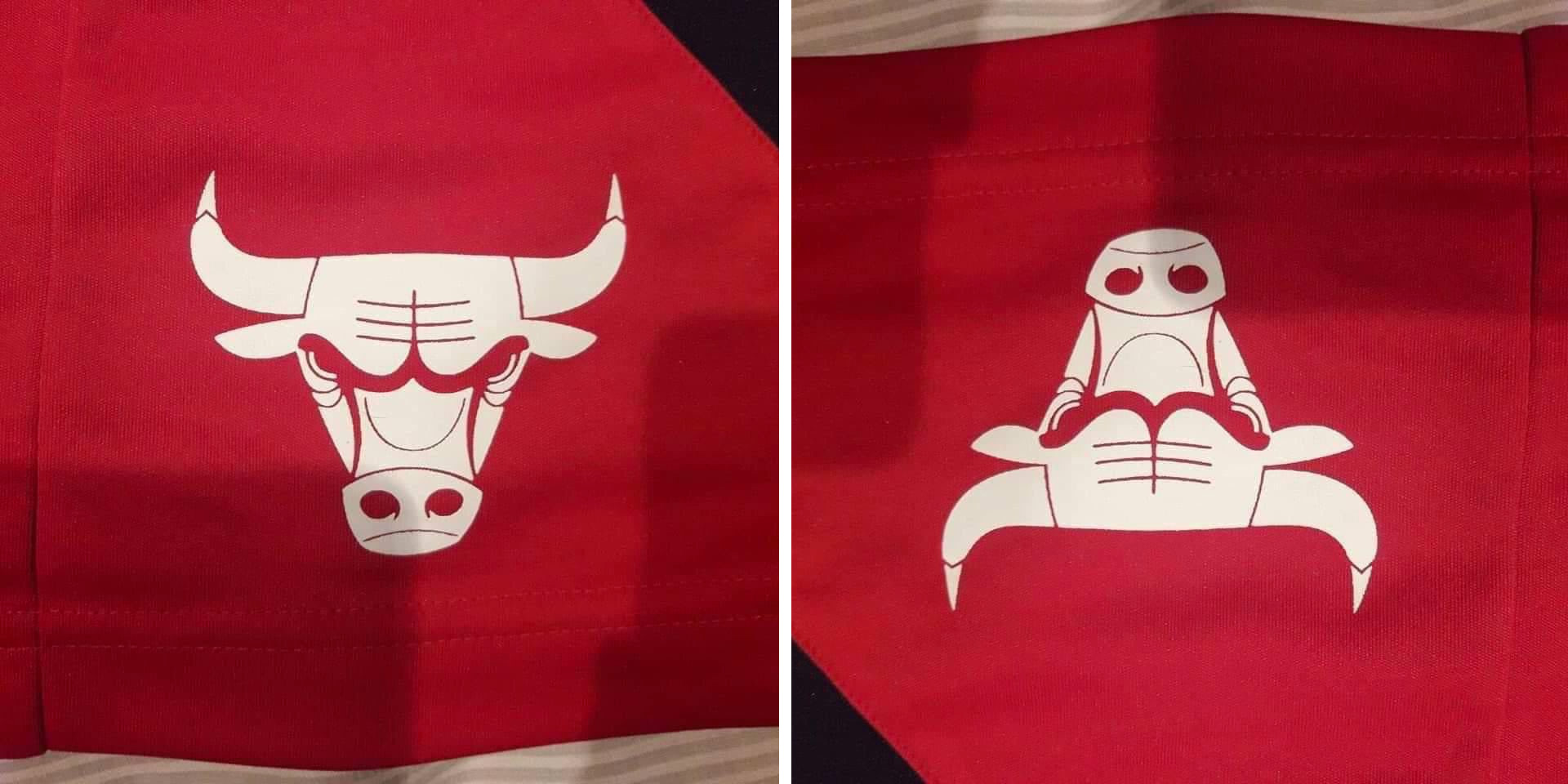
very much some "bull's logo upside" vibes going on here...
A maroon helmet with a metallic orange facemask would be pretty awesome, especially under the lights.
Yes!
Anodized maroon with a candy orange mask...one of my first 3D printed minis and still my favorite for an on-field concept idea.
If the main point of a helmet is to establish a clear brand/identity then most of these fail miserably.
Ours is a symbol vaguely resembling a "V" with talons, I suppose?
Of these only a few are really even decent. I like the GT design for sure.
The rest seem to be simply some combination of animal with sharp teeth +/- swirling lines or fire. Alot of it is just derivative design. The ones with 3D elements are obviously a no-go from the start.
Thanks for the effort AI, but maybe we leave this job to humans.
Minnesota's is freshhhh
Or, hear me out, is it just Notre Dame's?
Yeah pretty much.
not really getting a Hokie vibe from that logo
No link to an AI generator, or mention of the methodology? Extremely suss. You would also have to train an AI to learn to put texture on helmets for it to do that. AI is not the best at coming up with completely new ideas.
Cool designs. Doubt they were AI.
dunno what that is up there, but it ain't us
Is the middle thing a beak and Venom eyes?
... when did Florida State become a bunch of maroon-colored demonic pirates with helmets designed for the actors in the next Mad Max installment?

That TCU helmet will fuck someone up 😅