From what I understood, we didn't even go with Nike for those jerseys. We had a local firm whip them up late notice because we decided we wanted to do something special way too late for Nike to get them ready for us, but because of our contract, we had to put the Nike logo on them.
Its why the Nike logo there is black on those where its usually a complimentary school color on pretty much every other jersey they've done.
Log in or register to post comments about the Virginia Tech Hokies
Everything about these uniforms were bad. This game went to three overtimes in the pissing rain, and by the end of the game, some players VT logos on their helmets had peeled partially or completely off. I feel like we were Nike's guinea pigs with experimental uniforms for years without actually settling on one template.
Log in or register to post comments about the Virginia Tech Hokies
I don't think this was a Nike design, either. We in housed this one and were contractually obligated to put their logo on it, hence the black swoosh instead of the standard team color one.
Log in or register to post comments about the Virginia Tech Hokies
I remember the day they released these before that game and I thought it was a joke at first, found out it wasn't, and became irrationally angry. Looks like a Walmart brand jersey.
Log in or register to post comments about the Virginia Tech Hokies
Definitely agree there but I'm thinking like full time uniforms. Not the one off designs. Good god those Bama uniforms were hideous though. Then we wore the grey bottoms with a maroon jersey against Maryland, I think? Ugh.
Log in or register to post comments about the Virginia Tech Hokies
Excluding the one-off's as you mentioned, my other two are all of them from the last two seasons:
and the 2013 stripes:
Here's just my personal opinion:
Starting with this seasons' and lasts', I think they're so cheap looking. The little pseudo-mono stripe looks tacky and the whole kit looks like they purchased it on the cheap. The pants have potential but can't reconcile the horrible jersey look. The font of the numbers and the 'TECH' on the pants are the only highlights for me. Other than that, these kits have an identity that has closely resembled the product on the field over the last year and change for the most part.
The 2013 stripes, in all colors, were so awkwardly long and sweeping. It looked like they couldn't figure out how to cleanly end them so they just let them swallow the pits.
Log in or register to post comments about the Virginia Tech Hokies
These are the best imo. Classic and clean. I really wish we never went flashy with our uniforms and just stuck with these. We had a great logo and uniform and now We have an outrageous VT logo the university adopted recently. Our school colors are Chicago maroon and burnt orange not purple and creamsicle orange.
Log in or register to post comments about the Virginia Tech Hokies
I remember everyone wanted these gone. We didn't like they were so simple. We wanted something flashy and current (like Oregon). Then we did the throwbacks...everyone loved them and wanted them as our full time kit.
Log in or register to post comments about the Virginia Tech Hokies
This x10000. I was hoping this game was a jersey reveal for what we were going to wear after 2017. I like the uniforms we are wearing now but would like these more.
Log in or register to post comments about the Virginia Tech Hokies
I'm not a fan of the current unis. The back looks off if the name plate doesn't go all the way across.
I really wish we would go with a fresh update on our old unis (MV7 or TT5). I really like the X men jerseys, but they don't work well with the way jerseys are made today.
Log in or register to post comments about the Virginia Tech Hokies
I guess maybe I'm in the minority that really likes our current look. The stripe on the helmet goes well with the stripes on the shoulders. It's modern but not too busy or loud. I really like it. The name plate is a problem though.
Log in or register to post comments about the Virginia Tech Hokies
The nameplates are different sizes. Either really short names that fit between the stripes or long names that span the whole length of the shoulders and completely cover the stripes look best.
Log in or register to post comments about the Virginia Tech Hokies
Actually, when you look close (not necessarily at this pic in particular) the orange stripes actually stop on most jerseys. And the nameplate does not cover the strips. It's two different striping patterns.
Log in or register to post comments about the Virginia Tech Hokies
The name strip covers the orange on these examples.
Interesting that they've figured it out for some short names like King, but not others like Belmar. There are also pics of where the orange stripe is just barely visible BELOW the name plate.
Log in or register to post comments about the Virginia Tech Hokies
I can't stand this aspect of the current jersey. Something like the length of the player's name shouldn't create an opportunity for aesthetic inconsistency.
Log in or register to post comments about the Virginia Tech Hokies
I love these uniforms because when the defense is playing lights out and the TV camera angle is from behind the QB, it reminds me of the Predator movies. Where they are tearing through any shit that is in the way to kill you.
Log in or register to post comments about the Virginia Tech Hokies
Agree with these jersey stripes. This stripe...or no jersey stripe. I also like either no stripe on the helmet...or a stripe that doesn't taper to that weird point on the back of the helmet. Stripe it the same front to back...or no stripe.
Those dang kids need to get off my lawn.
Log in or register to post comments about the Virginia Tech Hokies
Would prefer to just have the maroon shoulders with the numbers on the sides, maybe with a small 'HOKIES" or "TECH" or "VT" across the middle of the front chest. There is an option for orange trim around the sleeve/arm that makes them look pretty sharp too.
Log in or register to post comments about the Virginia Tech Hokies
I was hoping we would go with this before the new uniforms came out last year. I would just add the VT (athletic dept. one) logo on the collar. This reminds me of the Georgia uniforms which I like the best because they are clean and classic.
Log in or register to post comments about the Virginia Tech Hokies
Interestingly enough, while searching for that image, I came across this blue and red VT starter jacket that can be yours for only $155.04 (marked down from $259.78)
Yeah it would definitely make the shoulder numbers pop a little more with some outline. I would like to see a modern version of this jersey with the sleeve stripes instead of long shoulder stripes. If we have to have stripes, I would prefer something like this. If not, give me a clean, simple look like the MV7 or mid 2000s era jerseys.
Log in or register to post comments about the Virginia Tech Hokies
Definitely need to incorporate white lids more often. The all whites they wore against Miami were nice. All maroon home default, all white road default. Who says no?
Log in or register to post comments about the Virginia Tech Hokies
Can someone who is good at photoshop change it so the number is Orange and the outline is white? My dream uniform is all maroon pants/jersey with orange numbers, team name, and VT logo, all with white outline.
Log in or register to post comments about the Virginia Tech Hokies
I'd be cool if we ditched the accent band around the colors. Just white chest/back numbers. Orange on top or side of the shoulders.
I also think it was the reason the one batch of fighting gobbler helmets looked like a blob on tv. The accenting border took away all the cutouts in the logo and turned it to mush.
Log in or register to post comments about the Virginia Tech Hokies
I still like to have a lot of orange in the uniform, but AOE might be too much. It rocks in NCAA 14 though. Much easier to see your guys in your periphery.
Log in or register to post comments about the Virginia Tech Hokies
Eh. I guess I'm pretty unusual in my uniform preference. Give me maroon pants all the time. Maroon top at home, white top away (both all the time). White numbers front and back with orange border. Nothing on the sleeves or shoulders. Orange collar on jersey with VT athletic department logo in front and no weird extension of the color on the back near the name. Always a maroon helmet with the athletic department VT logo and maroon facemask. Fighting Gobblers, Hokie tracks, Foghorn Leghorn, and other such fuckery should never make an appearance. Orange should never constitute more than a 5% accent color on anything.
Log in or register to post comments about the Virginia Tech Hokies

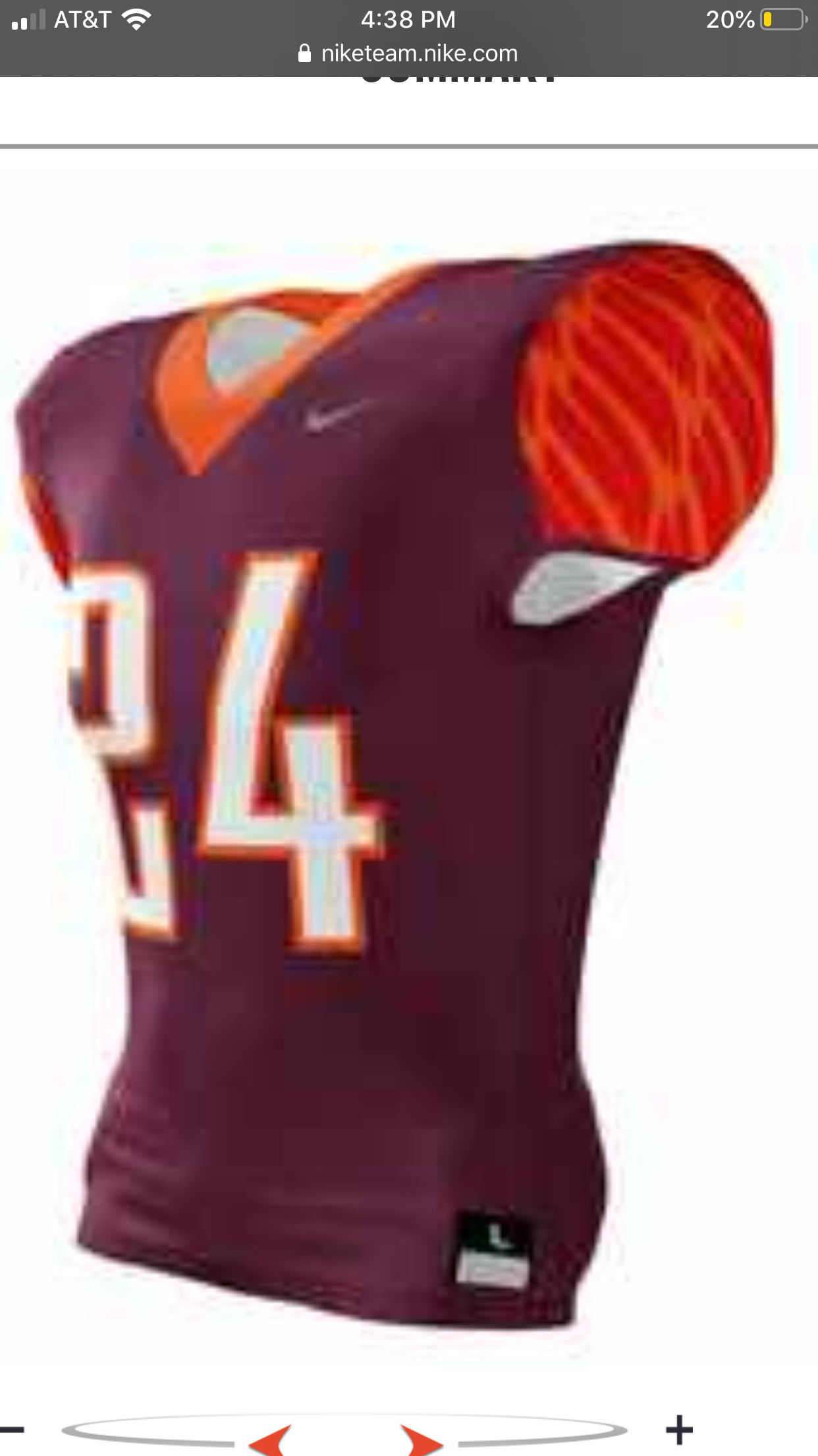
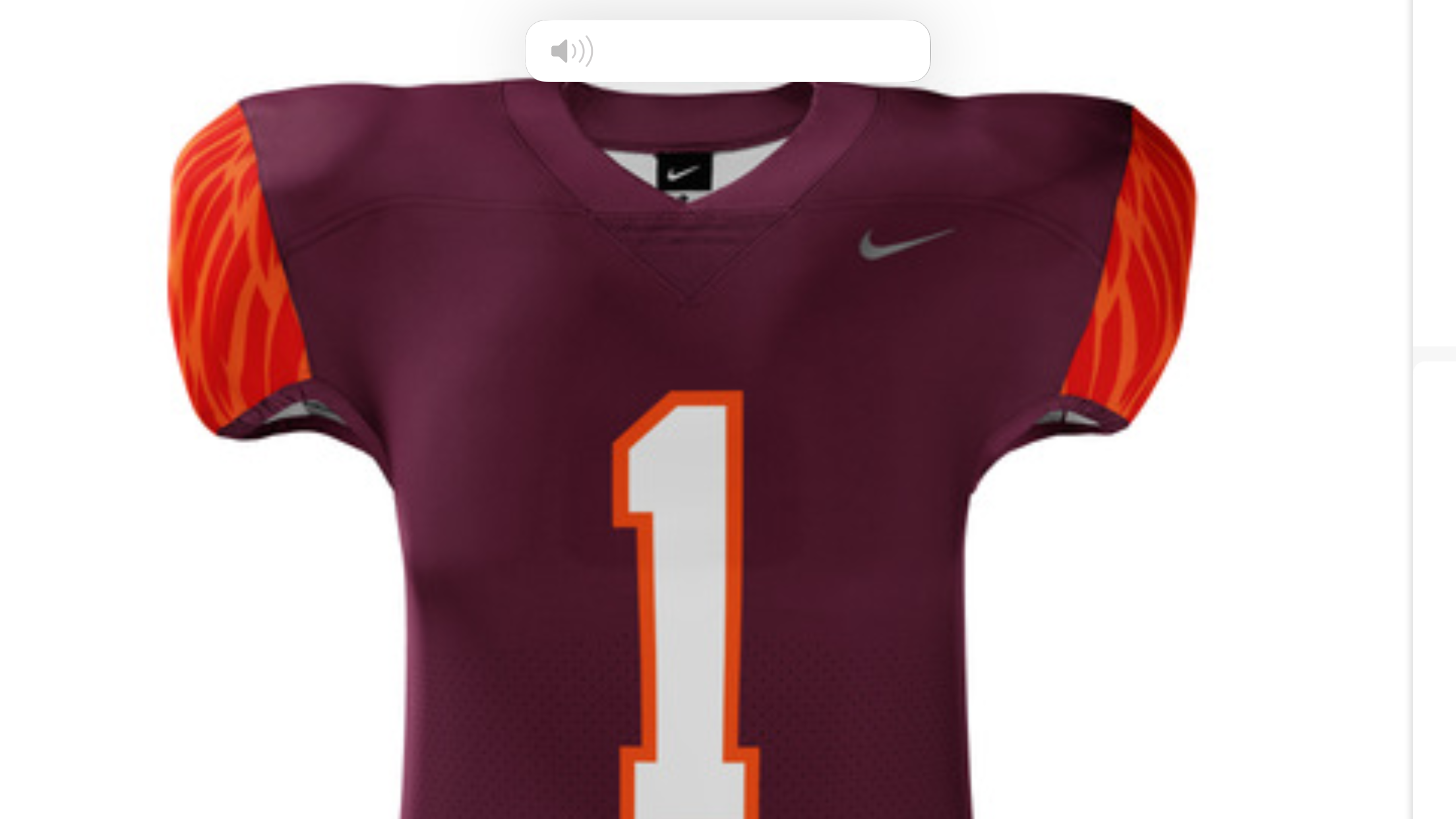

Comments
I don't dig the numbers, but it looks clean
I like the first one more.
After this weekend, all I want to see is all maroon, all the time.
AMAT!!!!
I like the second one more. More Maroon!! What are these for exactly?
Aside from the numbers, are they not the same jersey?Didn't catch the different collars. My B.
I liked it better with the 'Blacksburg' number font (as it is called in the Nike catalog)
I'd like to see us go back to these
You and the guy she tells you not to worry about
Never liked these jerseys.
I hate that font. especially the 2 and 5.
These were the best we've ever worn. You could look up sex appeal in the dictionary and you would see Tyrod at the 09 peach bowl as the definition.
Hard disagree hog brotha. In my top-3 of worst VT jerseys.
Before I provide an adequate reply, what are the other two in your top 3 worst?
The Flaming Cheeto Camo Jerseys and the cheap as hell looking grey jerseys from the '13 Bama game have to be up there.
Oh you mean the one where we got a bargain basement ill fitting discount WVU template jerseys for the Bama game?
We went from Nike giving us our own font to sloppy seconds from WVU. Sigh.
From what I understood, we didn't even go with Nike for those jerseys. We had a local firm whip them up late notice because we decided we wanted to do something special way too late for Nike to get them ready for us, but because of our contract, we had to put the Nike logo on them.
Its why the Nike logo there is black on those where its usually a complimentary school color on pretty much every other jersey they've done.
I didn't remember how terrible these were until I looked them up. Clearly I had to share.
Which themselves were so bad we went with our standard maroon pants during the game itself.
Now compare that to what we wore against them the previous game
Everyone also needed to be reminded of this as well. I guess we really liked the way James Gayle modeled uniforms?

Everything about these uniforms were bad. This game went to three overtimes in the pissing rain, and by the end of the game, some players VT logos on their helmets had peeled partially or completely off. I feel like we were Nike's guinea pigs with experimental uniforms for years without actually settling on one template.
I don't think this was a Nike design, either. We in housed this one and were contractually obligated to put their logo on it, hence the black swoosh instead of the standard team color one.
I remember the day they released these before that game and I thought it was a joke at first, found out it wasn't, and became irrationally angry. Looks like a Walmart brand jersey.
Definitely agree there but I'm thinking like full time uniforms. Not the one off designs. Good god those Bama uniforms were hideous though. Then we wore the grey bottoms with a maroon jersey against Maryland, I think? Ugh.
Excluding the one-off's as you mentioned, my other two are all of them from the last two seasons:
and the 2013 stripes:
Here's just my personal opinion:
Starting with this seasons' and lasts', I think they're so cheap looking. The little pseudo-mono stripe looks tacky and the whole kit looks like they purchased it on the cheap. The pants have potential but can't reconcile the horrible jersey look. The font of the numbers and the 'TECH' on the pants are the only highlights for me. Other than that, these kits have an identity that has closely resembled the product on the field over the last year and change for the most part.
The 2013 stripes, in all colors, were so awkwardly long and sweeping. It looked like they couldn't figure out how to cleanly end them so they just let them swallow the pits.
I see what you're saying on 2013. The current ones aren't bad IMO except for the nameplate issues. But they still lack what I see from other programs.
Officially speaking, the Brethren Court of the Hogs adopts the 2008-2009 as the best Hokie uniform.
Oooooo these unis are an all time favorite for me. The TV VT with no stripe is perfection.
I wanted to create a different Hokies jersey but they didn't have the design I was looking for.
Give me this one every time.
These are the best imo. Classic and clean. I really wish we never went flashy with our uniforms and just stuck with these. We had a great logo and uniform and now We have an outrageous VT logo the university adopted recently. Our school colors are Chicago maroon and burnt orange not purple and creamsicle orange.
I remember everyone wanted these gone. We didn't like they were so simple. We wanted something flashy and current (like Oregon). Then we did the throwbacks...everyone loved them and wanted them as our full time kit.
The orange numbers on the sleeve always seem out of place. The chest and sleeve coloring should match, both orange or both white.
put some maroon pants on those and we get the best color combination in our history. i propose starting a petition.
not a fan of the orange shoulders/sleeves
This 1000x so.
I like it better than what we wear today
I think the feather touch is too Oregon-ish for me. Give me Hokie stone, everytime. But I do like the second one of the two.
These are my favorites. Followed closely by the Michael Vick era jerseys.
Reverse those two and they are my picks
The away version of these were 🔥🔥🔥🔥🔥
get rid of the piping, and you have my attention.
If you get rid of the piping it's basically the Vick jersey.
If we bring these back, can we also bring back Xavier?
Honestly, I wish we could've seen these in Maroon. Feel like it's a modern take on the Vick-era jerseys we all love.
/cdn.vox-cdn.com/uploads/chorus_image/image/57281431/usa_today_10359719.0.jpg)
This x10000. I was hoping this game was a jersey reveal for what we were going to wear after 2017. I like the uniforms we are wearing now but would like these more.
I'm not a fan of the current unis. The back looks off if the name plate doesn't go all the way across.
I really wish we would go with a fresh update on our old unis (MV7 or TT5). I really like the X men jerseys, but they don't work well with the way jerseys are made today.
I guess maybe I'm in the minority that really likes our current look. The stripe on the helmet goes well with the stripes on the shoulders. It's modern but not too busy or loud. I really like it. The name plate is a problem though.
I'm not sure what is going on with the nameplate. Some have the orange stripes going past the top edge, some stop at the top edge.

The nameplates are different sizes. Either really short names that fit between the stripes or long names that span the whole length of the shoulders and completely cover the stripes look best.
Of course the simple solution is to use the same size name plate on each jersey, despite how long the players name is.
Seems like an epic fail of common sense right? Some of them look terrible.
Actually, when you look close (not necessarily at this pic in particular) the orange stripes actually stop on most jerseys. And the nameplate does not cover the strips. It's two different striping patterns.
The name strip covers the orange on these examples.
Interesting that they've figured it out for some short names like King, but not others like Belmar. There are also pics of where the orange stripe is just barely visible BELOW the name plate.
Like this one. You can just barely see the orange below King's nameplate.
No wonder the read option doesn't work with Willis.
So maybe there's 3 ways? I almost swear I've seen the orange stop at the top. Either way it's odd.
Except its not consistent. Some longer names still have the orange showing. Some short names span across the back.
home and away jerseys are incosistent for the same player as well. Farley's maroon nameplate covers. His white one does not.
Longer names have the nameplate covering the orange stripe, shorter names don't?
I can't stand this aspect of the current jersey. Something like the length of the player's name shouldn't create an opportunity for aesthetic inconsistency.
My favorite aspect of the current unis is the Hokie Stone pattern behind the numbers. Subtle but super effective
This is the only right answer to the questions of "What was the best VT uniform in history?".
I don't like the different colors on the chest/back and shoulders.....both should be white imo......
I dont know if the shoulders would work well with today's very slimmed down shoulder pads.
Clearly they're not waterproof. We could never play in NC.
I love these uniforms because when the defense is playing lights out and the TV camera angle is from behind the QB, it reminds me of the Predator movies. Where they are tearing through any shit that is in the way to kill you.
take my upvote
Also I wish Nike would bring these long sleeve shirts back. Coolest design I've ever seen!

My favorite will always be the shoulder stripes. They're almost a decade old at this point and are basically a retro jersey
I believe you were looking for this thread.
They were retro when we brought them back. Technically now they would be retro-retro. Which I think makes them cool.
Didn't LSU wear the same style for a while? It wasn't even unique.
I thought it looked great.
Was better in Maroon.
.
Agree with these jersey stripes. This stripe...or no jersey stripe. I also like either no stripe on the helmet...or a stripe that doesn't taper to that weird point on the back of the helmet. Stripe it the same front to back...or no stripe.
Those dang kids need to get off my lawn.
Reads thread......
Thinks: "Did I miss something? Is it off-season already?"
Bye week, it is like a mini offseason.
And this year is worse because we have 2 bye weeks.
Last year, though, we had an ECU imposed bye week, but extra football on ACC Championship weekend.
Give me the Vick era jersey every time. All white for road games.
Would prefer to just have the maroon shoulders with the numbers on the sides, maybe with a small 'HOKIES" or "TECH" or "VT" across the middle of the front chest. There is an option for orange trim around the sleeve/arm that makes them look pretty sharp too.
like I said...this jersey without the piping. (via Granville's comment above)
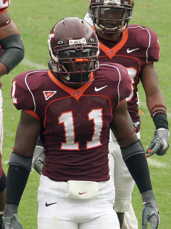
I was hoping we would go with this before the new uniforms came out last year. I would just add the VT (athletic dept. one) logo on the collar. This reminds me of the Georgia uniforms which I like the best because they are clean and classic.
Give me this, but reverse one thing - if the body of the number was orange and the border of the number was white, I think it'd be my ideal uniform.
These have always been my favorite for some odd reason. The striped helmet with the white facemask is also far and away my favorite look.
That lid is definitely clean. The orange shoulder number is interesting
I think it looks great on the white, but yea a little odd on the maroon.
I don't even know if I think it looks bad on the maroon. I can't make up my mind, why I went with "interesting", lol
It was the 90's. We all wore some odd stuff in the 90's.
Speak for yourself. Now, the weather is cooling off, gotta go find my jacket
.
You'll need the matching shirt and hat then!
Interestingly enough, while searching for that image, I came across this blue and red VT starter jacket that can be yours for only $155.04 (marked down from $259.78)
huh?
Where can I find that hat?
1994
I used to have that hat - and think my dad still does - wish they'd bring back some of the early 90's hats.
The numbers needed the outline to keep design consistency with the chest/back numbers
Yeah it would definitely make the shoulder numbers pop a little more with some outline. I would like to see a modern version of this jersey with the sleeve stripes instead of long shoulder stripes. If we have to have stripes, I would prefer something like this. If not, give me a clean, simple look like the MV7 or mid 2000s era jerseys.
These are the shoulder stripes we need!
The arm pads look like Salmon Nigiri
Sooo can anyone just make these and buy them or do you have to buy it in bulk?, because this site is awesome...
My absolute all-time fave away look.
Definitely need to incorporate white lids more often. The all whites they wore against Miami were nice. All maroon home default, all white road default. Who says no?
Can someone who is good at photoshop change it so the number is Orange and the outline is white? My dream uniform is all maroon pants/jersey with orange numbers, team name, and VT logo, all with white outline.
If you go to that Nike website, you can make the numbers orange and the outline white.
Maybe if it was the XFL, but for Lane, nope.
u rite, I was just playing with that one, here's the real deal
You're pushing me towards all maroon, all the time.
I never want to see this again as long as I live
Here's some rough edits I did a while back to see how the 2017 orange jerseys would look in maroon


Orange shoulder numbers look awesome. Send this to Whit!
dope. we need this
I think I like the top one most. With the bottom one, it bothers me the shoulder numbers are orange while the body numbers are white.
Shame Nike swoosh isn't orange though.
That bottom one.
i used to have that toy, lol
top but with the hokie stone accent like our current jersey!
I'd be cool if we ditched the accent band around the colors. Just white chest/back numbers. Orange on top or side of the shoulders.
I also think it was the reason the one batch of fighting gobbler helmets looked like a blob on tv. The accenting border took away all the cutouts in the logo and turned it to mush.
I disagree. I think if there was no white border, the gobblers would've really been blob like.
god i love that helmet
So happy I landed one of these this past summer. Great addition to the man cave area.
Agreed, the fighting gobbler needs to return
Should never have left.
#ALLORANGEEVERYTHING
I used to be like you. Then I matured.
I still like to have a lot of orange in the uniform, but AOE might be too much. It rocks in NCAA 14 though. Much easier to see your guys in your periphery.
Eh. I guess I'm pretty unusual in my uniform preference. Give me maroon pants all the time. Maroon top at home, white top away (both all the time). White numbers front and back with orange border. Nothing on the sleeves or shoulders. Orange collar on jersey with VT athletic department logo in front and no weird extension of the color on the back near the name. Always a maroon helmet with the athletic department VT logo and maroon facemask. Fighting Gobblers, Hokie tracks, Foghorn Leghorn, and other such fuckery should never make an appearance. Orange should never constitute more than a 5% accent color on anything.